- Published on
6 Easy Ways To Create A Tailwind Search Bar With Tailwind CSS Without Even Thinking About It
- What is Tailwind CSS?
- The description of Tailwind Search Bar ui component
- Why use Tailwind CSS to create a Tailwind Search Bar ui component?
- The preview of Tailwind Search Bar ui component
- The source code of Tailwind Search Bar ui component
- How to create a Tailwind Search Bar with Tailwind CSS?
- 1. Use the pre-designed Tailwind Search Bar UI component
- 2. Customize the Search Bar UI component's colors
- 3. Change the Search Bar UI component's size
- 4. Add a search icon to the Search Bar UI component
- 5. Add a hover effect to the Search Bar UI component
- 6. Make the Search Bar UI component responsive
- Conclusion
What is Tailwind CSS?
Tailwind CSS is a utility-first CSS framework that helps you quickly design and customize your website's look and feel. It provides a set of pre-defined CSS classes that you can use to style your HTML elements. Tailwind CSS is easy to use, and it allows you to create beautiful and responsive web designs without writing a lot of custom CSS code.
The description of Tailwind Search Bar ui component
A search bar is an essential UI component for any website or application that needs to search for content. A search bar allows users to enter keywords and search for specific information within a website or application. The Tailwind Search Bar UI component is a pre-designed search bar that you can easily customize and integrate into your website or application.
Why use Tailwind CSS to create a Tailwind Search Bar ui component?
Tailwind CSS provides a set of pre-defined CSS classes that you can use to style your HTML elements. This makes it easy to create a Tailwind Search Bar UI component without writing a lot of custom CSS code. Additionally, Tailwind CSS is highly customizable, which means you can easily modify the look and feel of your search bar to match your website or application's design.
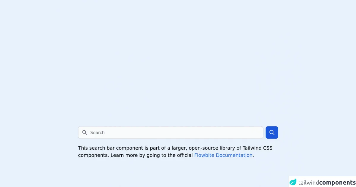
The preview of Tailwind Search Bar ui component
The Tailwind Search Bar UI component is a pre-designed search bar that you can easily customize and integrate into your website or application.
Free download of the Tailwind Search Bar's source code
The source code of Tailwind Search Bar ui component
To create a Tailwind Search Bar UI component, you can use the following HTML and CSS code.
<link rel="stylesheet" href="https://unpkg.com/[email protected]/dist/flowbite.min.css" />

<!-- This is an example component -->
<div class="max-w-2xl mx-auto">

	<form class="flex items-center">
        <label for="simple-search" class="sr-only">Search</label>
        <div class="relative w-full">
            <div class="flex absolute inset-y-0 left-0 items-center pl-3 pointer-events-none">
                <svg class="w-5 h-5 text-gray-500 dark:text-gray-400" fill="currentColor" viewBox="0 0 20 20" xmlns="http://www.w3.org/2000/svg"><path fill-rule="evenodd" d="M8 4a4 4 0 100 8 4 4 0 000-8zM2 8a6 6 0 1110.89 3.476l4.817 4.817a1 1 0 01-1.414 1.414l-4.816-4.816A6 6 0 012 8z" clip-rule="evenodd"></path></svg>
            </div>
            <input type="text" id="simple-search" class="bg-gray-50 border border-gray-300 text-gray-900 text-sm rounded-lg focus:ring-blue-500 focus:border-blue-500 block w-full pl-10 p-2.5  dark:bg-gray-700 dark:border-gray-600 dark:placeholder-gray-400 dark:text-white dark:focus:ring-blue-500 dark:focus:border-blue-500" placeholder="Search" required>
        </div>
        <button type="submit" class="p-2.5 ml-2 text-sm font-medium text-white bg-blue-700 rounded-lg border border-blue-700 hover:bg-blue-800 focus:ring-4 focus:outline-none focus:ring-blue-300 dark:bg-blue-600 dark:hover:bg-blue-700 dark:focus:ring-blue-800"><svg class="w-5 h-5" fill="none" stroke="currentColor" viewBox="0 0 24 24" xmlns="http://www.w3.org/2000/svg"><path stroke-linecap="round" stroke-linejoin="round" stroke-width="2" d="M21 21l-6-6m2-5a7 7 0 11-14 0 7 7 0 0114 0z"></path></svg></button>
    </form>

	<p class="mt-5">This search bar component is part of a larger, open-source library of Tailwind CSS components. Learn
		more
		by going to the official <a class="text-blue-600 hover:underline"
			href="https://flowbite.com/docs/getting-started/introduction/" target="_blank">Flowbite Documentation</a>.
	</p>
    <script src="https://unpkg.com/[email protected]/dist/flowbite.js"></script>
</div>
How to create a Tailwind Search Bar with Tailwind CSS?
Here are six easy ways to create a Tailwind Search Bar with Tailwind CSS:
1. Use the pre-designed Tailwind Search Bar UI component
Tailwind CSS provides a pre-designed Search Bar UI component that you can use in your website or application. To use the pre-designed Search Bar UI component, you need to add the following HTML code to your website or application:
<div class="relative text-gray-600 focus-within:text-gray-400">
  <span class="absolute inset-y-0 left-0 flex items-center pl-2">
    <button type="submit" class="p-1 focus:outline-none focus:shadow-outline">
      <svg fill="none" stroke="currentColor" stroke-linecap="round" stroke-linejoin="round" stroke-width="2" viewBox="0 0 24 24" class="w-6 h-6">
        <path d="M22 22l-6-6"></path>
        <path d="M16 11A6 6 0 1 1 8 11a6 6 0 0 1 6-6 6 6 0 0 1 6 6z"></path>
      </svg>
    </button>
  </span>
  <input type="search" name="q" class="py-2 text-sm text-white bg-gray-900 rounded-md pl-10 focus:outline-none focus:bg-white focus:text-gray-900" placeholder="Search...">
</div>
2. Customize the Search Bar UI component's colors
To customize the Search Bar UI component's colors, you can use Tailwind CSS's color classes. For example, you can change the search bar's background color to blue by adding the bg-blue-500 class to the input element:
<input type="search" name="q" class="py-2 text-sm text-white bg-blue-500 rounded-md pl-10 focus:outline-none focus:bg-white focus:text-gray-900" placeholder="Search...">
3. Change the Search Bar UI component's size
To change the Search Bar UI component's size, you can use Tailwind CSS's padding and font-size classes. For example, you can increase the search bar's font size by adding the text-lg class to the input element:
<input type="search" name="q" class="py-2 text-lg text-white bg-gray-900 rounded-md pl-10 focus:outline-none focus:bg-white focus:text-gray-900" placeholder="Search...">
4. Add a search icon to the Search Bar UI component
To add a search icon to the Search Bar UI component, you can use Tailwind CSS's flexbox and SVG classes. For example, you can add a search icon to the left of the search bar by adding the following HTML code:
<span class="absolute inset-y-0 left-0 flex items-center pl-2">
  <svg fill="none" stroke="currentColor" stroke-linecap="round" stroke-linejoin="round" stroke-width="2" viewBox="0 0 24 24" class="w-6 h-6">
    <path d="M22 22l-6-6"></path>
    <path d="M16 11A6 6 0 1 1 8 11a6 6 0 0 1 6-6 6 6 0 0 1 6 6z"></path>
  </svg>
</span>
5. Add a hover effect to the Search Bar UI component
To add a hover effect to the Search Bar UI component, you can use Tailwind CSS's hover classes. For example, you can change the search bar's background color to white when the user hovers over it by adding the hover:bg-white class to the input element:
<input type="search" name="q" class="py-2 text-sm text-white bg-gray-900 rounded-md pl-10 focus:outline-none focus:bg-white focus:text-gray-900 hover:bg-white" placeholder="Search...">
6. Make the Search Bar UI component responsive
To make the Search Bar UI component responsive, you can use Tailwind CSS's responsive classes. For example, you can make the search bar's font size smaller on mobile devices by adding the sm:text-sm class to the input element:
<input type="search" name="q" class="py-2 text-sm sm:text-lg text-white bg-gray-900 rounded-md pl-10 focus:outline-none focus:bg-white focus:text-gray-900 hover:bg-white" placeholder="Search...">
Conclusion
In conclusion, creating a Tailwind Search Bar UI component is easy and straightforward with Tailwind CSS. You can use the pre-designed Search Bar UI component or customize it to match your website or application's design. With Tailwind CSS's utility-first approach, you can create beautiful and responsive web designs without writing a lot of custom CSS code.