- Published on
Here Are 6 Ways To Create A Tailwind Login form With Tailwind CSS
- What is Tailwind CSS?
- The description of Tailwind Login form UI component
- Why use Tailwind CSS to create a Tailwind Login form UI component?
- The preview of Tailwind Login form UI component
- The source code of Tailwind Login form UI component
- How to create a Tailwind Login form with Tailwind CSS?
- 1. Basic Login Form
- 2. Login Form with Remember Me
- 3. Login Form with Forgot Password
- 4. Login Form with Create Account
- 5. Login Form with Social Icons
- 6. Login Form with Image Background
- Conclusion
What is Tailwind CSS?
Tailwind CSS is a utility-first CSS framework that helps developers to create responsive and customizable designs quickly. It provides a set of pre-defined CSS classes, which can be used to style HTML elements. With Tailwind CSS, developers can create complex layouts and designs without writing custom CSS from scratch.
The description of Tailwind Login form UI component
A login form is a common UI component that is used in many web applications. It allows users to authenticate themselves and access the application. A Tailwind Login form UI component is a login form that is styled using Tailwind CSS classes. It can be customized to fit the design of any web application.
Why use Tailwind CSS to create a Tailwind Login form UI component?
Tailwind CSS provides a set of pre-defined CSS classes that can be used to style HTML elements. This makes it easy to create a Tailwind Login form UI component without writing custom CSS from scratch. Additionally, Tailwind CSS is responsive by default, which means that the login form will look great on any device.
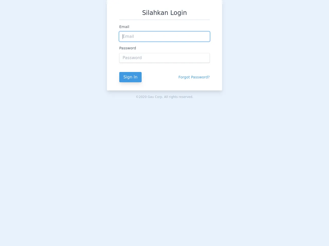
The preview of Tailwind Login form UI component
A Tailwind Login form UI component can be customized to fit the design of any web application. It can include fields for email, password, and a submit button. Additionally, it can include links to reset a password or create a new account.
Free download of the Tailwind Login form's source code
The source code of Tailwind Login form UI component
To create a Tailwind Login form UI component, you can use HTML and Tailwind CSS classes. The HTML code defines the structure of the login form, while the Tailwind CSS classes define the styling.
<div class="flex items-center justify-center">
<div class="w-full max-w-md">
<form class="bg-white shadow-lg rounded px-12 pt-6 pb-8 mb-4">
<!-- @csrf -->
<div
class="text-gray-800 text-2xl flex justify-center border-b-2 py-2 mb-4"
>
Silahkan Login
</div>
<div class="mb-4">
<label
class="block text-gray-700 text-sm font-normal mb-2"
for="username"
>
Email
</label>
<input
class="shadow appearance-none border rounded w-full py-2 px-3 text-gray-700 leading-tight focus:outline-none focus:shadow-outline"
name="email"
v-model="form.email"
type="email"
required
autofocus
placeholder="Email"
/>
</div>
<div class="mb-6">
<label
class="block text-gray-700 text-sm font-normal mb-2"
for="password"
>
Password
</label>
<input
class="shadow appearance-none border rounded w-full py-2 px-3 text-gray-700 mb-3 leading-tight focus:outline-none focus:shadow-outline"
v-model="form.password"
type="password"
placeholder="Password"
name="password"
required
autocomplete="current-password"
/>
</div>
<div class="flex items-center justify-between">
<button class="px-4 py-2 rounded text-white inline-block shadow-lg bg-blue-500 hover:bg-blue-600 focus:bg-blue-700" type="submit">Sign In</button>
<a
class="inline-block align-baseline font-normal text-sm text-blue-500 hover:text-blue-800"
href="#"
>
Forgot Password?
</a>
</div>
</form>
<p class="text-center text-gray-500 text-xs">
©2020 Gau Corp. All rights reserved.
</p>
</div>
</div>
How to create a Tailwind Login form with Tailwind CSS?
Here are six ways to create a Tailwind Login form with Tailwind CSS:
1. Basic Login Form
The basic login form includes fields for email and password, as well as a submit button.
<form class="bg-white rounded-lg p-6 shadow-md">
  <div class="mb-4">
    <label class="block text-gray-700 font-bold mb-2" for="email">
      Email
    </label>
    <input
      class="shadow appearance-none border rounded w-full py-2 px-3 text-gray-700 leading-tight focus:outline-none focus:shadow-outline"
      id="email"
      type="email"
      placeholder="Email"
    />
  </div>
  <div class="mb-6">
    <label class="block text-gray-700 font-bold mb-2" for="password">
      Password
    </label>
    <input
      class="shadow appearance-none border rounded w-full py-2 px-3 text-gray-700 leading-tight focus:outline-none focus:shadow-outline"
      id="password"
      type="password"
      placeholder="Password"
    />
  </div>
  <div class="flex items-center justify-between">
    <button
      class="bg-blue-500 hover:bg-blue-700 text-white font-bold py-2 px-4 rounded focus:outline-none focus:shadow-outline"
      type="button"
    >
      Sign In
    </button>
  </div>
</form>
2. Login Form with Remember Me
The login form with remember me includes a checkbox for users to remember their login credentials.
<form class="bg-white rounded-lg p-6 shadow-md">
  <div class="mb-4">
    <label class="block text-gray-700 font-bold mb-2" for="email">
      Email
    </label>
    <input
      class="shadow appearance-none border rounded w-full py-2 px-3 text-gray-700 leading-tight focus:outline-none focus:shadow-outline"
      id="email"
      type="email"
      placeholder="Email"
    />
  </div>
  <div class="mb-6">
    <label class="block text-gray-700 font-bold mb-2" for="password">
      Password
    </label>
    <input
      class="shadow appearance-none border rounded w-full py-2 px-3 text-gray-700 leading-tight focus:outline-none focus:shadow-outline"
      id="password"
      type="password"
      placeholder="Password"
    />
  </div>
  <div class="flex items-center mb-6">
    <label class="block text-gray-500 font-bold">
      <input class="mr-2 leading-tight" type="checkbox" />
      <span class="text-sm">
        Remember Me
      </span>
    </label>
  </div>
  <div class="flex items-center justify-between">
    <button
      class="bg-blue-500 hover:bg-blue-700 text-white font-bold py-2 px-4 rounded focus:outline-none focus:shadow-outline"
      type="button"
    >
      Sign In
    </button>
  </div>
</form>
3. Login Form with Forgot Password
The login form with forgot password includes a link for users to reset their password.
<form class="bg-white rounded-lg p-6 shadow-md">
  <div class="mb-4">
    <label class="block text-gray-700 font-bold mb-2" for="email">
      Email
    </label>
    <input
      class="shadow appearance-none border rounded w-full py-2 px-3 text-gray-700 leading-tight focus:outline-none focus:shadow-outline"
      id="email"
      type="email"
      placeholder="Email"
    />
  </div>
  <div class="mb-6">
    <label class="block text-gray-700 font-bold mb-2" for="password">
      Password
    </label>
    <input
      class="shadow appearance-none border rounded w-full py-2 px-3 text-gray-700 leading-tight focus:outline-none focus:shadow-outline"
      id="password"
      type="password"
      placeholder="Password"
    />
  </div>
  <div class="flex items-center mb-6">
    <a class="text-blue-500 hover:text-blue-700 text-sm" href="#">
      Forgot your password?
    </a>
  </div>
  <div class="flex items-center justify-between">
    <button
      class="bg-blue-500 hover:bg-blue-700 text-white font-bold py-2 px-4 rounded focus:outline-none focus:shadow-outline"
      type="button"
    >
      Sign In
    </button>
  </div>
</form>
4. Login Form with Create Account
The login form with create account includes a link for users to create a new account.
<form class="bg-white rounded-lg p-6 shadow-md">
  <div class="mb-4">
    <label class="block text-gray-700 font-bold mb-2" for="email">
      Email
    </label>
    <input
      class="shadow appearance-none border rounded w-full py-2 px-3 text-gray-700 leading-tight focus:outline-none focus:shadow-outline"
      id="email"
      type="email"
      placeholder="Email"
    />
  </div>
  <div class="mb-6">
    <label class="block text-gray-700 font-bold mb-2" for="password">
      Password
    </label>
    <input
      class="shadow appearance-none border rounded w-full py-2 px-3 text-gray-700 leading-tight focus:outline-none focus:shadow-outline"
      id="password"
      type="password"
      placeholder="Password"
    />
  </div>
  <div class="flex items-center mb-6">
    <a class="text-blue-500 hover:text-blue-700 text-sm" href="#">
      Create an account
    </a>
  </div>
  <div class="flex items-center justify-between">
    <button
      class="bg-blue-500 hover:bg-blue-700 text-white font-bold py-2 px-4 rounded focus:outline-none focus:shadow-outline"
      type="button"
    >
      Sign In
    </button>
  </div>
</form>
5. Login Form with Social Icons
The login form with social icons includes icons for popular social media platforms.
<form class="bg-white rounded-lg p-6 shadow-md">
  <div class="mb-4">
    <label class="block text-gray-700 font-bold mb-2" for="email">
      Email
    </label>
    <input
      class="shadow appearance-none border rounded w-full py-2 px-3 text-gray-700 leading-tight focus:outline-none focus:shadow-outline"
      id="email"
      type="email"
      placeholder="Email"
    />
  </div>
  <div class="mb-6">
    <label class="block text-gray-700 font-bold mb-2" for="password">
      Password
    </label>
    <input
      class="shadow appearance-none border rounded w-full py-2 px-3 text-gray-700 leading-tight focus:outline-none focus:shadow-outline"
      id="password"
      type="password"
      placeholder="Password"
    />
  </div>
  <div class="flex items-center mb-6">
    <div class="w-full">
      <button
        class="bg-blue-500 hover:bg-blue-700 text-white font-bold py-2 px-4 rounded focus:outline-none focus:shadow-outline w-full"
        type="button"
      >
        Sign In
      </button>
    </div>
  </div>
  <div class="flex items-center justify-between">
    <div class="w-full">
      <p class="text-center text-gray-500 text-sm mb-2">
        or sign in with
      </p>
    </div>
    <div class="w-full">
      <div class="flex justify-center">
        <a
          class="bg-blue-500 hover:bg-blue-700 text-white font-bold py-2 px-4 rounded-full mr-2"
          href="#"
        >
          <i class="fab fa-facebook-f"></i>
        </a>
        <a
          class="bg-blue-400 hover:bg-blue-600 text-white font-bold py-2 px-4 rounded-full ml-2"
          href="#"
        >
          <i class="fab fa-twitter"></i>
        </a>
      </div>
    </div>
  </div>
</form>
6. Login Form with Image Background
The login form with image background includes a background image.
<div
  class="bg-cover bg-center h-screen flex items-center justify-center"
  style="background-image: url('https://images.unsplash.com/photo-1519681393784-d120267933ba?ixlib=rb-1.2.1&auto=format&fit=crop&w=500&q=60')"
>
  <form class="bg-white rounded-lg p-6 shadow-md">
    <div class="mb-4">
      <label class="block text-gray-700 font-bold mb-2" for="email">
        Email
      </label>
      <input
        class="shadow appearance-none border rounded w-full py-2 px-3 text-gray-700 leading-tight focus:outline-none focus:shadow-outline"
        id="email"
        type="email"
        placeholder="Email"
      />
    </div>
    <div class="mb-6">
      <label class="block text-gray-700 font-bold mb-2" for="password">
        Password
      </label>
      <input
        class="shadow appearance-none border rounded w-full py-2 px-3 text-gray-700 leading-tight focus:outline-none focus:shadow-outline"
        id="password"
        type="password"
        placeholder="Password"
      />
    </div>
    <div class="flex items-center mb-6">
      <div class="w-full">
        <button
          class="bg-blue-500 hover:bg-blue-700 text-white font-bold py-2 px-4 rounded focus:outline-none focus:shadow-outline w-full"
          type="button"
        >
          Sign In
        </button>
      </div>
    </div>
    <div class="flex items-center justify-between">
      <div class="w-full">
        <p class="text-center text-gray-500 text-sm mb-2">
          or sign in with
        </p>
      </div>
      <div class="w-full">
        <div class="flex justify-center">
          <a
            class="bg-blue-500 hover:bg-blue-700 text-white font-bold py-2 px-4 rounded-full mr-2"
            href="#"
          >
            <i class="fab fa-facebook-f"></i>
          </a>
          <a
            class="bg-blue-400 hover:bg-blue-600 text-white font-bold py-2 px-4 rounded-full ml-2"
            href="#"
          >
            <i class="fab fa-twitter"></i>
          </a>
        </div>
      </div>
    </div>
  </form>
</div>
Conclusion
In conclusion, creating a Tailwind Login form UI component is easy with Tailwind CSS. By using pre-defined CSS classes, developers can create a responsive and customizable login form that fits the design of any web application. With the six ways described above, developers can choose the login form that best fits their needs and customize it to their liking.