- Published on
Best Ways To Create A Tailwind Responsive Product Card With Tailwind CSS
- What is Tailwind CSS?
- The description of Tailwind Responsive Product Card ui component
- Why use Tailwind CSS to create a Tailwind Responsive Product Card ui component?
- The preview of Tailwind Responsive Product Card ui component
- The source code of Tailwind Responsive Product Card ui component
- How to create a Tailwind Responsive Product Card with Tailwind CSS?
- Step 1: Set up the HTML structure
- Step 2: Add the image
- Step 3: Add the title and description
- Step 4: Add the price
- Step 5: Add responsiveness
- Conclusion
What is Tailwind CSS?
Tailwind CSS is a utility-first CSS framework that provides a set of pre-defined classes to style HTML elements. It is designed to speed up the development process by eliminating the need for writing custom CSS code. With Tailwind CSS, you can create responsive and mobile-first web designs with ease.
The description of Tailwind Responsive Product Card ui component
A product card is a UI component used to display information about a product. It typically includes an image, a title, a description, and a price. A responsive product card is a product card that adjusts its layout and size based on the device screen size.
Why use Tailwind CSS to create a Tailwind Responsive Product Card ui component?
Tailwind CSS provides a set of pre-defined classes that can be used to create a responsive product card quickly. It also offers customization options that allow you to modify the design to fit your needs. Using Tailwind CSS to create a responsive product card saves time and effort and ensures that the card looks great on all devices.
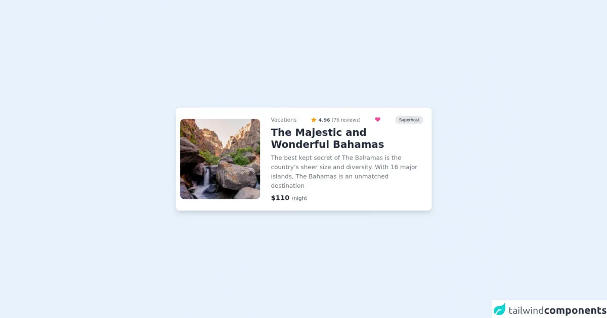
The preview of Tailwind Responsive Product Card ui component
To create a Tailwind Responsive Product Card, we will use a combination of HTML and Tailwind CSS classes. The card will include an image, a title, a description, and a price. Here is a preview of what the final product card will look like:
Free download of the Tailwind Responsive Product Card's source code
The source code of Tailwind Responsive Product Card ui component
Here is the source code for the Tailwind Responsive Product Card:
<div class="flex flex-col justify-center h-screen">
	<div
		class="relative flex flex-col md:flex-row md:space-x-5 space-y-3 md:space-y-0 rounded-xl shadow-lg p-3 max-w-xs md:max-w-3xl mx-auto border border-white bg-white">
		<div class="w-full md:w-1/3 bg-white grid place-items-center">
			<img src="https://images.pexels.com/photos/4381392/pexels-photo-4381392.jpeg?auto=compress&cs=tinysrgb&dpr=1&w=500" alt="tailwind logo" class="rounded-xl" />
    </div>
			<div class="w-full md:w-2/3 bg-white flex flex-col space-y-2 p-3">
				<div class="flex justify-between item-center">
					<p class="text-gray-500 font-medium hidden md:block">Vacations</p>
					<div class="flex items-center">
						<svg xmlns="http://www.w3.org/2000/svg" class="h-5 w-5 text-yellow-500" viewBox="0 0 20 20"
							fill="currentColor">
							<path
								d="M9.049 2.927c.3-.921 1.603-.921 1.902 0l1.07 3.292a1 1 0 00.95.69h3.462c.969 0 1.371 1.24.588 1.81l-2.8 2.034a1 1 0 00-.364 1.118l1.07 3.292c.3.921-.755 1.688-1.54 1.118l-2.8-2.034a1 1 0 00-1.175 0l-2.8 2.034c-.784.57-1.838-.197-1.539-1.118l1.07-3.292a1 1 0 00-.364-1.118L2.98 8.72c-.783-.57-.38-1.81.588-1.81h3.461a1 1 0 00.951-.69l1.07-3.292z" />
						</svg>
						<p class="text-gray-600 font-bold text-sm ml-1">
							4.96
							<span class="text-gray-500 font-normal">(76 reviews)</span>
						</p>
					</div>
					<div class="">
						<svg xmlns="http://www.w3.org/2000/svg" class="h-5 w-5 text-pink-500" viewBox="0 0 20 20"
							fill="currentColor">
							<path fill-rule="evenodd"
								d="M3.172 5.172a4 4 0 015.656 0L10 6.343l1.172-1.171a4 4 0 115.656 5.656L10 17.657l-6.828-6.829a4 4 0 010-5.656z"
								clip-rule="evenodd" />
						</svg>
					</div>
					<div class="bg-gray-200 px-3 py-1 rounded-full text-xs font-medium text-gray-800 hidden md:block">
						Superhost</div>
				</div>
				<h3 class="font-black text-gray-800 md:text-3xl text-xl">The Majestic and Wonderful Bahamas</h3>
				<p class="md:text-lg text-gray-500 text-base">The best kept secret of The Bahamas is the country’s sheer
					size and diversity. With 16 major islands, The Bahamas is an unmatched destination</p>
				<p class="text-xl font-black text-gray-800">
					$110
					<span class="font-normal text-gray-600 text-base">/night</span>
				</p>
			</div>
		</div>
	</div>
How to create a Tailwind Responsive Product Card with Tailwind CSS?
To create a Tailwind Responsive Product Card, follow these steps:
Step 1: Set up the HTML structure
The first step is to set up the HTML structure for the product card. Here is an example:
<div class="max-w-sm rounded overflow-hidden shadow-lg">
  <img class="w-full" src="product-image.jpg" alt="Product Image">
  <div class="px-6 py-4">
    <div class="font-bold text-xl mb-2">Product Title</div>
    <p class="text-gray-700 text-base">Product Description</p>
  </div>
  <div class="px-6 py-4">
    <span class="text-gray-700 font-bold">$Price</span>
  </div>
</div>
In this example, we have used the max-w-sm class to set the maximum width of the card to sm (small) on small screens. We have also used the rounded, overflow-hidden, and shadow-lg classes to give the card a rounded border, hide any overflow content, and add a shadow effect.
Step 2: Add the image
To add the product image, we can use the w-full class to set the width of the image to full. We can also add an alt attribute to provide a description of the image for screen readers.
<img class="w-full" src="product-image.jpg" alt="Product Image">
Step 3: Add the title and description
To add the product title and description, we can use the px-6 and py-4 classes to add padding to the card's content area. We can also use the font-bold class to make the title bold and the text-gray-700 class to set the color of the text to gray.
<div class="px-6 py-4">
  <div class="font-bold text-xl mb-2">Product Title</div>
  <p class="text-gray-700 text-base">Product Description</p>
</div>
Step 4: Add the price
To add the product price, we can use the px-6 and py-4 classes to add padding to the card's content area. We can also use the text-gray-700 class to set the color of the text to gray and the font-bold class to make the price bold.
<div class="px-6 py-4">
  <span class="text-gray-700 font-bold">$Price</span>
</div>
Step 5: Add responsiveness
To make the product card responsive, we can use Tailwind CSS's responsive classes. For example, we can use the md:max-w-md class to set the maximum width of the card to md (medium) on medium screens. We can also use the md:flex class to make the card a flex container on medium screens, which allows the image and content to be displayed side by side.
<div class="max-w-sm rounded overflow-hidden shadow-lg md:max-w-md md:flex">
  <img class="w-full" src="product-image.jpg" alt="Product Image">
  <div class="px-6 py-4">
    <div class="font-bold text-xl mb-2">Product Title</div>
    <p class="text-gray-700 text-base">Product Description</p>
  </div>
  <div class="px-6 py-4">
    <span class="text-gray-700 font-bold">$Price</span>
  </div>
</div>
Conclusion
Creating a Tailwind Responsive Product Card is easy with Tailwind CSS. By using pre-defined classes and customization options, you can create a responsive and mobile-first product card quickly. With Tailwind CSS, you can focus on the design and functionality of your product card without worrying about the CSS code.