- Published on
Beginners Guide: Build A Tailwind CSS users card list With Tailwind CSS
- What is Tailwind CSS?
- The Description of Tailwind CSS Users Card List UI Component
- Why Use Tailwind CSS to Create a Tailwind CSS Users Card List UI Component?
- The Preview of Tailwind CSS Users Card List UI Component
- The Source Code of Tailwind CSS Users Card List UI Component
- How to Create a Tailwind CSS Users Card List with Tailwind CSS?
- Step 1: Set up the HTML
- Step 2: Add User Information
- Step 3: Style the Cards
- Step 4: Make it Responsive
- Conclusion
If you're looking for a way to create a beautiful and responsive users card list for your website, Tailwind CSS is the perfect tool for you. In this article, we'll guide you through the process of building a Tailwind CSS users card list from scratch.
What is Tailwind CSS?
Tailwind CSS is a utility-first CSS framework that allows you to quickly and easily create custom designs for your website. With Tailwind CSS, you can build responsive layouts, customize colors and fonts, and create reusable components that can be used across your entire website.
The Description of Tailwind CSS Users Card List UI Component
A users card list is a common UI component that displays a list of users in a visually appealing way. Each user is represented by a card that contains their name, profile picture, and other relevant information. Users card lists are often used in social networking sites, online marketplaces, and other websites that require user profiles.
Why Use Tailwind CSS to Create a Tailwind CSS Users Card List UI Component?
Tailwind CSS is a great choice for creating a users card list because it allows you to easily customize the look and feel of your cards. With Tailwind CSS, you can quickly change the colors, fonts, and spacing of your cards without having to write any custom CSS.
Tailwind CSS also provides a set of responsive design classes that allow you to create a users card list that looks great on any device. Whether your users are viewing your website on a desktop computer or a mobile phone, your users card list will always look great.
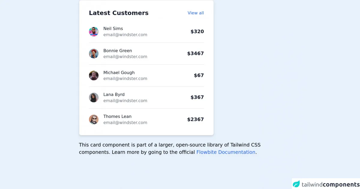
The Preview of Tailwind CSS Users Card List UI Component
To create a Tailwind CSS users card list, we'll use a combination of HTML and CSS. Here's a preview of what our users card list will look like:
Free download of the Tailwind CSS users card list's source code
The Source Code of Tailwind CSS Users Card List UI Component
To create our users card list, we'll use the following HTML and CSS code:
<!-- This is an example component -->
<div class="max-w-2xl mx-auto">

	<div class="p-4 max-w-md bg-white rounded-lg border shadow-md sm:p-8 dark:bg-gray-800 dark:border-gray-700">
    <div class="flex justify-between items-center mb-4">
        <h3 class="text-xl font-bold leading-none text-gray-900 dark:text-white">Latest Customers</h3>
        <a href="#" class="text-sm font-medium text-blue-600 hover:underline dark:text-blue-500">
            View all
        </a>
   </div>
   <div class="flow-root">
        <ul role="list" class="divide-y divide-gray-200 dark:divide-gray-700">
            <li class="py-3 sm:py-4">
                <div class="flex items-center space-x-4">
                    <div class="flex-shrink-0">
                        <img class="w-8 h-8 rounded-full" src="https://flowbite.com/docs/images/people/profile-picture-1.jpg" alt="Neil image">
                    </div>
                    <div class="flex-1 min-w-0">
                        <p class="text-sm font-medium text-gray-900 truncate dark:text-white">
                            Neil Sims
                        </p>
                        <p class="text-sm text-gray-500 truncate dark:text-gray-400">
                            [email protected]
                        </p>
                    </div>
                    <div class="inline-flex items-center text-base font-semibold text-gray-900 dark:text-white">
                        $320
                    </div>
                </div>
            </li>
            <li class="py-3 sm:py-4">
                <div class="flex items-center space-x-4">
                    <div class="flex-shrink-0">
                        <img class="w-8 h-8 rounded-full" src="https://flowbite.com/docs/images/people/profile-picture-3.jpg" alt="Bonnie image">
                    </div>
                    <div class="flex-1 min-w-0">
                        <p class="text-sm font-medium text-gray-900 truncate dark:text-white">
                            Bonnie Green
                        </p>
                        <p class="text-sm text-gray-500 truncate dark:text-gray-400">
                            [email protected]
                        </p>
                    </div>
                    <div class="inline-flex items-center text-base font-semibold text-gray-900 dark:text-white">
                        $3467
                    </div>
                </div>
            </li>
            <li class="py-3 sm:py-4">
                <div class="flex items-center space-x-4">
                    <div class="flex-shrink-0">
                        <img class="w-8 h-8 rounded-full" src="https://flowbite.com/docs/images/people/profile-picture-2.jpg" alt="Michael image">
                    </div>
                    <div class="flex-1 min-w-0">
                        <p class="text-sm font-medium text-gray-900 truncate dark:text-white">
                            Michael Gough
                        </p>
                        <p class="text-sm text-gray-500 truncate dark:text-gray-400">
                            [email protected]
                        </p>
                    </div>
                    <div class="inline-flex items-center text-base font-semibold text-gray-900 dark:text-white">
                        $67
                    </div>
                </div>
            </li>
            <li class="py-3 sm:py-4">
                <div class="flex items-center space-x-4">
                    <div class="flex-shrink-0">
                        <img class="w-8 h-8 rounded-full" src="https://flowbite.com/docs/images/people/profile-picture-4.jpg" alt="Lana image">
                    </div>
                    <div class="flex-1 min-w-0">
                        <p class="text-sm font-medium text-gray-900 truncate dark:text-white">
                            Lana Byrd
                        </p>
                        <p class="text-sm text-gray-500 truncate dark:text-gray-400">
                            [email protected]
                        </p>
                    </div>
                    <div class="inline-flex items-center text-base font-semibold text-gray-900 dark:text-white">
                        $367
                    </div>
                </div>
            </li>
            <li class="pt-3 pb-0 sm:pt-4">
                <div class="flex items-center space-x-4">
                    <div class="flex-shrink-0">
                        <img class="w-8 h-8 rounded-full" src="https://flowbite.com/docs/images/people/profile-picture-5.jpg" alt="Thomas image">
                    </div>
                    <div class="flex-1 min-w-0">
                        <p class="text-sm font-medium text-gray-900 truncate dark:text-white">
                            Thomes Lean
                        </p>
                        <p class="text-sm text-gray-500 truncate dark:text-gray-400">
                            [email protected]
                        </p>
                    </div>
                    <div class="inline-flex items-center text-base font-semibold text-gray-900 dark:text-white">
                        $2367
                    </div>
                </div>
            </li>
        </ul>
   </div>
</div>
	<p class="mt-5">This card component is part of a larger, open-source library of Tailwind CSS components. Learn more
		by going to the official <a class="text-blue-600 hover:underline"
			href="https://flowbite.com/docs/getting-started/introduction/" target="_blank">Flowbite Documentation</a>.
	</p>
</div>
How to Create a Tailwind CSS Users Card List with Tailwind CSS?
Now that we've seen what our users card list will look like, let's dive into the code and see how we can create it.
Step 1: Set up the HTML
The first step in creating our users card list is to set up the HTML. We'll start by creating a container div that will hold all of our user cards:
<div class="container mx-auto">
  <!-- User cards will go here -->
</div>
Inside the container div, we'll create a series of card divs that will represent each user:
<div class="container mx-auto">
  <div class="card">
    <!-- User information will go here -->
  </div>
  <div class="card">
    <!-- User information will go here -->
  </div>
  <div class="card">
    <!-- User information will go here -->
  </div>
</div>
Step 2: Add User Information
Next, we'll add the user information to each card. We'll start by adding the user's profile picture:
<div class="container mx-auto">
  <div class="card">
    <img src="https://via.placeholder.com/150" alt="Profile Picture" class="rounded-full w-32 h-32 mx-auto">
  </div>
  <div class="card">
    <img src="https://via.placeholder.com/150" alt="Profile Picture" class="rounded-full w-32 h-32 mx-auto">
  </div>
  <div class="card">
    <img src="https://via.placeholder.com/150" alt="Profile Picture" class="rounded-full w-32 h-32 mx-auto">
  </div>
</div>
We'll also add the user's name and other relevant information:
<div class="container mx-auto">
  <div class="card">
    <img src="https://via.placeholder.com/150" alt="Profile Picture" class="rounded-full w-32 h-32 mx-auto">
    <h2 class="text-xl font-bold mt-4">John Doe</h2>
    <p class="text-gray-600">Web Developer</p>
  </div>
  <div class="card">
    <img src="https://via.placeholder.com/150" alt="Profile Picture" class="rounded-full w-32 h-32 mx-auto">
    <h2 class="text-xl font-bold mt-4">Jane Doe</h2>
    <p class="text-gray-600">Graphic Designer</p>
  </div>
  <div class="card">
    <img src="https://via.placeholder.com/150" alt="Profile Picture" class="rounded-full w-32 h-32 mx-auto">
    <h2 class="text-xl font-bold mt-4">Bob Smith</h2>
    <p class="text-gray-600">Marketing Manager</p>
  </div>
</div>
Step 3: Style the Cards
Finally, we'll add some custom styles to our cards to make them look great. We'll start by adding some padding and a border to each card:
.card {
  padding: 2rem;
  border: 1px solid #e2e8f0;
}
We'll also add some styles to the profile picture to make it circular:
.rounded-full {
  border-radius: 50%;
}
And we'll add some styles to the name and job title to make them stand out:
.font-bold {
  font-weight: 700;
}
.text-xl {
  font-size: 1.875rem;
}
.text-gray-600 {
  color: #718096;
}
Step 4: Make it Responsive
To make our users card list responsive, we'll use Tailwind CSS's responsive design classes. We'll add the flex and flex-wrap classes to our container div to make the cards wrap on smaller screens:
<div class="container mx-auto flex flex-wrap">
  <!-- User cards will go here -->
</div>
And we'll add the w-full and md:w-1/2 classes to our card divs to make them take up the full width on smaller screens and half the width on larger screens:
<div class="container mx-auto flex flex-wrap">
  <div class="card w-full md:w-1/2">
    <!-- User information will go here -->
  </div>
  <div class="card w-full md:w-1/2">
    <!-- User information will go here -->
  </div>
  <div class="card w-full md:w-1/2">
    <!-- User information will go here -->
  </div>
</div>
And that's it! With just a few lines of HTML and CSS, we've created a beautiful and responsive users card list.
Conclusion
In this article, we've shown you how to create a Tailwind CSS users card list from scratch. With Tailwind CSS, you can easily customize the look and feel of your cards and create a responsive design that looks great on any device. We hope this guide has been helpful, and we encourage you to experiment with Tailwind CSS to create even more amazing designs for your website.