- Published on
How To Create A Tailwind CSS Timeline With Tailwind CSS In 6 Easy Steps?
- What is Tailwind CSS?
- The description of Tailwind CSS Timeline ui component
- Why use Tailwind CSS to create a Tailwind CSS Timeline ui component?
- The preview of Tailwind CSS Timeline ui component
- The source code of Tailwind CSS Timeline ui component
- How to create a Tailwind CSS Timeline with Tailwind CSS?
- Step 1: Create the HTML structure
- Step 2: Add Tailwind CSS classes
- Step 3: Style the timeline
- Step 4: Add responsiveness
- Step 5: Customize the timeline
- Step 6: Done!
- Conclusion
What is Tailwind CSS?
Tailwind CSS is a utility-first CSS framework that provides a set of pre-defined CSS classes to create responsive and customizable UI components. It allows developers to design and develop web applications faster and more efficiently by eliminating the need to write custom CSS code.
The description of Tailwind CSS Timeline ui component
A timeline is a graphical representation of a sequence of events, usually displayed in chronological order. A timeline UI component can be used to showcase a series of events or milestones in a chronological order. With Tailwind CSS, you can easily create a timeline UI component that is responsive and customizable.
Why use Tailwind CSS to create a Tailwind CSS Timeline ui component?
Tailwind CSS provides a set of pre-defined CSS classes that can be used to create a timeline UI component without writing any custom CSS code. This saves a lot of time and effort and makes the development process faster and more efficient. Additionally, Tailwind CSS is highly customizable and responsive, which means that you can easily modify the timeline UI component to fit your specific needs.
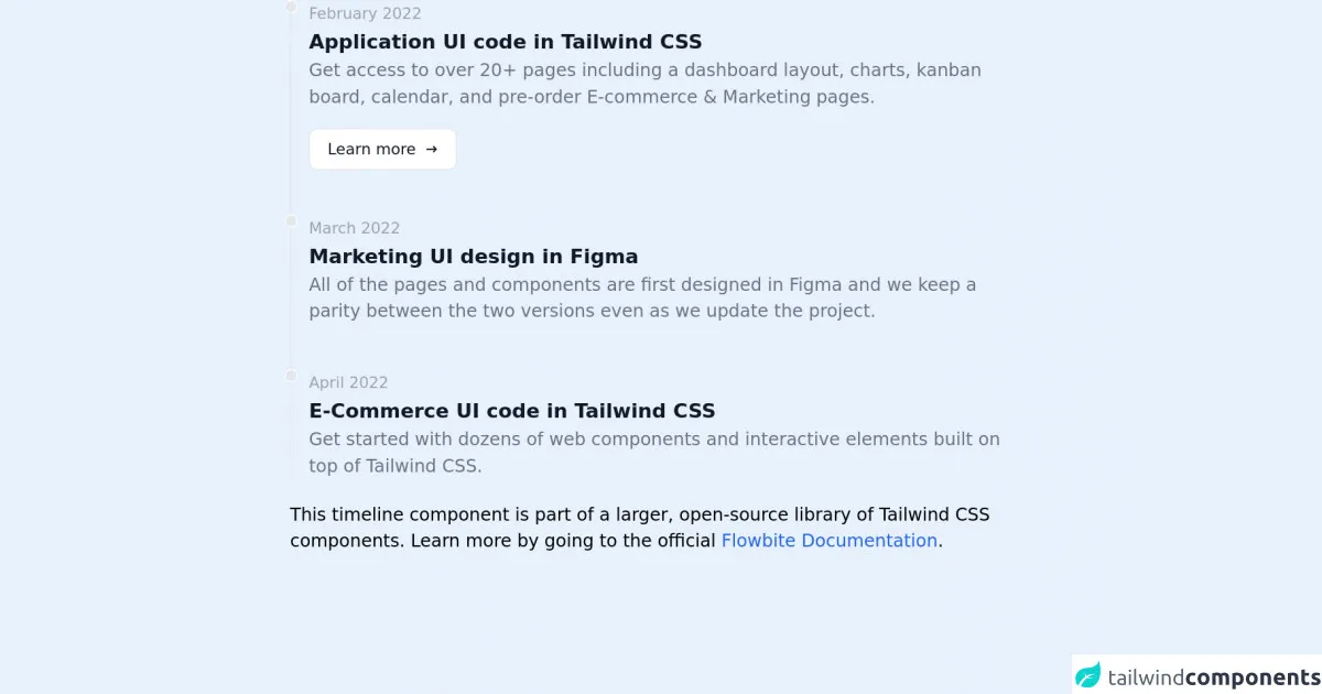
The preview of Tailwind CSS Timeline ui component
To create a Tailwind CSS Timeline UI component, we will use a combination of CSS classes to create a responsive and customizable timeline. Here is a preview of what the timeline UI component will look like:
Free download of the Tailwind CSS Timeline's source code
The source code of Tailwind CSS Timeline ui component
To create a Tailwind CSS Timeline UI component, we will use a combination of HTML and Tailwind CSS classes. Here is the source code for the timeline UI component:
<!-- This is an example component -->
<div class="max-w-2xl mx-auto">
<ol class="relative border-l border-gray-200 dark:border-gray-700">
<li class="mb-10 ml-4">
<div
class="absolute w-3 h-3 bg-gray-200 rounded-full -left-1.5 border border-white dark:border-gray-900 dark:bg-gray-700">
</div>
<time class="mb-1 text-sm font-normal leading-none text-gray-400 dark:text-gray-500">February 2022</time>
<h3 class="text-lg font-semibold text-gray-900 dark:text-white">Application UI code in Tailwind CSS</h3>
<p class="mb-4 text-base font-normal text-gray-500 dark:text-gray-400">Get access to over 20+ pages
including a dashboard layout, charts, kanban board, calendar, and pre-order E-commerce & Marketing
pages.</p>
<a href="#"
class="inline-flex items-center px-4 py-2 text-sm font-medium text-gray-900 bg-white border border-gray-200 rounded-lg hover:bg-gray-100 hover:text-blue-700 focus:z-10 focus:ring-2 focus:ring-blue-700 focus:text-blue-700 dark:bg-gray-800 dark:text-gray-400 dark:border-gray-600 dark:hover:text-white dark:hover:bg-gray-700">Learn
more <svg class="w-3 h-3 ml-2" fill="currentColor" viewBox="0 0 20 20"
xmlns="http://www.w3.org/2000/svg">
<path fill-rule="evenodd"
d="M12.293 5.293a1 1 0 011.414 0l4 4a1 1 0 010 1.414l-4 4a1 1 0 01-1.414-1.414L14.586 11H3a1 1 0 110-2h11.586l-2.293-2.293a1 1 0 010-1.414z"
clip-rule="evenodd"></path>
</svg></a>
</li>
<li class="mb-10 ml-4">
<div
class="absolute w-3 h-3 bg-gray-200 rounded-full -left-1.5 border border-white dark:border-gray-900 dark:bg-gray-700">
</div>
<time class="mb-1 text-sm font-normal leading-none text-gray-400 dark:text-gray-500">March 2022</time>
<h3 class="text-lg font-semibold text-gray-900 dark:text-white">Marketing UI design in Figma</h3>
<p class="text-base font-normal text-gray-500 dark:text-gray-400">All of the pages and components are first
designed in Figma and we keep a parity between the two versions even as we update the project.</p>
</li>
<li class="ml-4">
<div
class="absolute w-3 h-3 bg-gray-200 rounded-full -left-1.5 border border-white dark:border-gray-900 dark:bg-gray-700">
</div>
<time class="mb-1 text-sm font-normal leading-none text-gray-400 dark:text-gray-500">April 2022</time>
<h3 class="text-lg font-semibold text-gray-900 dark:text-white">E-Commerce UI code in Tailwind CSS</h3>
<p class="text-base font-normal text-gray-500 dark:text-gray-400">Get started with dozens of web components
and interactive elements built on top of Tailwind CSS.</p>
</li>
</ol>
<p class="mt-5">This timeline component is part of a larger, open-source library of Tailwind CSS components. Learn more
by going to the official <a class="text-blue-600 hover:underline"
href="https://flowbite.com/docs/getting-started/introduction/" target="_blank">Flowbite Documentation</a>.
</p>
</div>
How to create a Tailwind CSS Timeline with Tailwind CSS?
Here are the 6 easy steps to create a Tailwind CSS Timeline UI component:
Step 1: Create the HTML structure
The first step is to create the HTML structure for the timeline UI component. We will use an unordered list to represent the timeline and list items to represent the events.
<ul class="timeline">
  <li class="event">
    <div class="event-date">Jan 2021</div>
    <div class="event-description">
      <h3 class="event-title">Event Title</h3>
      <p class="event-content">Event Content</p>
    </div>
  </li>
  <li class="event">
    <div class="event-date">Feb 2021</div>
    <div class="event-description">
      <h3 class="event-title">Event Title</h3>
      <p class="event-content">Event Content</p>
    </div>
  </li>
  <li class="event">
    <div class="event-date">Mar 2021</div>
    <div class="event-description">
      <h3 class="event-title">Event Title</h3>
      <p class="event-content">Event Content</p>
    </div>
  </li>
</ul>
Step 2: Add Tailwind CSS classes
Next, we will add Tailwind CSS classes to the HTML structure to create the timeline UI component. We will use the following classes:
timeline: This class will be added to the unordered list to create the timeline.event: This class will be added to the list items to create the events.event-date: This class will be added to the div element to create the date of the event.event-description: This class will be added to the div element to create the description of the event.event-title: This class will be added to the h3 element to create the title of the event.event-content: This class will be added to the p element to create the content of the event.
<ul class="timeline">
  <li class="event">
    <div class="event-date bg-blue-500 text-white rounded-full px-2 py-1">Jan 2021</div>
    <div class="event-description ml-4">
      <h3 class="event-title text-lg font-bold">Event Title</h3>
      <p class="event-content">Event Content</p>
    </div>
  </li>
  <li class="event">
    <div class="event-date bg-blue-500 text-white rounded-full px-2 py-1">Feb 2021</div>
    <div class="event-description ml-4">
      <h3 class="event-title text-lg font-bold">Event Title</h3>
      <p class="event-content">Event Content</p>
    </div>
  </li>
  <li class="event">
    <div class="event-date bg-blue-500 text-white rounded-full px-2 py-1">Mar 2021</div>
    <div class="event-description ml-4">
      <h3 class="event-title text-lg font-bold">Event Title</h3>
      <p class="event-content">Event Content</p>
    </div>
  </li>
</ul>
Step 3: Style the timeline
Next, we will add some custom styles to the timeline to make it look more appealing. We will use the following classes:
border-l-2: This class will add a left border to the events to create the timeline.border-blue-500: This class will set the color of the border to blue.pl-4: This class will add some left padding to the events to create some space between the timeline and the event content.
<ul class="timeline">
  <li class="event border-l-2 border-blue-500">
    <div class="event-date bg-blue-500 text-white rounded-full px-2 py-1">Jan 2021</div>
    <div class="event-description ml-4 pl-4">
      <h3 class="event-title text-lg font-bold">Event Title</h3>
      <p class="event-content">Event Content</p>
    </div>
  </li>
  <li class="event border-l-2 border-blue-500">
    <div class="event-date bg-blue-500 text-white rounded-full px-2 py-1">Feb 2021</div>
    <div class="event-description ml-4 pl-4">
      <h3 class="event-title text-lg font-bold">Event Title</h3>
      <p class="event-content">Event Content</p>
    </div>
  </li>
  <li class="event border-l-2 border-blue-500">
    <div class="event-date bg-blue-500 text-white rounded-full px-2 py-1">Mar 2021</div>
    <div class="event-description ml-4 pl-4">
      <h3 class="event-title text-lg font-bold">Event Title</h3>
      <p class="event-content">Event Content</p>
    </div>
  </li>
</ul>
Step 4: Add responsiveness
Next, we will add some responsive classes to the timeline to make it look good on different screen sizes. We will use the following classes:
flex: This class will make the timeline and events display as a flex container.flex-col: This class will make the timeline and events display in a column direction on small screens.flex-row: This class will make the timeline and events display in a row direction on large screens.items-center: This class will center the timeline and events horizontally.justify-center: This class will center the timeline and events vertically.
<div class="flex flex-col items-center justify-center md:flex-row">
  <ul class="timeline md:mr-16">
    <li class="event border-l-2 border-blue-500">
      <div class="event-date bg-blue-500 text-white rounded-full px-2 py-1">Jan 2021</div>
      <div class="event-description ml-4 pl-4">
        <h3 class="event-title text-lg font-bold">Event Title</h3>
        <p class="event-content">Event Content</p>
      </div>
    </li>
    <li class="event border-l-2 border-blue-500">
      <div class="event-date bg-blue-500 text-white rounded-full px-2 py-1">Feb 2021</div>
      <div class="event-description ml-4 pl-4">
        <h3 class="event-title text-lg font-bold">Event Title</h3>
        <p class="event-content">Event Content</p>
      </div>
    </li>
    <li class="event border-l-2 border-blue-500">
      <div class="event-date bg-blue-500 text-white rounded-full px-2 py-1">Mar 2021</div>
      <div class="event-description ml-4 pl-4">
        <h3 class="event-title text-lg font-bold">Event Title</h3>
        <p class="event-content">Event Content</p>
      </div>
    </li>
  </ul>
</div>
Step 5: Customize the timeline
Finally, we can customize the timeline by changing the colors, fonts, and sizes. We can use the Tailwind CSS utility classes to customize the timeline to our liking.
<div class="flex flex-col items-center justify-center md:flex-row">
  <ul class="timeline md:mr-16">
    <li class="event border-l-2 border-blue-500">
      <div class="event-date bg-blue-500 text-white rounded-full px-2 py-1">Jan 2021</div>
      <div class="event-description ml-4 pl-4">
        <h3 class="event-title text-lg font-bold text-blue-500">Event Title</h3>
        <p class="event-content text-gray-600">Event Content</p>
      </div>
    </li>
    <li class="event border-l-2 border-blue-500">
      <div class="event-date bg-blue-500 text-white rounded-full px-2 py-1">Feb 2021</div>
      <div class="event-description ml-4 pl-4">
        <h3 class="event-title text-lg font-bold text-blue-500">Event Title</h3>
        <p class="event-content text-gray-600">Event Content</p>
      </div>
    </li>
    <li class="event border-l-2 border-blue-500">
      <div class="event-date bg-blue-500 text-white rounded-full px-2 py-1">Mar 2021</div>
      <div class="event-description ml-4 pl-4">
        <h3 class="event-title text-lg font-bold text-blue-500">Event Title</h3>
        <p class="event-content text-gray-600">Event Content</p>
      </div>
    </li>
  </ul>
</div>
Step 6: Done!
Congratulations! You have successfully created a Tailwind CSS Timeline UI component in 6 easy steps.
Conclusion
In this article, we have learned how to create a Tailwind CSS Timeline UI component in 6 easy steps. We have used a combination of HTML and Tailwind CSS classes to create a responsive and customizable timeline. With Tailwind CSS, you can easily create UI components without writing any custom CSS code, which makes the development process faster and more efficient.