- Published on
Best Ways To Build A Tailwind CSS Table Search With Tailwind CSS
- What is Tailwind CSS?
- The description of Tailwind CSS Table Search ui component
- Why use Tailwind CSS to create a Tailwind CSS Table Search ui component?
- The preview of Tailwind CSS Table Search ui component.
- The source code of Tailwind CSS Table Search ui component.
- How to create a Tailwind CSS Table Search with Tailwind CSS?
- Step 1: Create the HTML Markup
- Step 2: Add Tailwind CSS Classes
- Step 3: Add JavaScript
- Conclusion
What is Tailwind CSS?
Tailwind CSS is a utility-first CSS framework that allows you to quickly build custom user interfaces. It provides a set of pre-defined classes that can be used to style HTML elements. With Tailwind CSS, you can easily create complex layouts and responsive designs without writing custom CSS.
The description of Tailwind CSS Table Search ui component
A table search is a common UI component used in many web applications. It allows users to search for specific data within a table. A Tailwind CSS Table Search is a table search component that is built using Tailwind CSS classes. It is a simple and effective way to add search functionality to your tables.
Why use Tailwind CSS to create a Tailwind CSS Table Search ui component?
Tailwind CSS provides a set of pre-defined classes that can be used to style HTML elements. This makes it easy to create custom UI components, such as a Table Search, without writing custom CSS. Using Tailwind CSS also ensures that your UI components are consistent and follow a defined design system.
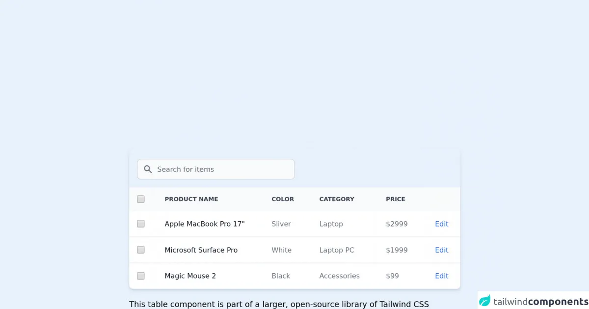
The preview of Tailwind CSS Table Search ui component.
To create a Tailwind CSS Table Search, we will use a combination of HTML and Tailwind CSS classes. The resulting component will be a search box that filters data in a table based on user input.
Free download of the Tailwind CSS Table Search's source code
The source code of Tailwind CSS Table Search ui component.
To create a Tailwind CSS Table Search, we will use the following HTML and Tailwind CSS classes:
<!-- This is an example component -->
<div class="max-w-2xl mx-auto">

	<div class="relative overflow-x-auto shadow-md sm:rounded-lg">
		<div class="p-4">
			<label for="table-search" class="sr-only">Search</label>
			<div class="relative mt-1">
				<div class="absolute inset-y-0 left-0 flex items-center pl-3 pointer-events-none">
					<svg class="w-5 h-5 text-gray-500 dark:text-gray-400" fill="currentColor" viewBox="0 0 20 20"
						xmlns="http://www.w3.org/2000/svg">
						<path fill-rule="evenodd"
							d="M8 4a4 4 0 100 8 4 4 0 000-8zM2 8a6 6 0 1110.89 3.476l4.817 4.817a1 1 0 01-1.414 1.414l-4.816-4.816A6 6 0 012 8z"
							clip-rule="evenodd"></path>
					</svg>
				</div>
				<input type="text" id="table-search" class="bg-gray-50 border border-gray-300 text-gray-900 text-sm rounded-lg focus:ring-blue-500 focus:border-blue-500 block w-80 pl-10 p-2.5  dark:bg-gray-700 dark:border-gray-600 dark:placeholder-gray-400 dark:text-white dark:focus:ring-blue-500 dark:focus:border-blue-500" placeholder="Search for items">
        </div>
			</div>
			<table class="w-full text-sm text-left text-gray-500 dark:text-gray-400">
				<thead class="text-xs text-gray-700 uppercase bg-gray-50 dark:bg-gray-700 dark:text-gray-400">
					<tr>
						<th scope="col" class="p-4">
							<div class="flex items-center">
								<input id="checkbox-all-search" type="checkbox" class="w-4 h-4 text-blue-600 bg-gray-100 border-gray-300 rounded focus:ring-blue-500 dark:focus:ring-blue-600 dark:ring-offset-gray-800 focus:ring-2 dark:bg-gray-700 dark:border-gray-600">
								<label for="checkbox-all-search" class="sr-only">checkbox</label>
							</div>
						</th>
						<th scope="col" class="px-6 py-3">
							Product name
						</th>
						<th scope="col" class="px-6 py-3">
							Color
						</th>
						<th scope="col" class="px-6 py-3">
							Category
						</th>
						<th scope="col" class="px-6 py-3">
							Price
						</th>
						<th scope="col" class="px-6 py-3">
							<span class="sr-only">Edit</span>
						</th>
					</tr>
				</thead>
				<tbody>
					<tr
						class="bg-white border-b dark:bg-gray-800 dark:border-gray-700 hover:bg-gray-50 dark:hover:bg-gray-600">
						<td class="w-4 p-4">
							<div class="flex items-center">
								<input id="checkbox-table-search-1" type="checkbox" class="w-4 h-4 text-blue-600 bg-gray-100 border-gray-300 rounded focus:ring-blue-500 dark:focus:ring-blue-600 dark:ring-offset-gray-800 focus:ring-2 dark:bg-gray-700 dark:border-gray-600">
								<label for="checkbox-table-search-1" class="sr-only">checkbox</label>
							</div>
						</td>
						<th scope="row" class="px-6 py-4 font-medium text-gray-900 dark:text-white whitespace-nowrap">
							Apple MacBook Pro 17"
						</th>
						<td class="px-6 py-4">
							Sliver
						</td>
						<td class="px-6 py-4">
							Laptop
						</td>
						<td class="px-6 py-4">
							$2999
						</td>
						<td class="px-6 py-4 text-right">
							<a href="#" class="font-medium text-blue-600 dark:text-blue-500 hover:underline">Edit</a>
						</td>
					</tr>
					<tr
						class="bg-white border-b dark:bg-gray-800 dark:border-gray-700 hover:bg-gray-50 dark:hover:bg-gray-600">
						<td class="w-4 p-4">
							<div class="flex items-center">
								<input id="checkbox-table-search-2" type="checkbox" class="w-4 h-4 text-blue-600 bg-gray-100 border-gray-300 rounded focus:ring-blue-500 dark:focus:ring-blue-600 dark:ring-offset-gray-800 focus:ring-2 dark:bg-gray-700 dark:border-gray-600">
								<label for="checkbox-table-search-2" class="sr-only">checkbox</label>
							</div>
						</td>
						<th scope="row" class="px-6 py-4 font-medium text-gray-900 dark:text-white whitespace-nowrap">
							Microsoft Surface Pro
						</th>
						<td class="px-6 py-4">
							White
						</td>
						<td class="px-6 py-4">
							Laptop PC
						</td>
						<td class="px-6 py-4">
							$1999
						</td>
						<td class="px-6 py-4 text-right">
							<a href="#" class="font-medium text-blue-600 dark:text-blue-500 hover:underline">Edit</a>
						</td>
					</tr>
					<tr class="bg-white dark:bg-gray-800 hover:bg-gray-50 dark:hover:bg-gray-600">
						<td class="w-4 p-4">
							<div class="flex items-center">
								<input id="checkbox-table-search-3" type="checkbox" class="w-4 h-4 text-blue-600 bg-gray-100 border-gray-300 rounded focus:ring-blue-500 dark:focus:ring-blue-600 dark:ring-offset-gray-800 focus:ring-2 dark:bg-gray-700 dark:border-gray-600">
								<label for="checkbox-table-search-3" class="sr-only">checkbox</label>
							</div>
						</td>
						<th scope="row" class="px-6 py-4 font-medium text-gray-900 dark:text-white whitespace-nowrap">
							Magic Mouse 2
						</th>
						<td class="px-6 py-4">
							Black
						</td>
						<td class="px-6 py-4">
							Accessories
						</td>
						<td class="px-6 py-4">
							$99
						</td>
						<td class="px-6 py-4 text-right">
							<a href="#" class="font-medium text-blue-600 dark:text-blue-500 hover:underline">Edit</a>
						</td>
					</tr>
				</tbody>
			</table>
		</div>

		<p class="mt-5">This table component is part of a larger, open-source library of Tailwind CSS components.
			Learn
			more
			by going to the official <a class="text-blue-600 hover:underline"
				href="https://flowbite.com/docs/getting-started/introduction/" target="_blank">Flowbite
				Documentation</a>.
		</p>
		<script src="https://unpkg.com/[email protected]/dist/flowbite.js"></script>
	</div>
How to create a Tailwind CSS Table Search with Tailwind CSS?
To create a Tailwind CSS Table Search, follow these steps:
Step 1: Create the HTML Markup
The first step is to create the HTML markup for the search box and the table. Here is an example:
<div class="p-6">
  <div class="mb-4">
    <label class="block text-gray-700 text-sm font-bold mb-2" for="search">
      Search
    </label>
    <input class="shadow appearance-none border rounded w-full py-2 px-3 text-gray-700 leading-tight focus:outline-none focus:shadow-outline" id="search" type="text" placeholder="Search...">
  </div>
  <table class="table-auto">
    <thead>
      <tr>
        <th class="px-4 py-2">Name</th>
        <th class="px-4 py-2">Email</th>
        <th class="px-4 py-2">Role</th>
      </tr>
    </thead>
    <tbody>
      <tr>
        <td class="border px-4 py-2">John Doe</td>
        <td class="border px-4 py-2">[email protected]</td>
        <td class="border px-4 py-2">Admin</td>
      </tr>
      <tr>
        <td class="border px-4 py-2">Jane Doe</td>
        <td class="border px-4 py-2">[email protected]</td>
        <td class="border px-4 py-2">User</td>
      </tr>
    </tbody>
  </table>
</div>
In this example, we have a search box and a table with some sample data.
Step 2: Add Tailwind CSS Classes
Next, we will add Tailwind CSS classes to style the search box and the table. Here is an example:
<div class="p-6">
  <div class="mb-4">
    <label class="block text-gray-700 text-sm font-bold mb-2" for="search">
      Search
    </label>
    <input class="shadow appearance-none border rounded w-full py-2 px-3 text-gray-700 leading-tight focus:outline-none focus:shadow-outline" id="search" type="text" placeholder="Search...">
  </div>
  <table class="table-auto">
    <thead>
      <tr>
        <th class="px-4 py-2 bg-gray-200 text-gray-600">Name</th>
        <th class="px-4 py-2 bg-gray-200 text-gray-600">Email</th>
        <th class="px-4 py-2 bg-gray-200 text-gray-600">Role</th>
      </tr>
    </thead>
    <tbody>
      <tr>
        <td class="border px-4 py-2">John Doe</td>
        <td class="border px-4 py-2">[email protected]</td>
        <td class="border px-4 py-2">Admin</td>
      </tr>
      <tr>
        <td class="border px-4 py-2">Jane Doe</td>
        <td class="border px-4 py-2">[email protected]</td>
        <td class="border px-4 py-2">User</td>
      </tr>
    </tbody>
  </table>
</div>
In this example, we have added Tailwind CSS classes to style the search box and the table. We have also added a background color and text color to the table header.
Step 3: Add JavaScript
Finally, we will add some JavaScript code to filter the table based on user input. Here is an example:
<script>
  const searchInput = document.getElementById('search');
  const rows = document.querySelectorAll('tbody tr');

  searchInput.addEventListener('keyup', function(event) {
    const term = event.target.value.toLowerCase();

    rows.forEach(row => {
      const name = row.querySelector('td:nth-child(1)').textContent.toLowerCase();
      const email = row.querySelector('td:nth-child(2)').textContent.toLowerCase();
      const role = row.querySelector('td:nth-child(3)').textContent.toLowerCase();

      if (name.indexOf(term) > -1 || email.indexOf(term) > -1 || role.indexOf(term) > -1) {
        row.style.display = '';
      } else {
        row.style.display = 'none';
      }
    });
  });
</script>
In this example, we have added JavaScript code to filter the table based on user input. We have also added an event listener to the search box to trigger the filtering.
Conclusion
In conclusion, a Tailwind CSS Table Search is a simple and effective way to add search functionality to your tables. With Tailwind CSS, you can easily create custom UI components without writing custom CSS. By following the steps outlined in this article, you can create a Tailwind CSS Table Search in no time.