- Published on
Learn How To Make A Tailwind CSS - Simple Card (Subscription CTA) With Tailwind CSS Like an Expert
- What is Tailwind CSS?
- The description of Tailwind CSS - Simple Card (Subscription CTA) ui component
- Why use Tailwind CSS to create a Tailwind CSS - Simple Card (Subscription CTA) ui component?
- The preview of Tailwind CSS - Simple Card (Subscription CTA) ui component
- The source code of Tailwind CSS - Simple Card (Subscription CTA) ui component
- How to create a Tailwind CSS - Simple Card (Subscription CTA) with Tailwind CSS?
- Conclusion
What is Tailwind CSS?
Tailwind CSS is a utility-first CSS framework that provides a set of pre-defined classes to style your HTML elements. It allows you to create custom designs quickly without writing any CSS code from scratch. With Tailwind CSS, you can easily create responsive and mobile-first designs that work on all devices.
The description of Tailwind CSS - Simple Card (Subscription CTA) ui component
The Tailwind CSS - Simple Card (Subscription CTA) is a UI component that is commonly used in web applications to display a subscription form or call-to-action (CTA) button. It is a simple and elegant design that can be easily customized to match your brand's color scheme.
Why use Tailwind CSS to create a Tailwind CSS - Simple Card (Subscription CTA) ui component?
Tailwind CSS provides a set of pre-defined classes that can be used to create a Tailwind CSS - Simple Card (Subscription CTA) ui component quickly. It saves time and effort in designing and developing the UI component from scratch. Additionally, Tailwind CSS is a mobile-first framework, which means that the UI component will be responsive and work well on all devices.
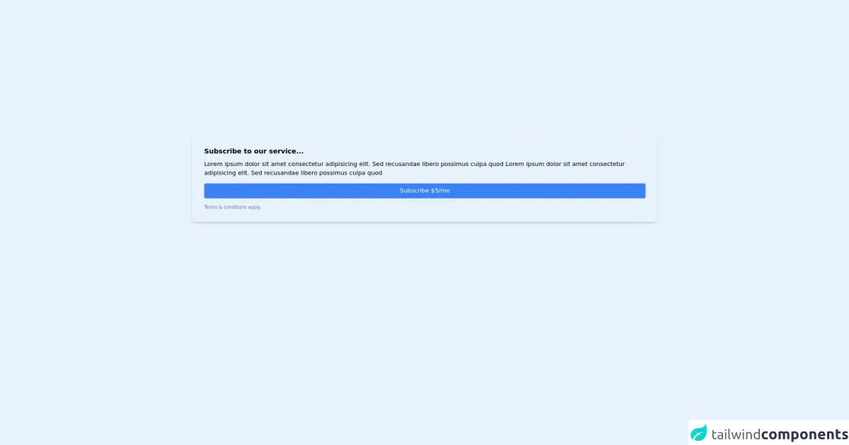
The preview of Tailwind CSS - Simple Card (Subscription CTA) ui component
To create a Tailwind CSS - Simple Card (Subscription CTA) ui component, we will use the following HTML and CSS code:
<div class="bg-white rounded-lg shadow-lg overflow-hidden">
  <div class="px-6 py-4">
    <h2 class="text-lg font-bold text-gray-800 mb-2">Subscribe to our newsletter</h2>
    <p class="text-gray-600 text-sm">Get the latest news and updates delivered to your inbox.</p>
  </div>
  <div class="px-6 py-4">
    <form>
      <div class="mb-4">
        <label class="block text-gray-700 text-sm font-bold mb-2" for="email">
          Email
        </label>
        <input class="shadow appearance-none border rounded w-full py-2 px-3 text-gray-700 leading-tight focus:outline-none focus:shadow-outline" id="email" type="email" placeholder="Enter your email">
      </div>
      <div class="flex items-center justify-between">
        <button class="bg-blue-500 hover:bg-blue-700 text-white font-bold py-2 px-4 rounded focus:outline-none focus:shadow-outline" type="button">
          Subscribe
        </button>
      </div>
    </form>
  </div>
</div>
Free download of the Tailwind CSS - Simple Card (Subscription CTA)'s source code
The source code of Tailwind CSS - Simple Card (Subscription CTA) ui component
To create a Tailwind CSS - Simple Card (Subscription CTA) ui component, we can use the following HTML and CSS code:
<div class="bg-white rounded-lg shadow-lg overflow-hidden">
  <div class="px-6 py-4">
    <h2 class="text-lg font-bold text-gray-800 mb-2">Subscribe to our newsletter</h2>
    <p class="text-gray-600 text-sm">Get the latest news and updates delivered to your inbox.</p>
  </div>
  <div class="px-6 py-4">
    <form>
      <div class="mb-4">
        <label class="block text-gray-700 text-sm font-bold mb-2" for="email">
          Email
        </label>
        <input class="shadow appearance-none border rounded w-full py-2 px-3 text-gray-700 leading-tight focus:outline-none focus:shadow-outline" id="email" type="email" placeholder="Enter your email">
      </div>
      <div class="flex items-center justify-between">
        <button class="bg-blue-500 hover:bg-blue-700 text-white font-bold py-2 px-4 rounded focus:outline-none focus:shadow-outline" type="button">
          Subscribe
        </button>
      </div>
    </form>
  </div>
</div>
<div class="w-full p-4">
<div class="p-8 rounded-xl shadow-md">
<h4 class="mb-2 text-lg font-semibold"> Subscribe to our service... </h4>
<p class="text-base"> Lorem ipsum dolor sit amet consectetur adipisicing elit. Sed recusandae libero possimus culpa quod Lorem ipsum dolor sit amet consectetur adipisicing elit. Sed recusandae libero possimus culpa quod </p><button class="my-4 px-4 py-2 block w-full text-white bg-blue-500 hover:bg-blue-700 rounded"> Subscribe $5/mo </button>
<div class="flex flex-wrap items-center">
<p class="text-gray-500 text-xs"> Terms & conditions apply. </p>
</div>
</div>
</div>
How to create a Tailwind CSS - Simple Card (Subscription CTA) with Tailwind CSS?
To create a Tailwind CSS - Simple Card (Subscription CTA) with Tailwind CSS, follow these steps:
- Create a new HTML file and add the following code:
<div class="bg-white rounded-lg shadow-lg overflow-hidden">
  <div class="px-6 py-4">
    <h2 class="text-lg font-bold text-gray-800 mb-2">Subscribe to our newsletter</h2>
    <p class="text-gray-600 text-sm">Get the latest news and updates delivered to your inbox.</p>
  </div>
  <div class="px-6 py-4">
    <form>
      <div class="mb-4">
        <label class="block text-gray-700 text-sm font-bold mb-2" for="email">
          Email
        </label>
        <input class="shadow appearance-none border rounded w-full py-2 px-3 text-gray-700 leading-tight focus:outline-none focus:shadow-outline" id="email" type="email" placeholder="Enter your email">
      </div>
      <div class="flex items-center justify-between">
        <button class="bg-blue-500 hover:bg-blue-700 text-white font-bold py-2 px-4 rounded focus:outline-none focus:shadow-outline" type="button">
          Subscribe
        </button>
      </div>
    </form>
  </div>
</div>
- Add the Tailwind CSS CDN link to the head section of your HTML file:
<head>
  <link href="https://cdn.jsdelivr.net/npm/[email protected]/dist/tailwind.min.css" rel="stylesheet">
</head>
Save the file and open it in your web browser to see the Tailwind CSS - Simple Card (Subscription CTA) UI component.
Customize the UI component by modifying the Tailwind CSS classes in the HTML code. For example, you can change the background color, font size, and button color.
Conclusion
In this article, we learned how to create a Tailwind CSS - Simple Card (Subscription CTA) UI component using Tailwind CSS. We also discussed the benefits of using Tailwind CSS to create UI components, such as saving time and effort in designing and developing the UI component from scratch. With Tailwind CSS, you can easily create responsive and mobile-first designs that work on all devices.