- Published on
A Complete Guide To Create A Tailwind CSS Sidebar Dropdown With Tailwind CSS
- What is Tailwind CSS?
- The description of Tailwind CSS Sidebar Dropdown ui component
- Why use Tailwind CSS to create a Tailwind CSS Sidebar Dropdown ui component?
- The preview of Tailwind CSS Sidebar Dropdown ui component.
- The source code of Tailwind CSS Sidebar Dropdown ui component.
- How to create a Tailwind CSS Sidebar Dropdown with Tailwind CSS?
- Step 1: Create a basic HTML structure for the sidebar dropdown.
- Step 2: Add Tailwind CSS classes to style the sidebar dropdown.
- Step 3: Add JavaScript code to handle the dropdown menu.
- Conclusion
What is Tailwind CSS?
Tailwind CSS is a utility-first CSS framework that helps developers to create responsive and customizable web designs. It provides a set of pre-defined CSS classes that can be used to style HTML elements. With Tailwind CSS, developers can create complex layouts and designs with ease.
The description of Tailwind CSS Sidebar Dropdown ui component
A sidebar dropdown is a UI component that allows users to access additional content or options by clicking on a button or link. The sidebar dropdown is a popular design pattern used in many web applications. It is a simple and effective way to organize content and provide users with quick access to important information.
Why use Tailwind CSS to create a Tailwind CSS Sidebar Dropdown ui component?
Tailwind CSS provides a fast and efficient way to create UI components like the sidebar dropdown. Tailwind CSS has a large set of pre-defined CSS classes that can be used to style HTML elements. This makes it easy to create complex layouts and designs without having to write custom CSS code. Using Tailwind CSS can save developers time and effort when creating UI components.
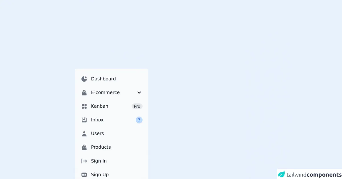
The preview of Tailwind CSS Sidebar Dropdown ui component.
To create a Tailwind CSS Sidebar Dropdown UI component, we will use a combination of HTML and Tailwind CSS classes. The sidebar dropdown will consist of a button that triggers the dropdown menu. The dropdown menu will contain a list of links or options.
Free download of the Tailwind CSS Sidebar Dropdown's source code
The source code of Tailwind CSS Sidebar Dropdown ui component.
To create a Tailwind CSS Sidebar Dropdown UI component, we will use a combination of HTML and Tailwind CSS classes. The sidebar dropdown will consist of a button that triggers the dropdown menu. The dropdown menu will contain a list of links or options.
<!-- This is an example component -->
<div class="max-w-2xl mx-auto">

	<aside class="w-64" aria-label="Sidebar">
		<div class="px-3 py-4 overflow-y-auto rounded bg-gray-50 dark:bg-gray-800">
			<ul class="space-y-2">
				<li>
					<a href="#"
						class="flex items-center p-2 text-base font-normal text-gray-900 rounded-lg dark:text-white hover:bg-gray-100 dark:hover:bg-gray-700">
						<svg class="w-6 h-6 text-gray-500 transition duration-75 dark:text-gray-400 group-hover:text-gray-900 dark:group-hover:text-white"
							fill="currentColor" viewBox="0 0 20 20" xmlns="http://www.w3.org/2000/svg">
							<path d="M2 10a8 8 0 018-8v8h8a8 8 0 11-16 0z"></path>
							<path d="M12 2.252A8.014 8.014 0 0117.748 8H12V2.252z"></path>
						</svg>
						<span class="ml-3">Dashboard</span>
					</a>
				</li>
				<li>
					<button type="button" class="flex items-center w-full p-2 text-base font-normal text-gray-900 transition duration-75 rounded-lg group hover:bg-gray-100 dark:text-white dark:hover:bg-gray-700" aria-controls="dropdown-example" data-collapse-toggle="dropdown-example">
                  <svg class="flex-shrink-0 w-6 h-6 text-gray-500 transition duration-75 group-hover:text-gray-900 dark:text-gray-400 dark:group-hover:text-white" fill="currentColor" viewBox="0 0 20 20" xmlns="http://www.w3.org/2000/svg"><path fill-rule="evenodd" d="M10 2a4 4 0 00-4 4v1H5a1 1 0 00-.994.89l-1 9A1 1 0 004 18h12a1 1 0 00.994-1.11l-1-9A1 1 0 0015 7h-1V6a4 4 0 00-4-4zm2 5V6a2 2 0 10-4 0v1h4zm-6 3a1 1 0 112 0 1 1 0 01-2 0zm7-1a1 1 0 100 2 1 1 0 000-2z" clip-rule="evenodd"></path></svg>
                  <span class="flex-1 ml-3 text-left whitespace-nowrap" sidebar-toggle-item>E-commerce</span>
                  <svg sidebar-toggle-item class="w-6 h-6" fill="currentColor" viewBox="0 0 20 20" xmlns="http://www.w3.org/2000/svg"><path fill-rule="evenodd" d="M5.293 7.293a1 1 0 011.414 0L10 10.586l3.293-3.293a1 1 0 111.414 1.414l-4 4a1 1 0 01-1.414 0l-4-4a1 1 0 010-1.414z" clip-rule="evenodd"></path></svg>
            </button>
					<ul id="dropdown-example" class="hidden py-2 space-y-2">
						<li>
							<a href="#"
								class="flex items-center w-full p-2 text-base font-normal text-gray-900 transition duration-75 rounded-lg group hover:bg-gray-100 dark:text-white dark:hover:bg-gray-700 pl-11">Products</a>
						</li>
						<li>
							<a href="#"
								class="flex items-center w-full p-2 text-base font-normal text-gray-900 transition duration-75 rounded-lg group hover:bg-gray-100 dark:text-white dark:hover:bg-gray-700 pl-11">Billing</a>
						</li>
						<li>
							<a href="#"
								class="flex items-center w-full p-2 text-base font-normal text-gray-900 transition duration-75 rounded-lg group hover:bg-gray-100 dark:text-white dark:hover:bg-gray-700 pl-11">Invoice</a>
						</li>
					</ul>
				</li>
				<li>
					<a href="#"
						class="flex items-center p-2 text-base font-normal text-gray-900 rounded-lg dark:text-white hover:bg-gray-100 dark:hover:bg-gray-700">
						<svg class="flex-shrink-0 w-6 h-6 text-gray-500 transition duration-75 dark:text-gray-400 group-hover:text-gray-900 dark:group-hover:text-white"
							fill="currentColor" viewBox="0 0 20 20" xmlns="http://www.w3.org/2000/svg">
							<path
								d="M5 3a2 2 0 00-2 2v2a2 2 0 002 2h2a2 2 0 002-2V5a2 2 0 00-2-2H5zM5 11a2 2 0 00-2 2v2a2 2 0 002 2h2a2 2 0 002-2v-2a2 2 0 00-2-2H5zM11 5a2 2 0 012-2h2a2 2 0 012 2v2a2 2 0 01-2 2h-2a2 2 0 01-2-2V5zM11 13a2 2 0 012-2h2a2 2 0 012 2v2a2 2 0 01-2 2h-2a2 2 0 01-2-2v-2z">
							</path>
						</svg>
						<span class="flex-1 ml-3 whitespace-nowrap">Kanban</span>
						<span class="inline-flex items-center justify-center px-2 ml-3 text-sm font-medium text-gray-800 bg-gray-200 rounded-full dark:bg-gray-700 dark:text-gray-300">Pro</span>
					</a>
				</li>
				<li>
					<a href="#"
						class="flex items-center p-2 text-base font-normal text-gray-900 rounded-lg dark:text-white hover:bg-gray-100 dark:hover:bg-gray-700">
						<svg class="flex-shrink-0 w-6 h-6 text-gray-500 transition duration-75 dark:text-gray-400 group-hover:text-gray-900 dark:group-hover:text-white"
							fill="currentColor" viewBox="0 0 20 20" xmlns="http://www.w3.org/2000/svg">
							<path
								d="M8.707 7.293a1 1 0 00-1.414 1.414l2 2a1 1 0 001.414 0l2-2a1 1 0 00-1.414-1.414L11 7.586V3a1 1 0 10-2 0v4.586l-.293-.293z">
							</path>
							<path
								d="M3 5a2 2 0 012-2h1a1 1 0 010 2H5v7h2l1 2h4l1-2h2V5h-1a1 1 0 110-2h1a2 2 0 012 2v10a2 2 0 01-2 2H5a2 2 0 01-2-2V5z">
							</path>
						</svg>
						<span class="flex-1 ml-3 whitespace-nowrap">Inbox</span>
						<span class="inline-flex items-center justify-center w-3 h-3 p-3 ml-3 text-sm font-medium text-blue-600 bg-blue-200 rounded-full dark:bg-blue-900 dark:text-blue-200">3</span>
					</a>
				</li>
				<li>
					<a href="#"
						class="flex items-center p-2 text-base font-normal text-gray-900 rounded-lg dark:text-white hover:bg-gray-100 dark:hover:bg-gray-700">
						<svg class="flex-shrink-0 w-6 h-6 text-gray-500 transition duration-75 dark:text-gray-400 group-hover:text-gray-900 dark:group-hover:text-white"
							fill="currentColor" viewBox="0 0 20 20" xmlns="http://www.w3.org/2000/svg">
							<path fill-rule="evenodd" d="M10 9a3 3 0 100-6 3 3 0 000 6zm-7 9a7 7 0 1114 0H3z"
								clip-rule="evenodd"></path>
						</svg>
						<span class="flex-1 ml-3 whitespace-nowrap">Users</span>
					</a>
				</li>
				<li>
					<a href="#"
						class="flex items-center p-2 text-base font-normal text-gray-900 rounded-lg dark:text-white hover:bg-gray-100 dark:hover:bg-gray-700">
						<svg class="flex-shrink-0 w-6 h-6 text-gray-500 transition duration-75 dark:text-gray-400 group-hover:text-gray-900 dark:group-hover:text-white"
							fill="currentColor" viewBox="0 0 20 20" xmlns="http://www.w3.org/2000/svg">
							<path fill-rule="evenodd"
								d="M10 2a4 4 0 00-4 4v1H5a1 1 0 00-.994.89l-1 9A1 1 0 004 18h12a1 1 0 00.994-1.11l-1-9A1 1 0 0015 7h-1V6a4 4 0 00-4-4zm2 5V6a2 2 0 10-4 0v1h4zm-6 3a1 1 0 112 0 1 1 0 01-2 0zm7-1a1 1 0 100 2 1 1 0 000-2z"
								clip-rule="evenodd"></path>
						</svg>
						<span class="flex-1 ml-3 whitespace-nowrap">Products</span>
					</a>
				</li>
				<li>
					<a href="#"
						class="flex items-center p-2 text-base font-normal text-gray-900 rounded-lg dark:text-white hover:bg-gray-100 dark:hover:bg-gray-700">
						<svg class="flex-shrink-0 w-6 h-6 text-gray-500 transition duration-75 dark:text-gray-400 group-hover:text-gray-900 dark:group-hover:text-white"
							fill="currentColor" viewBox="0 0 20 20" xmlns="http://www.w3.org/2000/svg">
							<path fill-rule="evenodd"
								d="M3 3a1 1 0 00-1 1v12a1 1 0 102 0V4a1 1 0 00-1-1zm10.293 9.293a1 1 0 001.414 1.414l3-3a1 1 0 000-1.414l-3-3a1 1 0 10-1.414 1.414L14.586 9H7a1 1 0 100 2h7.586l-1.293 1.293z"
								clip-rule="evenodd"></path>
						</svg>
						<span class="flex-1 ml-3 whitespace-nowrap">Sign In</span>
					</a>
				</li>
				<li>
					<a href="#"
						class="flex items-center p-2 text-base font-normal text-gray-900 rounded-lg dark:text-white hover:bg-gray-100 dark:hover:bg-gray-700">
						<svg class="flex-shrink-0 w-6 h-6 text-gray-500 transition duration-75 dark:text-gray-400 group-hover:text-gray-900 dark:group-hover:text-white"
							fill="currentColor" viewBox="0 0 20 20" xmlns="http://www.w3.org/2000/svg">
							<path fill-rule="evenodd"
								d="M5 4a3 3 0 00-3 3v6a3 3 0 003 3h10a3 3 0 003-3V7a3 3 0 00-3-3H5zm-1 9v-1h5v2H5a1 1 0 01-1-1zm7 1h4a1 1 0 001-1v-1h-5v2zm0-4h5V8h-5v2zM9 8H4v2h5V8z"
								clip-rule="evenodd"></path>
						</svg>
						<span class="flex-1 ml-3 whitespace-nowrap">Sign Up</span>
					</a>
				</li>
			</ul>
		</div>
	</aside>

	<p class="mt-5">This sidebar component is part of a larger, open-source library of Tailwind CSS components. Learn
		more
		by going to the official <a class="text-blue-600 hover:underline"
			href="https://flowbite.com/docs/getting-started/introduction/" target="_blank">Flowbite Documentation</a>.
	</p>
    <script src="https://unpkg.com/[email protected]/dist/flowbite.js"></script>
</div>
How to create a Tailwind CSS Sidebar Dropdown with Tailwind CSS?
To create a Tailwind CSS Sidebar Dropdown UI component, we will follow these steps:
- Create a basic HTML structure for the sidebar dropdown.
- Add Tailwind CSS classes to style the sidebar dropdown.
- Add JavaScript code to handle the dropdown menu.
Step 1: Create a basic HTML structure for the sidebar dropdown.
We will start by creating a basic HTML structure for the sidebar dropdown. The sidebar dropdown will consist of a button that triggers the dropdown menu. The dropdown menu will contain a list of links or options.
<div class="relative">
  <!-- Sidebar Dropdown Button -->
  <button class="flex items-center justify-center w-full px-4 py-2 text-sm font-medium text-white bg-indigo-600 rounded-md hover:bg-indigo-500 focus:outline-none focus:ring-2 focus:ring-offset-2 focus:ring-indigo-500">
    Dropdown
    <!-- Dropdown Arrow Icon -->
    <svg class="w-5 h-5 ml-2 -mr-1" viewBox="0 0 20 20" fill="currentColor">
      <path fill-rule="evenodd" d="M10 14l6-6H4z" />
    </svg>
  </button>

  <!-- Sidebar Dropdown Menu -->
  <div class="absolute right-0 w-48 py-2 mt-2 bg-white rounded-md shadow-lg">
    <a href="#" class="block px-4 py-2 text-sm text-gray-700 hover:bg-gray-100">Option 1</a>
    <a href="#" class="block px-4 py-2 text-sm text-gray-700 hover:bg-gray-100">Option 2</a>
    <a href="#" class="block px-4 py-2 text-sm text-gray-700 hover:bg-gray-100">Option 3</a>
  </div>
</div>
In the above code, we have created a div element with the relative class. Inside this div element, we have created a button element with the flex, items-center, justify-center, w-full, px-4, py-2, text-sm, font-medium, text-white, bg-indigo-600, rounded-md, hover:bg-indigo-500, focus:outline-none, focus:ring-2, focus:ring-offset-2, and focus:ring-indigo-500 classes. This button will act as the trigger for the dropdown menu.
We have also added an SVG icon inside the button element to indicate that it is a dropdown button.
Next, we have created a div element with the absolute, right-0, w-48, py-2, mt-2, bg-white, rounded-md, and shadow-lg classes. This div element will act as the dropdown menu.
Inside the dropdown menu, we have created three a elements with the block, px-4, py-2, text-sm, text-gray-700, and hover:bg-gray-100 classes. These a elements will act as the links or options in the dropdown menu.
Step 2: Add Tailwind CSS classes to style the sidebar dropdown.
Now that we have created the basic HTML structure for the sidebar dropdown, we can add Tailwind CSS classes to style it.
<div class="relative">
  <!-- Sidebar Dropdown Button -->
  <button class="flex items-center justify-center w-full px-4 py-2 text-sm font-medium text-white bg-indigo-600 rounded-md hover:bg-indigo-500 focus:outline-none focus:ring-2 focus:ring-offset-2 focus:ring-indigo-500">
    Dropdown
    <!-- Dropdown Arrow Icon -->
    <svg class="w-5 h-5 ml-2 -mr-1" viewBox="0 0 20 20" fill="currentColor">
      <path fill-rule="evenodd" d="M10 14l6-6H4z" />
    </svg>
  </button>

  <!-- Sidebar Dropdown Menu -->
  <div class="absolute right-0 w-48 py-2 mt-2 bg-white rounded-md shadow-lg">
    <a href="#" class="block px-4 py-2 text-sm text-gray-700 hover:bg-gray-100">Option 1</a>
    <a href="#" class="block px-4 py-2 text-sm text-gray-700 hover:bg-gray-100">Option 2</a>
    <a href="#" class="block px-4 py-2 text-sm text-gray-700 hover:bg-gray-100">Option 3</a>
  </div>
</div>
In the above code, we have added Tailwind CSS classes to style the sidebar dropdown. We have used the relative class on the parent div element to position the dropdown menu relative to the button.
We have used the flex, items-center, justify-center, w-full, px-4, py-2, text-sm, font-medium, text-white, bg-indigo-600, rounded-md, hover:bg-indigo-500, focus:outline-none, focus:ring-2, focus:ring-offset-2, and focus:ring-indigo-500 classes on the button element to style it.
We have used the absolute, right-0, w-48, py-2, mt-2, bg-white, rounded-md, and shadow-lg classes on the dropdown menu to style it.
We have used the block, px-4, py-2, text-sm, text-gray-700, and hover:bg-gray-100 classes on the a elements to style them.
Step 3: Add JavaScript code to handle the dropdown menu.
Finally, we need to add JavaScript code to handle the dropdown menu. We will use the click event to toggle the visibility of the dropdown menu.
<div class="relative">
  <!-- Sidebar Dropdown Button -->
  <button class="flex items-center justify-center w-full px-4 py-2 text-sm font-medium text-white bg-indigo-600 rounded-md hover:bg-indigo-500 focus:outline-none focus:ring-2 focus:ring-offset-2 focus:ring-indigo-500" id="dropdown-button">
    Dropdown
    <!-- Dropdown Arrow Icon -->
    <svg class="w-5 h-5 ml-2 -mr-1" viewBox="0 0 20 20" fill="currentColor">
      <path fill-rule="evenodd" d="M10 14l6-6H4z" />
    </svg>
  </button>

  <!-- Sidebar Dropdown Menu -->
  <div class="absolute right-0 w-48 py-2 mt-2 bg-white rounded-md shadow-lg" id="dropdown-menu">
    <a href="#" class="block px-4 py-2 text-sm text-gray-700 hover:bg-gray-100">Option 1</a>
    <a href="#" class="block px-4 py-2 text-sm text-gray-700 hover:bg-gray-100">Option 2</a>
    <a href="#" class="block px-4 py-2 text-sm text-gray-700 hover:bg-gray-100">Option 3</a>
  </div>
</div>

<script>
  const button = document.getElementById('dropdown-button');
  const menu = document.getElementById('dropdown-menu');

  button.addEventListener('click', () => {
    menu.classList.toggle('hidden');
  });
</script>
In the above code, we have added an id attribute to the button and dropdown menu elements. We have also added JavaScript code to handle the click event on the button element.
When the button is clicked, the JavaScript code toggles the hidden class on the dropdown menu element. The hidden class is a Tailwind CSS class that sets the display property to none.
Conclusion
In this article, we have learned how to create a Tailwind CSS Sidebar Dropdown UI component. We have used a combination of HTML and Tailwind CSS classes to create the sidebar dropdown. We have also added JavaScript code to handle the dropdown menu. With Tailwind CSS, creating UI components like the sidebar dropdown is fast and efficient.