- Published on
Advanced Guide: Build A Tailwind CSS Sidebar With Tailwind CSS
- What is Tailwind CSS?
- The description of Tailwind CSS Sidebar ui component
- Why use Tailwind CSS to create a Tailwind CSS Sidebar ui component?
- The preview of Tailwind CSS Sidebar ui component
- The source code of Tailwind CSS Sidebar ui component
- How to create a Tailwind CSS Sidebar with Tailwind CSS?
- Conclusion
What is Tailwind CSS?
Tailwind CSS is a utility-first CSS framework that provides pre-defined CSS classes that can be used to style HTML elements. It is designed to be highly customizable and easy to use, allowing developers to quickly create responsive and modern user interfaces.
The description of Tailwind CSS Sidebar ui component
A sidebar is a common UI component used in web applications to display navigation links or additional information. The Tailwind CSS Sidebar UI component is a pre-built sidebar that can be easily customized using Tailwind CSS classes.
Why use Tailwind CSS to create a Tailwind CSS Sidebar ui component?
Tailwind CSS provides a wide range of pre-defined CSS classes that can be used to style UI components quickly and efficiently. By using Tailwind CSS to create a sidebar, developers can save time and effort by not having to write custom CSS from scratch.
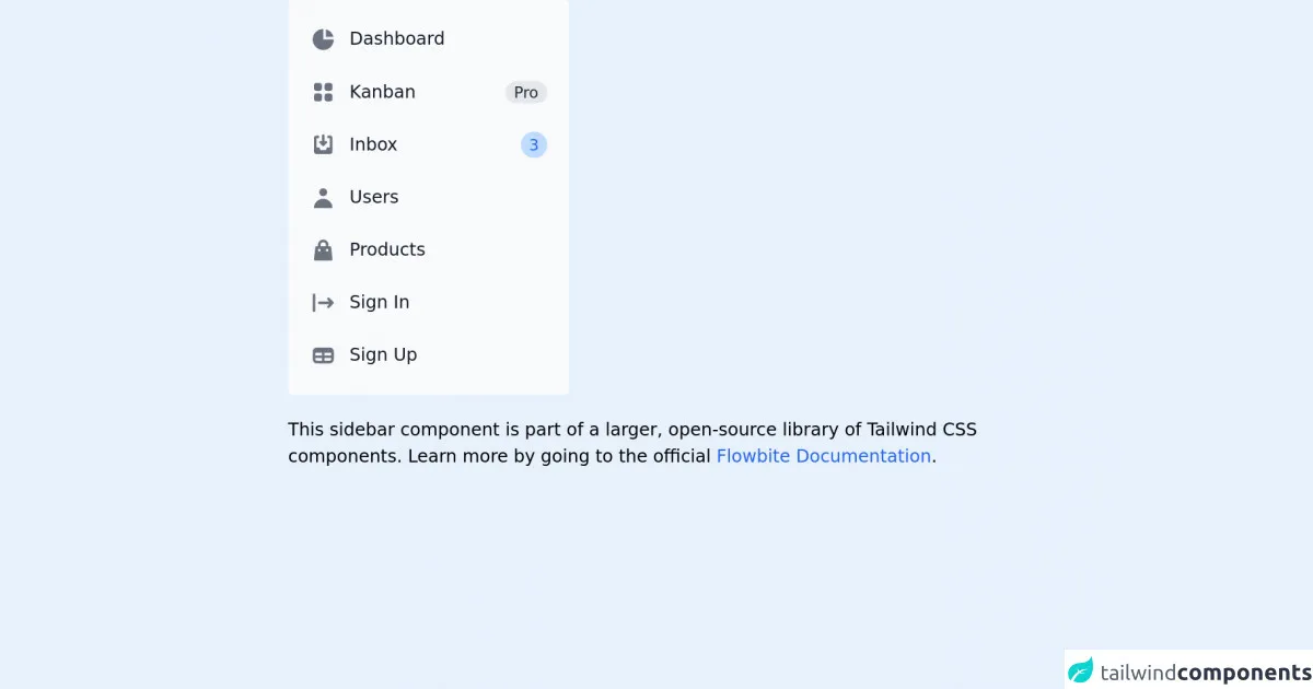
The preview of Tailwind CSS Sidebar ui component
The Tailwind CSS Sidebar UI component is a responsive sidebar that can be easily customized to fit any design. It includes a header section, a menu section, and a footer section.
Free download of the Tailwind CSS Sidebar's source code
The source code of Tailwind CSS Sidebar ui component
The source code for the Tailwind CSS Sidebar UI component is available on the Tailwind CSS website. It includes HTML and CSS files that can be easily customized to fit any design.
<!-- This is an example component -->
<div class="max-w-2xl mx-auto">

	<aside class="w-64" aria-label="Sidebar">
		<div class="px-3 py-4 overflow-y-auto rounded bg-gray-50 dark:bg-gray-800">
			<ul class="space-y-2">
				<li>
					<a href="#"
						class="flex items-center p-2 text-base font-normal text-gray-900 rounded-lg dark:text-white hover:bg-gray-100 dark:hover:bg-gray-700">
						<svg class="w-6 h-6 text-gray-500 transition duration-75 dark:text-gray-400 group-hover:text-gray-900 dark:group-hover:text-white"
							fill="currentColor" viewBox="0 0 20 20" xmlns="http://www.w3.org/2000/svg">
							<path d="M2 10a8 8 0 018-8v8h8a8 8 0 11-16 0z"></path>
							<path d="M12 2.252A8.014 8.014 0 0117.748 8H12V2.252z"></path>
						</svg>
						<span class="ml-3">Dashboard</span>
					</a>
				</li>
				<li>
					<a href="#" target="_blank"
						class="flex items-center p-2 text-base font-normal text-gray-900 rounded-lg dark:text-white hover:bg-gray-100 dark:hover:bg-gray-700">
						<svg class="flex-shrink-0 w-6 h-6 text-gray-500 transition duration-75 dark:text-gray-400 group-hover:text-gray-900 dark:group-hover:text-white"
							fill="currentColor" viewBox="0 0 20 20" xmlns="http://www.w3.org/2000/svg">
							<path
								d="M5 3a2 2 0 00-2 2v2a2 2 0 002 2h2a2 2 0 002-2V5a2 2 0 00-2-2H5zM5 11a2 2 0 00-2 2v2a2 2 0 002 2h2a2 2 0 002-2v-2a2 2 0 00-2-2H5zM11 5a2 2 0 012-2h2a2 2 0 012 2v2a2 2 0 01-2 2h-2a2 2 0 01-2-2V5zM11 13a2 2 0 012-2h2a2 2 0 012 2v2a2 2 0 01-2 2h-2a2 2 0 01-2-2v-2z">
							</path>
						</svg>
						<span class="flex-1 ml-3 whitespace-nowrap">Kanban</span>
						<span class="inline-flex items-center justify-center px-2 ml-3 text-sm font-medium text-gray-800 bg-gray-200 rounded-full dark:bg-gray-700 dark:text-gray-300">Pro</span>
					</a>
				</li>
				<li>
					<a href="#" target="_blank"
						class="flex items-center p-2 text-base font-normal text-gray-900 rounded-lg dark:text-white hover:bg-gray-100 dark:hover:bg-gray-700">
						<svg class="flex-shrink-0 w-6 h-6 text-gray-500 transition duration-75 dark:text-gray-400 group-hover:text-gray-900 dark:group-hover:text-white"
							fill="currentColor" viewBox="0 0 20 20" xmlns="http://www.w3.org/2000/svg">
							<path
								d="M8.707 7.293a1 1 0 00-1.414 1.414l2 2a1 1 0 001.414 0l2-2a1 1 0 00-1.414-1.414L11 7.586V3a1 1 0 10-2 0v4.586l-.293-.293z">
							</path>
							<path
								d="M3 5a2 2 0 012-2h1a1 1 0 010 2H5v7h2l1 2h4l1-2h2V5h-1a1 1 0 110-2h1a2 2 0 012 2v10a2 2 0 01-2 2H5a2 2 0 01-2-2V5z">
							</path>
						</svg>
						<span class="flex-1 ml-3 whitespace-nowrap">Inbox</span>
						<span class="inline-flex items-center justify-center w-3 h-3 p-3 ml-3 text-sm font-medium text-blue-600 bg-blue-200 rounded-full dark:bg-blue-900 dark:text-blue-200">3</span>
					</a>
				</li>
				<li>
					<a href="#"
						class="flex items-center p-2 text-base font-normal text-gray-900 rounded-lg dark:text-white hover:bg-gray-100 dark:hover:bg-gray-700">
						<svg class="flex-shrink-0 w-6 h-6 text-gray-500 transition duration-75 dark:text-gray-400 group-hover:text-gray-900 dark:group-hover:text-white"
							fill="currentColor" viewBox="0 0 20 20" xmlns="http://www.w3.org/2000/svg">
							<path fill-rule="evenodd" d="M10 9a3 3 0 100-6 3 3 0 000 6zm-7 9a7 7 0 1114 0H3z"
								clip-rule="evenodd"></path>
						</svg>
						<span class="flex-1 ml-3 whitespace-nowrap">Users</span>
					</a>
				</li>
				<li>
					<a href="#"
						class="flex items-center p-2 text-base font-normal text-gray-900 rounded-lg dark:text-white hover:bg-gray-100 dark:hover:bg-gray-700">
						<svg class="flex-shrink-0 w-6 h-6 text-gray-500 transition duration-75 dark:text-gray-400 group-hover:text-gray-900 dark:group-hover:text-white"
							fill="currentColor" viewBox="0 0 20 20" xmlns="http://www.w3.org/2000/svg">
							<path fill-rule="evenodd"
								d="M10 2a4 4 0 00-4 4v1H5a1 1 0 00-.994.89l-1 9A1 1 0 004 18h12a1 1 0 00.994-1.11l-1-9A1 1 0 0015 7h-1V6a4 4 0 00-4-4zm2 5V6a2 2 0 10-4 0v1h4zm-6 3a1 1 0 112 0 1 1 0 01-2 0zm7-1a1 1 0 100 2 1 1 0 000-2z"
								clip-rule="evenodd"></path>
						</svg>
						<span class="flex-1 ml-3 whitespace-nowrap">Products</span>
					</a>
				</li>
				<li>
					<a href="#"
						class="flex items-center p-2 text-base font-normal text-gray-900 rounded-lg dark:text-white hover:bg-gray-100 dark:hover:bg-gray-700">
						<svg class="flex-shrink-0 w-6 h-6 text-gray-500 transition duration-75 dark:text-gray-400 group-hover:text-gray-900 dark:group-hover:text-white"
							fill="currentColor" viewBox="0 0 20 20" xmlns="http://www.w3.org/2000/svg">
							<path fill-rule="evenodd"
								d="M3 3a1 1 0 00-1 1v12a1 1 0 102 0V4a1 1 0 00-1-1zm10.293 9.293a1 1 0 001.414 1.414l3-3a1 1 0 000-1.414l-3-3a1 1 0 10-1.414 1.414L14.586 9H7a1 1 0 100 2h7.586l-1.293 1.293z"
								clip-rule="evenodd"></path>
						</svg>
						<span class="flex-1 ml-3 whitespace-nowrap">Sign In</span>
					</a>
				</li>
				<li>
					<a href="#"
						class="flex items-center p-2 text-base font-normal text-gray-900 rounded-lg dark:text-white hover:bg-gray-100 dark:hover:bg-gray-700">
						<svg class="flex-shrink-0 w-6 h-6 text-gray-500 transition duration-75 dark:text-gray-400 group-hover:text-gray-900 dark:group-hover:text-white"
							fill="currentColor" viewBox="0 0 20 20" xmlns="http://www.w3.org/2000/svg">
							<path fill-rule="evenodd"
								d="M5 4a3 3 0 00-3 3v6a3 3 0 003 3h10a3 3 0 003-3V7a3 3 0 00-3-3H5zm-1 9v-1h5v2H5a1 1 0 01-1-1zm7 1h4a1 1 0 001-1v-1h-5v2zm0-4h5V8h-5v2zM9 8H4v2h5V8z"
								clip-rule="evenodd"></path>
						</svg>
						<span class="flex-1 ml-3 whitespace-nowrap">Sign Up</span>
					</a>
				</li>
			</ul>
		</div>
	</aside>

	<p class="mt-5">This sidebar component is part of a larger, open-source library of Tailwind CSS components. Learn
		more
		by going to the official <a class="text-blue-600 hover:underline"
			href="https://flowbite.com/docs/getting-started/introduction/" target="_blank">Flowbite Documentation</a>.
	</p>
</div>
How to create a Tailwind CSS Sidebar with Tailwind CSS?
To create a Tailwind CSS Sidebar, follow these steps:
- Create a new HTML file and include the necessary CSS and JavaScript files.
- Add the HTML markup for the sidebar, including the header, menu, and footer sections.
- Use Tailwind CSS classes to style the sidebar elements.
- Add JavaScript code to handle user interactions, such as opening and closing the sidebar.
Here's an example of what the HTML markup for a basic Tailwind CSS Sidebar might look like:
<div class="flex h-screen">
  <!-- Sidebar -->
  <div class="bg-gray-800 text-white w-64 flex flex-col">
    <div class="h-16 flex items-center justify-center">
      <span class="text-xl font-bold">Sidebar</span>
    </div>
    <div class="flex-grow flex flex-col">
      <a href="#" class="px-4 py-2 hover:bg-gray-700">Link 1</a>
      <a href="#" class="px-4 py-2 hover:bg-gray-700">Link 2</a>
      <a href="#" class="px-4 py-2 hover:bg-gray-700">Link 3</a>
    </div>
    <div class="h-16 flex items-center justify-center">
      <span class="text-xl font-bold">Footer</span>
    </div>
  </div>
  <!-- Content -->
  <div class="flex-grow bg-gray-100">
    <div class="h-16 flex items-center justify-center">
      <span class="text-xl font-bold">Content</span>
    </div>
  </div>
</div>
In this example, the sidebar is defined using a div element with a flex layout. The sidebar includes a header section with a title, a menu section with links, and a footer section with additional content.
To style the sidebar, Tailwind CSS classes are used to set the background color, text color, width, and padding of the sidebar elements. For example, the bg-gray-800 class sets the background color of the sidebar to dark gray, while the text-white class sets the text color to white.
Conclusion
In this article, we've explored how to create a Tailwind CSS Sidebar UI component using Tailwind CSS. By using pre-defined CSS classes, developers can quickly create responsive and modern user interfaces without having to write custom CSS from scratch. With Tailwind CSS, creating a sidebar has never been easier!