- Published on
6 Steps To Build A Tailwind CSS product card dark With Tailwind CSS Like A Pro In Under An Hour
- What is Tailwind CSS?
- The description of Tailwind CSS product card dark ui component
- Why use Tailwind CSS to create a Tailwind CSS product card dark ui component?
- The preview of Tailwind CSS product card dark ui component.
- The source code of Tailwind CSS product card dark ui component.
- How to create a Tailwind CSS product card dark with Tailwind CSS?
- Step 1: Set up your HTML
- Step 2: Style the product card
- Step 3: Add the product image
- Step 4: Add the product name
- Step 5: Add the product price
- Step 6: Add the product description
- Conclusion
As a FrontEnd technology blogger, I am always looking for ways to make my website more visually appealing and user-friendly. One tool that has helped me achieve this is Tailwind CSS. In this article, I will show you how to create a Tailwind CSS product card dark ui component in just six easy steps.
What is Tailwind CSS?
Tailwind CSS is a utility-first CSS framework that allows you to quickly and easily create custom designs without having to write any CSS from scratch. It provides a set of pre-defined classes that you can use to style your HTML elements.
The description of Tailwind CSS product card dark ui component
The Tailwind CSS product card dark ui component is a UI element that is commonly used in e-commerce websites. It displays a product image, name, price, and a short description. It is designed to be visually appealing and easy to navigate.
Why use Tailwind CSS to create a Tailwind CSS product card dark ui component?
Tailwind CSS makes it easy to create custom designs without having to write any CSS from scratch. It provides a set of pre-defined classes that you can use to style your HTML elements. This saves you time and allows you to focus on the design of your website.
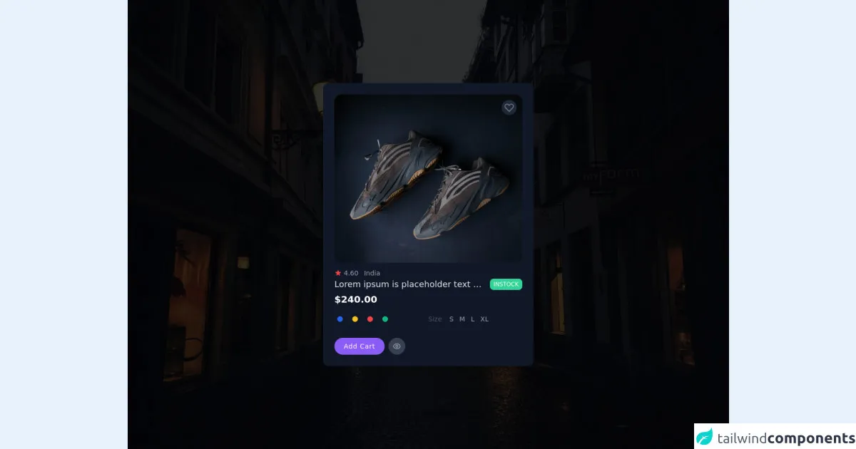
The preview of Tailwind CSS product card dark ui component.
To create a Tailwind CSS product card dark ui component, we will use a combination of HTML and Tailwind CSS classes. The final result will look something like this:
Free download of the Tailwind CSS product card dark's source code
The source code of Tailwind CSS product card dark ui component.
To create a Tailwind CSS product card dark ui component, we will use the following HTML and Tailwind CSS classes:
<div class="min-w-screen h-screen animated fadeIn faster  fixed  left-0 top-0 flex justify-center items-center inset-0 z-50 outline-none focus:outline-none bg-no-repeat bg-center bg-cover" style="background-image: url(https://images.unsplash.com/photo-1604262725913-1c415cd27564?ixid=MnwxMjA3fDB8MHxwaG90by1wYWdlfHx8fGVufDB8fHx8&ixlib=rb-1.2.1&auto=format&fit=crop&w=2142&q=80);" id="modal-id">
  <div class="absolute bg-black opacity-80 inset-0 z-0"></div>
  <div class="relative min-h-screen flex flex-col items-center justify-center ">
    <div class="container">
      <div class="max-w-md w-full bg-gray-900 shadow-lg rounded-xl p-6">
        <div class="flex flex-col ">
          <div class="">
            <div class="relative h-62 w-full mb-3">
              <div class="absolute flex flex-col top-0 right-0 p-3">
                <button class="transition ease-in duration-300 bg-gray-800  hover:text-purple-500 shadow hover:shadow-md text-gray-500 rounded-full w-8 h-8 text-center p-1"><svg xmlns="http://www.w3.org/2000/svg" class="h-6 w-6" fill="none" viewBox="0 0 24 24" stroke="currentColor">
                    <path stroke-linecap="round" stroke-linejoin="round" stroke-width="2" d="M4.318 6.318a4.5 4.5 0 000 6.364L12 20.364l7.682-7.682a4.5 4.5 0 00-6.364-6.364L12 7.636l-1.318-1.318a4.5 4.5 0 00-6.364 0z" />
                  </svg></button>
              </div>
              <img src="https://images.unsplash.com/photo-1577982787983-e07c6730f2d3?ixlib=rb-1.2.1&ixid=MnwxMjA3fDB8MHxwaG90by1wYWdlfHx8fGVufDB8fHx8&auto=format&fit=crop&w=2059&q=80" alt="Just a flower" class=" w-full   object-fill  rounded-2xl">
            </div>
            <div class="flex-auto justify-evenly">
              <div class="flex flex-wrap ">
                <div class="w-full flex-none text-sm flex items-center text-gray-600">
                  <svg xmlns="http://www.w3.org/2000/svg" class="h-4 w-4 text-red-500 mr-1" viewBox="0 0 20 20" fill="currentColor">
                    <path d="M9.049 2.927c.3-.921 1.603-.921 1.902 0l1.07 3.292a1 1 0 00.95.69h3.462c.969 0 1.371 1.24.588 1.81l-2.8 2.034a1 1 0 00-.364 1.118l1.07 3.292c.3.921-.755 1.688-1.54 1.118l-2.8-2.034a1 1 0 00-1.175 0l-2.8 2.034c-.784.57-1.838-.197-1.539-1.118l1.07-3.292a1 1 0 00-.364-1.118L2.98 8.72c-.783-.57-.38-1.81.588-1.81h3.461a1 1 0 00.951-.69l1.07-3.292z" />
                  </svg>
                  <span class="text-gray-400 whitespace-nowrap mr-3">4.60</span><span class="mr-2 text-gray-400">India</span>
                </div>
                <div class="flex items-center w-full justify-between min-w-0 ">
                  <h2 class="text-lg mr-auto cursor-pointer text-gray-200 hover:text-purple-500 truncate ">Lorem ipsum
                    is placeholder text commonly used in the graphic</h2>
                  <div class="flex items-center bg-green-400 text-white text-xs px-2 py-1 ml-3 rounded-lg">
                    INSTOCK</div>
                </div>
              </div>
              <div class="text-xl text-white font-semibold mt-1">$240.00</div>
              <div class="lg:flex  py-4  text-sm text-gray-600">
                <div class="flex-1 inline-flex items-center  mb-3">
                  <div class="w-full flex-none text-sm flex items-center text-gray-600">
                    <ul class="flex flex-row justify-center items-center space-x-2">
                      <li class="">
                        <span class="block p-1 border-2 border-gray-900 hover:border-blue-600 rounded-full transition ease-in duration-300">
                          <a href="#blue" class="block w-3 h-3 bg-blue-600 rounded-full"></a>
                        </span>
                      </li>
                      <li class="">
                        <span class="block p-1 border-2 border-gray-900 hover:border-yellow-400 rounded-full transition ease-in duration-300">
                          <a href="#yellow" class="block w-3 h-3  bg-yellow-400 rounded-full"></a>
                        </span>
                      </li>
                      <li class="">
                        <span class="block p-1 border-2 border-gray-900 hover:border-red-500 rounded-full transition ease-in duration-300">
                          <a href="#red" class="block w-3 h-3  bg-red-500 rounded-full"></a>
                        </span>
                      </li>
                      <li class="">
                        <span class="block p-1 border-2 border-gray-900 hover:border-green-500 rounded-full transition ease-in duration-300">
                          <a href="#green" class="block w-3 h-3  bg-green-500 rounded-full"></a>
                        </span>
                      </li>
                    </ul>
                  </div>
                </div>
                <div class="flex-1 inline-flex items-center mb-3">
                  <span class="text-secondary whitespace-nowrap mr-3">Size</span>
                  <div class="cursor-pointer text-gray-400 ">
                    <span class="hover:text-purple-500 p-1 py-0">S</span>
                    <span class="hover:text-purple-500 p-1 py-0">M</span>
                    <span class="hover:text-purple-500 p-1 py-0">L</span>
                    <span class="hover:text-purple-500 p-1 py-0">XL</span>

                  </div>
                </div>
              </div>
              <div class="flex space-x-2 text-sm font-medium justify-start">
                <button class="transition ease-in duration-300 inline-flex items-center text-sm font-medium mb-2 md:mb-0 bg-purple-500 px-5 py-2 hover:shadow-lg tracking-wider text-white rounded-full hover:bg-purple-600 ">
                  <span>Add Cart</span>
                </button>
                <button class="transition ease-in duration-300 bg-gray-700 hover:bg-gray-800 border hover:border-gray-500 border-gray-700 hover:text-white  hover:shadow-lg text-gray-400 rounded-full w-9 h-9 text-center p-2">
                  <svg xmlns="http://www.w3.org/2000/svg" class="" fill="none" viewBox="0 0 24 24" stroke="currentColor">
                    <path stroke-linecap="round" stroke-linejoin="round" stroke-width="2" d="M15 12a3 3 0 11-6 0 3 3 0 016 0z" />
                    <path stroke-linecap="round" stroke-linejoin="round" stroke-width="2" d="M2.458 12C3.732 7.943 7.523 5 12 5c4.478 0 8.268 2.943 9.542 7-1.274 4.057-5.064 7-9.542 7-4.477 0-8.268-2.943-9.542-7z" />
                  </svg>
                </button>
              </div>
            </div>
          </div>
        </div>
      </div>
    </div>
  </div>
</div>
How to create a Tailwind CSS product card dark with Tailwind CSS?
Now that we have a basic understanding of what Tailwind CSS is and why it is useful, let's get started on creating our Tailwind CSS product card dark ui component.
Step 1: Set up your HTML
First, we need to set up our HTML. We will use a div element to contain our product card. Inside this div, we will create four div elements to hold our product image, name, price, and description.
<div class="bg-gray-800 rounded-lg overflow-hidden shadow-lg">
  <div class="h-64 bg-cover bg-center" style="background-image: url('https://via.placeholder.com/640x480.png/0088cc?text=Product+Image')"></div>
  <div class="p-4">
    <h2 class="text-2xl font-bold text-white">Product Name</h2>
    <p class="text-gray-400">$19.99</p>
    <p class="text-gray-400">Lorem ipsum dolor sit amet, consectetur adipiscing elit.</p>
  </div>
</div>
Step 2: Style the product card
Next, we need to style our product card using Tailwind CSS classes. We will use the bg-gray-800 class to set the background color of our card to dark gray. We will also use the rounded-lg class to add rounded corners to our card. Finally, we will use the overflow-hidden and shadow-lg classes to add a drop shadow to our card.
<div class="bg-gray-800 rounded-lg overflow-hidden shadow-lg">
Step 3: Add the product image
Now, we need to add the product image to our card. We will use the bg-cover and bg-center classes to center and scale our image. We will also use the h-64 class to set the height of our image to 64 pixels.
<div class="h-64 bg-cover bg-center" style="background-image: url('https://via.placeholder.com/640x480.png/0088cc?text=Product+Image')"></div>
Step 4: Add the product name
Next, we need to add the product name to our card. We will use the text-2xl and font-bold classes to set the font size and weight of our text. We will also use the text-white class to set the color of our text to white.
<h2 class="text-2xl font-bold text-white">Product Name</h2>
Step 5: Add the product price
Now, we need to add the product price to our card. We will use the text-gray-400 class to set the color of our text to gray.
<p class="text-gray-400">$19.99</p>
Step 6: Add the product description
Finally, we need to add the product description to our card. We will use the text-gray-400 class to set the color of our text to gray.
<p class="text-gray-400">Lorem ipsum dolor sit amet, consectetur adipiscing elit.</p>
Conclusion
In this article, we have learned how to create a Tailwind CSS product card dark ui component in just six easy steps. By using Tailwind CSS, we were able to create a visually appealing and user-friendly design without having to write any CSS from scratch. I hope you found this tutorial helpful and that you are inspired to create your own custom designs using Tailwind CSS.