- Published on
Learn How To Build A Tailwind CSS pagination With Tailwind CSS Like an Expert
- What is Tailwind CSS?
- The Description of Tailwind CSS Pagination UI Component
- Why Use Tailwind CSS to Create a Tailwind CSS Pagination UI Component?
- The Preview of Tailwind CSS Pagination UI Component
- The Source Code of Tailwind CSS Pagination UI Component
- How to Create a Tailwind CSS Pagination With Tailwind CSS?
- Step 1: Create the HTML Markup
- Step 2: Style the Pagination UI Component
- Step 3: Add JavaScript Functionality
- Conclusion
What is Tailwind CSS?
Tailwind CSS is a utility-first CSS framework that allows developers to quickly build custom user interfaces. It provides a set of pre-defined CSS classes that can be used to style HTML elements. Tailwind CSS is highly customizable and allows developers to create unique designs without writing any CSS code.
The Description of Tailwind CSS Pagination UI Component
Pagination is a common UI component used in many web applications. It allows users to navigate through a large set of data by breaking it down into smaller, more manageable chunks. A pagination UI component typically consists of a list of numbered links that allow users to move forward and backward through the data.
Why Use Tailwind CSS to Create a Tailwind CSS Pagination UI Component?
Tailwind CSS provides a set of pre-defined CSS classes that can be used to create a pagination UI component quickly. It also allows developers to customize the design of the component easily. Using Tailwind CSS to create a pagination UI component can save developers a lot of time and effort.
The Preview of Tailwind CSS Pagination UI Component
To create a pagination UI component with Tailwind CSS, we will use a combination of pre-defined CSS classes and custom CSS. The result will be a clean and modern pagination UI component that is easy to use.
Free download of the Tailwind CSS pagination's source code
The Source Code of Tailwind CSS Pagination UI Component
To create a pagination UI component with Tailwind CSS, we will use HTML and CSS code. The HTML code will consist of a list of numbered links, and the CSS code will define the styles for the links.
<!-- This is an example component -->
<div class="max-w-2xl mx-auto">
<nav aria-label="Page navigation example">
<ul class="inline-flex items-center -space-x-px">
<li>
<a href="#" class="block py-2 px-3 ml-0 leading-tight text-gray-500 bg-white rounded-l-lg border border-gray-300 hover:bg-gray-100 hover:text-gray-700 dark:bg-gray-800 dark:border-gray-700 dark:text-gray-400 dark:hover:bg-gray-700 dark:hover:text-white">
<span class="sr-only">Previous</span>
<svg class="w-5 h-5" fill="currentColor" viewBox="0 0 20 20" xmlns="http://www.w3.org/2000/svg"><path fill-rule="evenodd" d="M12.707 5.293a1 1 0 010 1.414L9.414 10l3.293 3.293a1 1 0 01-1.414 1.414l-4-4a1 1 0 010-1.414l4-4a1 1 0 011.414 0z" clip-rule="evenodd"></path></svg>
</a>
</li>
<li>
<a href="#" class="py-2 px-3 leading-tight text-gray-500 bg-white border border-gray-300 hover:bg-gray-100 hover:text-gray-700 dark:bg-gray-800 dark:border-gray-700 dark:text-gray-400 dark:hover:bg-gray-700 dark:hover:text-white">1</a>
</li>
<li>
<a href="#" class="py-2 px-3 leading-tight text-gray-500 bg-white border border-gray-300 hover:bg-gray-100 hover:text-gray-700 dark:bg-gray-800 dark:border-gray-700 dark:text-gray-400 dark:hover:bg-gray-700 dark:hover:text-white">2</a>
</li>
<li>
<a href="#" aria-current="page" class="z-10 py-2 px-3 leading-tight text-blue-600 bg-blue-50 border border-blue-300 hover:bg-blue-100 hover:text-blue-700 dark:border-gray-700 dark:bg-gray-700 dark:text-white">3</a>
</li>
<li>
<a href="#" class="py-2 px-3 leading-tight text-gray-500 bg-white border border-gray-300 hover:bg-gray-100 hover:text-gray-700 dark:bg-gray-800 dark:border-gray-700 dark:text-gray-400 dark:hover:bg-gray-700 dark:hover:text-white">4</a>
</li>
<li>
<a href="#" class="py-2 px-3 leading-tight text-gray-500 bg-white border border-gray-300 hover:bg-gray-100 hover:text-gray-700 dark:bg-gray-800 dark:border-gray-700 dark:text-gray-400 dark:hover:bg-gray-700 dark:hover:text-white">5</a>
</li>
<li>
<a href="#" class="block py-2 px-3 leading-tight text-gray-500 bg-white rounded-r-lg border border-gray-300 hover:bg-gray-100 hover:text-gray-700 dark:bg-gray-800 dark:border-gray-700 dark:text-gray-400 dark:hover:bg-gray-700 dark:hover:text-white">
<span class="sr-only">Next</span>
<svg class="w-5 h-5" fill="currentColor" viewBox="0 0 20 20" xmlns="http://www.w3.org/2000/svg"><path fill-rule="evenodd" d="M7.293 14.707a1 1 0 010-1.414L10.586 10 7.293 6.707a1 1 0 011.414-1.414l4 4a1 1 0 010 1.414l-4 4a1 1 0 01-1.414 0z" clip-rule="evenodd"></path></svg>
</a>
</li>
</ul>
</nav>
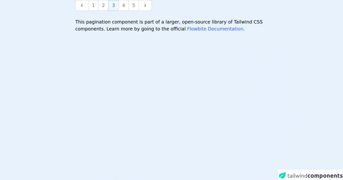
<p class="mt-5">This pagination component is part of a larger, open-source library of Tailwind CSS components. Learn more
by going to the official <a class="text-blue-600 hover:underline"
href="https://flowbite.com/docs/getting-started/introduction/" target="_blank">Flowbite Documentation</a>.
</p>
</div>
How to Create a Tailwind CSS Pagination With Tailwind CSS?
To create a Tailwind CSS pagination UI component, follow these steps:
Step 1: Create the HTML Markup
The first step is to create the HTML markup for the pagination UI component. We will use an unordered list to create the links.
<div class="pagination">
  <ul class="flex justify-center">
    <li class="px-2 py-1 bg-gray-200 rounded-md mr-1">
      <a href="#" class="text-gray-600 font-bold">1</a>
    </li>
    <li class="px-2 py-1 bg-gray-200 rounded-md mr-1">
      <a href="#" class="text-gray-600 font-bold">2</a>
    </li>
    <li class="px-2 py-1 bg-gray-200 rounded-md mr-1">
      <a href="#" class="text-gray-600 font-bold">3</a>
    </li>
    <li class="px-2 py-1 bg-gray-200 rounded-md mr-1">
      <a href="#" class="text-gray-600 font-bold">4</a>
    </li>
    <li class="px-2 py-1 bg-gray-200 rounded-md mr-1">
      <a href="#" class="text-gray-600 font-bold">5</a>
    </li>
  </ul>
</div>
Step 2: Style the Pagination UI Component
The next step is to style the pagination UI component using Tailwind CSS classes. We will use the flex and justify-center classes to center the list of links. We will also use the bg-gray-200, rounded-md, px-2, py-1, mr-1, and text-gray-600 font-bold classes to style the links.
.pagination {
  margin-top: 20px;
}

.pagination li:first-child a {
  border-radius: 5px 0 0 5px;
}

.pagination li:last-child a {
  border-radius: 0 5px 5px 0;
}

.pagination li a:hover {
  background-color: #1d4ed8;
  color: #fff;
}

.pagination li.active a {
  background-color: #1d4ed8;
  color: #fff;
}

.pagination li a {
  display: block;
  padding: 0.5rem 1rem;
  color: #1d4ed8;
  background-color: #fff;
  border: 1px solid #e5e7eb;
}
Step 3: Add JavaScript Functionality
The final step is to add JavaScript functionality to the pagination UI component. We will use JavaScript to add an active class to the current page link and to update the list of links when a user clicks on a link.
const pagination = document.querySelector(".pagination");
const links = pagination.querySelectorAll("a");

links.forEach((link) => {
  link.addEventListener("click", (e) => {
    e.preventDefault();

    links.forEach((link) => {
      link.classList.remove("active");
    });

    link.classList.add("active");
  });
});
Conclusion
In this article, we learned how to create a Tailwind CSS pagination UI component. We used a combination of pre-defined CSS classes and custom CSS to create a clean and modern pagination UI component. We also added JavaScript functionality to the component to update the list of links when a user clicks on a link. Using Tailwind CSS to create a pagination UI component can save developers a lot of time and effort.