- Published on
3 Things You Must Know To Create A Tailwind CSS Modal With Tailwind CSS
- What is Tailwind CSS?
- The description of Tailwind CSS Modal ui component
- Why use Tailwind CSS to create a Tailwind CSS Modal UI component?
- The preview of Tailwind CSS Modal UI component
- The source code of Tailwind CSS Modal UI component
- How to create a Tailwind CSS Modal with Tailwind CSS?
- Step 1: Add the HTML Markup
- Step 2: Add the Tailwind CSS Classes
- Step 3: Add the JavaScript Functionality
- Conclusion
What is Tailwind CSS?
Tailwind CSS is a utility-first CSS framework that provides a set of pre-defined classes to style your HTML elements. It allows you to create complex and responsive designs with minimal effort. The framework is highly customizable and can be configured to match your project's specific needs.
The description of Tailwind CSS Modal ui component
A modal is a UI component that is used to display content on top of the current page. It is commonly used to display additional information or to prompt the user for input. The Tailwind CSS Modal UI component is a pre-built modal that you can use in your projects. It comes with pre-defined styles and functionality that you can customize to match your project's needs.
Why use Tailwind CSS to create a Tailwind CSS Modal UI component?
Tailwind CSS provides a set of pre-defined classes that can be used to style your HTML elements. This makes it easy to create complex and responsive designs without having to write custom CSS. The Tailwind CSS Modal UI component is pre-built and comes with pre-defined styles and functionality that you can customize to match your project's needs. This saves you time and effort in creating a modal from scratch.
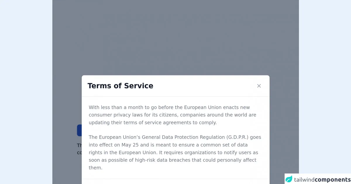
The preview of Tailwind CSS Modal UI component
The Tailwind CSS Modal UI component is a pre-built modal that you can use in your projects. It comes with pre-defined styles and functionality that you can customize to match your project's needs.
Free download of the Tailwind CSS Modal's source code
The source code of Tailwind CSS Modal UI component
The Tailwind CSS Modal UI component is pre-built and comes with pre-defined styles and functionality that you can customize to match your project's needs.
<!-- This is an example component -->
<div class="max-w-2xl mx-auto">

    <!-- Modal toggle -->
    <button class="block text-white bg-blue-700 hover:bg-blue-800 focus:ring-4 focus:ring-blue-300 font-medium rounded-lg text-sm px-5 py-2.5 text-center dark:bg-blue-600 dark:hover:bg-blue-700 dark:focus:ring-blue-800" type="button" data-modal-toggle="default-modal">
    Toggle modal
    </button>

    <!-- Main modal -->
    <div id="default-modal" data-modal-show="true" aria-hidden="true" class="hidden overflow-x-hidden overflow-y-auto fixed h-modal md:h-full top-4 left-0 right-0 md:inset-0 z-50 justify-center items-center">
        <div class="relative w-full max-w-2xl px-4 h-full md:h-auto">
            <!-- Modal content -->
            <div class="bg-white rounded-lg shadow relative dark:bg-gray-700">
                <!-- Modal header -->
                <div class="flex items-start justify-between p-5 border-b rounded-t dark:border-gray-600">
                    <h3 class="text-gray-900 text-xl lg:text-2xl font-semibold dark:text-white">
                        Terms of Service
                    </h3>
                    <button type="button" class="text-gray-400 bg-transparent hover:bg-gray-200 hover:text-gray-900 rounded-lg text-sm p-1.5 ml-auto inline-flex items-center dark:hover:bg-gray-600 dark:hover:text-white" data-modal-toggle="default-modal">
                        <svg class="w-5 h-5" fill="currentColor" viewBox="0 0 20 20" xmlns="http://www.w3.org/2000/svg"><path fill-rule="evenodd" d="M4.293 4.293a1 1 0 011.414 0L10 8.586l4.293-4.293a1 1 0 111.414 1.414L11.414 10l4.293 4.293a1 1 0 01-1.414 1.414L10 11.414l-4.293 4.293a1 1 0 01-1.414-1.414L8.586 10 4.293 5.707a1 1 0 010-1.414z" clip-rule="evenodd"></path></svg>
                    </button>
                </div>
                <!-- Modal body -->
                <div class="p-6 space-y-6">
                    <p class="text-gray-500 text-base leading-relaxed dark:text-gray-400">
                        With less than a month to go before the European Union enacts new consumer privacy laws for its citizens, companies around the world are updating their terms of service agreements to comply.
                    </p>
                    <p class="text-gray-500 text-base leading-relaxed dark:text-gray-400">
                        The European Union’s General Data Protection Regulation (G.D.P.R.) goes into effect on May 25 and is meant to ensure a common set of data rights in the European Union. It requires organizations to notify users as soon as possible of high-risk data breaches that could personally affect them.
                    </p>
                </div>
                <!-- Modal footer -->
                <div class="flex space-x-2 items-center p-6 border-t border-gray-200 rounded-b dark:border-gray-600">
                    <button data-modal-toggle="default-modal" type="button" class="text-white bg-blue-700 hover:bg-blue-800 focus:ring-4 focus:ring-blue-300 font-medium rounded-lg text-sm px-5 py-2.5 text-center dark:bg-blue-600 dark:hover:bg-blue-700 dark:focus:ring-blue-800">I accept</button>
                    <button data-modal-toggle="default-modal" type="button" class="text-gray-500 bg-white hover:bg-gray-100 focus:ring-4 focus:ring-gray-300 rounded-lg border border-gray-200 text-sm font-medium px-5 py-2.5 hover:text-gray-900 focus:z-10 dark:bg-gray-700 dark:text-gray-300 dark:border-gray-500 dark:hover:text-white dark:hover:bg-gray-600">Decline</button>
                </div>
            </div>
        </div>
    </div>

    <p class="mt-5">This modal element is part of a larger, open-source library of Tailwind CSS components. Learn more by going to the official <a class="text-blue-600 hover:underline" href="https://flowbite.com/docs/getting-started/introduction/" target="_blank">Flowbite Documentation</a>.</p>
</div>

<script src="https://unpkg.com/[email protected]/dist/flowbite.js"></script>
How to create a Tailwind CSS Modal with Tailwind CSS?
To create a Tailwind CSS Modal, you need to follow these three steps:
Step 1: Add the HTML Markup
The first step is to add the HTML markup for the modal. This includes the modal container, the modal header, the modal body, and the modal footer. Here's an example of what the HTML markup might look like:
<div class="modal fixed w-full h-full top-0 left-0 flex items-center justify-center">
  <div class="modal-overlay absolute w-full h-full bg-gray-900 opacity-50"></div>

  <div class="modal-container bg-white w-11/12 md:max-w-md mx-auto rounded shadow-lg z-50 overflow-y-auto">

    <div class="modal-header py-3 px-4">
      <h2 class="text-lg font-semibold text-gray-900">Modal Header</h2>
      <button class="modal-close absolute top-0 right-0" type="button">
        <svg class="fill-current text-gray-500 w-4 h-4" xmlns="http://www.w3.org/2000/svg" viewBox="0 0 20 20"><path d="M14.348 5.652a.999.999 0 0 0-1.414 0L10 8.586 6.066 4.652a.999.999 0 1 0-1.414 1.414L8.586 10l-3.934 3.934a.999.999 0 1 0 1.414 1.414L10 11.414l3.934 3.934a.999.999 0 1 0 1.414-1.414L11.414 10l3.934-3.934a.999.999 0 0 0 0-1.414z"/></svg>
      </button>
    </div>

    <div class="modal-body p-4">
      <p>Modal Body</p>
    </div>

    <div class="modal-footer py-3 px-4">
      <button class="modal-close px-4 bg-indigo-500 p-3 rounded-lg text-white hover:bg-indigo-400">Close</button>
    </div>

  </div>
</div>
Step 2: Add the Tailwind CSS Classes
The second step is to add the Tailwind CSS classes to the HTML markup. This includes the classes for the modal container, the modal header, the modal body, and the modal footer. Here's an example of what the HTML markup might look like with the Tailwind CSS classes added:
<div class="modal fixed w-full h-full top-0 left-0 flex items-center justify-center">
  <div class="modal-overlay absolute w-full h-full bg-gray-900 opacity-50"></div>

  <div class="modal-container bg-white w-11/12 md:max-w-md mx-auto rounded shadow-lg z-50 overflow-y-auto">

    <div class="modal-header py-3 px-4">
      <h2 class="text-lg font-semibold text-gray-900">Modal Header</h2>
      <button class="modal-close absolute top-0 right-0" type="button">
        <svg class="fill-current text-gray-500 w-4 h-4" xmlns="http://www.w3.org/2000/svg" viewBox="0 0 20 20"><path d="M14.348 5.652a.999.999 0 0 0-1.414 0L10 8.586 6.066 4.652a.999.999 0 1 0-1.414 1.414L8.586 10l-3.934 3.934a.999.999 0 1 0 1.414 1.414L10 11.414l3.934 3.934a.999.999 0 1 0 1.414-1.414L11.414 10l3.934-3.934a.999.999 0 0 0 0-1.414z"/></svg>
      </button>
    </div>

    <div class="modal-body p-4">
      <p>Modal Body</p>
    </div>

    <div class="modal-footer py-3 px-4">
      <button class="modal-close px-4 bg-indigo-500 p-3 rounded-lg text-white hover:bg-indigo-400">Close</button>
    </div>

  </div>
</div>
Step 3: Add the JavaScript Functionality
The third step is to add the JavaScript functionality to the modal. This includes the functions to open and close the modal. Here's an example of what the JavaScript code might look like:
const openModalButtons = document.querySelectorAll('[data-modal-target]')
const closeModalButtons = document.querySelectorAll('[data-close-button]')
const overlay = document.getElementById('overlay')

openModalButtons.forEach(button => {
  button.addEventListener('click', () => {
    const modal = document.querySelector(button.dataset.modalTarget)
    openModal(modal)
  })
})

overlay.addEventListener('click', () => {
  const modals = document.querySelectorAll('.modal.active')
  modals.forEach(modal => {
    closeModal(modal)
  })
})

closeModalButtons.forEach(button => {
  button.addEventListener('click', () => {
    const modal = button.closest('.modal')
    closeModal(modal)
  })
})

function openModal(modal) {
  if (modal == null) return
  modal.classList.add('active')
  overlay.classList.add('active')
}

function closeModal(modal) {
  if (modal == null) return
  modal.classList.remove('active')
  overlay.classList.remove('active')
}
Conclusion
Creating a Tailwind CSS Modal is a straightforward process that can be done in three simple steps. By using Tailwind CSS, you can save time and effort in creating a modal from scratch. The pre-built Tailwind CSS Modal UI component comes with pre-defined styles and functionality that you can customize to match your project's needs.