- Published on
The Ultimate Guide To Help You Build A Tailwind CSS login/register modal With Tailwind CSS
- What is Tailwind CSS?
- The Description of Tailwind CSS Login/Register Modal UI Component
- Why Use Tailwind CSS to Create a Tailwind CSS Login/Register Modal UI Component?
- The Preview of Tailwind CSS Login/Register Modal UI Component
- The Source Code of Tailwind CSS Login/Register Modal UI Component
- How to Create a Tailwind CSS Login/Register Modal with Tailwind CSS?
- Conclusion
What is Tailwind CSS?
Tailwind CSS is a utility-first CSS framework that provides a set of pre-defined classes to help you quickly build custom user interfaces. It is designed to be highly customizable and is ideal for building complex, responsive layouts. With Tailwind CSS, you can create beautiful, modern designs without having to write a lot of custom CSS code.
The Description of Tailwind CSS Login/Register Modal UI Component
A login/register modal is a common UI component used in many web applications. It allows users to sign in or register for an account without leaving the current page. A login/register modal typically includes a form for users to enter their login credentials or register for a new account.
Why Use Tailwind CSS to Create a Tailwind CSS Login/Register Modal UI Component?
Tailwind CSS provides a set of pre-defined classes that make it easy to create complex UI components like a login/register modal. By using Tailwind CSS, you can save time and reduce the amount of custom CSS code you need to write. Additionally, Tailwind CSS makes it easy to create responsive designs that work well on a variety of devices.
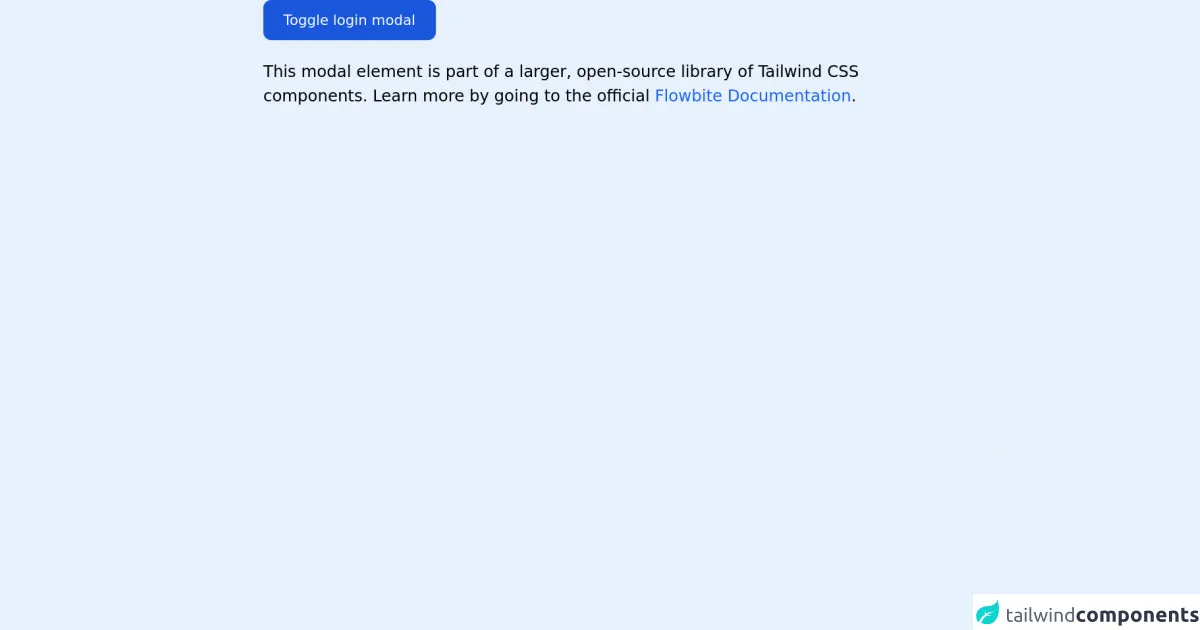
The Preview of Tailwind CSS Login/Register Modal UI Component
Here is a preview of what the login/register modal will look like:
Free download of the Tailwind CSS login/register modal's source code
The Source Code of Tailwind CSS Login/Register Modal UI Component
Here is the source code for the login/register modal:
<link rel="stylesheet" href="https://unpkg.com/@themesberg/[email protected]/dist/flowbite.min.css" />

<!-- This is an example component -->
<div class="max-w-2xl mx-auto">

    <!-- Modal toggle -->
    <button class="block text-white bg-blue-700 hover:bg-blue-800 focus:ring-4 focus:ring-blue-300 font-medium rounded-lg text-sm px-5 py-2.5 text-center dark:bg-blue-600 dark:hover:bg-blue-700 dark:focus:ring-blue-800" type="button" data-modal-toggle="authentication-modal">
    Toggle login modal
    </button>

    <!-- Main modal -->
    <div id="authentication-modal" aria-hidden="true" class="hidden overflow-x-hidden overflow-y-auto fixed h-modal md:h-full top-4 left-0 right-0 md:inset-0 z-50 justify-center items-center">
        <div class="relative w-full max-w-md px-4 h-full md:h-auto">
            <!-- Modal content -->
            <div class="bg-white rounded-lg shadow relative dark:bg-gray-700">
                <div class="flex justify-end p-2">
                    <button type="button" class="text-gray-400 bg-transparent hover:bg-gray-200 hover:text-gray-900 rounded-lg text-sm p-1.5 ml-auto inline-flex items-center dark:hover:bg-gray-800 dark:hover:text-white" data-modal-toggle="authentication-modal">
                        <svg class="w-5 h-5" fill="currentColor" viewBox="0 0 20 20" xmlns="http://www.w3.org/2000/svg"><path fill-rule="evenodd" d="M4.293 4.293a1 1 0 011.414 0L10 8.586l4.293-4.293a1 1 0 111.414 1.414L11.414 10l4.293 4.293a1 1 0 01-1.414 1.414L10 11.414l-4.293 4.293a1 1 0 01-1.414-1.414L8.586 10 4.293 5.707a1 1 0 010-1.414z" clip-rule="evenodd"></path></svg>
                    </button>
                </div>
                <form class="space-y-6 px-6 lg:px-8 pb-4 sm:pb-6 xl:pb-8" action="#">
                    <h3 class="text-xl font-medium text-gray-900 dark:text-white">Sign in to our platform</h3>
                    <div>
                        <label for="email" class="text-sm font-medium text-gray-900 block mb-2 dark:text-gray-300">Your email</label>
                        <input type="email" name="email" id="email" class="bg-gray-50 border border-gray-300 text-gray-900 sm:text-sm rounded-lg focus:ring-blue-500 focus:border-blue-500 block w-full p-2.5 dark:bg-gray-600 dark:border-gray-500 dark:placeholder-gray-400 dark:text-white" placeholder="[email protected]" required="">
                    </div>
                    <div>
                        <label for="password" class="text-sm font-medium text-gray-900 block mb-2 dark:text-gray-300">Your password</label>
                        <input type="password" name="password" id="password" placeholder="••••••••" class="bg-gray-50 border border-gray-300 text-gray-900 sm:text-sm rounded-lg focus:ring-blue-500 focus:border-blue-500 block w-full p-2.5 dark:bg-gray-600 dark:border-gray-500 dark:placeholder-gray-400 dark:text-white" required="">
                    </div>
                    <div class="flex justify-between">
                        <div class="flex items-start">
                            <div class="flex items-center h-5">
                                <input id="remember" aria-describedby="remember" type="checkbox" class="bg-gray-50 border border-gray-300 focus:ring-3 focus:ring-blue-300 h-4 w-4 rounded dark:bg-gray-600 dark:border-gray-500 dark:focus:ring-blue-600 dark:ring-offset-gray-800" required="">
                            </div>
                            <div class="text-sm ml-3">
                            <label for="remember" class="font-medium text-gray-900 dark:text-gray-300">Remember me</label>
                            </div>
                        </div>
                        <a href="#" class="text-sm text-blue-700 hover:underline dark:text-blue-500">Lost Password?</a>
                    </div>
                    <button type="submit" class="w-full text-white bg-blue-700 hover:bg-blue-800 focus:ring-4 focus:ring-blue-300 font-medium rounded-lg text-sm px-5 py-2.5 text-center dark:bg-blue-600 dark:hover:bg-blue-700 dark:focus:ring-blue-800">Login to your account</button>
                    <div class="text-sm font-medium text-gray-500 dark:text-gray-300">
                        Not registered? <a href="#" class="text-blue-700 hover:underline dark:text-blue-500">Create account</a>
                    </div>
                </form>
            </div>
        </div>
    </div>

    <p class="mt-5">This modal element is part of a larger, open-source library of Tailwind CSS components. Learn more by going to the official <a class="text-blue-600 hover:underline" href="https://flowbite.com/docs/getting-started/introduction/" target="_blank">Flowbite Documentation</a>.</p>
</div>

<script src="https://unpkg.com/@themesberg/[email protected]/dist/flowbite.bundle.js"></script>
How to Create a Tailwind CSS Login/Register Modal with Tailwind CSS?
To create a login/register modal with Tailwind CSS, follow these steps:
Create a new HTML file and add the necessary HTML markup for the modal. The modal should include a form for users to enter their login credentials or register for a new account.
Add the necessary Tailwind CSS classes to style the modal. You can use the pre-defined classes provided by Tailwind CSS to style the modal or create your own custom classes.
Add JavaScript code to handle the opening and closing of the modal. You can use a JavaScript library like jQuery or write your own custom JavaScript code.
Test the login/register modal to ensure it works as expected on a variety of devices.
Conclusion
In this article, we have discussed how to create a login/register modal using Tailwind CSS. By using Tailwind CSS, you can save time and reduce the amount of custom CSS code you need to write. Additionally, Tailwind CSS makes it easy to create responsive designs that work well on a variety of devices. With the steps outlined in this article, you can create a beautiful, modern login/register modal for your web application.