- Published on
How to Build A Tailwind CSS Login Card With Tailwind CSS?
- What is Tailwind CSS?
- The description of Tailwind CSS Login Card ui component
- Why use Tailwind CSS to create a Tailwind CSS Login Card ui component?
- The preview of Tailwind CSS Login Card ui component
- The source code of Tailwind CSS Login Card ui component
- How to create a Tailwind CSS Login Card with Tailwind CSS?
- Step 1: Set up your HTML file
- Step 2: Add Tailwind CSS to your project
- Step 3: Customize your styles
- Conclusion
What is Tailwind CSS?
Tailwind CSS is a utility-first CSS framework that provides a set of pre-defined CSS classes to help you quickly build custom user interfaces. It allows you to design your website without writing any CSS code from scratch.
The description of Tailwind CSS Login Card ui component
A login card is a user interface component that allows users to log in to a website or application. It usually consists of a form with input fields for the username and password, as well as a submit button. A Tailwind CSS Login Card is a login card that has been designed using the Tailwind CSS framework.
Why use Tailwind CSS to create a Tailwind CSS Login Card ui component?
Tailwind CSS provides a set of pre-defined CSS classes that make it easy to create custom user interfaces. By using Tailwind CSS, you can save time and effort by not having to write CSS code from scratch. Additionally, Tailwind CSS is highly customizable, which means that you can easily modify the look and feel of your login card to match your website or application.
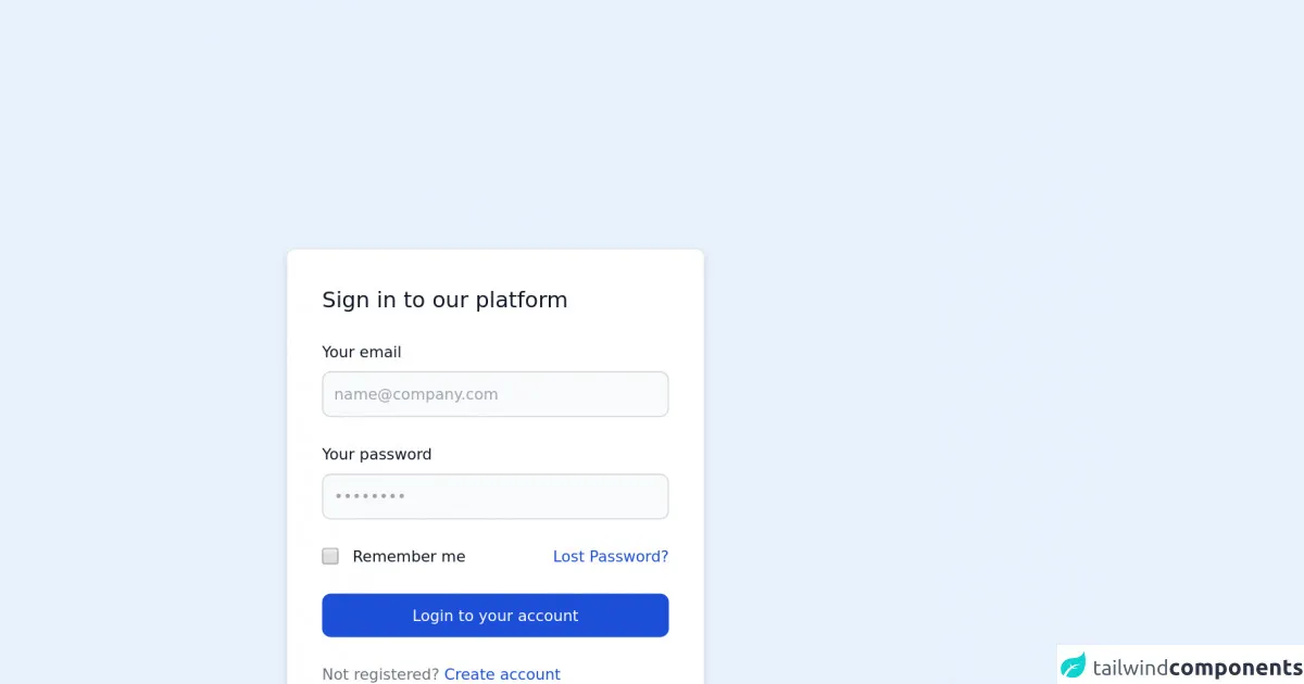
The preview of Tailwind CSS Login Card ui component
To create a Tailwind CSS Login Card, we will be using a combination of pre-defined CSS classes and custom styles. The end result will be a login card that has a clean and modern design.
Free download of the Tailwind CSS Login Card's source code
The source code of Tailwind CSS Login Card ui component
To create a Tailwind CSS Login Card, we will be using HTML and CSS code. The HTML code will define the structure of the login card, while the CSS code will define the styles.
<!-- This is an example component -->
<div class="max-w-2xl mx-auto">
	<div
		class="bg-white shadow-md border border-gray-200 rounded-lg max-w-sm p-4 sm:p-6 lg:p-8 dark:bg-gray-800 dark:border-gray-700">
		<form class="space-y-6" action="#">
			<h3 class="text-xl font-medium text-gray-900 dark:text-white">Sign in to our platform</h3>
			<div>
				<label for="email" class="text-sm font-medium text-gray-900 block mb-2 dark:text-gray-300">Your email</label>
				<input type="email" name="email" id="email" class="bg-gray-50 border border-gray-300 text-gray-900 sm:text-sm rounded-lg focus:ring-blue-500 focus:border-blue-500 block w-full p-2.5 dark:bg-gray-600 dark:border-gray-500 dark:placeholder-gray-400 dark:text-white" placeholder="[email protected]" required="">
            </div>
				<div>
					<label for="password" class="text-sm font-medium text-gray-900 block mb-2 dark:text-gray-300">Your password</label>
					<input type="password" name="password" id="password" placeholder="••••••••" class="bg-gray-50 border border-gray-300 text-gray-900 sm:text-sm rounded-lg focus:ring-blue-500 focus:border-blue-500 block w-full p-2.5 dark:bg-gray-600 dark:border-gray-500 dark:placeholder-gray-400 dark:text-white" required="">
                </div>
					<div class="flex items-start">
						<div class="flex items-start">
							<div class="flex items-center h-5">
								<input id="remember" aria-describedby="remember" type="checkbox" class="bg-gray-50 border border-gray-300 focus:ring-3 focus:ring-blue-300 h-4 w-4 rounded dark:bg-gray-700 dark:border-gray-600 dark:focus:ring-blue-600 dark:ring-offset-gray-800" required="">
                            </div>
								<div class="text-sm ml-3">
									<label for="remember" class="font-medium text-gray-900 dark:text-gray-300">Remember me</label>
								</div>
							</div>
							<a href="#" class="text-sm text-blue-700 hover:underline ml-auto dark:text-blue-500">Lost
								Password?</a>
						</div>
						<button type="submit" class="w-full text-white bg-blue-700 hover:bg-blue-800 focus:ring-4 focus:ring-blue-300 font-medium rounded-lg text-sm px-5 py-2.5 text-center dark:bg-blue-600 dark:hover:bg-blue-700 dark:focus:ring-blue-800">Login to your account</button>
						<div class="text-sm font-medium text-gray-500 dark:text-gray-300">
							Not registered? <a href="#" class="text-blue-700 hover:underline dark:text-blue-500">Create
								account</a>
						</div>
		</form>
	</div>


	<p class="mt-5">This card component is part of a larger, open-source library of Tailwind CSS components. Learn more
		by going to the official <a class="text-blue-600 hover:underline"
			href="https://flowbite.com/docs/getting-started/introduction/" target="_blank">Flowbite Documentation</a>.
	</p>
</div>
How to create a Tailwind CSS Login Card with Tailwind CSS?
To create a Tailwind CSS Login Card, follow these steps:
Step 1: Set up your HTML file
Create an HTML file and add the following code:
<div class="bg-white rounded-lg shadow-lg p-6">
  <h2 class="text-2xl font-bold mb-6">Login</h2>
  <form>
    <div class="mb-4">
      <label class="block text-gray-700 font-bold mb-2" for="username">
        Username
      </label>
      <input
        class="appearance-none border rounded w-full py-2 px-3 text-gray-700 leading-tight focus:outline-none focus:shadow-outline"
        id="username"
        type="text"
        placeholder="Username"
      />
    </div>
    <div class="mb-6">
      <label class="block text-gray-700 font-bold mb-2" for="password">
        Password
      </label>
      <input
        class="appearance-none border rounded w-full py-2 px-3 text-gray-700 leading-tight focus:outline-none focus:shadow-outline"
        id="password"
        type="password"
        placeholder="Password"
      />
    </div>
    <div class="flex items-center justify-between">
      <button
        class="bg-blue-500 hover:bg-blue-700 text-white font-bold py-2 px-4 rounded focus:outline-none focus:shadow-outline"
        type="button"
      >
        Sign In
      </button>
      <a class="inline-block align-baseline font-bold text-sm text-blue-500 hover:text-blue-800" href="#">
        Forgot Password?
      </a>
    </div>
  </form>
</div>
Step 2: Add Tailwind CSS to your project
Add the following code to the head section of your HTML file to include Tailwind CSS:
<link href="https://cdn.jsdelivr.net/npm/[email protected]/dist/tailwind.min.css" rel="stylesheet">
Step 3: Customize your styles
You can customize your styles by modifying the pre-defined CSS classes or by adding your own custom styles. For example, you can change the background color of the login card by adding the following code to the head section of your HTML file:
<style>
  .bg-white {
    background-color: #f0f4f8;
  }
</style>
Conclusion
In this article, we have learned how to create a Tailwind CSS Login Card. By using pre-defined CSS classes and custom styles, we were able to create a login card that has a clean and modern design. Tailwind CSS is a powerful tool that can help you quickly build custom user interfaces without having to write CSS code from scratch.