- Published on
6 Easy Ways To Build A Tailwind CSS form With Tailwind CSS Without Even Thinking About It
- What is Tailwind CSS?
- The Description of Tailwind CSS Form UI Component
- Why Use Tailwind CSS to Create a Tailwind CSS Form UI Component?
- The Preview of Tailwind CSS Form UI Component
- The Source Code of Tailwind CSS Form UI Component
- How to Create a Tailwind CSS Form with Tailwind CSS?
- 1. Create a Basic Form
- 2. Create a Horizontal Form
- 3. Create a Stacked Form
- 4. Create a Rounded Form
- 5. Create a Shadowed Form
- 6. Create a Colored Form
- Conclusion
As a FrontEnd technology blogger, you might have heard about Tailwind CSS, a utility-first CSS framework that allows you to create custom designs without writing any CSS code. In this article, we will discuss how to build a Tailwind CSS form without even thinking about it.
What is Tailwind CSS?
Tailwind CSS is a utility-first CSS framework that provides a set of pre-defined classes that you can use to create custom designs without writing any CSS code. It is a highly customizable framework that allows you to create unique designs for your website or application.
The Description of Tailwind CSS Form UI Component
A form is an essential UI component that allows users to input data into a website or application. Tailwind CSS provides a set of pre-defined classes that you can use to create a form UI component quickly. These classes include form inputs, labels, buttons, and more.
Why Use Tailwind CSS to Create a Tailwind CSS Form UI Component?
Tailwind CSS provides a set of pre-defined classes that allow you to create a form UI component quickly without writing any CSS code. This saves you time and effort, allowing you to focus on other aspects of your website or application.
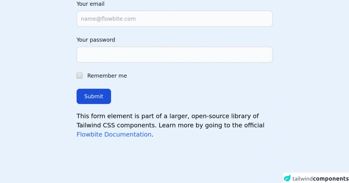
The Preview of Tailwind CSS Form UI Component
Creating a Tailwind CSS form is easy. You can use the pre-defined classes to create inputs, labels, buttons, and more. Here is an example of what a Tailwind CSS form might look like:
Free download of the Tailwind CSS form's source code
The Source Code of Tailwind CSS Form UI Component
To create a Tailwind CSS form, you need to use the pre-defined classes that Tailwind CSS provides. Here is an example of what the HTML code for a Tailwind CSS form might look like:
<!-- This is an example component -->
<div class="max-w-lg mx-auto">

    <form>
        <div class="mb-6">
            <label for="email" class="text-sm font-medium text-gray-900 block mb-2">Your email</label>
            <input type="email" id="email" class="bg-gray-50 border border-gray-300 text-gray-900 sm:text-sm rounded-lg focus:ring-blue-500 focus:border-blue-500 block w-full p-2.5" placeholder="[email protected]" required="">
        </div>
        <div class="mb-6">
            <label for="password" class="text-sm font-medium text-gray-900 block mb-2">Your password</label>
            <input type="password" id="password" class="bg-gray-50 border border-gray-300 text-gray-900 sm:text-sm rounded-lg focus:ring-blue-500 focus:border-blue-500 block w-full p-2.5" required="">
        </div>
        <div class="flex items-start mb-6">
            <div class="flex items-center h-5">
            <input id="remember" aria-describedby="remember" type="checkbox" class="bg-gray-50 border-gray-300 focus:ring-3 focus:ring-blue-300 h-4 w-4 rounded" required="">
            </div>
            <div class="text-sm ml-3">
            <label for="remember" class="font-medium text-gray-900">Remember me</label>
            </div>
        </div>
        <button type="submit" class="text-white bg-blue-700 hover:bg-blue-800 focus:ring-4 focus:ring-blue-300 font-medium rounded-lg text-sm px-5 py-2.5 text-center">Submit</button>
    </form>

    <p class="mt-5">This form element is part of a larger, open-source library of Tailwind CSS components. Learn more by going to the official <a class="text-blue-600 hover:underline" href="https://flowbite.com/docs/getting-started/introduction/" target="_blank">Flowbite Documentation</a>.</p>
</div>

<script src="https://unpkg.com/@themesberg/flowbite@latest/dist/flowbite.bundle.js"></script>
How to Create a Tailwind CSS Form with Tailwind CSS?
Creating a Tailwind CSS form is easy. Here are six easy ways to build a Tailwind CSS form with Tailwind CSS without even thinking about it:
1. Create a Basic Form
To create a basic form, you need to use the form and input classes. Here is an example of what the HTML code for a basic form might look like:
<form class="bg-white p-6 rounded-lg shadow-md">
  <label class="block mb-2 font-bold text-gray-700" for="username">
    Username
  </label>
  <input class="w-full px-3 py-2 mb-6 text-gray-700 border rounded-lg focus:outline-none focus:border-blue-500" type="text" id="username" name="username" placeholder="Enter your username">
  <button class="px-4 py-2 font-bold text-white bg-blue-500 rounded-lg hover:bg-blue-700 focus:outline-none focus:shadow-outline-blue active:bg-blue-800">
    Submit
  </button>
</form>
2. Create a Horizontal Form
To create a horizontal form, you need to use the form and input classes with the flex and items-center classes. Here is an example of what the HTML code for a horizontal form might look like:
<form class="bg-white p-6 rounded-lg shadow-md">
  <div class="flex items-center mb-6">
    <label class="w-1/3 font-bold text-gray-700" for="username">
      Username
    </label>
    <input class="w-full px-3 py-2 text-gray-700 border rounded-lg focus:outline-none focus:border-blue-500" type="text" id="username" name="username" placeholder="Enter your username">
  </div>
  <button class="px-4 py-2 font-bold text-white bg-blue-500 rounded-lg hover:bg-blue-700 focus:outline-none focus:shadow-outline-blue active:bg-blue-800">
    Submit
  </button>
</form>
3. Create a Stacked Form
To create a stacked form, you need to use the form and input classes with the flex-col class. Here is an example of what the HTML code for a stacked form might look like:
<form class="bg-white p-6 rounded-lg shadow-md">
  <label class="block mb-2 font-bold text-gray-700" for="username">
    Username
  </label>
  <input class="w-full px-3 py-2 mb-6 text-gray-700 border rounded-lg focus:outline-none focus:border-blue-500" type="text" id="username" name="username" placeholder="Enter your username">
  <button class="px-4 py-2 font-bold text-white bg-blue-500 rounded-lg hover:bg-blue-700 focus:outline-none focus:shadow-outline-blue active:bg-blue-800">
    Submit
  </button>
</form>
4. Create a Rounded Form
To create a rounded form, you need to use the form and input classes with the rounded-full class. Here is an example of what the HTML code for a rounded form might look like:
<form class="bg-white p-6 rounded-full shadow-md">
  <label class="block mb-2 font-bold text-gray-700" for="username">
    Username
  </label>
  <input class="w-full px-3 py-2 mb-6 text-gray-700 border rounded-full focus:outline-none focus:border-blue-500" type="text" id="username" name="username" placeholder="Enter your username">
  <button class="px-4 py-2 font-bold text-white bg-blue-500 rounded-full hover:bg-blue-700 focus:outline-none focus:shadow-outline-blue active:bg-blue-800">
    Submit
  </button>
</form>
5. Create a Shadowed Form
To create a shadowed form, you need to use the form and input classes with the shadow-lg class. Here is an example of what the HTML code for a shadowed form might look like:
<form class="bg-white p-6 rounded-lg shadow-lg">
  <label class="block mb-2 font-bold text-gray-700" for="username">
    Username
  </label>
  <input class="w-full px-3 py-2 mb-6 text-gray-700 border rounded-lg focus:outline-none focus:border-blue-500" type="text" id="username" name="username" placeholder="Enter your username">
  <button class="px-4 py-2 font-bold text-white bg-blue-500 rounded-lg hover:bg-blue-700 focus:outline-none focus:shadow-outline-blue active:bg-blue-800">
    Submit
  </button>
</form>
6. Create a Colored Form
To create a colored form, you need to use the form and input classes with a custom color class. Here is an example of what the HTML code for a colored form might look like:
<form class="bg-red-500 p-6 rounded-lg shadow-md">
  <label class="block mb-2 font-bold text-white" for="username">
    Username
  </label>
  <input class="w-full px-3 py-2 mb-6 text-white border rounded-lg focus:outline-none focus:border-blue-500" type="text" id="username" name="username" placeholder="Enter your username">
  <button class="px-4 py-2 font-bold text-white bg-blue-500 rounded-lg hover:bg-blue-700 focus:outline-none focus:shadow-outline-blue active:bg-blue-800">
    Submit
  </button>
</form>
Conclusion
In conclusion, Tailwind CSS is a powerful utility-first CSS framework that allows you to create custom designs without writing any CSS code. Creating a Tailwind CSS form is easy, and you can use pre-defined classes to create inputs, labels, buttons, and more. With these six easy ways to build a Tailwind CSS form with Tailwind CSS without even thinking about it, you can create a custom form UI component quickly and efficiently.