- Published on
How To Create A Tailwind CSS Footer Logo With Tailwind CSS In 5 Easy Steps
- What is Tailwind CSS?
- The description of Tailwind CSS Footer Logo ui component
- Why use Tailwind CSS to create a Tailwind CSS Footer Logo ui component?
- The preview of Tailwind CSS Footer Logo ui component.
- The source code of Tailwind CSS Footer Logo ui component.
- How to create a Tailwind CSS Footer Logo with Tailwind CSS?
- Step 1: Create a new HTML file
- Step 2: Add the Tailwind CSS CDN
- Step 3: Add the necessary classes
- Step 4: Add your logo
- Step 5: Customize the design
- Conclusion
What is Tailwind CSS?
Tailwind CSS is a utility-first CSS framework that allows you to quickly build custom designs without having to write any CSS. It comes with a set of pre-defined classes that you can use to style your HTML elements.
The description of Tailwind CSS Footer Logo ui component
A footer logo is a common UI component that is often found at the bottom of a web page. It typically includes a logo or icon, along with some text or a tagline. In this tutorial, we will be creating a footer logo using Tailwind CSS.
Why use Tailwind CSS to create a Tailwind CSS Footer Logo ui component?
Tailwind CSS makes it easy to create custom designs without having to write any CSS. By using pre-defined classes, you can quickly style your HTML elements and create a consistent design across your website. This saves time and allows you to focus on the functionality of your website.
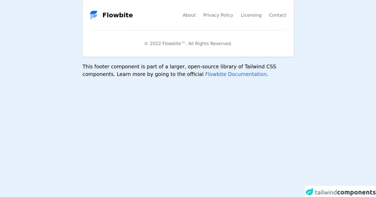
The preview of Tailwind CSS Footer Logo ui component.
To create a Tailwind CSS Footer Logo, we will be using the following classes:
flex: This class sets the display property to flex, allowing us to create a flexible layout.items-center: This class centers the items horizontally within the container.justify-between: This class evenly distributes the items within the container.py-4: This class adds padding to the top and bottom of the container.bg-gray-900: This class sets the background color of the container to gray.text-white: This class sets the text color to white.
Free download of the Tailwind CSS Footer Logo's source code
The source code of Tailwind CSS Footer Logo ui component.
To create a Tailwind CSS Footer Logo, we will be using the following HTML code:
<footer class="flex items-center justify-between py-4 bg-gray-900 text-white">
  <div>
    <img src="logo.png" alt="Logo" class="h-8">
  </div>
  <div>
    <p>Copyright © 2021</p>
  </div>
</footer>
To style this HTML code using Tailwind CSS, we will be using the following classes:
h-8: This class sets the height of the image to 8 pixels.
<!-- This is an example component -->
<div class="max-w-2xl mx-auto">

	<footer class="p-4 bg-white rounded-lg shadow md:px-6 md:py-8 dark:bg-gray-800">
		<div class="sm:flex sm:items-center sm:justify-between">
			<a href="https://flowbite.com" target="_blank" class="flex items-center mb-4 sm:mb-0">
				<img src="https://flowbite.com/docs/images/logo.svg" class="mr-4 h-8" alt="Flowbite Logo" />
				<span class="self-center text-xl font-semibold whitespace-nowrap dark:text-white">Flowbite</span>
			</a>
			<ul class="flex flex-wrap items-center mb-6 sm:mb-0">
				<li>
					<a href="#" class="mr-4 text-sm text-gray-500 hover:underline md:mr-6 dark:text-gray-400">About</a>
				</li>
				<li>
					<a href="#" class="mr-4 text-sm text-gray-500 hover:underline md:mr-6 dark:text-gray-400">Privacy
						Policy</a>
				</li>
				<li>
					<a href="#"
						class="mr-4 text-sm text-gray-500 hover:underline md:mr-6 dark:text-gray-400">Licensing</a>
				</li>
				<li>
					<a href="#" class="text-sm text-gray-500 hover:underline dark:text-gray-400">Contact</a>
				</li>
			</ul>
		</div>
		<hr class="my-6 border-gray-200 sm:mx-auto dark:border-gray-700 lg:my-8" />
		<span class="block text-sm text-gray-500 sm:text-center dark:text-gray-400">© 2022 <a href="https://flowbite.com" target="_blank" class="hover:underline">Flowbite™</a>. All Rights Reserved.
    </span>
	</footer>

	<p class="mt-5">This footer component is part of a larger, open-source library of Tailwind CSS components. Learn
		more
		by going to the official <a class="text-blue-600 hover:underline"
			href="https://flowbite.com/docs/getting-started/introduction/" target="_blank">Flowbite Documentation</a>.
	</p>
</div>
How to create a Tailwind CSS Footer Logo with Tailwind CSS?
Follow these 5 easy steps to create a Tailwind CSS Footer Logo:
Step 1: Create a new HTML file
Create a new HTML file and add the following code:
<!DOCTYPE html>
<html lang="en">
<head>
  <meta charset="UTF-8">
  <title>Tailwind CSS Footer Logo</title>
  <link rel="stylesheet" href="https://cdn.jsdelivr.net/npm/[email protected]/dist/tailwind.min.css">
</head>
<body>
  <footer class="flex items-center justify-between py-4 bg-gray-900 text-white">
    <div>
      <img src="logo.png" alt="Logo" class="h-8">
    </div>
    <div>
      <p>Copyright © 2021</p>
    </div>
  </footer>
</body>
</html>
Step 2: Add the Tailwind CSS CDN
Add the Tailwind CSS CDN to your HTML file by adding the following line inside the head tag:
<link rel="stylesheet" href="https://cdn.jsdelivr.net/npm/[email protected]/dist/tailwind.min.css">
Step 3: Add the necessary classes
Add the necessary classes to your footer element to style it using Tailwind CSS:
<footer class="flex items-center justify-between py-4 bg-gray-900 text-white">
  <div>
    <img src="logo.png" alt="Logo" class="h-8">
  </div>
  <div>
    <p>Copyright © 2021</p>
  </div>
</footer>
Step 4: Add your logo
Replace the src attribute of the img tag with the path to your logo file:
<img src="logo.png" alt="Logo" class="h-8">
Step 5: Customize the design
Customize the design of your footer logo by changing the classes or adding your own custom classes.
Conclusion
Creating a Tailwind CSS Footer Logo is easy and can be done in just a few steps. By using pre-defined classes, you can quickly style your HTML elements and create a consistent design across your website. Tailwind CSS is a powerful tool that can save you time and allow you to focus on the functionality of your website.