- Published on
Imagine You Build A Tailwind CSS checkbox With Tailwind CSS Like An Expert. Follow These 6 Steps To Get There
- What is Tailwind CSS?
- The description of Tailwind CSS checkbox ui component
- Why use Tailwind CSS to create a Tailwind CSS checkbox ui component?
- The preview of Tailwind CSS checkbox ui component.
- The source code of Tailwind CSS checkbox ui component.
- How to create a Tailwind CSS checkbox with Tailwind CSS?
- Conclusion.
Tailwind CSS is a utility-first CSS framework that allows you to design your web pages with ease. It provides you with a set of pre-defined classes that you can use to style your HTML elements. In this article, we will learn how to create a Tailwind CSS checkbox with Tailwind CSS.
What is Tailwind CSS?
Tailwind CSS is a CSS framework that provides you with a set of pre-defined classes that you can use to style your HTML elements. It is a utility-first CSS framework, which means that it focuses on providing you with utility classes that you can use to style your HTML elements.
The description of Tailwind CSS checkbox ui component
A checkbox is a UI component that allows users to select one or more options from a set of options. It is a common UI component that is used in many web applications. A Tailwind CSS checkbox is a checkbox that is styled using Tailwind CSS classes.
Why use Tailwind CSS to create a Tailwind CSS checkbox ui component?
Tailwind CSS provides you with a set of pre-defined classes that you can use to style your HTML elements. It is a utility-first CSS framework, which means that it focuses on providing you with utility classes that you can use to style your HTML elements. This makes it easy to create a Tailwind CSS checkbox with Tailwind CSS.
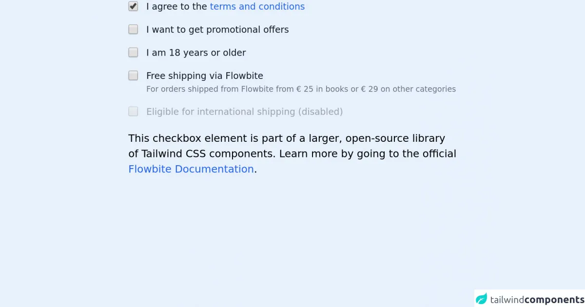
The preview of Tailwind CSS checkbox ui component.
To create a Tailwind CSS checkbox, we will use the following classes:
form-checkbox: This class is used to style the checkbox element.text-[color]: This class is used to set the color of the text.bg-[color]: This class is used to set the background color of the element.border-[color]: This class is used to set the border color of the element.rounded: This class is used to round the corners of the element.
Free download of the Tailwind CSS checkbox's source code
The source code of Tailwind CSS checkbox ui component.
To create a Tailwind CSS checkbox, we will use the following HTML code:
<label class="inline-flex items-center">
  <input type="checkbox" class="form-checkbox text-[color] bg-[color] border-[color] rounded" />
  <span class="ml-2">Label</span>
</label>
To create a Tailwind CSS checkbox with a checked state, we can add the checked attribute to the input element:
<label class="inline-flex items-center">
  <input type="checkbox" class="form-checkbox text-[color] bg-[color] border-[color] rounded" checked />
  <span class="ml-2">Label</span>
</label>
<!-- This is an example component -->
<div class="max-w-lg mx-auto">

    <fieldset class="mb-5">
        <legend class="sr-only">Checkbox variants</legend>

        <div class="flex items-center items-start mb-4">
            <input id="checkbox-1" aria-describedby="checkbox-1" type="checkbox" class="bg-gray-50 border-gray-300 focus:ring-3 focus:ring-blue-300 h-4 w-4 rounded" checked="">
            <label for="checkbox-1" class="text-sm ml-3 font-medium text-gray-900">I agree to the <a href="#" class="text-blue-600 hover:underline">terms and conditions</a></label>
        </div>

        <div class="flex items-start items-center mb-4">
            <input id="checkbox-2" aria-describedby="checkbox-2" type="checkbox" class="bg-gray-50 border-gray-300 focus:ring-3 focus:ring-blue-300 h-4 w-4 rounded">
            <label for="checkbox-2" class="text-sm ml-3 font-medium text-gray-900">I want to get promotional offers</label>
        </div>

        <div class="flex items-start items-center mb-4">
            <input id="checkbox-3" aria-describedby="checkbox-3" type="checkbox" class="bg-gray-50 border-gray-300 focus:ring-3 focus:ring-blue-300 h-4 w-4 rounded">
            <label for="checkbox-3" class="text-sm ml-3 font-medium text-gray-900">I am 18 years or older</label>
        </div>

        <div class="flex items-start mb-4">
            <div class="flex items-center h-5">
            <input id="shipping-2" aria-describedby="shipping-2" type="checkbox" class="bg-gray-50 border-gray-300 focus:ring-3 focus:ring-blue-300 h-4 w-4 rounded">
            </div>
            <div class="text-sm ml-3">
            <label for="shipping-2" class="font-medium text-gray-900">Free shipping via Flowbite</label>
            <div class="text-gray-500"><span class="font-normal text-xs">For orders shipped from Flowbite from <span class="font-medium">€ 25</span> in books or <span>€ 29</span> on other categories</span></div>
            </div>
        </div>

        <div class="flex items-start items-center">
            <input id="international-shipping-disabled" aria-describedby="international-shipping-disabled" type="checkbox" class="bg-gray-50 border-gray-300 focus:ring-3 focus:ring-blue-300 h-4 w-4 rounded" disabled="">
            <label for="international-shipping-disabled" class="text-sm ml-3 font-medium text-gray-400">Eligible for international shipping (disabled)</label>
        </div>
    </fieldset>

    <p class="mt-5">This checkbox element is part of a larger, open-source library of Tailwind CSS components. Learn more by going to the official <a class="text-blue-600 hover:underline" href="https://flowbite.com/docs/getting-started/introduction/" target="_blank">Flowbite Documentation</a>.</p>
</div>

<script src="https://unpkg.com/@themesberg/flowbite@latest/dist/flowbite.bundle.js"></script>
How to create a Tailwind CSS checkbox with Tailwind CSS?
To create a Tailwind CSS checkbox, follow these steps:
- Create a new HTML file and add the following code:
<!DOCTYPE html>
<html>
<head>
  <title>Tailwind CSS Checkbox</title>
  <link rel="stylesheet" href="https://cdnjs.cloudflare.com/ajax/libs/tailwindcss/2.2.7/tailwind.min.css">
</head>
<body>
  <label class="inline-flex items-center">
    <input type="checkbox" class="form-checkbox text-[color] bg-[color] border-[color] rounded" />
    <span class="ml-2">Label</span>
  </label>
</body>
</html>
Replace
[color]with the color that you want to use for your checkbox. For example, if you want to use the color red, replace[color]withred.Save the file and open it in your web browser. You should see a Tailwind CSS checkbox.
Conclusion.
In this article, we learned how to create a Tailwind CSS checkbox with Tailwind CSS. We used the form-checkbox, text-[color], bg-[color], border-[color], and rounded classes to style the checkbox element. We also learned how to create a checked state for the checkbox. With these steps, you can create a Tailwind CSS checkbox like an expert.