- Published on
What You Need To Create A Tailwind CSS Cards With Tailwind CSS
- The description of Tailwind CSS Cards ui component
- Why use Tailwind CSS to create a Tailwind CSS Cards ui component?
- The preview of Tailwind CSS Cards ui component
- The source code of Tailwind CSS Cards ui component
- How to create a Tailwind CSS Cards with Tailwind CSS?
- Conclusion
Tailwind CSS is a utility-first CSS framework that allows developers to create user interfaces quickly and efficiently. It provides a set of pre-defined CSS classes that can be used to style HTML elements without writing any custom CSS code. Tailwind CSS is highly customizable, and developers can easily modify the default styles to match their project's design requirements.
The description of Tailwind CSS Cards ui component
A card is a common UI component used to display content in a structured and organized way. Tailwind CSS provides a set of pre-defined classes that can be used to create beautiful and responsive cards quickly. The Tailwind CSS Cards UI component includes several pre-designed card styles that can be customized to match your project's design requirements.
Why use Tailwind CSS to create a Tailwind CSS Cards ui component?
Tailwind CSS provides a set of pre-defined classes that can be used to create beautiful and responsive UI components quickly. The Tailwind CSS Cards UI component includes several pre-designed card styles that can be customized to match your project's design requirements. Using Tailwind CSS to create a Tailwind CSS Cards UI component saves time and effort, as developers do not need to write custom CSS code.
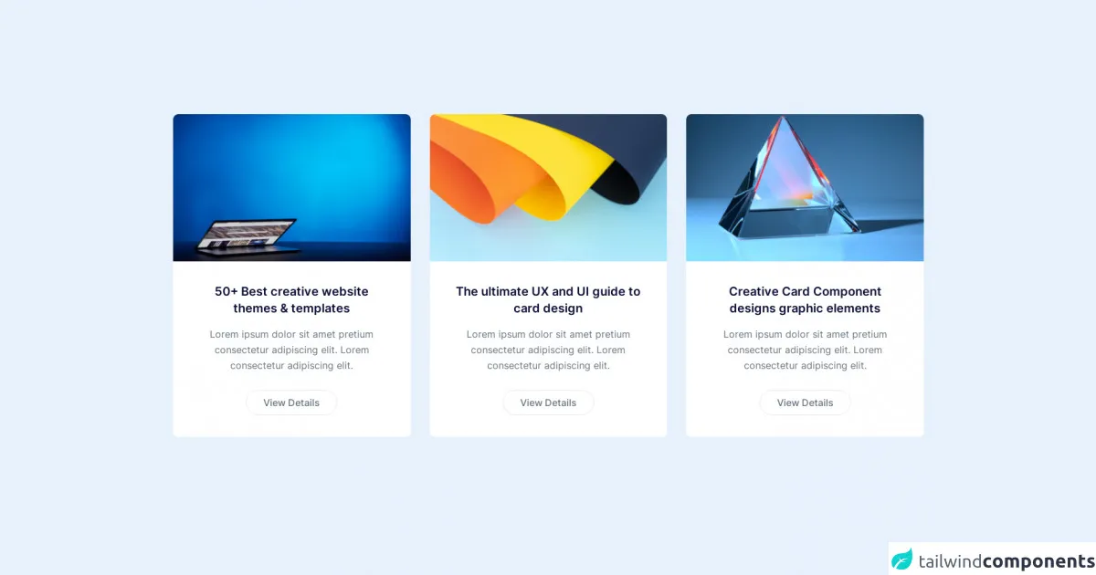
The preview of Tailwind CSS Cards ui component
Tailwind CSS Cards UI component includes several pre-designed card styles that can be customized to match your project's design requirements. The cards can be used to display various types of content, including images, text, and links. The cards are responsive and can be used on different screen sizes.
Free download of the Tailwind CSS Cards's source code
The source code of Tailwind CSS Cards ui component
The source code of the Tailwind CSS Cards UI component includes HTML and CSS code. The HTML code includes the card structure, and the CSS code includes the styles for the cards. The CSS code uses Tailwind CSS classes to style the cards.
<link rel="stylesheet" href="https://cdn.tailgrids.com/tailgrids-fallback.css" />

<!-- ====== Cards Section Start -->
<section class="pt-20 lg:pt-[120px] pb-10 lg:pb-20 bg-[#F3F4F6]">
   <div class="container">
      <div class="flex flex-wrap -mx-4">
         <div class="w-full md:w-1/2 xl:w-1/3 px-4">
            <div class="bg-white rounded-lg overflow-hidden mb-10">
               <img
                  src="https://cdn.tailgrids.com/1.0/assets/images/cards/card-01/image-01.jpg"
                  alt="image"
                  class="w-full"
                  />
               <div class="p-8 sm:p-9 md:p-7 xl:p-9 text-center">
                  <h3>
                     <a
                        href="javascript:void(0)"
                        class="
                        font-semibold
                        text-dark text-xl
                        sm:text-[22px]
                        md:text-xl
                        lg:text-[22px]
                        xl:text-xl
                        2xl:text-[22px]
                        mb-4
                        block
                        hover:text-primary
                        "
                        >
                     50+ Best creative website themes & templates
                     </a>
                  </h3>
                  <p class="text-base text-body-color leading-relaxed mb-7">
                     Lorem ipsum dolor sit amet pretium consectetur adipiscing
                     elit. Lorem consectetur adipiscing elit.
                  </p>
                  <a
                     href="javascript:void(0)"
                     class="
                     inline-block
                     py-2
                     px-7
                     border border-[#E5E7EB]
                     rounded-full
                     text-base text-body-color
                     font-medium
                     hover:border-primary hover:bg-primary hover:text-white
                     transition
                     "
                     >
                  View Details
                  </a>
               </div>
            </div>
         </div>
         <div class="w-full md:w-1/2 xl:w-1/3 px-4">
            <div class="bg-white rounded-lg overflow-hidden mb-10">
               <img
                  src="https://cdn.tailgrids.com/1.0/assets/images/cards/card-01/image-02.jpg"
                  alt="image"
                  class="w-full"
                  />
               <div class="p-8 sm:p-9 md:p-7 xl:p-9 text-center">
                  <h3>
                     <a
                        href="javascript:void(0)"
                        class="
                        font-semibold
                        text-dark text-xl
                        sm:text-[22px]
                        md:text-xl
                        lg:text-[22px]
                        xl:text-xl
                        2xl:text-[22px]
                        mb-4
                        block
                        hover:text-primary
                        "
                        >
                     The ultimate UX and UI guide to card design
                     </a>
                  </h3>
                  <p class="text-base text-body-color leading-relaxed mb-7">
                     Lorem ipsum dolor sit amet pretium consectetur adipiscing
                     elit. Lorem consectetur adipiscing elit.
                  </p>
                  <a
                     href="javascript:void(0)"
                     class="
                     inline-block
                     py-2
                     px-7
                     border border-[#E5E7EB]
                     rounded-full
                     text-base text-body-color
                     font-medium
                     hover:border-primary hover:bg-primary hover:text-white
                     transition
                     "
                     >
                  View Details
                  </a>
               </div>
            </div>
         </div>
         <div class="w-full md:w-1/2 xl:w-1/3 px-4">
            <div class="bg-white rounded-lg overflow-hidden mb-10">
               <img
                  src="https://cdn.tailgrids.com/1.0/assets/images/cards/card-01/image-03.jpg"
                  alt="image"
                  class="w-full"
                  />
               <div class="p-8 sm:p-9 md:p-7 xl:p-9 text-center">
                  <h3>
                     <a
                        href="javascript:void(0)"
                        class="
                        font-semibold
                        text-dark text-xl
                        sm:text-[22px]
                        md:text-xl
                        lg:text-[22px]
                        xl:text-xl
                        2xl:text-[22px]
                        mb-4
                        block
                        hover:text-primary
                        "
                        >
                     Creative Card Component designs graphic elements
                     </a>
                  </h3>
                  <p class="text-base text-body-color leading-relaxed mb-7">
                     Lorem ipsum dolor sit amet pretium consectetur adipiscing
                     elit. Lorem consectetur adipiscing elit.
                  </p>
                  <a
                     href="javascript:void(0)"
                     class="
                     inline-block
                     py-2
                     px-7
                     border border-[#E5E7EB]
                     rounded-full
                     text-base text-body-color
                     font-medium
                     hover:border-primary hover:bg-primary hover:text-white
                     transition
                     "
                     >
                  View Details
                  </a>
               </div>
            </div>
         </div>
      </div>
   </div>
</section>
<!-- ====== Cards Section End -->
How to create a Tailwind CSS Cards with Tailwind CSS?
To create a Tailwind CSS Cards UI component, follow these steps:
- Create a new HTML file and add the necessary HTML structure for the card.
- Add the Tailwind CSS stylesheet to the HTML file.
- Add the necessary Tailwind CSS classes to the HTML elements to style the card.
- Customize the card styles as per your project's design requirements.
Here is an example of the HTML and CSS code for a basic Tailwind CSS card:
<div class="max-w-sm rounded overflow-hidden shadow-lg">
  <img class="w-full" src="/img/card-top.jpg" alt="Sunset in the mountains">
  <div class="px-6 py-4">
    <div class="font-bold text-xl mb-2">The Coldest Sunset</div>
    <p class="text-gray-700 text-base">
      Lorem ipsum dolor sit amet, consectetur adipisicing elit. Voluptatibus quia, nulla! Maiores et perferendis eaque, exercitationem praesentium nihil.
    </p>
  </div>
  <div class="px-6 pt-4 pb-2">
    <span class="inline-block bg-gray-200 rounded-full px-3 py-1 text-sm font-semibold text-gray-700 mr-2">#photography</span>
    <span class="inline-block bg-gray-200 rounded-full px-3 py-1 text-sm font-semibold text-gray-700 mr-2">#travel</span>
    <span class="inline-block bg-gray-200 rounded-full px-3 py-1 text-sm font-semibold text-gray-700">#winter</span>
  </div>
</div>
In the above code, the max-w-sm, rounded, overflow-hidden, and shadow-lg classes are used to style the card container. The w-full class is used to make the image full-width, and the px-6 and py-4 classes are used to add padding to the card content. The font-bold and text-xl classes are used to style the card title, and the text-gray-700 and text-base classes are used to style the card text. The px-6, pt-4, and pb-2 classes are used to add padding to the card footer, and the inline-block, bg-gray-200, rounded-full, px-3, py-1, text-sm, font-semibold, and text-gray-700 classes are used to style the card tags.
Conclusion
Tailwind CSS Cards UI component is a pre-designed set of cards that can be customized to match your project's design requirements. Using Tailwind CSS to create a Tailwind CSS Cards UI component saves time and effort, as developers do not need to write custom CSS code. The cards are responsive and can be used on different screen sizes. With Tailwind CSS, developers can create beautiful and responsive UI components quickly and efficiently.