- Published on
How To Build A Tailwind CSS Card: NBA Kobe Bryant With Tailwind CSS From Scratch
- What is Tailwind CSS?
- The description of Tailwind CSS Card: NBA Kobe Bryant ui component
- Why use Tailwind CSS to create a Tailwind CSS Card: NBA Kobe Bryant ui component?
- The preview of Tailwind CSS Card: NBA Kobe Bryant ui component
- The source code of Tailwind CSS Card: NBA Kobe Bryant ui component
- How to create a Tailwind CSS Card: NBA Kobe Bryant with Tailwind CSS?
- Step 1: Set up the HTML structure
- Step 2: Style the card using Tailwind CSS
- Step 3: Add responsive classes
- Conclusion
What is Tailwind CSS?
Tailwind CSS is a utility-first CSS framework that allows you to quickly design and customize your website without writing any CSS code. It provides a set of pre-defined CSS classes that you can use to style your HTML elements. With Tailwind CSS, you can easily create responsive and mobile-friendly websites.
The description of Tailwind CSS Card: NBA Kobe Bryant ui component
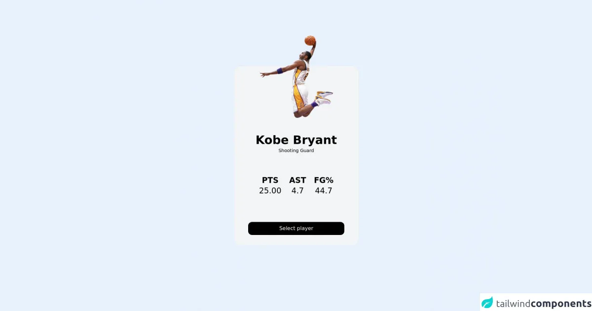
In this tutorial, we will create a Tailwind CSS card component for NBA Kobe Bryant. The card will display his image, name, position, and some statistics. The card will be responsive and mobile-friendly.
Why use Tailwind CSS to create a Tailwind CSS Card: NBA Kobe Bryant ui component?
Tailwind CSS is a great choice for creating UI components because it provides a set of pre-defined classes that you can use to style your HTML elements. This makes it easy to create consistent and responsive UI components without writing any custom CSS code. Additionally, Tailwind CSS is highly customizable, so you can easily modify the default styles to match your design requirements.
The preview of Tailwind CSS Card: NBA Kobe Bryant ui component
Free download of the Tailwind CSS Card: NBA Kobe Bryant's source code
The source code of Tailwind CSS Card: NBA Kobe Bryant ui component
<div class="flex h-screen w-screen items-center justify-center bg-gradient-to-bl from-violet-900 to-teal-400">
  <div class="p-8 w-96 cursor-pointer rounded-3xl bg-gray-100 transition duration-300 ease-in-out hover:scale-105 hover:drop-shadow-2xl">
    <div class="-mb-20 -translate-y-1/2 transform">
      <img src="https://i.ibb.co/JWTX98g/Seek-Png-com-kobe-bryant-png-109287.png" alt="Kobe Bryant" title="Kobe Bryant" class="mx-auto h-64" />
    </div>
    <div class="text-center">
      <h3 class="text-center text-4xl font-bold">Kobe Bryant</h3>
      <span class="text-sm">Shooting Guard</span>
    </div>
    <ul class="mt-16 mb-20 flex justify-center text-center text-2xl">
      <li class="flex flex-col"><span class="font-bold">PTS</span> 25.00</li>
      <li class="mx-6 flex flex-col"><span class="font-bold">AST</span> 4.7</li>
      <li class="flex flex-col"><span class="font-bold">FG%</span> 44.7</li>
    </ul>
    <div class="text-center">
      <button class="rounded-xl bg-black px-24 py-2 text-white">Select player</button>
    </div>
  </div>
</div>
How to create a Tailwind CSS Card: NBA Kobe Bryant with Tailwind CSS?
Step 1: Set up the HTML structure
The first step is to set up the HTML structure for the card. We will use a div element with a class of card to wrap all the card content. Inside the card div, we will create a div element with a class of image-container to display the image of Kobe Bryant. We will also create another div element with a class of content-container to display the name, position, and statistics.
<div class="card">
  <div class="image-container">
    <img src="kobe.jpg" alt="Kobe Bryant">
  </div>
  <div class="content-container">
    <h2 class="name">Kobe Bryant</h2>
    <p class="position">Shooting Guard</p>
    <ul class="stats">
      <li>Points per game: 25.0</li>
      <li>Assists per game: 4.7</li>
      <li>Rebounds per game: 5.2</li>
    </ul>
  </div>
</div>
Step 2: Style the card using Tailwind CSS
Now that we have set up the HTML structure, we can start styling the card using Tailwind CSS classes. We will use the following classes to style the card:
bg-white: sets the background color of the card to whiteshadow-md: adds a shadow to the card to give it depthrounded-lg: rounds the corners of the cardw-full: sets the width of the card to 100% to make it responsivemax-w-md: sets the maximum width of the card to 28rem to prevent it from becoming too wide on larger screensmx-auto: centers the card horizontally on the pagep-4: adds padding to the card to create some space between the content and the edges of the cardimage-container: sets the height of the image container to 18rem to create a fixed height for the imagecontent-container: sets the padding of the content container to 1rem to create some space between the content and the edges of the containername: sets the font size of the name to 2xl to make it stand outposition: sets the font size of the position to lg to make it slightly smaller than the namestats: sets the margin of the stats list to 0 and the padding to 0.5rem to create some space between the list items
<div class="card bg-white shadow-md rounded-lg w-full max-w-md mx-auto p-4">
  <div class="image-container h-48">
    <img src="kobe.jpg" alt="Kobe Bryant" class="object-cover w-full h-full rounded-lg">
  </div>
  <div class="content-container p-4">
    <h2 class="name text-2xl font-bold mb-2">Kobe Bryant</h2>
    <p class="position text-lg mb-4">Shooting Guard</p>
    <ul class="stats list-none m-0 p-0">
      <li>Points per game: 25.0</li>
      <li>Assists per game: 4.7</li>
      <li>Rebounds per game: 5.2</li>
    </ul>
  </div>
</div>
Step 3: Add responsive classes
Finally, we will add some responsive classes to make the card look good on different screen sizes. We will use the following classes to make the card responsive:
sm:p-6: adds more padding to the card on small screensmd:flex: changes the layout of the card to a row on medium screensmd:p-8: adds more padding to the card on medium screensmd:content-container: sets the width of the content container to 70% on medium screensmd:image-container: sets the width of the image container to 30% on medium screenslg:p-12: adds even more padding to the card on large screenslg:content-container: sets the width of the content container to 60% on large screenslg:image-container: sets the width of the image container to 40% on large screens
<div class="card bg-white shadow-md rounded-lg w-full max-w-md mx-auto p-4 sm:p-6 md:flex md:p-8">
  <div class="image-container h-48 md:w-1/3 lg:w-2/5">
    <img src="kobe.jpg" alt="Kobe Bryant" class="object-cover w-full h-full rounded-lg">
  </div>
  <div class="content-container p-4 md:w-2/3 lg:w-3/5">
    <h2 class="name text-2xl font-bold mb-2">Kobe Bryant</h2>
    <p class="position text-lg mb-4">Shooting Guard</p>
    <ul class="stats list-none m-0 p-0">
      <li>Points per game: 25.0</li>
      <li>Assists per game: 4.7</li>
      <li>Rebounds per game: 5.2</li>
    </ul>
  </div>
</div>
Conclusion
In this tutorial, we have learned how to create a Tailwind CSS card component for NBA Kobe Bryant. We have used Tailwind CSS classes to style the card and make it responsive. With Tailwind CSS, you can easily create custom UI components without writing any custom CSS code.