- Published on
6 Ideas To Help You Make A Tailwind CSS card With Tailwind CSS Like A Pro

- What is Tailwind CSS?
- The description of Tailwind CSS card ui component
- Why use Tailwind CSS to create a Tailwind CSS card ui component?
- The preview of Tailwind CSS card ui component.
- The source code of Tailwind CSS card ui component.
- How to create a Tailwind CSS card with Tailwind CSS?
- 1. Customize the background color
- 2. Add an image to the card
- 3. Add a header to the card
- 4. Add a footer to the card
- 5. Add a hover effect to the card
- 6. Make the card responsive
- Conclusion
What is Tailwind CSS?
Tailwind CSS is a utility-first CSS framework that allows developers to create responsive and customizable web designs with ease. With a focus on flexibility and efficiency, Tailwind CSS provides pre-defined classes that can be used to style HTML elements quickly and easily.
The description of Tailwind CSS card ui component
The card UI component is a popular design pattern that is used to display information in a visually appealing and organized way. A card typically consists of a header, body, and footer, and can be used to display a variety of content, such as images, text, and links.
Why use Tailwind CSS to create a Tailwind CSS card ui component?
Tailwind CSS provides a number of pre-defined classes that can be used to create a card UI component quickly and easily. By using Tailwind CSS, developers can save time and effort when creating a card UI component, and can focus on other aspects of their project.
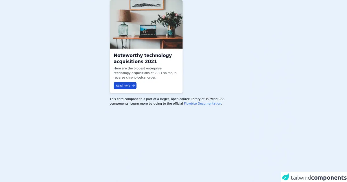
The preview of Tailwind CSS card ui component.
To create a Tailwind CSS card UI component, you can use the following classes:
bg-white: sets the background color of the card to white.rounded-lg: rounds the corners of the card.shadow-md: adds a drop shadow to the card.p-4: adds padding to the card.border: adds a border to the card.
Free download of the Tailwind CSS card's source code
The source code of Tailwind CSS card ui component.
To create a Tailwind CSS card UI component, you can use the following HTML code:
<div class="bg-white rounded-lg shadow-md p-4 border">
  <div class="font-bold text-lg mb-2">Card Title</div>
  <p class="text-gray-700 text-base">Lorem ipsum dolor sit amet, consectetur adipiscing elit. Fusce euismod justo vel mauris luctus, vel euismod mi lobortis. Sed vel magna ut eros malesuada malesuada.</p>
  <a href="#" class="text-blue-500">Read More</a>
</div>
<!-- This is an example component -->
<div class="max-w-2xl mx-auto">

    <div class="bg-white shadow-md border border-gray-200 rounded-lg max-w-sm dark:bg-gray-800 dark:border-gray-700">
        <a href="#">
            <img class="rounded-t-lg" src="https://flowbite.com/docs/images/blog/image-1.jpg" alt="">
        </a>
        <div class="p-5">
            <a href="#">
                <h5 class="text-gray-900 font-bold text-2xl tracking-tight mb-2 dark:text-white">Noteworthy technology acquisitions 2021</h5>
            </a>
            <p class="font-normal text-gray-700 mb-3 dark:text-gray-400">Here are the biggest enterprise technology acquisitions of 2021 so far, in reverse chronological order.</p>
            <a href="#" class="text-white bg-blue-700 hover:bg-blue-800 focus:ring-4 focus:ring-blue-300 font-medium rounded-lg text-sm px-3 py-2 text-center inline-flex items-center  dark:bg-blue-600 dark:hover:bg-blue-700 dark:focus:ring-blue-800">
                Read more
                <svg class="-mr-1 ml-2 h-4 w-4" fill="currentColor" viewBox="0 0 20 20" xmlns="http://www.w3.org/2000/svg"><path fill-rule="evenodd" d="M10.293 3.293a1 1 0 011.414 0l6 6a1 1 0 010 1.414l-6 6a1 1 0 01-1.414-1.414L14.586 11H3a1 1 0 110-2h11.586l-4.293-4.293a1 1 0 010-1.414z" clip-rule="evenodd"></path></svg>
            </a>
        </div>
    </div>

    <p class="mt-5">This card component is part of a larger, open-source library of Tailwind CSS components. Learn more by going to the official <a class="text-blue-600 hover:underline" href="https://flowbite.com/docs/getting-started/introduction/" target="_blank">Flowbite Documentation</a>.</p>
</div>
How to create a Tailwind CSS card with Tailwind CSS?
Here are six ideas to help you make a Tailwind CSS card with Tailwind CSS like a pro:
1. Customize the background color
You can customize the background color of the card by using one of Tailwind CSS's pre-defined background color classes, such as bg-red-500 or bg-blue-500.
2. Add an image to the card
You can add an image to the card by using the w-full and h-48 classes to set the width and height of the image, and the object-cover class to ensure that the image is scaled and cropped appropriately.
3. Add a header to the card
You can add a header to the card by using the font-bold and text-lg classes to set the font weight and size of the header text.
4. Add a footer to the card
You can add a footer to the card by using the border-t class to add a border to the top of the card, and the text-gray-700 class to set the color of the footer text.
5. Add a hover effect to the card
You can add a hover effect to the card by using the hover:shadow-lg class to add a larger drop shadow to the card when the user hovers over it.
6. Make the card responsive
You can make the card responsive by using Tailwind CSS's responsive classes, such as md:w-1/2 and lg:w-1/3, to set the width of the card at different screen sizes.
Conclusion
Tailwind CSS is a powerful tool for creating responsive and customizable web designs, and the card UI component is a popular design pattern that can be used to display information in a visually appealing and organized way. By using Tailwind CSS to create a card UI component, developers can save time and effort, and can focus on other aspects of their project. With these six ideas, you can make a Tailwind CSS card with Tailwind CSS like a pro.