- Published on
Surprisingly Effective Ways To Build A Tailwind CSS blog card With Tailwind CSS

- What is Tailwind CSS?
- The Description of Tailwind CSS Blog Card UI Component
- Why Use Tailwind CSS to Create a Tailwind CSS Blog Card UI Component?
- The Preview of Tailwind CSS Blog Card UI Component
- The Source Code of Tailwind CSS Blog Card UI Component
- How to Create a Tailwind CSS Blog Card with Tailwind CSS?
- Conclusion
As a FrontEnd technology blogger, you may already be familiar with Tailwind CSS. Tailwind CSS is a utility-first CSS framework that allows you to create custom designs without writing any CSS code. In this article, we will explore how to use Tailwind CSS to create a blog card UI component.
What is Tailwind CSS?
Tailwind CSS is a CSS framework that provides a set of pre-defined utility classes that you can use to style your HTML elements. It allows you to create custom designs without writing any CSS code. Tailwind CSS is a utility-first CSS framework, meaning that it provides a set of utility classes that you can use to style your HTML elements. You can use these utility classes to create custom designs without writing any CSS code.
The Description of Tailwind CSS Blog Card UI Component
A blog card is a UI component that is used to display a blog post. It typically includes an image, title, author, date, and a short description of the blog post. The blog card UI component is an essential part of any blog website. It helps to attract the reader's attention and encourages them to read the blog post.
Why Use Tailwind CSS to Create a Tailwind CSS Blog Card UI Component?
There are several reasons why you should use Tailwind CSS to create a blog card UI component. Firstly, Tailwind CSS provides a set of pre-defined utility classes that you can use to style your HTML elements. This means that you can create custom designs without writing any CSS code. Secondly, Tailwind CSS is easy to use and can save you a lot of time. You don't have to spend hours writing CSS code to create a custom design. Finally, Tailwind CSS is highly customizable. You can easily customize the design of your blog card UI component by modifying the utility classes.
The Preview of Tailwind CSS Blog Card UI Component
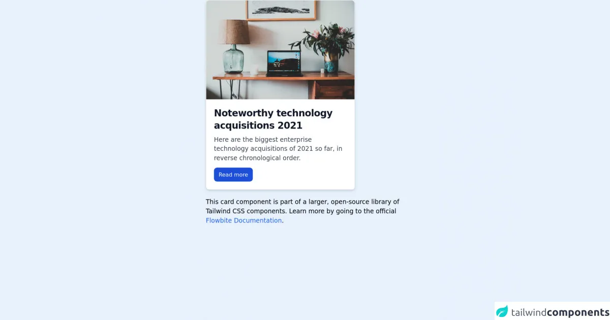
In this section, we will provide a preview of the Tailwind CSS blog card UI component. The blog card UI component includes an image, title, author, date, and a short description of the blog post. Here is a preview of the Tailwind CSS blog card UI component:
Free download of the Tailwind CSS blog card's source code
The Source Code of Tailwind CSS Blog Card UI Component
In this section, we will provide the source code of the Tailwind CSS blog card UI component. The source code includes HTML and CSS code. You can use this code as a starting point to create your own blog card UI component. Here is the source code of the Tailwind CSS blog card UI component:
<!-- This is an example component -->
<div class="max-w-lg mx-auto">
    <div class="bg-white shadow-md border border-gray-200 rounded-lg max-w-sm mb-5">
        <a href="#">
            <img class="rounded-t-lg" src="https://flowbite.com/docs/images/blog/image-1.jpg" alt="">
        </a>
        <div class="p-5">
            <a href="#">
                <h5 class="text-gray-900 font-bold text-2xl tracking-tight mb-2">Noteworthy technology acquisitions 2021</h5>
            </a>
            <p class="font-normal text-gray-700 mb-3">Here are the biggest enterprise technology acquisitions of 2021 so far, in reverse chronological order.</p>
            <a class="text-white bg-blue-700 hover:bg-blue-800 focus:ring-4 focus:ring-blue-300 font-medium rounded-lg text-sm px-3 py-2 text-center inline-flex items-center" href="#">
                Read more
            </a>
        </div>
    </div>
    <p>This card component is part of a larger, open-source library of Tailwind CSS components. Learn more by going to the official <a class="text-blue-600 hover:underline" href="https://flowbite.com/docs/getting-started/introduction/" target="_blank">Flowbite Documentation</a>.</p>
</div>
How to Create a Tailwind CSS Blog Card with Tailwind CSS?
Now that we have provided a preview and the source code of the Tailwind CSS blog card UI component, let's explore how to create a blog card with Tailwind CSS. Here are the steps to create a Tailwind CSS blog card:
- Create a new HTML file and add the required HTML elements for the blog card, including an image, title, author, date, and a short description of the blog post.
- Add the required utility classes from Tailwind CSS to style the HTML elements. You can use classes such as
bg-gray-100,text-gray-700,font-bold,text-sm, andp-4to style the blog card. - Customize the design of the blog card by modifying the utility classes. You can modify the font size, color, background color, padding, and margin of the blog card.
- Use the Tailwind CSS responsive utility classes to make the blog card responsive. You can use classes such as
sm:w-1/2andmd:w-1/3to make the blog card responsive on different screen sizes.
Conclusion
In this article, we have explored how to use Tailwind CSS to create a blog card UI component. We have provided a preview and the source code of the Tailwind CSS blog card UI component. We have also explored how to create a blog card with Tailwind CSS. Tailwind CSS is a powerful CSS framework that can save you a lot of time and effort when creating custom designs. We hope that this article has been helpful in showing you how to create a blog card with Tailwind CSS.