- Published on
How To Make A Tailwind CSS Alerts With Tailwind CSS In 6 Easy Steps?
- What is Tailwind CSS?
- The description of Tailwind CSS Alerts ui component
- Why use Tailwind CSS to create a Tailwind CSS Alerts ui component?
- The preview of Tailwind CSS Alerts ui component.
- The source code of Tailwind CSS Alerts ui component.
- How to create a Tailwind CSS Alerts with Tailwind CSS?
- Step 1: Set up your HTML
- Step 2: Add Tailwind CSS to your project
- Step 3: Customize the alert styles
- Step 4: Add additional styles
- Step 5: Add JavaScript functionality
- Step 6: Test your alert component
- Conclusion
What is Tailwind CSS?
Tailwind CSS is a utility-first CSS framework that provides a set of pre-defined classes that can be used to style HTML elements. It is designed to make it easy to create complex and responsive user interfaces without writing custom CSS.
The description of Tailwind CSS Alerts ui component
Alerts are a common user interface element used to display important messages to users. They are often used to notify users of errors, warnings, or other important information. The Tailwind CSS Alerts component provides a set of pre-defined styles for creating alerts that can be easily customized to match your application's design.
Why use Tailwind CSS to create a Tailwind CSS Alerts ui component?
Tailwind CSS provides a set of pre-defined classes that can be used to style HTML elements. This makes it easy to create complex and responsive user interfaces without writing custom CSS. The Tailwind CSS Alerts component provides a set of pre-defined styles for creating alerts that can be easily customized to match your application's design. This saves time and effort in creating custom styles from scratch.
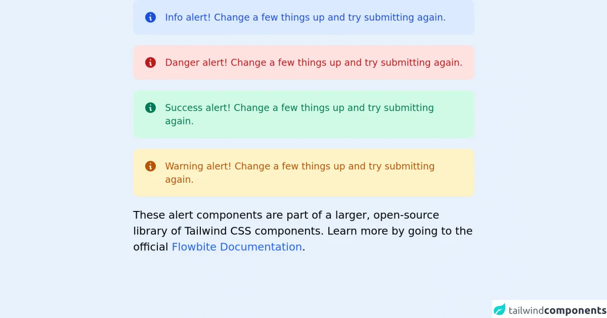
The preview of Tailwind CSS Alerts ui component.
The Tailwind CSS Alerts component provides a set of pre-defined styles for creating alerts that can be easily customized to match your application's design.
Free download of the Tailwind CSS Alerts's source code
The source code of Tailwind CSS Alerts ui component.
The Tailwind CSS Alerts component can be easily customized using the pre-defined classes provided by Tailwind CSS.
<!-- This is an example component -->
<div class="max-w-lg mx-auto">
    <div class="flex bg-blue-100 rounded-lg p-4 mb-4 text-sm text-blue-700" role="alert">
        <svg class="w-5 h-5 inline mr-3" fill="currentColor" viewBox="0 0 20 20" xmlns="http://www.w3.org/2000/svg"><path fill-rule="evenodd" d="M18 10a8 8 0 11-16 0 8 8 0 0116 0zm-7-4a1 1 0 11-2 0 1 1 0 012 0zM9 9a1 1 0 000 2v3a1 1 0 001 1h1a1 1 0 100-2v-3a1 1 0 00-1-1H9z" clip-rule="evenodd"></path></svg>
        <div>
            <span class="font-medium">Info alert!</span> Change a few things up and try submitting again.
        </div>
    </div>
    <div class="flex bg-red-100 rounded-lg p-4 mb-4 text-sm text-red-700" role="alert">
        <svg class="w-5 h-5 inline mr-3" fill="currentColor" viewBox="0 0 20 20" xmlns="http://www.w3.org/2000/svg"><path fill-rule="evenodd" d="M18 10a8 8 0 11-16 0 8 8 0 0116 0zm-7-4a1 1 0 11-2 0 1 1 0 012 0zM9 9a1 1 0 000 2v3a1 1 0 001 1h1a1 1 0 100-2v-3a1 1 0 00-1-1H9z" clip-rule="evenodd"></path></svg>
        <div>
            <span class="font-medium">Danger alert!</span> Change a few things up and try submitting again.
        </div>
    </div>
    <div class="flex bg-green-100 rounded-lg p-4 mb-4 text-sm text-green-700" role="alert">
        <svg class="w-5 h-5 inline mr-3" fill="currentColor" viewBox="0 0 20 20" xmlns="http://www.w3.org/2000/svg"><path fill-rule="evenodd" d="M18 10a8 8 0 11-16 0 8 8 0 0116 0zm-7-4a1 1 0 11-2 0 1 1 0 012 0zM9 9a1 1 0 000 2v3a1 1 0 001 1h1a1 1 0 100-2v-3a1 1 0 00-1-1H9z" clip-rule="evenodd"></path></svg>
        <div>
            <span class="font-medium">Success alert!</span> Change a few things up and try submitting again.
        </div>
    </div>
    <div class="flex bg-yellow-100 rounded-lg p-4 mb-4 text-sm text-yellow-700" role="alert">
        <svg class="w-5 h-5 inline mr-3" fill="currentColor" viewBox="0 0 20 20" xmlns="http://www.w3.org/2000/svg"><path fill-rule="evenodd" d="M18 10a8 8 0 11-16 0 8 8 0 0116 0zm-7-4a1 1 0 11-2 0 1 1 0 012 0zM9 9a1 1 0 000 2v3a1 1 0 001 1h1a1 1 0 100-2v-3a1 1 0 00-1-1H9z" clip-rule="evenodd"></path></svg>
        <div>
            <span class="font-medium">Warning alert!</span> Change a few things up and try submitting again.
        </div>
    </div>
    <p>These alert components are part of a larger, open-source library of Tailwind CSS components. Learn more by going to the official <a class="text-blue-600 hover:underline" href="https://flowbite.com/docs/getting-started/introduction/" target="_blank">Flowbite Documentation</a>.</p>
</div>
How to create a Tailwind CSS Alerts with Tailwind CSS?
In this tutorial, we will show you how to create a Tailwind CSS Alerts component in 6 easy steps.
Step 1: Set up your HTML
The first step is to set up your HTML. We will create a basic HTML structure for our alert component.
<div class="alert">
  <div class="bg-red-100 border border-red-400 text-red-700 px-4 py-3 rounded relative" role="alert">
    <strong class="font-bold">Holy smokes!</strong>
    <span class="block sm:inline">Something seriously bad happened.</span>
    <span class="absolute top-0 bottom-0 right-0 px-4 py-3">
      <svg class="fill-current h-6 w-6 text-red-500" role="button" xmlns="http://www.w3.org/2000/svg" viewBox="0 0 20 20"><title>Close</title><path d="M14.348 5.652a1 1 0 00-1.414 0L10 8.586 6.066 4.652a1 1 0 00-1.414 1.414L8.586 10l-3.934 3.934a1 1 0 001.414 1.414L10 11.414l3.934 3.934a1 1 0 001.414-1.414L11.414 10l3.934-3.934a1 1 0 000-1.414z"/></svg>
    </span>
  </div>
</div>
Step 2: Add Tailwind CSS to your project
The next step is to add Tailwind CSS to your project. You can either download the CSS file from the Tailwind CSS website or use a package manager like npm or yarn to install it.
<link href="https://cdn.jsdelivr.net/npm/tailwindcss@latest/dist/tailwind.min.css" rel="stylesheet">
Step 3: Customize the alert styles
The Tailwind CSS Alerts component provides a set of pre-defined styles that can be easily customized using Tailwind CSS classes. In this example, we will customize the alert to use a green background color.
<div class="alert">
  <div class="bg-green-100 border border-green-400 text-green-700 px-4 py-3 rounded relative" role="alert">
    <strong class="font-bold">Holy smokes!</strong>
    <span class="block sm:inline">Something seriously bad happened.</span>
    <span class="absolute top-0 bottom-0 right-0 px-4 py-3">
      <svg class="fill-current h-6 w-6 text-green-500" role="button" xmlns="http://www.w3.org/2000/svg" viewBox="0 0 20 20"><title>Close</title><path d="M14.348 5.652a1 1 0 00-1.414 0L10 8.586 6.066 4.652a1 1 0 00-1.414 1.414L8.586 10l-3.934 3.934a1 1 0 001.414 1.414L10 11.414l3.934 3.934a1 1 0 001.414-1.414L11.414 10l3.934-3.934a1 1 0 000-1.414z"/></svg>
    </span>
  </div>
</div>
Step 4: Add additional styles
You can add additional styles to your alert component using Tailwind CSS classes. In this example, we will add a margin to the alert component.
<div class="alert mt-4">
  <div class="bg-green-100 border border-green-400 text-green-700 px-4 py-3 rounded relative" role="alert">
    <strong class="font-bold">Holy smokes!</strong>
    <span class="block sm:inline">Something seriously bad happened.</span>
    <span class="absolute top-0 bottom-0 right-0 px-4 py-3">
      <svg class="fill-current h-6 w-6 text-green-500" role="button" xmlns="http://www.w3.org/2000/svg" viewBox="0 0 20 20"><title>Close</title><path d="M14.348 5.652a1 1 0 00-1.414 0L10 8.586 6.066 4.652a1 1 0 00-1.414 1.414L8.586 10l-3.934 3.934a1 1 0 001.414 1.414L10 11.414l3.934 3.934a1 1 0 001.414-1.414L11.414 10l3.934-3.934a1 1 0 000-1.414z"/></svg>
    </span>
  </div>
</div>
Step 5: Add JavaScript functionality
You can add JavaScript functionality to your alert component to allow users to close the alert. In this example, we will add a JavaScript function to close the alert when the close button is clicked.
<div class="alert mt-4">
  <div class="bg-green-100 border border-green-400 text-green-700 px-4 py-3 rounded relative" role="alert">
    <strong class="font-bold">Holy smokes!</strong>
    <span class="block sm:inline">Something seriously bad happened.</span>
    <span class="absolute top-0 bottom-0 right-0 px-4 py-3">
      <svg class="fill-current h-6 w-6 text-green-500" role="button" xmlns="http://www.w3.org/2000/svg" viewBox="0 0 20 20"><title>Close</title><path d="M14.348 5.652a1 1 0 00-1.414 0L10 8.586 6.066 4.652a1 1 0 00-1.414 1.414L8.586 10l-3.934 3.934a1 1 0 001.414 1.414L10 11.414l3.934 3.934a1 1 0 001.414-1.414L11.414 10l3.934-3.934a1 1 0 000-1.414z"/></svg>
    </span>
  </div>
</div>

<script>
  document.querySelector('.alert').addEventListener('click', function() {
    this.style.display = 'none';
  });
</script>
Step 6: Test your alert component
You can test your alert component by adding it to your application and verifying that it works as expected. Congratulations, you have successfully created a Tailwind CSS Alerts component!
Conclusion
In this tutorial, we have shown you how to create a Tailwind CSS Alerts component in 6 easy steps. Tailwind CSS provides a set of pre-defined classes that can be used to style HTML elements, making it easy to create complex and responsive user interfaces without writing custom CSS. The Tailwind CSS Alerts component provides a set of pre-defined styles for creating alerts that can be easily customized to match your application's design. We hope you found this tutorial helpful and informative. Happy coding!