- Published on
3 Things You Must Know To Build A Tailwind CSS admin dashboard layout With Tailwind CSS
- What is Tailwind CSS?
- The description of Tailwind CSS admin dashboard layout UI component
- Why use Tailwind CSS to create a Tailwind CSS admin dashboard layout UI component?
- The preview of Tailwind CSS admin dashboard layout UI component
- The source code of Tailwind CSS admin dashboard layout UI component
- How to create a Tailwind CSS admin dashboard layout with Tailwind CSS?
- Step 1: Set up your project
- Step 2: Create the HTML structure
- Step 3: Add Tailwind CSS classes
- Step 4: Add interactivity
- Conclusion
Are you looking for a way to create a beautiful and responsive admin dashboard layout using Tailwind CSS? If so, you've come to the right place! In this article, we'll cover the basics of Tailwind CSS, the benefits of using it to create an admin dashboard layout, and provide you with a step-by-step guide to building your own.
What is Tailwind CSS?
Tailwind CSS is a utility-first CSS framework that allows you to quickly and easily create custom designs without having to write custom CSS. It provides a set of pre-defined classes that you can use to style your HTML elements. Tailwind CSS is designed to be highly customizable, so you can easily tweak the default styles to fit your needs.
The description of Tailwind CSS admin dashboard layout UI component
An admin dashboard layout is a UI component that provides an overview of the key metrics and data for an application or website. It typically includes charts, tables, and other visual elements that allow users to quickly and easily understand the state of their application.
Why use Tailwind CSS to create a Tailwind CSS admin dashboard layout UI component?
Tailwind CSS is an excellent choice for creating an admin dashboard layout UI component for several reasons:
- Rapid development: Tailwind CSS provides a set of pre-defined classes that you can use to quickly and easily create custom designs without having to write custom CSS.
- Highly customizable: Tailwind CSS is designed to be highly customizable, so you can easily tweak the default styles to fit your needs.
- Responsive: Tailwind CSS is designed to be responsive, so your admin dashboard layout will look great on any device.
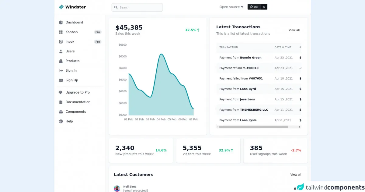
The preview of Tailwind CSS admin dashboard layout UI component
Free download of the Tailwind CSS admin dashboard layout's source code
The source code of Tailwind CSS admin dashboard layout UI component
<!-- This is an example component -->
<div>
<nav class="bg-white border-b border-gray-200 fixed z-30 w-full">
<div class="px-3 py-3 lg:px-5 lg:pl-3">
<div class="flex items-center justify-between">
<div class="flex items-center justify-start">
<button id="toggleSidebarMobile" aria-expanded="true" aria-controls="sidebar" class="lg:hidden mr-2 text-gray-600 hover:text-gray-900 cursor-pointer p-2 hover:bg-gray-100 focus:bg-gray-100 focus:ring-2 focus:ring-gray-100 rounded">
<svg id="toggleSidebarMobileHamburger" class="w-6 h-6" fill="currentColor" viewBox="0 0 20 20" xmlns="http://www.w3.org/2000/svg">
<path fill-rule="evenodd" d="M3 5a1 1 0 011-1h12a1 1 0 110 2H4a1 1 0 01-1-1zM3 10a1 1 0 011-1h6a1 1 0 110 2H4a1 1 0 01-1-1zM3 15a1 1 0 011-1h12a1 1 0 110 2H4a1 1 0 01-1-1z" clip-rule="evenodd"></path>
</svg>
<svg id="toggleSidebarMobileClose" class="w-6 h-6 hidden" fill="currentColor" viewBox="0 0 20 20" xmlns="http://www.w3.org/2000/svg">
<path fill-rule="evenodd" d="M4.293 4.293a1 1 0 011.414 0L10 8.586l4.293-4.293a1 1 0 111.414 1.414L11.414 10l4.293 4.293a1 1 0 01-1.414 1.414L10 11.414l-4.293 4.293a1 1 0 01-1.414-1.414L8.586 10 4.293 5.707a1 1 0 010-1.414z" clip-rule="evenodd"></path>
</svg>
</button>
<a href="https://demo.themesberg.com/windster/" class="text-xl font-bold flex items-center lg:ml-2.5">
<img src="https://demo.themesberg.com/windster/images/logo.svg" class="h-6 mr-2" alt="Windster Logo">
<span class="self-center whitespace-nowrap">Windster</span>
</a>
<form action="#" method="GET" class="hidden lg:block lg:pl-32">
<label for="topbar-search" class="sr-only">Search</label>
<div class="mt-1 relative lg:w-64">
<div class="absolute inset-y-0 left-0 pl-3 flex items-center pointer-events-none">
<svg class="w-5 h-5 text-gray-500" fill="currentColor" viewBox="0 0 20 20" xmlns="http://www.w3.org/2000/svg">
<path fill-rule="evenodd" d="M8 4a4 4 0 100 8 4 4 0 000-8zM2 8a6 6 0 1110.89 3.476l4.817 4.817a1 1 0 01-1.414 1.414l-4.816-4.816A6 6 0 012 8z" clip-rule="evenodd"></path>
</svg>
</div>
<input type="text" name="email" id="topbar-search" class="bg-gray-50 border border-gray-300 text-gray-900 sm:text-sm rounded-lg focus:ring-cyan-600 focus:border-cyan-600 block w-full pl-10 p-2.5" placeholder="Search">
</div>
</form>
</div>
<div class="flex items-center">
<button id="toggleSidebarMobileSearch" type="button" class="lg:hidden text-gray-500 hover:text-gray-900 hover:bg-gray-100 p-2 rounded-lg">
<span class="sr-only">Search</span>
<svg class="w-6 h-6" fill="currentColor" viewBox="0 0 20 20" xmlns="http://www.w3.org/2000/svg">
<path fill-rule="evenodd" d="M8 4a4 4 0 100 8 4 4 0 000-8zM2 8a6 6 0 1110.89 3.476l4.817 4.817a1 1 0 01-1.414 1.414l-4.816-4.816A6 6 0 012 8z" clip-rule="evenodd"></path>
</svg>
</button>
<div class="hidden lg:flex items-center">
<span class="text-base font-normal text-gray-500 mr-5">Open source ❤️</span>
<div class="-mb-1">
<a class="github-button" href="https://github.com/themesberg/windster-tailwind-css-dashboard" data-color-scheme="no-preference: dark; light: light; dark: light;" data-icon="octicon-star" data-size="large" data-show-count="true" aria-label="Star themesberg/windster-tailwind-css-dashboard on GitHub">Star</a>
</div>
</div>
<a href="https://demo.themesberg.com/windster/pricing/" class="hidden sm:inline-flex ml-5 text-white bg-cyan-600 hover:bg-cyan-700 focus:ring-4 focus:ring-cyan-200 font-medium rounded-lg text-sm px-5 py-2.5 text-center items-center mr-3">
<svg class="svg-inline--fa fa-gem -ml-1 mr-2 h-4 w-4" aria-hidden="true" focusable="false" data-prefix="fas" data-icon="gem" role="img" xmlns="http://www.w3.org/2000/svg" viewBox="0 0 512 512">
<path fill="currentColor" d="M378.7 32H133.3L256 182.7L378.7 32zM512 192l-107.4-141.3L289.6 192H512zM107.4 50.67L0 192h222.4L107.4 50.67zM244.3 474.9C247.3 478.2 251.6 480 256 480s8.653-1.828 11.67-5.062L510.6 224H1.365L244.3 474.9z"></path>
</svg>
Upgrade to Pro
</a>
</div>
</div>
</div>
</nav>
<div class="flex overflow-hidden bg-white pt-16">
<aside id="sidebar" class="fixed hidden z-20 h-full top-0 left-0 pt-16 flex lg:flex flex-shrink-0 flex-col w-64 transition-width duration-75" aria-label="Sidebar">
<div class="relative flex-1 flex flex-col min-h-0 border-r border-gray-200 bg-white pt-0">
<div class="flex-1 flex flex-col pt-5 pb-4 overflow-y-auto">
<div class="flex-1 px-3 bg-white divide-y space-y-1">
<ul class="space-y-2 pb-2">
<li>
<form action="#" method="GET" class="lg:hidden">
<label for="mobile-search" class="sr-only">Search</label>
<div class="relative">
<div class="absolute inset-y-0 left-0 pl-3 flex items-center pointer-events-none">
<svg class="w-5 h-5 text-gray-500" fill="currentColor" viewBox="0 0 20 20" xmlns="http://www.w3.org/2000/svg">
<path d="M5 3a2 2 0 00-2 2v2a2 2 0 002 2h2a2 2 0 002-2V5a2 2 0 00-2-2H5zM5 11a2 2 0 00-2 2v2a2 2 0 002 2h2a2 2 0 002-2v-2a2 2 0 00-2-2H5zM11 5a2 2 0 012-2h2a2 2 0 012 2v2a2 2 0 01-2 2h-2a2 2 0 01-2-2V5zM11 13a2 2 0 012-2h2a2 2 0 012 2v2a2 2 0 01-2 2h-2a2 2 0 01-2-2v-2z"></path>
</svg>
</div>
<input type="text" name="email" id="mobile-search" class="bg-gray-50 border border-gray-300 text-gray-900 text-sm rounded-lg focus:ring-cyan-600 focus:ring-cyan-600 block w-full pl-10 p-2.5" placeholder="Search">
</div>
</form>
</li>
<li>
<a href="https://demo.themesberg.com/windster/" class="text-base text-gray-900 font-normal rounded-lg flex items-center p-2 hover:bg-gray-100 group">
<svg class="w-6 h-6 text-gray-500 group-hover:text-gray-900 transition duration-75" fill="currentColor" viewBox="0 0 20 20" xmlns="http://www.w3.org/2000/svg">
<path d="M2 10a8 8 0 018-8v8h8a8 8 0 11-16 0z"></path>
<path d="M12 2.252A8.014 8.014 0 0117.748 8H12V2.252z"></path>
</svg>
<span class="ml-3">Dashboard</span>
</a>
</li>
<li>
<a href="https://demo.themesberg.com/windster-pro/kanban/" target="_blank" class="text-base text-gray-900 font-normal rounded-lg hover:bg-gray-100 flex items-center p-2 group ">
<svg class="w-6 h-6 text-gray-500 flex-shrink-0 group-hover:text-gray-900 transition duration-75" fill="currentColor" viewBox="0 0 20 20" xmlns="http://www.w3.org/2000/svg">
<path d="M5 3a2 2 0 00-2 2v2a2 2 0 002 2h2a2 2 0 002-2V5a2 2 0 00-2-2H5zM5 11a2 2 0 00-2 2v2a2 2 0 002 2h2a2 2 0 002-2v-2a2 2 0 00-2-2H5zM11 5a2 2 0 012-2h2a2 2 0 012 2v2a2 2 0 01-2 2h-2a2 2 0 01-2-2V5zM11 13a2 2 0 012-2h2a2 2 0 012 2v2a2 2 0 01-2 2h-2a2 2 0 01-2-2v-2z"></path>
</svg>
<span class="ml-3 flex-1 whitespace-nowrap">Kanban</span>
<span class="bg-gray-200 text-gray-800 ml-3 text-sm font-medium inline-flex items-center justify-center px-2 rounded-full">Pro</span>
</a>
</li>
<li>
<a href="https://demo.themesberg.com/windster-pro/mailing/inbox/" target="_blank" class="text-base text-gray-900 font-normal rounded-lg hover:bg-gray-100 flex items-center p-2 group ">
<svg class="w-6 h-6 text-gray-500 flex-shrink-0 group-hover:text-gray-900 transition duration-75" fill="currentColor" viewBox="0 0 20 20" xmlns="http://www.w3.org/2000/svg">
<path d="M8.707 7.293a1 1 0 00-1.414 1.414l2 2a1 1 0 001.414 0l2-2a1 1 0 00-1.414-1.414L11 7.586V3a1 1 0 10-2 0v4.586l-.293-.293z"></path>
<path d="M3 5a2 2 0 012-2h1a1 1 0 010 2H5v7h2l1 2h4l1-2h2V5h-1a1 1 0 110-2h1a2 2 0 012 2v10a2 2 0 01-2 2H5a2 2 0 01-2-2V5z"></path>
</svg>
<span class="ml-3 flex-1 whitespace-nowrap">Inbox</span>
<span class="bg-gray-200 text-gray-800 ml-3 text-sm font-medium inline-flex items-center justify-center px-2 rounded-full">Pro</span>
</a>
</li>
<li>
<a href="https://demo.themesberg.com/windster/users/list/" class="text-base text-gray-900 font-normal rounded-lg hover:bg-gray-100 flex items-center p-2 group ">
<svg class="w-6 h-6 text-gray-500 flex-shrink-0 group-hover:text-gray-900 transition duration-75" fill="currentColor" viewBox="0 0 20 20" xmlns="http://www.w3.org/2000/svg">
<path fill-rule="evenodd" d="M10 9a3 3 0 100-6 3 3 0 000 6zm-7 9a7 7 0 1114 0H3z" clip-rule="evenodd"></path>
</svg>
<span class="ml-3 flex-1 whitespace-nowrap">Users</span>
</a>
</li>
<li>
<a href="https://demo.themesberg.com/windster/e-commerce/products/" class="text-base text-gray-900 font-normal rounded-lg hover:bg-gray-100 flex items-center p-2 group ">
<svg class="w-6 h-6 text-gray-500 flex-shrink-0 group-hover:text-gray-900 transition duration-75" fill="currentColor" viewBox="0 0 20 20" xmlns="http://www.w3.org/2000/svg">
<path fill-rule="evenodd" d="M10 2a4 4 0 00-4 4v1H5a1 1 0 00-.994.89l-1 9A1 1 0 004 18h12a1 1 0 00.994-1.11l-1-9A1 1 0 0015 7h-1V6a4 4 0 00-4-4zm2 5V6a2 2 0 10-4 0v1h4zm-6 3a1 1 0 112 0 1 1 0 01-2 0zm7-1a1 1 0 100 2 1 1 0 000-2z" clip-rule="evenodd"></path>
</svg>
<span class="ml-3 flex-1 whitespace-nowrap">Products</span>
</a>
</li>
<li>
<a href="https://demo.themesberg.com/windster/authentication/sign-in/" class="text-base text-gray-900 font-normal rounded-lg hover:bg-gray-100 flex items-center p-2 group ">
<svg class="w-6 h-6 text-gray-500 flex-shrink-0 group-hover:text-gray-900 transition duration-75" fill="currentColor" viewBox="0 0 20 20" xmlns="http://www.w3.org/2000/svg">
<path fill-rule="evenodd" d="M3 3a1 1 0 00-1 1v12a1 1 0 102 0V4a1 1 0 00-1-1zm10.293 9.293a1 1 0 001.414 1.414l3-3a1 1 0 000-1.414l-3-3a1 1 0 10-1.414 1.414L14.586 9H7a1 1 0 100 2h7.586l-1.293 1.293z" clip-rule="evenodd"></path>
</svg>
<span class="ml-3 flex-1 whitespace-nowrap">Sign In</span>
</a>
</li>
<li>
<a href="https://demo.themesberg.com/windster/authentication/sign-up/" class="text-base text-gray-900 font-normal rounded-lg hover:bg-gray-100 flex items-center p-2 group ">
<svg class="w-6 h-6 text-gray-500 flex-shrink-0 group-hover:text-gray-900 transition duration-75" fill="currentColor" viewBox="0 0 20 20" xmlns="http://www.w3.org/2000/svg">
<path fill-rule="evenodd" d="M5 4a3 3 0 00-3 3v6a3 3 0 003 3h10a3 3 0 003-3V7a3 3 0 00-3-3H5zm-1 9v-1h5v2H5a1 1 0 01-1-1zm7 1h4a1 1 0 001-1v-1h-5v2zm0-4h5V8h-5v2zM9 8H4v2h5V8z" clip-rule="evenodd"></path>
</svg>
<span class="ml-3 flex-1 whitespace-nowrap">Sign Up</span>
</a>
</li>
</ul>
<div class="space-y-2 pt-2">
<a href="https://demo.themesberg.com/windster/pricing/" class="text-base text-gray-900 font-normal rounded-lg hover:bg-gray-100 group transition duration-75 flex items-center p-2">
<svg class="w-5 h-5 text-gray-500 flex-shrink-0 group-hover:text-gray-900 transition duration-75" aria-hidden="true" focusable="false" data-prefix="fas" data-icon="gem" role="img" xmlns="http://www.w3.org/2000/svg" viewBox="0 0 512 512">
<path fill="currentColor" d="M378.7 32H133.3L256 182.7L378.7 32zM512 192l-107.4-141.3L289.6 192H512zM107.4 50.67L0 192h222.4L107.4 50.67zM244.3 474.9C247.3 478.2 251.6 480 256 480s8.653-1.828 11.67-5.062L510.6 224H1.365L244.3 474.9z"></path>
</svg>
<span class="ml-4">Upgrade to Pro</span>
</a>
<a href="https://flowbite.com/docs/getting-started/introduction/" target="_blank" class="text-base text-gray-900 font-normal rounded-lg hover:bg-gray-100 group transition duration-75 flex items-center p-2">
<svg class="w-6 h-6 text-gray-500 flex-shrink-0 group-hover:text-gray-900 transition duration-75" fill="currentColor" viewBox="0 0 20 20" xmlns="http://www.w3.org/2000/svg">
<path d="M9 2a1 1 0 000 2h2a1 1 0 100-2H9z"></path>
<path fill-rule="evenodd" d="M4 5a2 2 0 012-2 3 3 0 003 3h2a3 3 0 003-3 2 2 0 012 2v11a2 2 0 01-2 2H6a2 2 0 01-2-2V5zm3 4a1 1 0 000 2h.01a1 1 0 100-2H7zm3 0a1 1 0 000 2h3a1 1 0 100-2h-3zm-3 4a1 1 0 100 2h.01a1 1 0 100-2H7zm3 0a1 1 0 100 2h3a1 1 0 100-2h-3z" clip-rule="evenodd"></path>
</svg>
<span class="ml-3">Documentation</span>
</a>
<a href="https://flowbite.com/docs/components/alerts/" target="_blank" class="text-base text-gray-900 font-normal rounded-lg hover:bg-gray-100 group transition duration-75 flex items-center p-2">
<svg class="w-6 h-6 text-gray-500 flex-shrink-0 group-hover:text-gray-900 transition duration-75" fill="currentColor" viewBox="0 0 20 20" xmlns="http://www.w3.org/2000/svg">
<path d="M7 3a1 1 0 000 2h6a1 1 0 100-2H7zM4 7a1 1 0 011-1h10a1 1 0 110 2H5a1 1 0 01-1-1zM2 11a2 2 0 012-2h12a2 2 0 012 2v4a2 2 0 01-2 2H4a2 2 0 01-2-2v-4z"></path>
</svg>
<span class="ml-3">Components</span>
</a>
<a href="https://github.com/themesberg/windster-tailwind-css-dashboard/issues" target="_blank" class="text-base text-gray-900 font-normal rounded-lg hover:bg-gray-100 group transition duration-75 flex items-center p-2">
<svg class="w-6 h-6 text-gray-500 flex-shrink-0 group-hover:text-gray-900 transition duration-75" fill="currentColor" viewBox="0 0 20 20" xmlns="http://www.w3.org/2000/svg">
<path fill-rule="evenodd" d="M18 10a8 8 0 11-16 0 8 8 0 0116 0zm-2 0c0 .993-.241 1.929-.668 2.754l-1.524-1.525a3.997 3.997 0 00.078-2.183l1.562-1.562C15.802 8.249 16 9.1 16 10zm-5.165 3.913l1.58 1.58A5.98 5.98 0 0110 16a5.976 5.976 0 01-2.516-.552l1.562-1.562a4.006 4.006 0 001.789.027zm-4.677-2.796a4.002 4.002 0 01-.041-2.08l-.08.08-1.53-1.533A5.98 5.98 0 004 10c0 .954.223 1.856.619 2.657l1.54-1.54zm1.088-6.45A5.974 5.974 0 0110 4c.954 0 1.856.223 2.657.619l-1.54 1.54a4.002 4.002 0 00-2.346.033L7.246 4.668zM12 10a2 2 0 11-4 0 2 2 0 014 0z" clip-rule="evenodd"></path>
</svg>
<span class="ml-3">Help</span>
</a>
</div>
</div>
</div>
</div>
</aside>
<div class="bg-gray-900 opacity-50 hidden fixed inset-0 z-10" id="sidebarBackdrop"></div>
<div id="main-content" class="h-full w-full bg-gray-50 relative overflow-y-auto lg:ml-64">
<main>
<div class="pt-6 px-4">
<div class="w-full grid grid-cols-1 xl:grid-cols-2 2xl:grid-cols-3 gap-4">
<div class="bg-white shadow rounded-lg p-4 sm:p-6 xl:p-8 2xl:col-span-2">
<div class="flex items-center justify-between mb-4">
<div class="flex-shrink-0">
<span class="text-2xl sm:text-3xl leading-none font-bold text-gray-900">$45,385</span>
<h3 class="text-base font-normal text-gray-500">Sales this week</h3>
</div>
<div class="flex items-center justify-end flex-1 text-green-500 text-base font-bold">
12.5%
<svg class="w-5 h-5" fill="currentColor" viewBox="0 0 20 20" xmlns="http://www.w3.org/2000/svg">
<path fill-rule="evenodd" d="M5.293 7.707a1 1 0 010-1.414l4-4a1 1 0 011.414 0l4 4a1 1 0 01-1.414 1.414L11 5.414V17a1 1 0 11-2 0V5.414L6.707 7.707a1 1 0 01-1.414 0z" clip-rule="evenodd"></path>
</svg>
</div>
</div>
<div id="main-chart"></div>
</div>
<div class="bg-white shadow rounded-lg p-4 sm:p-6 xl:p-8 ">
<div class="mb-4 flex items-center justify-between">
<div>
<h3 class="text-xl font-bold text-gray-900 mb-2">Latest Transactions</h3>
<span class="text-base font-normal text-gray-500">This is a list of latest transactions</span>
</div>
<div class="flex-shrink-0">
<a href="#" class="text-sm font-medium text-cyan-600 hover:bg-gray-100 rounded-lg p-2">View all</a>
</div>
</div>
<div class="flex flex-col mt-8">
<div class="overflow-x-auto rounded-lg">
<div class="align-middle inline-block min-w-full">
<div class="shadow overflow-hidden sm:rounded-lg">
<table class="min-w-full divide-y divide-gray-200">
<thead class="bg-gray-50">
<tr>
<th scope="col" class="p-4 text-left text-xs font-medium text-gray-500 uppercase tracking-wider">
Transaction
</th>
<th scope="col" class="p-4 text-left text-xs font-medium text-gray-500 uppercase tracking-wider">
Date & Time
</th>
<th scope="col" class="p-4 text-left text-xs font-medium text-gray-500 uppercase tracking-wider">
Amount
</th>
</tr>
</thead>
<tbody class="bg-white">
<tr>
<td class="p-4 whitespace-nowrap text-sm font-normal text-gray-900">
Payment from <span class="font-semibold">Bonnie Green</span>
</td>
<td class="p-4 whitespace-nowrap text-sm font-normal text-gray-500">
Apr 23 ,2021
</td>
<td class="p-4 whitespace-nowrap text-sm font-semibold text-gray-900">
$2300
</td>
</tr>
<tr class="bg-gray-50">
<td class="p-4 whitespace-nowrap text-sm font-normal text-gray-900 rounded-lg rounded-left">
Payment refund to <span class="font-semibold">#00910</span>
</td>
<td class="p-4 whitespace-nowrap text-sm font-normal text-gray-500">
Apr 23 ,2021
</td>
<td class="p-4 whitespace-nowrap text-sm font-semibold text-gray-900">
-$670
</td>
</tr>
<tr>
<td class="p-4 whitespace-nowrap text-sm font-normal text-gray-900">
Payment failed from <span class="font-semibold">#087651</span>
</td>
<td class="p-4 whitespace-nowrap text-sm font-normal text-gray-500">
Apr 18 ,2021
</td>
<td class="p-4 whitespace-nowrap text-sm font-semibold text-gray-900">
$234
</td>
</tr>
<tr class="bg-gray-50">
<td class="p-4 whitespace-nowrap text-sm font-normal text-gray-900 rounded-lg rounded-left">
Payment from <span class="font-semibold">Lana Byrd</span>
</td>
<td class="p-4 whitespace-nowrap text-sm font-normal text-gray-500">
Apr 15 ,2021
</td>
<td class="p-4 whitespace-nowrap text-sm font-semibold text-gray-900">
$5000
</td>
</tr>
<tr>
<td class="p-4 whitespace-nowrap text-sm font-normal text-gray-900">
Payment from <span class="font-semibold">Jese Leos</span>
</td>
<td class="p-4 whitespace-nowrap text-sm font-normal text-gray-500">
Apr 15 ,2021
</td>
<td class="p-4 whitespace-nowrap text-sm font-semibold text-gray-900">
$2300
</td>
</tr>
<tr class="bg-gray-50">
<td class="p-4 whitespace-nowrap text-sm font-normal text-gray-900 rounded-lg rounded-left">
Payment from <span class="font-semibold">THEMESBERG LLC</span>
</td>
<td class="p-4 whitespace-nowrap text-sm font-normal text-gray-500">
Apr 11 ,2021
</td>
<td class="p-4 whitespace-nowrap text-sm font-semibold text-gray-900">
$560
</td>
</tr>
<tr>
<td class="p-4 whitespace-nowrap text-sm font-normal text-gray-900">
Payment from <span class="font-semibold">Lana Lysle</span>
</td>
<td class="p-4 whitespace-nowrap text-sm font-normal text-gray-500">
Apr 6 ,2021
</td>
<td class="p-4 whitespace-nowrap text-sm font-semibold text-gray-900">
$1437
</td>
</tr>
</tbody>
</table>
</div>
</div>
</div>
</div>
</div>
</div>
<div class="mt-4 w-full grid grid-cols-1 md:grid-cols-2 xl:grid-cols-3 gap-4">
<div class="bg-white shadow rounded-lg p-4 sm:p-6 xl:p-8 ">
<div class="flex items-center">
<div class="flex-shrink-0">
<span class="text-2xl sm:text-3xl leading-none font-bold text-gray-900">2,340</span>
<h3 class="text-base font-normal text-gray-500">New products this week</h3>
</div>
<div class="ml-5 w-0 flex items-center justify-end flex-1 text-green-500 text-base font-bold">
14.6%
<svg class="w-5 h-5" fill="currentColor" viewBox="0 0 20 20" xmlns="http://www.w3.org/2000/svg">
<path fill-rule="evenodd" d="M5.293 7.707a1 1 0 010-1.414l4-4a1 1 0 011.414 0l4 4a1 1 0 01-1.414 1.414L11 5.414V17a1 1 0 11-2 0V5.414L6.707 7.707a1 1 0 01-1.414 0z" clip-rule="evenodd"></path>
</svg>
</div>
</div>
</div>
<div class="bg-white shadow rounded-lg p-4 sm:p-6 xl:p-8 ">
<div class="flex items-center">
<div class="flex-shrink-0">
<span class="text-2xl sm:text-3xl leading-none font-bold text-gray-900">5,355</span>
<h3 class="text-base font-normal text-gray-500">Visitors this week</h3>
</div>
<div class="ml-5 w-0 flex items-center justify-end flex-1 text-green-500 text-base font-bold">
32.9%
<svg class="w-5 h-5" fill="currentColor" viewBox="0 0 20 20" xmlns="http://www.w3.org/2000/svg">
<path fill-rule="evenodd" d="M5.293 7.707a1 1 0 010-1.414l4-4a1 1 0 011.414 0l4 4a1 1 0 01-1.414 1.414L11 5.414V17a1 1 0 11-2 0V5.414L6.707 7.707a1 1 0 01-1.414 0z" clip-rule="evenodd"></path>
</svg>
</div>
</div>
</div>
<div class="bg-white shadow rounded-lg p-4 sm:p-6 xl:p-8 ">
<div class="flex items-center">
<div class="flex-shrink-0">
<span class="text-2xl sm:text-3xl leading-none font-bold text-gray-900">385</span>
<h3 class="text-base font-normal text-gray-500">User signups this week</h3>
</div>
<div class="ml-5 w-0 flex items-center justify-end flex-1 text-red-500 text-base font-bold">
-2.7%
<svg class="w-5 h-5" fill="currentColor" viewBox="0 0 20 20" xmlns="http://www.w3.org/2000/svg">
<path fill-rule="evenodd" d="M14.707 12.293a1 1 0 010 1.414l-4 4a1 1 0 01-1.414 0l-4-4a1 1 0 111.414-1.414L9 14.586V3a1 1 0 012 0v11.586l2.293-2.293a1 1 0 011.414 0z" clip-rule="evenodd"></path>
</svg>
</div>
</div>
</div>
</div>
<div class="grid grid-cols-1 2xl:grid-cols-2 xl:gap-4 my-4">
<div class="bg-white shadow rounded-lg mb-4 p-4 sm:p-6 h-full">
<div class="flex items-center justify-between mb-4">
<h3 class="text-xl font-bold leading-none text-gray-900">Latest Customers</h3>
<a href="#" class="text-sm font-medium text-cyan-600 hover:bg-gray-100 rounded-lg inline-flex items-center p-2">
View all
</a>
</div>
<div class="flow-root">
<ul role="list" class="divide-y divide-gray-200">
<li class="py-3 sm:py-4">
<div class="flex items-center space-x-4">
<div class="flex-shrink-0">
<img class="h-8 w-8 rounded-full" src="https://demo.themesberg.com/windster/images/users/neil-sims.png" alt="Neil image">
</div>
<div class="flex-1 min-w-0">
<p class="text-sm font-medium text-gray-900 truncate">
Neil Sims
</p>
<p class="text-sm text-gray-500 truncate">
<a href="/cdn-cgi/l/email-protection" class="__cf_email__" data-cfemail="17727a767e7b57607e7973646372653974787a">[email protected]</a>
</p>
</div>
<div class="inline-flex items-center text-base font-semibold text-gray-900">
$320
</div>
</div>
</li>
<li class="py-3 sm:py-4">
<div class="flex items-center space-x-4">
<div class="flex-shrink-0">
<img class="h-8 w-8 rounded-full" src="https://demo.themesberg.com/windster/images/users/bonnie-green.png" alt="Neil image">
</div>
<div class="flex-1 min-w-0">
<p class="text-sm font-medium text-gray-900 truncate">
Bonnie Green
</p>
<p class="text-sm text-gray-500 truncate">
<a href="/cdn-cgi/l/email-protection" class="__cf_email__" data-cfemail="d4b1b9b5bdb894a3bdbab0a7a0b1a6fab7bbb9">[email protected]</a>
</p>
</div>
<div class="inline-flex items-center text-base font-semibold text-gray-900">
$3467
</div>
</div>
</li>
<li class="py-3 sm:py-4">
<div class="flex items-center space-x-4">
<div class="flex-shrink-0">
<img class="h-8 w-8 rounded-full" src="https://demo.themesberg.com/windster/images/users/michael-gough.png" alt="Neil image">
</div>
<div class="flex-1 min-w-0">
<p class="text-sm font-medium text-gray-900 truncate">
Michael Gough
</p>
<p class="text-sm text-gray-500 truncate">
<a href="/cdn-cgi/l/email-protection" class="__cf_email__" data-cfemail="57323a363e3b17203e3933242332257934383a">[email protected]</a>
</p>
</div>
<div class="inline-flex items-center text-base font-semibold text-gray-900">
$67
</div>
</div>
</li>
<li class="py-3 sm:py-4">
<div class="flex items-center space-x-4">
<div class="flex-shrink-0">
<img class="h-8 w-8 rounded-full" src="https://demo.themesberg.com/windster/images/users/thomas-lean.png" alt="Neil image">
</div>
<div class="flex-1 min-w-0">
<p class="text-sm font-medium text-gray-900 truncate">
Thomes Lean
</p>
<p class="text-sm text-gray-500 truncate">
<a href="/cdn-cgi/l/email-protection" class="__cf_email__" data-cfemail="284d45494144685f41464c5b5c4d5a064b4745">[email protected]</a>
</p>
</div>
<div class="inline-flex items-center text-base font-semibold text-gray-900">
$2367
</div>
</div>
</li>
<li class="pt-3 sm:pt-4 pb-0">
<div class="flex items-center space-x-4">
<div class="flex-shrink-0">
<img class="h-8 w-8 rounded-full" src="https://demo.themesberg.com/windster/images/users/lana-byrd.png" alt="Neil image">
</div>
<div class="flex-1 min-w-0">
<p class="text-sm font-medium text-gray-900 truncate">
Lana Byrd
</p>
<p class="text-sm text-gray-500 truncate">
<a href="/cdn-cgi/l/email-protection" class="__cf_email__" data-cfemail="a2c7cfc3cbcee2d5cbccc6d1d6c7d08cc1cdcf">[email protected]</a>
</p>
</div>
<div class="inline-flex items-center text-base font-semibold text-gray-900">
$367
</div>
</div>
</li>
</ul>
</div>
</div>
<div class="bg-white shadow rounded-lg p-4 sm:p-6 xl:p-8 ">
<h3 class="text-xl leading-none font-bold text-gray-900 mb-10">Acquisition Overview</h3>
<div class="block w-full overflow-x-auto">
<table class="items-center w-full bg-transparent border-collapse">
<thead>
<tr>
<th class="px-4 bg-gray-50 text-gray-700 align-middle py-3 text-xs font-semibold text-left uppercase border-l-0 border-r-0 whitespace-nowrap">Top Channels</th>
<th class="px-4 bg-gray-50 text-gray-700 align-middle py-3 text-xs font-semibold text-left uppercase border-l-0 border-r-0 whitespace-nowrap">Users</th>
<th class="px-4 bg-gray-50 text-gray-700 align-middle py-3 text-xs font-semibold text-left uppercase border-l-0 border-r-0 whitespace-nowrap min-w-140-px"></th>
</tr>
</thead>
<tbody class="divide-y divide-gray-100">
<tr class="text-gray-500">
<th class="border-t-0 px-4 align-middle text-sm font-normal whitespace-nowrap p-4 text-left">Organic Search</th>
<td class="border-t-0 px-4 align-middle text-xs font-medium text-gray-900 whitespace-nowrap p-4">5,649</td>
<td class="border-t-0 px-4 align-middle text-xs whitespace-nowrap p-4">
<div class="flex items-center">
<span class="mr-2 text-xs font-medium">30%</span>
<div class="relative w-full">
<div class="w-full bg-gray-200 rounded-sm h-2">
<div class="bg-cyan-600 h-2 rounded-sm" style="width: 30%"></div>
</div>
</div>
</div>
</td>
</tr>
<tr class="text-gray-500">
<th class="border-t-0 px-4 align-middle text-sm font-normal whitespace-nowrap p-4 text-left">Referral</th>
<td class="border-t-0 px-4 align-middle text-xs font-medium text-gray-900 whitespace-nowrap p-4">4,025</td>
<td class="border-t-0 px-4 align-middle text-xs whitespace-nowrap p-4">
<div class="flex items-center">
<span class="mr-2 text-xs font-medium">24%</span>
<div class="relative w-full">
<div class="w-full bg-gray-200 rounded-sm h-2">
<div class="bg-orange-300 h-2 rounded-sm" style="width: 24%"></div>
</div>
</div>
</div>
</td>
</tr>
<tr class="text-gray-500">
<th class="border-t-0 px-4 align-middle text-sm font-normal whitespace-nowrap p-4 text-left">Direct</th>
<td class="border-t-0 px-4 align-middle text-xs font-medium text-gray-900 whitespace-nowrap p-4">3,105</td>
<td class="border-t-0 px-4 align-middle text-xs whitespace-nowrap p-4">
<div class="flex items-center">
<span class="mr-2 text-xs font-medium">18%</span>
<div class="relative w-full">
<div class="w-full bg-gray-200 rounded-sm h-2">
<div class="bg-teal-400 h-2 rounded-sm" style="width: 18%"></div>
</div>
</div>
</div>
</td>
</tr>
<tr class="text-gray-500">
<th class="border-t-0 px-4 align-middle text-sm font-normal whitespace-nowrap p-4 text-left">Social</th>
<td class="border-t-0 px-4 align-middle text-xs font-medium text-gray-900 whitespace-nowrap p-4">1251</td>
<td class="border-t-0 px-4 align-middle text-xs whitespace-nowrap p-4">
<div class="flex items-center">
<span class="mr-2 text-xs font-medium">12%</span>
<div class="relative w-full">
<div class="w-full bg-gray-200 rounded-sm h-2">
<div class="bg-pink-600 h-2 rounded-sm" style="width: 12%"></div>
</div>
</div>
</div>
</td>
</tr>
<tr class="text-gray-500">
<th class="border-t-0 px-4 align-middle text-sm font-normal whitespace-nowrap p-4 text-left">Other</th>
<td class="border-t-0 px-4 align-middle text-xs font-medium text-gray-900 whitespace-nowrap p-4">734</td>
<td class="border-t-0 px-4 align-middle text-xs whitespace-nowrap p-4">
<div class="flex items-center">
<span class="mr-2 text-xs font-medium">9%</span>
<div class="relative w-full">
<div class="w-full bg-gray-200 rounded-sm h-2">
<div class="bg-indigo-600 h-2 rounded-sm" style="width: 9%"></div>
</div>
</div>
</div>
</td>
</tr>
<tr class="text-gray-500">
<th class="border-t-0 align-middle text-sm font-normal whitespace-nowrap p-4 pb-0 text-left">Email</th>
<td class="border-t-0 align-middle text-xs font-medium text-gray-900 whitespace-nowrap p-4 pb-0">456</td>
<td class="border-t-0 align-middle text-xs whitespace-nowrap p-4 pb-0">
<div class="flex items-center">
<span class="mr-2 text-xs font-medium">7%</span>
<div class="relative w-full">
<div class="w-full bg-gray-200 rounded-sm h-2">
<div class="bg-purple-500 h-2 rounded-sm" style="width: 7%"></div>
</div>
</div>
</div>
</td>
</tr>
</tbody>
</table>
</div>
</div>
</div>
</div>
</main>
<footer class="bg-white md:flex md:items-center md:justify-between shadow rounded-lg p-4 md:p-6 xl:p-8 my-6 mx-4">
<ul class="flex items-center flex-wrap mb-6 md:mb-0">
<li><a href="#" class="text-sm font-normal text-gray-500 hover:underline mr-4 md:mr-6">Terms and conditions</a></li>
<li><a href="#" class="text-sm font-normal text-gray-500 hover:underline mr-4 md:mr-6">Privacy Policy</a></li>
<li><a href="#" class="text-sm font-normal text-gray-500 hover:underline mr-4 md:mr-6">Licensing</a></li>
<li><a href="#" class="text-sm font-normal text-gray-500 hover:underline mr-4 md:mr-6">Cookie Policy</a></li>
<li><a href="#" class="text-sm font-normal text-gray-500 hover:underline">Contact</a></li>
</ul>
<div class="flex sm:justify-center space-x-6">
<a href="#" class="text-gray-500 hover:text-gray-900">
<svg class="h-5 w-5" fill="currentColor" viewBox="0 0 24 24" aria-hidden="true">
<path fill-rule="evenodd" d="M22 12c0-5.523-4.477-10-10-10S2 6.477 2 12c0 4.991 3.657 9.128 8.438 9.878v-6.987h-2.54V12h2.54V9.797c0-2.506 1.492-3.89 3.777-3.89 1.094 0 2.238.195 2.238.195v2.46h-1.26c-1.243 0-1.63.771-1.63 1.562V12h2.773l-.443 2.89h-2.33v6.988C18.343 21.128 22 16.991 22 12z" clip-rule="evenodd" />
</svg>
</a>
<a href="#" class="text-gray-500 hover:text-gray-900">
<svg class="h-5 w-5" fill="currentColor" viewBox="0 0 24 24" aria-hidden="true">
<path fill-rule="evenodd" d="M12.315 2c2.43 0 2.784.013 3.808.06 1.064.049 1.791.218 2.427.465a4.902 4.902 0 011.772 1.153 4.902 4.902 0 011.153 1.772c.247.636.416 1.363.465 2.427.048 1.067.06 1.407.06 4.123v.08c0 2.643-.012 2.987-.06 4.043-.049 1.064-.218 1.791-.465 2.427a4.902 4.902 0 01-1.153 1.772 4.902 4.902 0 01-1.772 1.153c-.636.247-1.363.416-2.427.465-1.067.048-1.407.06-4.123.06h-.08c-2.643 0-2.987-.012-4.043-.06-1.064-.049-1.791-.218-2.427-.465a4.902 4.902 0 01-1.772-1.153 4.902 4.902 0 01-1.153-1.772c-.247-.636-.416-1.363-.465-2.427-.047-1.024-.06-1.379-.06-3.808v-.63c0-2.43.013-2.784.06-3.808.049-1.064.218-1.791.465-2.427a4.902 4.902 0 011.153-1.772A4.902 4.902 0 015.45 2.525c.636-.247 1.363-.416 2.427-.465C8.901 2.013 9.256 2 11.685 2h.63zm-.081 1.802h-.468c-2.456 0-2.784.011-3.807.058-.975.045-1.504.207-1.857.344-.467.182-.8.398-1.15.748-.35.35-.566.683-.748 1.15-.137.353-.3.882-.344 1.857-.047 1.023-.058 1.351-.058 3.807v.468c0 2.456.011 2.784.058 3.807.045.975.207 1.504.344 1.857.182.466.399.8.748 1.15.35.35.683.566 1.15.748.353.137.882.3 1.857.344 1.054.048 1.37.058 4.041.058h.08c2.597 0 2.917-.01 3.96-.058.976-.045 1.505-.207 1.858-.344.466-.182.8-.398 1.15-.748.35-.35.566-.683.748-1.15.137-.353.3-.882.344-1.857.048-1.055.058-1.37.058-4.041v-.08c0-2.597-.01-2.917-.058-3.96-.045-.976-.207-1.505-.344-1.858a3.097 3.097 0 00-.748-1.15 3.098 3.098 0 00-1.15-.748c-.353-.137-.882-.3-1.857-.344-1.023-.047-1.351-.058-3.807-.058zM12 6.865a5.135 5.135 0 110 10.27 5.135 5.135 0 010-10.27zm0 1.802a3.333 3.333 0 100 6.666 3.333 3.333 0 000-6.666zm5.338-3.205a1.2 1.2 0 110 2.4 1.2 1.2 0 010-2.4z" clip-rule="evenodd" />
</svg>
</a>
<a href="#" class="text-gray-500 hover:text-gray-900">
<svg class="h-5 w-5" fill="currentColor" viewBox="0 0 24 24" aria-hidden="true">
<path d="M8.29 20.251c7.547 0 11.675-6.253 11.675-11.675 0-.178 0-.355-.012-.53A8.348 8.348 0 0022 5.92a8.19 8.19 0 01-2.357.646 4.118 4.118 0 001.804-2.27 8.224 8.224 0 01-2.605.996 4.107 4.107 0 00-6.993 3.743 11.65 11.65 0 01-8.457-4.287 4.106 4.106 0 001.27 5.477A4.072 4.072 0 012.8 9.713v.052a4.105 4.105 0 003.292 4.022 4.095 4.095 0 01-1.853.07 4.108 4.108 0 003.834 2.85A8.233 8.233 0 012 18.407a11.616 11.616 0 006.29 1.84" />
</svg>
</a>
<a href="#" class="text-gray-500 hover:text-gray-900">
<svg class="h-5 w-5" fill="currentColor" viewBox="0 0 24 24" aria-hidden="true">
<path fill-rule="evenodd" d="M12 2C6.477 2 2 6.484 2 12.017c0 4.425 2.865 8.18 6.839 9.504.5.092.682-.217.682-.483 0-.237-.008-.868-.013-1.703-2.782.605-3.369-1.343-3.369-1.343-.454-1.158-1.11-1.466-1.11-1.466-.908-.62.069-.608.069-.608 1.003.07 1.531 1.032 1.531 1.032.892 1.53 2.341 1.088 2.91.832.092-.647.35-1.088.636-1.338-2.22-.253-4.555-1.113-4.555-4.951 0-1.093.39-1.988 1.029-2.688-.103-.253-.446-1.272.098-2.65 0 0 .84-.27 2.75 1.026A9.564 9.564 0 0112 6.844c.85.004 1.705.115 2.504.337 1.909-1.296 2.747-1.027 2.747-1.027.546 1.379.202 2.398.1 2.651.64.7 1.028 1.595 1.028 2.688 0 3.848-2.339 4.695-4.566 4.943.359.309.678.92.678 1.855 0 1.338-.012 2.419-.012 2.747 0 .268.18.58.688.482A10.019 10.019 0 0022 12.017C22 6.484 17.522 2 12 2z" clip-rule="evenodd" />
</svg>
</a>
<a href="#" class="text-gray-500 hover:text-gray-900">
<svg class="h-5 w-5" fill="currentColor" viewBox="0 0 24 24" aria-hidden="true">
<path fill-rule="evenodd" d="M12 2C6.48 2 2 6.48 2 12s4.48 10 10 10c5.51 0 10-4.48 10-10S17.51 2 12 2zm6.605 4.61a8.502 8.502 0 011.93 5.314c-.281-.054-3.101-.629-5.943-.271-.065-.141-.12-.293-.184-.445a25.416 25.416 0 00-.564-1.236c3.145-1.28 4.577-3.124 4.761-3.362zM12 3.475c2.17 0 4.154.813 5.662 2.148-.152.216-1.443 1.941-4.48 3.08-1.399-2.57-2.95-4.675-3.189-5A8.687 8.687 0 0112 3.475zm-3.633.803a53.896 53.896 0 013.167 4.935c-3.992 1.063-7.517 1.04-7.896 1.04a8.581 8.581 0 014.729-5.975zM3.453 12.01v-.26c.37.01 4.512.065 8.775-1.215.25.477.477.965.694 1.453-.109.033-.228.065-.336.098-4.404 1.42-6.747 5.303-6.942 5.629a8.522 8.522 0 01-2.19-5.705zM12 20.547a8.482 8.482 0 01-5.239-1.8c.152-.315 1.888-3.656 6.703-5.337.022-.01.033-.01.054-.022a35.318 35.318 0 011.823 6.475 8.4 8.4 0 01-3.341.684zm4.761-1.465c-.086-.52-.542-3.015-1.659-6.084 2.679-.423 5.022.271 5.314.369a8.468 8.468 0 01-3.655 5.715z" clip-rule="evenodd" />
</svg>
</a>
</div>
</footer>
<p class="text-center text-sm text-gray-500 my-10">
© 2019-2021 <a href="https://themesberg.com" class="hover:underline" target="_blank">Themesberg</a>. All rights reserved.
</p>
</div>
</div>
<script async defer src="https://buttons.github.io/buttons.js"></script>
<script src="https://demo.themesberg.com/windster/app.bundle.js"></script>
</div>
How to create a Tailwind CSS admin dashboard layout with Tailwind CSS?
Now that you understand the benefits of using Tailwind CSS to create an admin dashboard layout UI component, let's dive into the step-by-step process of building one.
Step 1: Set up your project
The first step is to set up your project. You can either create a new project or add Tailwind CSS to an existing project. To add Tailwind CSS to an existing project, you'll need to install it using npm or yarn.
Step 2: Create the HTML structure
The next step is to create the HTML structure for your admin dashboard layout. This will include the main container, header, sidebar, and main content area.
Step 3: Add Tailwind CSS classes
Once you have the HTML structure in place, you can start adding Tailwind CSS classes to style your elements. You can use the pre-defined classes provided by Tailwind CSS or create your own custom classes.
Step 4: Add interactivity
Finally, you can add interactivity to your admin dashboard layout using JavaScript or a JavaScript framework like React or Vue.
Conclusion
In conclusion, Tailwind CSS is an excellent choice for creating an admin dashboard layout UI component. It provides a set of pre-defined classes that you can use to quickly and easily create custom designs without having to write custom CSS. It's highly customizable, responsive, and easy to use. By following the steps outlined in this article, you can create your own beautiful and responsive admin dashboard layout using Tailwind CSS.