- Published on
How to Make A Tailwind CSS accordion With Tailwind CSS?
- What is Tailwind CSS?
- The description of Tailwind CSS accordion UI component
- Why use Tailwind CSS to create a Tailwind CSS accordion UI component?
- The preview of Tailwind CSS accordion UI component
- The source code of Tailwind CSS accordion UI component
- How to create a Tailwind CSS accordion with Tailwind CSS?
- Conclusion
What is Tailwind CSS?
Tailwind CSS is a utility-first CSS framework that allows you to quickly build custom user interfaces. It provides a set of pre-defined CSS classes that you can use to style your HTML elements. With Tailwind CSS, you can create responsive and mobile-first designs without writing any custom CSS.
The description of Tailwind CSS accordion UI component
An accordion is a UI component that allows you to hide and show content based on user interactions. It's a useful way to organize information and reduce clutter on a page. A typical accordion consists of a set of headings and content sections. When a user clicks on a heading, the corresponding content section expands or collapses.
Why use Tailwind CSS to create a Tailwind CSS accordion UI component?
Tailwind CSS provides a set of pre-defined classes that make it easy to create an accordion. You don't need to write any custom CSS, which saves you time and effort. Additionally, Tailwind CSS is highly customizable, so you can easily tweak the styles to match your design requirements.
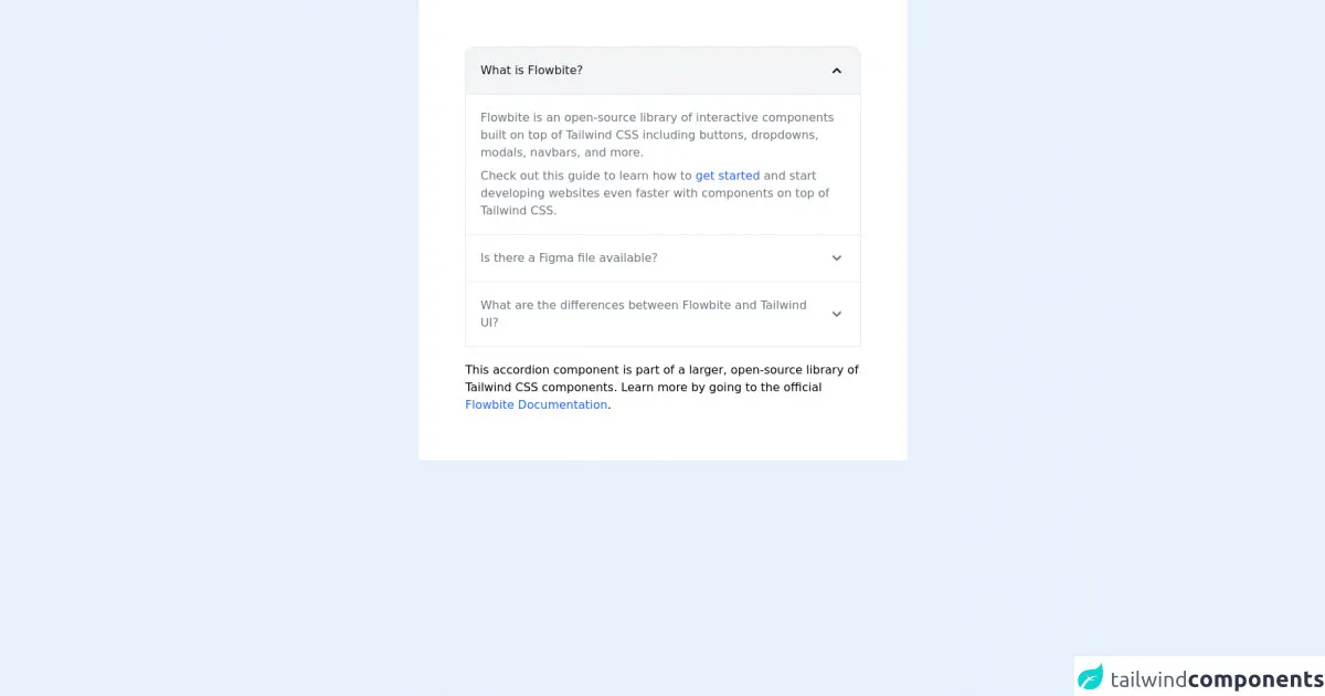
The preview of Tailwind CSS accordion UI component
To create a Tailwind CSS accordion, we'll use a combination of HTML and Tailwind CSS classes. Here's what the final result will look like:
Free download of the Tailwind CSS accordion's source code
The source code of Tailwind CSS accordion UI component
Here's the HTML and Tailwind CSS code we'll use to create the accordion:
<!-- This is an example component -->
<div class="max-w-2xl mx-auto bg-white p-16 rounded">

	<div id="accordion-collapse" data-accordion="collapse">
		<h2 id="accordion-collapse-heading-1">
			<button type="button" class="flex items-center focus:ring-4 focus:ring-gray-200 dark:focus:ring-gray-800 justify-between p-5 w-full font-medium text-left border border-gray-200 dark:border-gray-700 border-b-0 text-gray-900 dark:text-white bg-gray-100 dark:bg-gray-800 hover:bg-gray-100 dark:hover:bg-gray-800 rounded-t-xl" data-accordion-target="#accordion-collapse-body-1" aria-expanded="true" aria-controls="accordion-collapse-body-1">
      <span>What is Flowbite?</span>
      <svg data-accordion-icon class="w-6 h-6 shrink-0 rotate-180" fill="currentColor" viewBox="0 0 20 20" xmlns="http://www.w3.org/2000/svg"><path fill-rule="evenodd" d="M5.293 7.293a1 1 0 011.414 0L10 10.586l3.293-3.293a1 1 0 111.414 1.414l-4 4a1 1 0 01-1.414 0l-4-4a1 1 0 010-1.414z" clip-rule="evenodd"></path></svg>
    </button>
		</h2>
		<div id="accordion-collapse-body-1" aria-labelledby="accordion-collapse-heading-1">
			<div class="p-5 border border-gray-200 dark:border-gray-700 dark:bg-gray-900 border-b-0">
				<p class="mb-2 text-gray-500 dark:text-gray-400">Flowbite is an open-source library of interactive
					components built on top of Tailwind CSS including buttons, dropdowns, modals, navbars, and more.</p>
				<p class="text-gray-500 dark:text-gray-400">Check out this guide to learn how to <a
						href="https://flowbite.com/docs/getting-started/introduction/" target="_blank"
						class="text-blue-600 dark:text-blue-500 hover:underline">get started</a> and start developing
					websites even faster with components on top of Tailwind CSS.</p>
			</div>
		</div>
		<h2 id="accordion-collapse-heading-2">
			<button type="button" class="flex items-center focus:ring-4 focus:ring-gray-200 dark:focus:ring-gray-800 justify-between p-5 w-full font-medium border border-gray-200 dark:border-gray-700 border-b-0 text-left text-gray-500 dark:text-gray-400 hover:bg-gray-100 dark:hover:bg-gray-800" data-accordion-target="#accordion-collapse-body-2" aria-expanded="false" aria-controls="accordion-collapse-body-2">
      <span>Is there a Figma file available?</span>
      <svg data-accordion-icon class="w-6 h-6 shrink-0" fill="currentColor" viewBox="0 0 20 20" xmlns="http://www.w3.org/2000/svg"><path fill-rule="evenodd" d="M5.293 7.293a1 1 0 011.414 0L10 10.586l3.293-3.293a1 1 0 111.414 1.414l-4 4a1 1 0 01-1.414 0l-4-4a1 1 0 010-1.414z" clip-rule="evenodd"></path></svg>
    </button>
		</h2>
		<div id="accordion-collapse-body-2" class="hidden" aria-labelledby="accordion-collapse-heading-2">
			<div class="p-5 border border-gray-200 dark:border-gray-700 border-b-0">
				<p class="mb-2 text-gray-500 dark:text-gray-400">Flowbite is first conceptualized and designed using the
					Figma software so everything you see in the library has a design equivalent in our Figma file.</p>
				<p class="text-gray-500 dark:text-gray-400">Check out the <a href="https://flowbite.com/figma/"
						target="_blank" class="text-blue-600 dark:text-blue-500 hover:underline">Figma design system</a>
					based on the utility classes from Tailwind CSS and components from Flowbite.</p>
			</div>
		</div>
		<h2 id="accordion-collapse-heading-3">
			<button type="button" class="flex items-center border focus:ring-4 focus:ring-gray-200 dark:focus:ring-gray-800 border-gray-200 dark:border-gray-700 justify-between p-5 w-full font-medium text-left text-gray-500 dark:text-gray-400 hover:bg-gray-100 dark:hover:bg-gray-800" data-accordion-target="#accordion-collapse-body-3" aria-expanded="false" aria-controls="accordion-collapse-body-3">
      <span>What are the differences between Flowbite and Tailwind UI?</span>
      <svg data-accordion-icon class="w-6 h-6 shrink-0" fill="currentColor" viewBox="0 0 20 20" xmlns="http://www.w3.org/2000/svg"><path fill-rule="evenodd" d="M5.293 7.293a1 1 0 011.414 0L10 10.586l3.293-3.293a1 1 0 111.414 1.414l-4 4a1 1 0 01-1.414 0l-4-4a1 1 0 010-1.414z" clip-rule="evenodd"></path></svg>
    </button>
		</h2>
		<div id="accordion-collapse-body-3" class="hidden" aria-labelledby="accordion-collapse-heading-3">
			<div class="p-5 border border-gray-200 dark:border-gray-700 border-t-0">
				<p class="mb-2 text-gray-500 dark:text-gray-400">The main difference is that the core components from
					Flowbite are open source under the MIT license, whereas Tailwind UI is a paid product. Another
					difference is that Flowbite relies on smaller and standalone components, whereas Tailwind UI offers
					sections of pages.</p>
				<p class="mb-2 text-gray-500 dark:text-gray-400">However, we actually recommend using both Flowbite,
					Flowbite Pro, and even Tailwind UI as there is no technical reason stopping you from using the best
					of two worlds.</p>
				<p class="mb-2 text-gray-500 dark:text-gray-400">Learn more about these technologies:</p>
				<ul class="list-disc pl-5 dark:text-gray-400 text-gray-500">
					<li><a href="https://flowbite.com/pro/" target="_blank"
							class="text-blue-600 dark:text-blue-500 hover:underline">Flowbite Pro</a></li>
					<li><a href="https://tailwindui.com/" rel="nofollow" target="_blank"
							class="text-blue-600 dark:text-blue-500 hover:underline">Tailwind UI</a></li>
				</ul>
			</div>
		</div>
	</div>

	<p class="mt-5">This accordion component is part of a larger, open-source library of Tailwind CSS components. Learn
		more
		by going to the official <a class="text-blue-600 hover:underline"
			href="https://flowbite.com/docs/getting-started/introduction/" target="_blank">Flowbite Documentation</a>.
	</p>
	<script src="https://unpkg.com/[email protected]/dist/flowbite.js"></script>
</div>
How to create a Tailwind CSS accordion with Tailwind CSS?
- Create the HTML structure
The first step is to create the HTML structure for the accordion. We'll use a set of headings and content sections. Here's what the HTML code looks like:
<div class="accordion">
  <div class="accordion-item">
    <h2 class="accordion-header">
      <button class="accordion-button" type="button">
        Section 1
      </button>
    </h2>
    <div class="accordion-collapse">
      <div class="accordion-body">
        Content for section 1 goes here.
      </div>
    </div>
  </div>
  <div class="accordion-item">
    <h2 class="accordion-header">
      <button class="accordion-button" type="button">
        Section 2
      </button>
    </h2>
    <div class="accordion-collapse">
      <div class="accordion-body">
        Content for section 2 goes here.
      </div>
    </div>
  </div>
</div>
In this code, we've created a div element with a class of accordion. Inside the div, we've created two accordion items, each with a heading and a content section. The heading is an h2 element with a class of accordion-header. The button inside the heading has a class of accordion-button. The content section is a div element with a class of accordion-body.
- Add Tailwind CSS classes
Now that we have the HTML structure in place, we can add Tailwind CSS classes to style the accordion. Here's what the CSS code looks like:
.accordion {
  border: 1px solid #ddd;
}

.accordion-item {
  border-bottom: 1px solid #ddd;
}

.accordion-header {
  background-color: #f5f5f5;
  padding: 1rem;
}

.accordion-button {
  font-weight: bold;
  cursor: pointer;
}

.accordion-body {
  padding: 1rem;
}
In this code, we've added styles for the accordion, accordion items, headers, buttons, and content sections. We've set a border for the accordion and accordion items, and added a background color for the headers. We've also added padding to the headers and content sections.
- Add JavaScript for the accordion functionality
Finally, we need to add some JavaScript to handle the accordion functionality. We'll use the click event to toggle the visibility of the content sections. Here's what the JavaScript code looks like:
const accordionHeaders = document.querySelectorAll('.accordion-header');

accordionHeaders.forEach(header => {
  header.addEventListener('click', () => {
    const accordionCollapse = header.nextElementSibling;
    header.classList.toggle('active');
    accordionCollapse.classList.toggle('show');
  });
});
In this code, we've selected all the accordion headers using querySelectorAll. We've then added a click event listener to each header. When a header is clicked, we toggle the active class on the header and the show class on the content section.
Conclusion
In this article, we've learned how to create a Tailwind CSS accordion UI component. We've used a combination of HTML, Tailwind CSS classes, and JavaScript to create an accordion that's both functional and visually appealing. With Tailwind CSS, you can easily customize the styles to match your design requirements.