- Published on
6 Incredibly Easy Ways To Make A Tailwind CSS 404 Error Page With Tailwind CSS Better While Spending Less
- What is Tailwind CSS?
- The description of Tailwind CSS 404 Error Page ui component
- Why use Tailwind CSS to create a Tailwind CSS 404 Error Page ui component?
- The preview of Tailwind CSS 404 Error Page ui component.
- The source code of Tailwind CSS 404 Error Page ui component.
- How to create a Tailwind CSS 404 Error Page with Tailwind CSS?
- 1. Use a pre-designed Tailwind CSS 404 Error Page ui component
- 2. Add custom branding
- 3. Provide helpful information
- 4. Use animations
- 5. Make it responsive
- 6. Test it
- Conclusion
What is Tailwind CSS?
Tailwind CSS is a utility-first CSS framework that enables developers to create responsive and customizable web designs quickly. It provides a set of pre-defined CSS classes that can be used to style HTML elements, making it easier and faster to create layouts.
The description of Tailwind CSS 404 Error Page ui component
A 404 error page is a page that is displayed when a user tries to access a page that does not exist on a website. A Tailwind CSS 404 Error Page ui component is a pre-designed user interface component that can be used to create a custom 404 error page using Tailwind CSS classes.
Why use Tailwind CSS to create a Tailwind CSS 404 Error Page ui component?
Using Tailwind CSS to create a Tailwind CSS 404 Error Page ui component has several benefits:
- Tailwind CSS provides pre-defined CSS classes that can be used to style HTML elements, making it easier and faster to create a custom 404 error page.
- Tailwind CSS is highly customizable, allowing developers to create unique and responsive designs.
- Tailwind CSS is lightweight, which means that it does not add unnecessary bloat to a website's code, resulting in faster load times.
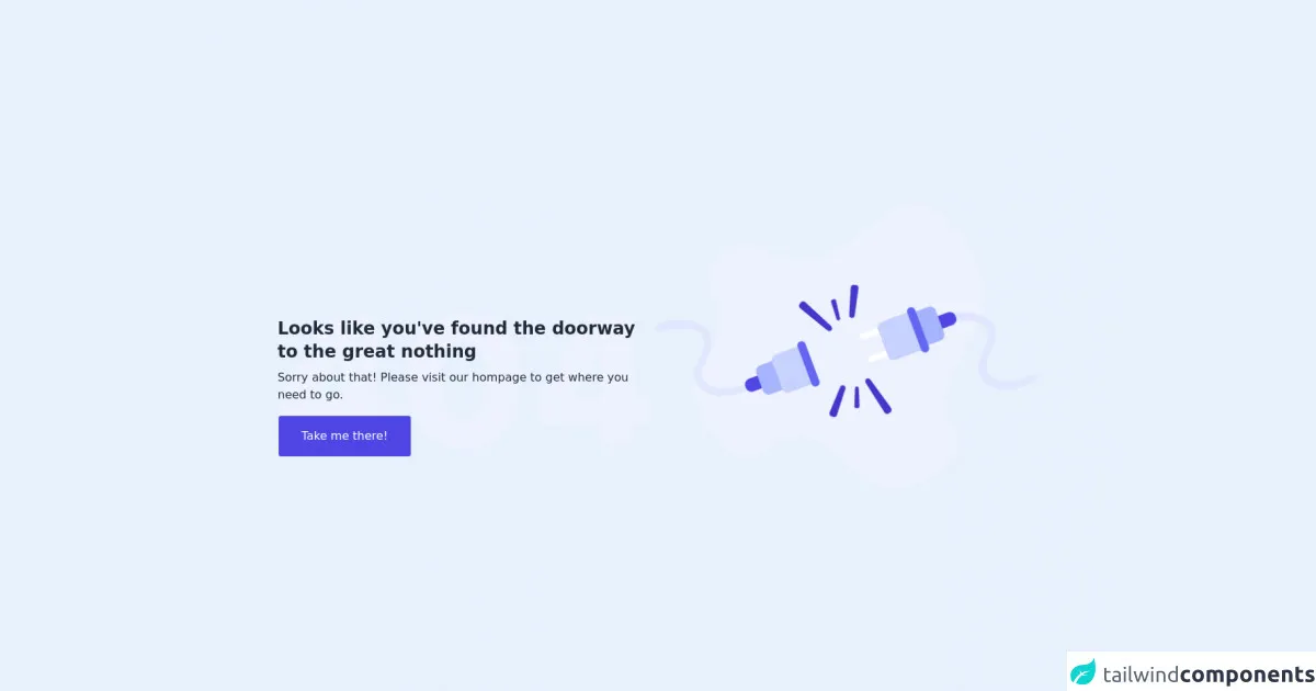
The preview of Tailwind CSS 404 Error Page ui component.
Free download of the Tailwind CSS 404 Error Page's source code
The source code of Tailwind CSS 404 Error Page ui component.
<div class="lg:px-24 lg:py-24 md:py-20 md:px-44 px-4 py-24 items-center flex justify-center flex-col-reverse lg:flex-row md:gap-28 gap-16">
            <div class="xl:pt-24 w-full xl:w-1/2 relative pb-12 lg:pb-0">
                <div class="relative">
                    <div class="absolute">
                        <div class="">
                            <h1 class="my-2 text-gray-800 font-bold text-2xl">
                                Looks like you've found the
                                doorway to the great nothing
                            </h1>
                            <p class="my-2 text-gray-800">Sorry about that! Please visit our hompage to get where you need to go.</p>
                            <button class="sm:w-full lg:w-auto my-2 border rounded md py-4 px-8 text-center bg-indigo-600 text-white hover:bg-indigo-700 focus:outline-none focus:ring-2 focus:ring-indigo-700 focus:ring-opacity-50">Take me there!</button>
                        </div>
                    </div>
                    <div>
                        <img src="https://i.ibb.co/G9DC8S0/404-2.png" />
                    </div>
                </div>
            </div>
            <div>
                <img src="https://i.ibb.co/ck1SGFJ/Group.png" />
            </div>
        </div>
How to create a Tailwind CSS 404 Error Page with Tailwind CSS?
Here are six incredibly easy ways to make a Tailwind CSS 404 Error Page with Tailwind CSS better while spending less:
1. Use a pre-designed Tailwind CSS 404 Error Page ui component
Tailwind CSS provides pre-designed 404 error page ui components that can be used as a starting point for creating a custom 404 error page. These components can be found in the Tailwind CSS documentation and can be customized using Tailwind CSS classes.
2. Add custom branding
Adding custom branding to a 404 error page can help to reinforce a website's brand identity. This can be done by adding a logo, using the website's color scheme, or adding a custom message.
3. Provide helpful information
Providing helpful information on a 404 error page can help to keep users on a website. This can be done by providing links to popular pages, a search bar, or a contact form.
4. Use animations
Using animations on a 404 error page can help to make it more engaging and memorable. This can be done using CSS animations or by using a JavaScript library like Animate.css.
5. Make it responsive
Making a 404 error page responsive ensures that it looks good on all devices, including desktops, tablets, and mobile devices. This can be done using Tailwind CSS's responsive classes.
6. Test it
Testing a 404 error page is essential to ensure that it works as expected. This can be done by intentionally entering incorrect URLs and ensuring that the correct 404 error page is displayed.
Conclusion
Creating a custom 404 error page using Tailwind CSS is an easy and effective way to improve a website's user experience. By using pre-designed ui components, adding custom branding, providing helpful information, using animations, making it responsive, and testing it, developers can create a memorable and engaging 404 error page while spending less time and effort.