- Published on
Surprisingly Effective Ways To Make A Tailbox login With Tailwind CSS
- What is Tailwind CSS?
- The description of Tailbox login ui component
- Why use Tailwind CSS to create a Tailbox login ui component?
- The preview of Tailbox login ui component
- The source code of Tailbox login ui component
- How to create a Tailbox login with Tailwind CSS?
- Conclusion
What is Tailwind CSS?
Tailwind CSS is a utility-first CSS framework that allows developers to easily create custom designs without writing any CSS code. It provides a set of pre-defined classes that can be used to style HTML elements.
The description of Tailbox login ui component
Tailbox login UI component is a login form that can be easily integrated into any website or application. It includes a username and password input field, a submit button, and a forgot password link.
Why use Tailwind CSS to create a Tailbox login ui component?
Tailwind CSS is a great choice for creating a Tailbox login UI component because it provides a set of pre-defined classes that can be used to style the form. This means that developers can easily create a custom login form without writing any CSS code.
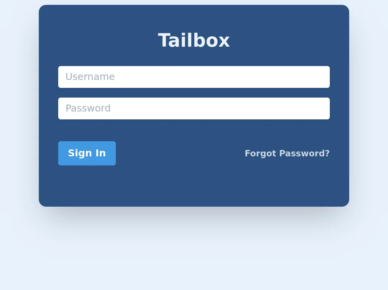
The preview of Tailbox login ui component
The Tailbox login UI component is a simple and elegant login form that can be easily integrated into any website or application. It includes a username and password input field, a submit button, and a forgot password link.
Free download of the Tailbox login's source code
The source code of Tailbox login ui component
To create a Tailbox login UI component with Tailwind CSS, you can use the following HTML and CSS code.
<div class="max-w-lg max-w-xs bg-blue-800 shadow-2xl rounded-lg mx-auto text-center py-12 mt-4 rounded-xl">
        <h1 class="text-gray-200 text-center font-extrabold -mt-3 text-3xl">Tailbox</h1>
        <div class="container py-5 max-w-md mx-auto">
            <form method="" action="">
                <div class="mb-4">
                    <input placeholder="Username"
                        class="shadow appearance-none  rounded w-full py-2 px-3 text-gray-700 leading-tight focus:outline-none focus:shadow-outline"
                        id="username" type="text">
                </div>
                <div class="mb-6">

                    <input placeholder="Password"
                        class="shadow appearance-none  rounded w-full py-2 px-3 text-gray-700 mb-3 leading-tight focus:outline-none focus:shadow-outline"
                        id="password" type="password">

                </div>
                <div class="flex items-center justify-between">
                    <button
                        class="bg-blue-500 hover:bg-blue-700 text-white font-bold py-2 px-4 rounded focus:outline-none focus:shadow-outline"
                        type="button">
                        Sign In
                    </button>
                    <a class="inline-block align-baseline font-bold text-sm text-gray-400 " href="#">
                        Forgot Password?
                    </a>
                </div>
            </form>
        </div>
    </div>
How to create a Tailbox login with Tailwind CSS?
To create a Tailbox login UI component with Tailwind CSS, follow these steps:
- Create a new HTML file and add the following code:
<div class="bg-gray-100 min-h-screen flex flex-col justify-center py-12 sm:px-6 lg:px-8">
  <div class="sm:mx-auto sm:w-full sm:max-w-md">
    <h2 class="mt-6 text-center text-3xl font-extrabold text-gray-900">
      Sign in to your account
    </h2>
    <p class="mt-2 text-center text-sm text-gray-600">
      Or
      <a href="#" class="font-medium text-indigo-600 hover:text-indigo-500">
        start your 14-day free trial
      </a>
    </p>
  </div>

  <div class="mt-8 sm:mx-auto sm:w-full sm:max-w-md">
    <div class="bg-white py-8 px-4 shadow sm:rounded-lg sm:px-10">
      <form class="space-y-6" action="#" method="POST">
        <div>
          <label for="email" class="block text-sm font-medium text-gray-700">
            Email address
          </label>
          <div class="mt-1">
            <input id="email" name="email" type="email" autocomplete="email" required class="appearance-none rounded-none relative block w-full px-3 py-2 border border-gray-300 placeholder-gray-500 text-gray-900 rounded-t-md focus:outline-none focus:ring-indigo-500 focus:border-indigo-500 focus:z-10 sm:text-sm" placeholder="Enter your email address">
          </div>
        </div>

        <div>
          <label for="password" class="block text-sm font-medium text-gray-700">
            Password
          </label>
          <div class="mt-1">
            <input id="password" name="password" type="password" autocomplete="current-password" required class="appearance-none rounded-none relative block w-full px-3 py-2 border border-gray-300 placeholder-gray-500 text-gray-900 rounded-b-md focus:outline-none focus:ring-indigo-500 focus:border-indigo-500 focus:z-10 sm:text-sm" placeholder="Enter your password">
          </div>
        </div>

        <div class="flex items-center justify-between">
          <div class="flex items-center">
            <input id="remember_me" name="remember_me" type="checkbox" class="h-4 w-4 text-indigo-600 focus:ring-indigo-500 border-gray-300 rounded">
            <label for="remember_me" class="ml-2 block text-sm text-gray-900">
              Remember me
            </label>
          </div>

          <div class="text-sm">
            <a href="#" class="font-medium text-indigo-600 hover:text-indigo-500">
              Forgot your password?
            </a>
          </div>
        </div>

        <div>
          <button type="submit" class="group relative w-full flex justify-center py-2 px-4 border border-transparent text-sm font-medium rounded-md text-white bg-indigo-600 hover:bg-indigo-700 focus:outline-none focus:ring-2 focus:ring-offset-2 focus:ring-indigo-500">
            <span class="absolute left-0 inset-y-0 flex items-center pl-3">
              <!-- Heroicon name: solid/lock-closed -->
              <svg class="h-5 w-5 text-indigo-500 group-hover:text-indigo-400" xmlns="http://www.w3.org/2000/svg" viewBox="0 0 20 20" fill="currentColor" aria-hidden="true">
                <path fill-rule="evenodd" d="M10 2a3 3 0 00-3 3v2H4a2 2 0 00-2 2v8a2 2 0 002 2h12a2 2 0 002-2v-8a2 2 0 00-2-2h-3V5a3 3 0 00-3-3zm-3 7a1 1 0 011-1h4a1 1 0 110 2H8a1 1 0 01-1-1zm5 3a1 1 0 100 2 1 1 0 000-2z" clip-rule="evenodd" />
              </svg>
            </span>
            Sign in
          </button>
        </div>
      </form>
    </div>
  </div>
</div>
- Add the Tailwind CSS CDN to your HTML file:
<link rel="stylesheet" href="https://cdn.jsdelivr.net/npm/tailwindcss@latest/dist/tailwind.min.css">
- Save the file and open it in your web browser. You should see the Tailbox login UI component.
Conclusion
In this article, we have discussed how to create a Tailbox login UI component with Tailwind CSS. We have seen that Tailwind CSS provides a set of pre-defined classes that can be used to style HTML elements, making it easy for developers to create custom designs without writing any CSS code. By following the steps outlined in this article, you can easily create a Tailbox login UI component for your website or application.