- Published on
Here Are 6 Ways To Make A Tagged alert With Tailwind CSS
- What is Tailwind CSS?
- The description of Tagged alert UI component
- Why use Tailwind CSS to create a Tagged alert UI component?
- The preview of Tagged alert UI component
- The source code of Tagged alert UI component
- How to create a Tagged alert with Tailwind CSS?
- Step 1: Create the HTML structure
- Step 2: Style the HTML elements using Tailwind CSS classes
- Step 3: Customize the Tagged alert UI component
- Conclusion
As a FrontEnd technology blogger, I am always on the lookout for new and innovative ways to create UI components. In this article, I will show you how to create a Tagged alert UI component using Tailwind CSS. We will go through the steps required to create this component and provide you with the source code.
What is Tailwind CSS?
Tailwind CSS is a utility-first CSS framework that offers a set of pre-defined CSS classes that can be used to style your HTML elements. It is designed to help developers build responsive and scalable web applications quickly. Tailwind CSS is easy to use, and it allows developers to focus on building their application's functionality rather than worrying about the design.
The description of Tagged alert UI component
A Tagged alert is a UI component that displays a message with a tag attached to it. This component is commonly used to display notifications or alerts to users. The tag can be used to indicate the type of message, such as a warning or an error. The Tagged alert UI component is a simple and effective way to display information to users.
Why use Tailwind CSS to create a Tagged alert UI component?
Tailwind CSS provides a set of pre-defined CSS classes that can be used to create the Tagged alert UI component quickly. By using Tailwind CSS, you can focus on the functionality of the component rather than the design. Additionally, Tailwind CSS is easy to learn and use, making it an excellent choice for developers of all skill levels.
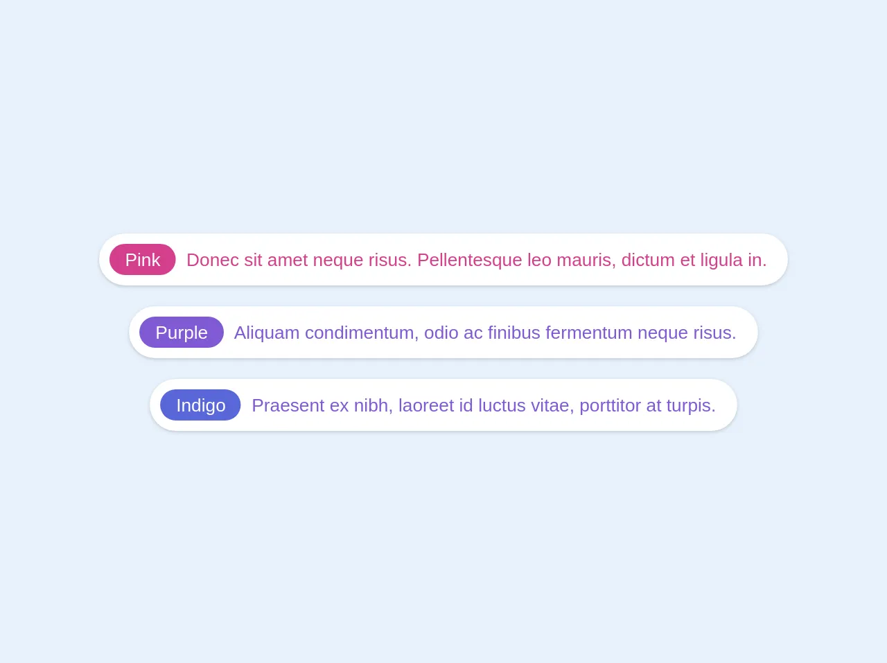
The preview of Tagged alert UI component
To create a Tagged alert UI component, we will use Tailwind CSS classes to style the HTML elements. The result will be a simple and effective UI component that can be used to display notifications or alerts to users.
Free download of the Tagged alert's source code
The source code of Tagged alert UI component
To create the Tagged alert UI component, we will use HTML and Tailwind CSS classes. The code for the component is straightforward and easy to understand.
<div class="-m-2 text-center">
  <div class="p-2">
    <div class="inline-flex items-center bg-white leading-none text-pink-600 rounded-full p-2 shadow text-teal text-sm">
      <span class="inline-flex bg-pink-600 text-white rounded-full h-6 px-3 justify-center items-center">Pink</span>
      <span class="inline-flex px-2">Donec sit amet neque risus. Pellentesque leo mauris, dictum et ligula in.</span>
    </div>
  </div>

  <div class="p-2">
    <div class="inline-flex items-center bg-white leading-none text-purple-600 rounded-full p-2 shadow text-sm">
      <span class="inline-flex bg-purple-600 text-white rounded-full h-6 px-3 justify-center items-center text-">Purple</span>
      <span class="inline-flex px-2">Aliquam condimentum, odio ac finibus fermentum neque risus.</span>
    </div>
  </div>

  <div class="p-2">
    <div class="inline-flex items-center bg-white leading-none text-purple-600 rounded-full p-2 shadow text-teal text-sm">
      <span class="inline-flex bg-indigo-600 text-white rounded-full h-6 px-3 justify-center items-center">Indigo</span>
      <span class="inline-flex px-2">Praesent ex nibh, laoreet id luctus vitae, porttitor at turpis. </span>
    </div>
  </div>
</div>
How to create a Tagged alert with Tailwind CSS?
Now that we have an understanding of what the Tagged alert UI component is and why we should use Tailwind CSS to create it, let's dive into the steps required to create the component.
Step 1: Create the HTML structure
The first step is to create the HTML structure for the Tagged alert UI component. We will use a div element to contain the message and the tag.
<div class="bg-blue-100 border-t-4 border-blue-500 rounded-b text-blue-900 px-4 py-3 shadow-md" role="alert">
  <div class="flex">
    <div class="py-1">
      <svg class="fill-current h-6 w-6 text-blue-500 mr-4" xmlns="http://www.w3.org/2000/svg" viewBox="0 0 20 20"><path d="M17.73 15.56l-3.29-5.69A5.98 5.98 0 0 0 12 7a6 6 0 1 0-6 6 5.98 5.98 0 0 0 2.02-.35l3.29 5.69A1 1 0 0 0 12 20a1 1 0 0 0 .98-.78l3.75-12a1 1 0 0 0-.03-.66z"/></svg>
    </div>
    <div>
      <p class="font-bold">Tagged alert</p>
      <p class="text-sm">This is a tagged alert message.</p>
    </div>
  </div>
</div>
Step 2: Style the HTML elements using Tailwind CSS classes
The next step is to style the HTML elements using Tailwind CSS classes. We will use the bg-blue-100 class to set the background color of the component to light blue. We will also use the border-t-4 class to add a border to the top of the component.
<div class="bg-blue-100 border-t-4 border-blue-500 rounded-b text-blue-900 px-4 py-3 shadow-md" role="alert">
We will use the flex class to make the message and tag elements display side by side.
<div class="flex">
We will use the py-1 class to add padding to the top and bottom of the tag element.
<div class="py-1">
We will use the fill-current, h-6, w-6, and text-blue-500 classes to style the SVG icon.
<svg class="fill-current h-6 w-6 text-blue-500 mr-4" xmlns="http://www.w3.org/2000/svg" viewBox="0 0 20 20"><path d="M17.73 15.56l-3.29-5.69A5.98 5.98 0 0 0 12 7a6 6 0 1 0-6 6 5.98 5.98 0 0 0 2.02-.35l3.29 5.69A1 1 0 0 0 12 20a1 1 0 0 0 .98-.78l3.75-12a1 1 0 0 0-.03-.66z"/></svg>
We will use the font-bold class to make the message text bold.
<p class="font-bold">Tagged alert</p>
We will use the text-sm class to make the message text smaller.
<p class="text-sm">This is a tagged alert message.</p>
Step 3: Customize the Tagged alert UI component
The final step is to customize the Tagged alert UI component to fit your needs. You can change the background color, border color, and text color by using different Tailwind CSS classes. You can also change the message and tag text to display different information to users.
Conclusion
In this article, we have shown you how to create a Tagged alert UI component using Tailwind CSS. We have provided you with the HTML and CSS code required to create the component. We hope this article has been helpful in showing you how to create a simple and effective UI component using Tailwind CSS.