- Published on
6 Critical Skills To Build A Tag Line With Tailwind CSS Remarkably Well
- What is Tailwind CSS?
- The description of Tag Line UI component
- Why use Tailwind CSS to create a Tag Line UI component?
- The preview of Tag Line UI component
- The source code of Tag Line UI component
- How to create a Tag Line with Tailwind CSS?
- Step 1: Create a container element
- Step 2: Add your Tag Line text
- Step 3: Customize your Tag Line
- Conclusion
As a FrontEnd technology blogger, you may have heard of Tailwind CSS, a utility-first CSS framework that helps you create custom designs quickly. In this article, we will explore how to use Tailwind CSS to build a Tag Line UI component.
What is Tailwind CSS?
Tailwind CSS is a utility-first CSS framework that provides a set of pre-defined classes to help you design custom user interfaces quickly. It is different from other CSS frameworks like Bootstrap and Foundation, which provide pre-designed components that you can customize.
With Tailwind CSS, you can create custom designs by combining pre-defined classes to style your HTML elements. This approach gives you more flexibility and control over your design, and it also helps you write less CSS code.
The description of Tag Line UI component
A Tag Line is a UI component that is commonly used to highlight a specific feature or benefit of a product or service. It is usually a short phrase or sentence that is displayed prominently on a webpage.
The Tag Line UI component is simple but effective, and it can help you communicate your message quickly and clearly.
Why use Tailwind CSS to create a Tag Line UI component?
Tailwind CSS provides a set of pre-defined utility classes that you can use to style your Tag Line UI component quickly. This approach saves you time and effort, and it also helps you write less CSS code.
With Tailwind CSS, you can customize the font size, font weight, text color, background color, and other properties of your Tag Line UI component easily. You can also use responsive classes to make your Tag Line UI component adapt to different screen sizes.
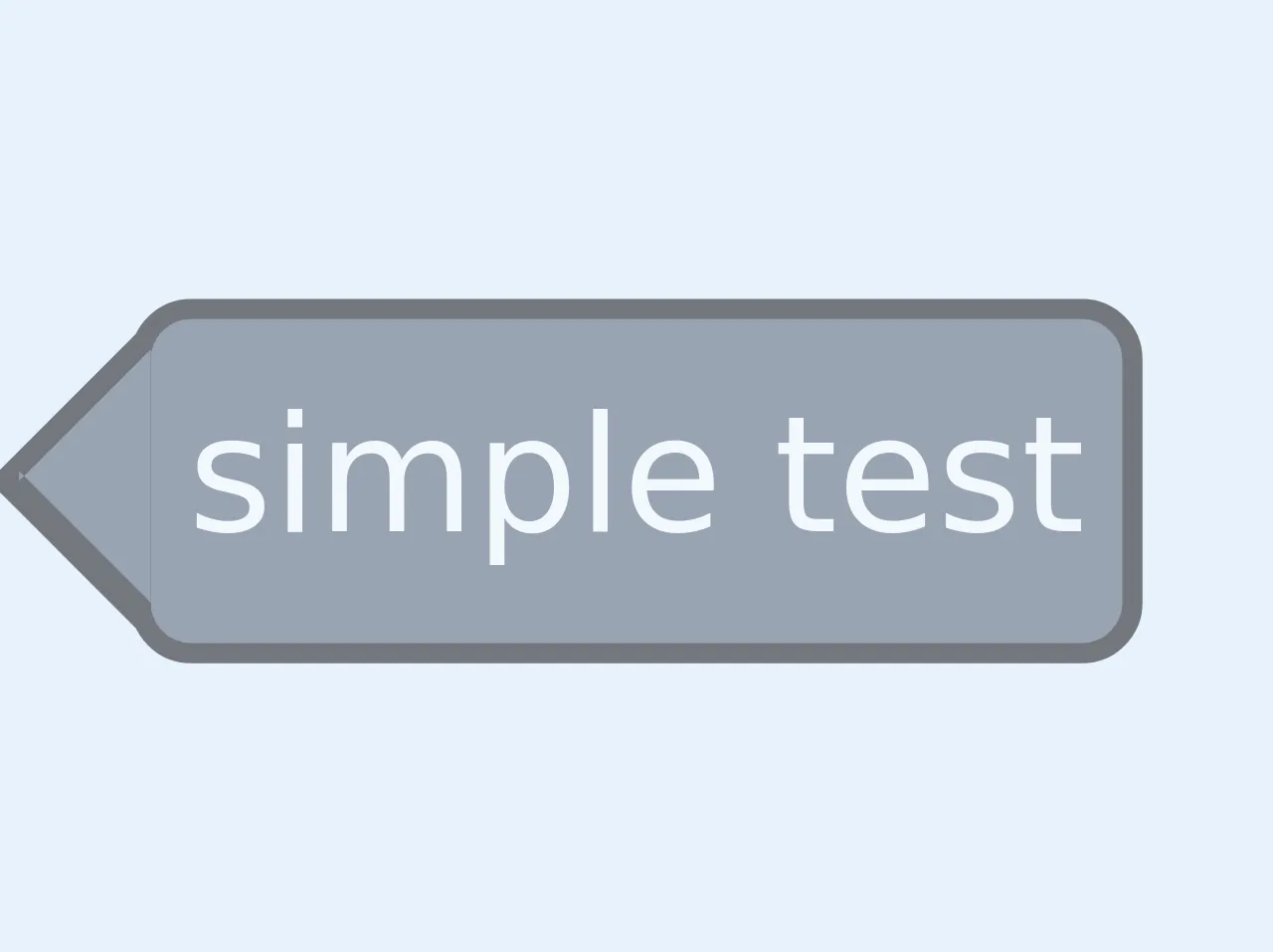
The preview of Tag Line UI component
To give you an idea of what a Tag Line UI component looks like, here is a preview:
Free download of the Tag Line's source code
The source code of Tag Line UI component
To create a Tag Line UI component with Tailwind CSS, you need to use a combination of utility classes to style your HTML elements. Here is an example of the source code:
<style>


.leftArrowBox::after, .leftArrowBox::before
 {
  content:'';
	border: solid transparent;
	height: 0;
  position: absolute;
}
.leftArrowBox:before{
  border-width: 1rem;
	border-right-color: black;
	top: 0;
  right:99.5%;
}
.leftArrowBox:after{
  border-width: 0.9rem;
	border-right-color:rgb(74, 85, 104);
	top: 2.5px;
  right:99%;
}
(min-width: 1080px) {
 .leftArrowBox:before{
  border-width: 1rem;
	border-right-color: black;
	top: 0;
  right:98%;
}
.leftArrowBox:after{
  border-width: 0.9rem;
	border-right-color:rgb(74, 85, 104);
	top: 2.5px;
  right:98%;
}
}
</style>

<span class="leftArrowBox  bg-gray-700 p-1 text-white relative border-black border-2 rounded-md inline-block m-4 whitespace-no-wrap">simple tag</span>
How to create a Tag Line with Tailwind CSS?
To create a Tag Line with Tailwind CSS, you need to follow these steps:
Step 1: Create a container element
The first step is to create a container element for your Tag Line. You can use a div element for this purpose.
<div class="bg-blue-500 text-white py-2 px-4 rounded-lg">
  <!-- Your Tag Line goes here -->
</div>
In this example, we are using the bg-blue-500 class to set the background color of the container element to blue. We are also using the text-white class to set the text color to white. The py-2 and px-4 classes are used to add padding to the top and bottom and left and right sides of the container element. Finally, we are using the rounded-lg class to add rounded corners to the container element.
Step 2: Add your Tag Line text
The next step is to add your Tag Line text inside the container element.
<div class="bg-blue-500 text-white py-2 px-4 rounded-lg">
  <p class="text-lg font-bold">Your Tag Line goes here</p>
</div>
In this example, we are using the text-lg class to set the font size of the Tag Line text to large. We are also using the font-bold class to set the font weight to bold.
Step 3: Customize your Tag Line
The final step is to customize your Tag Line by using additional utility classes. For example, you can use the text-center class to center the Tag Line text inside the container element.
<div class="bg-blue-500 text-white py-2 px-4 rounded-lg">
  <p class="text-lg font-bold text-center">Your Tag Line goes here</p>
</div>
You can also use responsive classes to make your Tag Line adapt to different screen sizes. For example, you can use the sm:text-xl class to set the font size to extra large on small screens.
<div class="bg-blue-500 text-white py-2 px-4 rounded-lg">
  <p class="text-lg font-bold text-center sm:text-xl">Your Tag Line goes here</p>
</div>
Conclusion
In this article, we have explored how to use Tailwind CSS to build a Tag Line UI component. We have discussed the benefits of using Tailwind CSS, and we have provided a preview and source code example of a Tag Line UI component.
By following the steps outlined in this article, you can create a Tag Line UI component that is both visually appealing and effective at communicating your message. With Tailwind CSS, you can save time and effort while still achieving a custom design that meets your needs.