- Published on
Beginners Guide: Create A Tabs line with icons With Tailwind CSS
- What is Tailwind CSS?
- The description of Tabs line with icons ui component
- Why use Tailwind CSS to create a Tabs line with icons ui component?
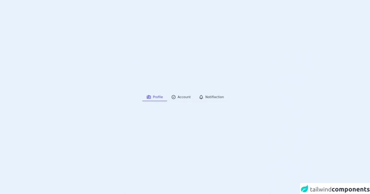
- The preview of Tabs line with icons ui component.
- The source code of Tabs line with icons ui component.
- How to create a Tabs line with icons with Tailwind CSS?
- Step 1: Create the HTML structure
- Step 2: Style the Tabs line with icons
- Step 3: Style the active tab
- Step 4: Style the tab content
- Step 5: Add interactivity with JavaScript
- Conclusion
What is Tailwind CSS?
Tailwind CSS is a utility-first CSS framework that allows you to quickly build custom user interfaces. It provides a set of pre-defined classes that you can use to style your HTML elements. With Tailwind CSS, you can create complex layouts and responsive designs without writing any custom CSS.
The description of Tabs line with icons ui component
Tabs line with icons is a popular user interface component that allows users to navigate between different sections of a web page. It consists of a horizontal line of tabs, each with an icon and a label. When a user clicks on a tab, the corresponding section of the page is displayed.
Why use Tailwind CSS to create a Tabs line with icons ui component?
Tailwind CSS provides a set of pre-defined classes that you can use to create a Tabs line with icons ui component quickly. You don't have to write any custom CSS, which saves you time and effort. Additionally, Tailwind CSS allows you to create responsive designs easily, which is essential for a Tabs line with icons ui component that needs to work on different screen sizes.
The preview of Tabs line with icons ui component.
Free download of the Tabs line with icons's source code
The source code of Tabs line with icons ui component.
<div class="h-screen flex justify-center items-center">
  <div class="flex border-b border-gray-200 dark:border-gray-700">
    <button class="flex items-center h-10 px-2 py-2 -mb-px text-center text-indigo-600 bg-transparent border-b-2 border-indigo-500 sm:px-4 -px-1 dark:border-indigo-400 dark:text-indigo-300 whitespace-nowrap focus:outline-none">
      <svg xmlns="http://www.w3.org/2000/svg" class="w-4 h-4 mx-1 sm:w-6 sm:h-6" fill="none" viewBox="0 0 24 24" stroke="currentColor">
        <path stroke-linecap="round" stroke-linejoin="round" stroke-width="2" d="M10 6H5a2 2 0 00-2 2v9a2 2 0 002 2h14a2 2 0 002-2V8a2 2 0 00-2-2h-5m-4 0V5a2 2 0 114 0v1m-4 0a2 2 0 104 0m-5 8a2 2 0 100-4 2 2 0 000 4zm0 0c1.306 0 2.417.835 2.83 2M9 14a3.001 3.001 0 00-2.83 2M15 11h3m-3 4h2" />
      </svg>

      <span class="mx-1 text-sm sm:text-base"> Profile </span>
    </button>

    <button class="flex items-center h-10 px-2 py-2 -mb-px text-center text-gray-700 bg-transparent border-b-2 border-transparent sm:px-4 -px-1 dark:text-white whitespace-nowrap cursor-base focus:outline-none hover:border-gray-400">
      <svg xmlns="http://www.w3.org/2000/svg" class="w-4 h-4 mx-1 sm:w-6 sm:h-6" fill="none" viewBox="0 0 24 24" stroke="currentColor">
        <path stroke-linecap="round" stroke-linejoin="round" stroke-width="2" d="M9 12l2 2 4-4M7.835 4.697a3.42 3.42 0 001.946-.806 3.42 3.42 0 014.438 0 3.42 3.42 0 001.946.806 3.42 3.42 0 013.138 3.138 3.42 3.42 0 00.806 1.946 3.42 3.42 0 010 4.438 3.42 3.42 0 00-.806 1.946 3.42 3.42 0 01-3.138 3.138 3.42 3.42 0 00-1.946.806 3.42 3.42 0 01-4.438 0 3.42 3.42 0 00-1.946-.806 3.42 3.42 0 01-3.138-3.138 3.42 3.42 0 00-.806-1.946 3.42 3.42 0 010-4.438 3.42 3.42 0 00.806-1.946 3.42 3.42 0 013.138-3.138z" />
      </svg>

      <span class="mx-1 text-sm sm:text-base"> Account </span>
    </button>

    <button class="flex items-center h-10 px-2 py-2 -mb-px text-center text-gray-700 bg-transparent border-b-2 border-transparent sm:px-4 -px-1 dark:text-white whitespace-nowrap cursor-base focus:outline-none hover:border-gray-400">
      <svg xmlns="http://www.w3.org/2000/svg" class="w-4 h-4 mx-1 sm:w-6 sm:h-6" fill="none" viewBox="0 0 24 24" stroke="currentColor">
        <path stroke-linecap="round" stroke-linejoin="round" stroke-width="2" d="M15 17h5l-1.405-1.405A2.032 2.032 0 0118 14.158V11a6.002 6.002 0 00-4-5.659V5a2 2 0 10-4 0v.341C7.67 6.165 6 8.388 6 11v3.159c0 .538-.214 1.055-.595 1.436L4 17h5m6 0v1a3 3 0 11-6 0v-1m6 0H9" />
      </svg>

      <span class="mx-1 text-sm sm:text-base"> Notifiaction </span>
    </button>
  </div>
</div>
How to create a Tabs line with icons with Tailwind CSS?
To create a Tabs line with icons ui component with Tailwind CSS, follow these steps:
Step 1: Create the HTML structure
First, create the HTML structure for the Tabs line with icons ui component. The component consists of a container element that contains a horizontal line of tabs, each with an icon and a label. Additionally, create a section element for each tab that will display the corresponding content when the tab is clicked.
<div class="tabs">
  <div class="tab">
    <i class="fas fa-home"></i>
    <span>Home</span>
  </div>
  <div class="tab">
    <i class="fas fa-user"></i>
    <span>Profile</span>
  </div>
  <div class="tab">
    <i class="fas fa-envelope"></i>
    <span>Messages</span>
  </div>
</div>

<div class="tab-content">
  <section class="tab-pane active">
    <h1>Home</h1>
    <p>Welcome to the home page!</p>
  </section>
  <section class="tab-pane">
    <h1>Profile</h1>
    <p>Here's your profile information.</p>
  </section>
  <section class="tab-pane">
    <h1>Messages</h1>
    <p>Here are your messages.</p>
  </section>
</div>
Step 2: Style the Tabs line with icons
Next, use Tailwind CSS classes to style the Tabs line with icons. Add the flex class to the container element to make it a flex container. Add the border-b class to the container element to create a bottom border. Add the px-4 and py-2 classes to the tabs to add padding. Add the text-gray-600 class to the tab labels to set the text color. Add the cursor-pointer class to the tabs to make them clickable.
<div class="tabs flex border-b">
  <div class="tab px-4 py-2 cursor-pointer">
    <i class="fas fa-home"></i>
    <span class="text-gray-600">Home</span>
  </div>
  <div class="tab px-4 py-2 cursor-pointer">
    <i class="fas fa-user"></i>
    <span class="text-gray-600">Profile</span>
  </div>
  <div class="tab px-4 py-2 cursor-pointer">
    <i class="fas fa-envelope"></i>
    <span class="text-gray-600">Messages</span>
  </div>
</div>
Step 3: Style the active tab
Add the border-b-4 and border-blue-500 classes to the active tab to create a blue bottom border. Add the text-blue-500 class to the active tab label to set the text color to blue.
<div class="tabs flex border-b">
  <div class="tab px-4 py-2 cursor-pointer border-b-4 border-blue-500">
    <i class="fas fa-home"></i>
    <span class="text-blue-500">Home</span>
  </div>
  <div class="tab px-4 py-2 cursor-pointer">
    <i class="fas fa-user"></i>
    <span class="text-gray-600">Profile</span>
  </div>
  <div class="tab px-4 py-2 cursor-pointer">
    <i class="fas fa-envelope"></i>
    <span class="text-gray-600">Messages</span>
  </div>
</div>
Step 4: Style the tab content
Add the hidden class to all the tab content sections except for the active one. Add the block class to the active tab content section to display it. Add the px-4 and py-2 classes to the tab content sections to add padding.
<div class="tab-content">
  <section class="tab-pane active block px-4 py-2">
    <h1>Home</h1>
    <p>Welcome to the home page!</p>
  </section>
  <section class="tab-pane hidden px-4 py-2">
    <h1>Profile</h1>
    <p>Here's your profile information.</p>
  </section>
  <section class="tab-pane hidden px-4 py-2">
    <h1>Messages</h1>
    <p>Here are your messages.</p>
  </section>
</div>
Step 5: Add interactivity with JavaScript
Finally, add JavaScript code to handle the click events on the tabs. When a tab is clicked, remove the active class from the previously active tab and add it to the clicked tab. Hide the previously active tab content section and display the clicked tab content section.
const tabs = document.querySelectorAll('.tab');
const tabContent = document.querySelectorAll('.tab-pane');

tabs.forEach((tab, index) => {
  tab.addEventListener('click', () => {
    // Remove active class from previously active tab
    tabs.forEach((tab) => {
      tab.classList.remove('border-b-4', 'border-blue-500');
      tab.querySelector('span').classList.remove('text-blue-500');
    });
    // Add active class to clicked tab
    tab.classList.add('border-b-4', 'border-blue-500');
    tab.querySelector('span').classList.add('text-blue-500');
    // Hide previously active tab content section
    tabContent.forEach((section) => {
      section.classList.remove('block');
      section.classList.add('hidden');
    });
    // Display clicked tab content section
    tabContent[index].classList.remove('hidden');
    tabContent[index].classList.add('block');
  });
});
Conclusion
In this article, we have learned how to create a Tabs line with icons ui component with Tailwind CSS. We have seen how Tailwind CSS can help us quickly create responsive designs without writing any custom CSS. By following the steps outlined in this article, you can create your Tabs line with icons ui component in no time.