- Published on
6 Steps To Make A Tabs With Tailwind CSS Like A Pro In Under An Hour
- What is Tailwind CSS?
- The description of Tabs ui component
- Why use Tailwind CSS to create a Tabs ui component?
- The preview of Tabs ui component.
- The source code of Tabs ui component.
- How to create a Tabs with Tailwind CSS?
- Step 1: Set up your HTML structure
- Step 2: Style your tabs
- Step 3: Style your tab content
- Step 4: Add JavaScript functionality
- Step 5: Add responsive design
- Step 6: Test and refine your Tabs ui component
- Conclusion
What is Tailwind CSS?
Tailwind CSS is a utility-first CSS framework that allows you to create custom designs without having to write any CSS code. It provides a set of pre-defined classes that you can use to style your HTML elements. With Tailwind CSS, you can create responsive designs, customize your styles, and build complex layouts quickly and easily.
The description of Tabs ui component
Tabs are a common user interface component used to display multiple sections of content within the same page. They are often used to organize information and improve the user experience by reducing clutter and making it easier to find the information they need.
Why use Tailwind CSS to create a Tabs ui component?
Tailwind CSS provides a set of pre-defined classes that you can use to create a Tabs ui component quickly and easily. You don't need to write any CSS code, which saves you a lot of time and effort. Tailwind CSS also provides responsive design classes, which means that your Tabs ui component will look great on any device.
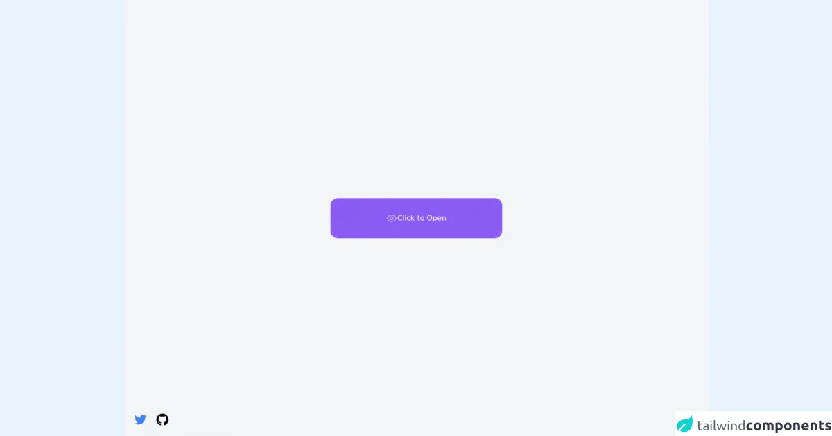
The preview of Tabs ui component.
To create a Tabs ui component with Tailwind CSS, you will need to use a combination of HTML and CSS code. Here is a preview of what the final product will look like:
Free download of the Tabs's source code
The source code of Tabs ui component.
Here is the source code for the Tabs ui component created with Tailwind CSS:
<script defer src="https://unpkg.com/@alpinejs/[email protected]/dist/cdn.min.js"></script>
<script src="//unpkg.com/alpinejs" defer></script>
<script src="https://cdn.jsdelivr.net/npm/[email protected]/dist/perfect-scrollbar.min.js"></script>

<div
  class="flex flex-col items-center justify-center min-h-screen antialiased bg-gray-100"
>
  <div x-data="tabs" class="overflow-hidden rounded-2xl" x-cloak>
    <!-- Tabs -->
    <div
         x-show="isTabsActive"
         x-collapse
         class="bg-white border-t-4 border-purple-500 border-x-4 rounded-t-2xl"
    >
      <div id="tabs-container" class="relative h-64 overflow-hidden">
        <ul class="p-6">
          <template x-for="(tab, index) in tabs" x-key="index">
            <li x-show="activeTab == tab.title" class="space-y-4">
              <h2
                  x-text="(new String(tab.title)).replace(/\w\S*/g, (w) => (w.replace(/^\w/, (c) => c.toUpperCase())))"
                  class="text-3xl text-gray-700"
                  ></h2>
              <p
                 class="max-w-md text-base text-gray-500"
                 x-text="tab.content"
                 ></p>
            </li>
          </template>
        </ul>
      </div>
    </div>

    <div
      class="relative flex items-center overflow-hidden bg-white border-4 border-purple-500 rounded-b-2xl"
    >
      <!-- Links -->
      <nav class="flex items-center justify-center h-20 gap-8 px-6">
        <template x-for="(link, index) in links" x-key="index">
          <a
             href="#"
             @click="setActiveTab($event, link.title, index)"
             class="grid w-16 h-16 grid-cols-1 grid-rows-1"
             >
            <span class="sr-only" x-text="link.title"></span>
            <div
                 class="col-[1/1] row-[1/1] flex items-center justify-center w-16 h-16 transition-opacity duration-300"
                 :class="activeTab != link.title ? 'opacity-100 pointer-events-auto' : 'opacity-0 pointer-events-none'"
                 x-html="link.inActiveIcon"
                 ></div>
            <div
                 class="col-[1/1] row-[1/1] flex items-center justify-center w-16 h-16 transition-opacity duration-300"
                 :class="activeTab == link.title ? 'opacity-100 pointer-events-auto' : 'opacity-0 pointer-events-none'"
                 x-html="link.activeIcon"
                 ></div>
          </a>
        </template>
      </nav>

      <!-- Show/Hide button -->
      <button
              @click="isTabsActive = !isTabsActive"
              class="absolute z-10 flex items-center justify-center gap-2 transition-all bg-purple-500"
              :class="isTabsActive ? 'left-0 top-0 w-8 h-8 rounded-br-lg' : 'w-full h-full inset-0'"
              >
        <svg
             x-show="!isTabsActive"
             class="w-6 h-6 text-white animate-pulse"
             fill="none"
             stroke="currentColor"
             viewBox="0 0 24 24"
             xmlns="http://www.w3.org/2000/svg"
             >
          <path
                stroke-linecap="round"
                stroke-linejoin="round"
                stroke-width="2"
                d="M15 12a3 3 0 11-6 0 3 3 0 016 0z"
                ></path>
          <path
                stroke-linecap="round"
                stroke-linejoin="round"
                stroke-width="2"
                d="M2.458 12C3.732 7.943 7.523 5 12 5c4.478 0 8.268 2.943 9.542 7-1.274 4.057-5.064 7-9.542 7-4.477 0-8.268-2.943-9.542-7z"
                ></path>
        </svg>

        <svg
             x-show="isTabsActive"
             class="w-6 h-6 text-white"
             fill="none"
             stroke="currentColor"
             viewBox="0 0 24 24"
             xmlns="http://www.w3.org/2000/svg"
             >
          <path
                stroke-linecap="round"
                stroke-linejoin="round"
                stroke-width="2"
                d="M6 18L18 6M6 6l12 12"
                ></path>
        </svg>

        <span x-show="!isTabsActive" class="text-white">Click to Open</span>
      </button>

      <!-- Indicator -->
      <div
           id="indicator"
           class="absolute w-6 h-8 transition-all duration-300 bg-purple-500 rounded-full -bottom-4 left-11"
           >
        <div
             style="box-shadow: 0 10px 0 rgb(168 85 247)"
             class="absolute w-5 h-5 bg-white -left-4 bottom-1/2 rounded-br-3xl"
             ></div>
        <div
             style="box-shadow: 0 10px 0 rgb(168 85 247)"
             class="absolute w-5 h-5 bg-white -right-4 bottom-1/2 rounded-bl-3xl"
             ></div>
      </div>
    </div>
  </div>
</div>

<!-- Author links -->
<div class="fixed flex items-center space-x-4 bottom-5 left-5">
    <a href="https://twitter.com/ak_kamona" target="_blank" class="transition-transform transform hover:scale-125">
        <span class="sr-only">Twitter</span>
        <svg
            aria-hidden="true"
            class="w-8 h-8 text-blue-500"
            fill="currentColor"
            xmlns="http://www.w3.org/2000/svg"
            viewBox="0 0 24 24"
            >
            <path
                d="M19.633,7.997c0.013,0.175,0.013,0.349,0.013,0.523c0,5.325-4.053,11.461-11.46,11.461c-2.282,0-4.402-0.661-6.186-1.809 c0.324,0.037,0.636,0.05,0.973,0.05c1.883,0,3.616-0.636,5.001-1.721c-1.771-0.037-3.255-1.197-3.767-2.793 c0.249,0.037,0.499,0.062,0.761,0.062c0.361,0,0.724-0.05,1.061-0.137c-1.847-0.374-3.23-1.995-3.23-3.953v-0.05 c0.537,0.299,1.16,0.486,1.82,0.511C3.534,9.419,2.823,8.184,2.823,6.787c0-0.748,0.199-1.434,0.548-2.032 c1.983,2.443,4.964,4.04,8.306,4.215c-0.062-0.3-0.1-0.611-0.1-0.923c0-2.22,1.796-4.028,4.028-4.028 c1.16,0,2.207,0.486,2.943,1.272c0.91-0.175,1.782-0.512,2.556-0.973c-0.299,0.935-0.936,1.721-1.771,2.22 c0.811-0.088,1.597-0.312,2.319-0.624C21.104,6.712,20.419,7.423,19.633,7.997z"
                ></path>
        </svg>
    </a>
    <a href="https://github.com/Kamona-WD" target="_blank" class="transition-transform transform hover:scale-125">
        <span class="sr-only">Github</span>
        <svg
            aria-hidden="true"
            class="w-8 h-8 text-black"
            fill="currentColor"
            xmlns="http://www.w3.org/2000/svg"
            viewBox="0 0 24 24"
            >
            <path
                fill-rule="evenodd"
                clip-rule="evenodd"
                d="M12.026,2c-5.509,0-9.974,4.465-9.974,9.974c0,4.406,2.857,8.145,6.821,9.465 c0.499,0.09,0.679-0.217,0.679-0.481c0-0.237-0.008-0.865-0.011-1.696c-2.775,0.602-3.361-1.338-3.361-1.338 c-0.452-1.152-1.107-1.459-1.107-1.459c-0.905-0.619,0.069-0.605,0.069-0.605c1.002,0.07,1.527,1.028,1.527,1.028 c0.89,1.524,2.336,1.084,2.902,0.829c0.091-0.645,0.351-1.085,0.635-1.334c-2.214-0.251-4.542-1.107-4.542-4.93 c0-1.087,0.389-1.979,1.024-2.675c-0.101-0.253-0.446-1.268,0.099-2.64c0,0,0.837-0.269,2.742,1.021 c0.798-0.221,1.649-0.332,2.496-0.336c0.849,0.004,1.701,0.115,2.496,0.336c1.906-1.291,2.742-1.021,2.742-1.021 c0.545,1.372,0.203,2.387,0.099,2.64c0.64,0.696,1.024,1.587,1.024,2.675c0,3.833-2.33,4.675-4.552,4.922 c0.355,0.308,0.675,0.916,0.675,1.846c0,1.334-0.012,2.41-0.012,2.737c0,0.267,0.178,0.577,0.687,0.479 C19.146,20.115,22,16.379,22,11.974C22,6.465,17.535,2,12.026,2z"
                ></path>
        </svg>
    </a>
</div>

<script>
const tabs = () => {
  let ps;
  const init = () => {
    const tabsContainer = document.querySelector("#tabs-container");
    ps = new PerfectScrollbar(tabsContainer);
  };

  return {
    init,

    isTabsActive: false,

    activeTab: "templates",

    links: [
      {
        title: "templates",
        inActiveIcon: `
              <svg
                aria-hidden="true"
                class="w-8 h-8 text-purple-500"
                fill="none"
                stroke="currentColor"
                viewBox="0 0 24 24"
                xmlns="http://www.w3.org/2000/svg"
              >
                <path
                  stroke-linecap="round"
                  stroke-linejoin="round"
                  stroke-width="2"
                  d="M4 5a1 1 0 011-1h14a1 1 0 011 1v2a1 1 0 01-1 1H5a1 1 0 01-1-1V5zM4 13a1 1 0 011-1h6a1 1 0 011 1v6a1 1 0 01-1 1H5a1 1 0 01-1-1v-6zM16 13a1 1 0 011-1h2a1 1 0 011 1v6a1 1 0 01-1 1h-2a1 1 0 01-1-1v-6z"
                ></path>
              </svg>
              `,
        activeIcon: `
              <svg
                aria-hidden="true"
                class="w-8 h-8 text-purple-500"
                fill="currentColor"
                viewBox="0 0 20 20"
                xmlns="http://www.w3.org/2000/svg"
              >
                <path
                  d="M3 4a1 1 0 011-1h12a1 1 0 011 1v2a1 1 0 01-1 1H4a1 1 0 01-1-1V4zM3 10a1 1 0 011-1h6a1 1 0 011 1v6a1 1 0 01-1 1H4a1 1 0 01-1-1v-6zM14 9a1 1 0 00-1 1v6a1 1 0 001 1h2a1 1 0 001-1v-6a1 1 0 00-1-1h-2z"
                ></path>
              </svg>
              `,
      },
      {
        title: "cloud",
        inActiveIcon: `
              <svg
                aria-hidden="true"
                class="w-8 h-8 text-purple-500"
                fill="none"
                stroke="currentColor"
                viewBox="0 0 24 24"
                xmlns="http://www.w3.org/2000/svg"
              >
                <path
                  stroke-linecap="round"
                  stroke-linejoin="round"
                  stroke-width="2"
                  d="M3 15a4 4 0 004 4h9a5 5 0 10-.1-9.999 5.002 5.002 0 10-9.78 2.096A4.001 4.001 0 003 15z"
                ></path>
              </svg>
              `,
        activeIcon: `
              <svg
                aria-hidden="true"
                class="w-8 h-8 text-purple-500"
                fill="currentColor"
                viewBox="0 0 20 20"
                xmlns="http://www.w3.org/2000/svg"
              >
              <path
                d="M5.5 16a3.5 3.5 0 01-.369-6.98 4 4 0 117.753-1.977A4.5 4.5 0 1113.5 16h-8z"
              ></path>
              </svg>
              `,
      },
      {
        title: "security",
        inActiveIcon: `
              <svg
                aria-hidden="true"
                class="w-8 h-8 text-purple-500"
                fill="none"
                stroke="currentColor"
                viewBox="0 0 24 24"
                xmlns="http://www.w3.org/2000/svg"
              >
                <path
                  stroke-linecap="round"
                  stroke-linejoin="round" stroke-width="2"
                  d="M9 12l2 2 4-4m5.618-4.016A11.955 11.955 0 0112 2.944a11.955 11.955 0 01-8.618 3.04A12.02 12.02 0 003 9c0 5.591 3.824 10.29 9 11.622 5.176-1.332 9-6.03 9-11.622 0-1.042-.133-2.052-.382-3.016z"
                ></path>
              </svg>
              `,
        activeIcon: `
              <svg
                aria-hidden="true"
                class="w-8 h-8 text-purple-500"
                fill="currentColor"
                viewBox="0 0 20 20"
                xmlns="http://www.w3.org/2000/svg"
              >
                <path
                  fill-rule="evenodd"
                  d="M2.166 4.999A11.954 11.954 0 0010 1.944 11.954 11.954 0 0017.834 5c.11.65.166 1.32.166 2.001 0 5.225-3.34 9.67-8 11.317C5.34 16.67 2 12.225 2 7c0-.682.057-1.35.166-2.001zm11.541 3.708a1 1 0 00-1.414-1.414L9 10.586 7.707 9.293a1 1 0 00-1.414 1.414l2 2a1 1 0 001.414 0l4-4z" clip-rule="evenodd"
                ></path>
              </svg>
              `,
      },
      {
        title: "support",
        inActiveIcon: `
              <svg
                aria-hidden="true"
                class="w-8 h-8 text-purple-500"
                fill="none"
                stroke="currentColor"
                viewBox="0 0 24 24"
                xmlns="http://www.w3.org/2000/svg"
              >
                <path
                  stroke-linecap="round"
                  stroke-linejoin="round"
                  stroke-width="2"
                  d="M15 5v2m0 4v2m0 4v2M5 5a2 2 0 00-2 2v3a2 2 0 110 4v3a2 2 0 002 2h14a2 2 0 002-2v-3a2 2 0 110-4V7a2 2 0 00-2-2H5z"
                ></path>
              </svg>
              `,
        activeIcon: `
              <svg
                aria-hidden="true"
                class="w-8 h-8 text-purple-500"
                fill="currentColor"
                viewBox="0 0 20 20"
                xmlns="http://www.w3.org/2000/svg"
              >
                <path
                  d="M2 6a2 2 0 012-2h12a2 2 0 012 2v2a2 2 0 100 4v2a2 2 0 01-2 2H4a2 2 0 01-2-2v-2a2 2 0 100-4V6z"
                ></path>
              </svg>
              `,
      },
      {
        title: "settings",
        inActiveIcon: `
              <svg
                aria-hidden="true"
                class="w-8 h-8 text-purple-500"
                fill="none"
                stroke="currentColor"
                viewBox="0 0 24 24"
                xmlns="http://www.w3.org/2000/svg"
              >
                <path
                  stroke-linecap="round"
                  stroke-linejoin="round"
                  stroke-width="2"
                  d="M10.325 4.317c.426-1.756 2.924-1.756 3.35 0a1.724 1.724 0 002.573 1.066c1.543-.94 3.31.826 2.37 2.37a1.724 1.724 0 001.065 2.572c1.756.426 1.756 2.924 0 3.35a1.724 1.724 0 00-1.066 2.573c.94 1.543-.826 3.31-2.37 2.37a1.724 1.724 0 00-2.572 1.065c-.426 1.756-2.924 1.756-3.35 0a1.724 1.724 0 00-2.573-1.066c-1.543.94-3.31-.826-2.37-2.37a1.724 1.724 0 00-1.065-2.572c-1.756-.426-1.756-2.924 0-3.35a1.724 1.724 0 001.066-2.573c-.94-1.543.826-3.31 2.37-2.37.996.608 2.296.07 2.572-1.065z"
                ></path>
                <path
                  stroke-linecap="round"
                  stroke-linejoin="round"
                  stroke-width="2"
                  d="M15 12a3 3 0 11-6 0 3 3 0 016 0z"
                ></path>
              </svg>
              `,
        activeIcon: `
              <svg
                aria-hidden="true"
                class="w-8 h-8 text-purple-500"
                fill="currentColor"
                viewBox="0 0 20 20"
                xmlns="http://www.w3.org/2000/svg"
              >
                <path
                  fill-rule="evenodd"
                  d="M11.49 3.17c-.38-1.56-2.6-1.56-2.98 0a1.532 1.532 0 01-2.286.948c-1.372-.836-2.942.734-2.106 2.106.54.886.061 2.042-.947 2.287-1.561.379-1.561 2.6 0 2.978a1.532 1.532 0 01.947 2.287c-.836 1.372.734 2.942 2.106 2.106a1.532 1.532 0 012.287.947c.379 1.561 2.6 1.561 2.978 0a1.533 1.533 0 012.287-.947c1.372.836 2.942-.734 2.106-2.106a1.533 1.533 0 01.947-2.287c1.561-.379 1.561-2.6 0-2.978a1.532 1.532 0 01-.947-2.287c.836-1.372-.734-2.942-2.106-2.106a1.532 1.532 0 01-2.287-.947zM10 13a3 3 0 100-6 3 3 0 000 6z"
                  clip-rule="evenodd"
                ></path>
              </svg>
              `,
      },
    ],

    tabs: [
      {
        title: "templates",
        content:
        "Lorem ipsum dolor sit amet consectetur, adipisicing elit. Quod hic autem, cumque nobis in a, quam temporibus est et iure ullam tenetur ut. Officia explicabo atque beatae. Illum, eum quo? Lorem ipsum dolor sit amet consectetur, adipisicing elit. Quod hic autem, cumque nobis in a, quam temporibus est et iure ullam tenetur ut. Officia explicabo atque beatae. Illum, eum quo? Lorem ipsum dolor sit amet consectetur, adipisicing elit. Quod hic autem, cumque nobis in a, quam temporibus est et iure ullam tenetur ut. Officia explicabo atque beatae. Illum, eum quo? Lorem ipsum dolor sit amet consectetur, adipisicing elit. Quod hic autem, cumque nobis in a, quam temporibus est et iure ullam tenetur ut. Officia explicabo atque beatae. Illum, eum quo? Lorem ipsum dolor sit amet consectetur, adipisicing elit. Quod hic autem, cumque nobis in a, quam temporibus est et iure ullam tenetur ut. Officia explicabo atque beatae. Illum, eum quo? Lorem ipsum dolor sit amet consectetur, adipisicing elit. Quod hic autem, cumque nobis in a, quam temporibus est et iure ullam tenetur ut. Officia explicabo atque beatae. Illum, eum quo? Lorem ipsum dolor sit amet consectetur, adipisicing elit. Quod hic autem, cumque nobis in a, quam temporibus est et iure ullam tenetur ut. Officia explicabo atque beatae. Illum, eum quo? Lorem ipsum dolor sit amet consectetur, adipisicing elit. Quod hic autem, cumque nobis in a, quam temporibus est et iure ullam tenetur ut. Officia explicabo atque beatae. Illum, eum quo? Lorem ipsum dolor sit amet consectetur, adipisicing elit. Quod hic autem, cumque nobis in a, quam temporibus est et iure ullam tenetur ut. Officia explicabo atque beatae. Illum, eum quo? Lorem ipsum dolor sit amet consectetur, adipisicing elit. Quod hic autem, cumque nobis in a, quam temporibus est et iure ullam tenetur ut. Officia explicabo atque beatae. Illum, eum quo? Lorem ipsum dolor sit amet consectetur, adipisicing elit. Quod hic autem, cumque nobis in a, quam temporibus est et iure ullam tenetur ut. Officia explicabo atque beatae. Illum, eum quo? Lorem ipsum dolor sit amet consectetur, adipisicing elit. Quod hic autem, cumque nobis in a, quam temporibus est et iure ullam tenetur ut. Officia explicabo atque beatae. Illum, eum quo? Lorem ipsum dolor sit amet consectetur, adipisicing elit. Quod hic autem, cumque nobis in a, quam temporibus est et iure ullam tenetur ut. Officia explicabo atque beatae. Illum, eum quo? Lorem ipsum dolor sit amet consectetur, adipisicing elit. Quod hic autem, cumque nobis in a, quam temporibus est et iure ullam tenetur ut. Officia explicabo atque beatae. Illum, eum quo? Lorem ipsum dolor sit amet consectetur, adipisicing elit. Quod hic autem, cumque nobis in a, quam temporibus est et iure ullam tenetur ut. Officia explicabo atque beatae. Illum, eum quo? Lorem ipsum dolor sit amet consectetur, adipisicing elit. Quod hic autem, cumque nobis in a, quam temporibus est et iure ullam tenetur ut. Officia explicabo atque beatae. Illum, eum quo? Lorem ipsum dolor sit amet consectetur, adipisicing elit. Quod hic autem, cumque nobis in a, quam temporibus est et iure ullam tenetur ut. Officia explicabo atque beatae. Illum, eum quo? Lorem ipsum dolor sit amet consectetur, adipisicing elit. Quod hic autem, cumque nobis in a, quam temporibus est et iure ullam tenetur ut. Officia explicabo atque beatae. Illum, eum quo? Lorem ipsum dolor sit amet consectetur, adipisicing elit. Quod hic autem, cumque nobis in a, quam temporibus est et iure ullam tenetur ut. Officia explicabo atque beatae. Illum, eum quo? Lorem ipsum dolor sit amet consectetur, adipisicing elit. Quod hic autem, cumque nobis in a, quam temporibus est et iure ullam tenetur ut. Officia explicabo atque beatae. Illum, eum quo? Lorem ipsum dolor sit amet consectetur, adipisicing elit. Quod hic autem, cumque nobis in a, quam temporibus est et iure ullam tenetur ut. Officia explicabo atque beatae. Illum, eum quo? Lorem ipsum dolor sit amet consectetur, adipisicing elit. Quod hic autem, cumque nobis in a, quam temporibus est et iure ullam tenetur ut. Officia explicabo atque beatae. Illum, eum quo? Lorem ipsum dolor sit amet consectetur, adipisicing elit. Quod hic autem, cumque nobis in a, quam temporibus est et iure ullam tenetur ut. Officia explicabo atque beatae. Illum, eum quo? Lorem ipsum dolor sit amet consectetur, adipisicing elit. Quod hic autem, cumque nobis in a, quam temporibus est et iure ullam tenetur ut. Officia explicabo atque beatae. Illum, eum quo? Lorem ipsum dolor sit amet consectetur, adipisicing elit. Quod hic autem, cumque nobis in a, quam temporibus est et iure ullam tenetur ut. Officia explicabo atque beatae. Illum, eum quo? Lorem ipsum dolor sit amet consectetur, adipisicing elit. Quod hic autem, cumque nobis in a, quam temporibus est et iure ullam tenetur ut. Officia explicabo atque beatae. Illum, eum quo? Lorem ipsum dolor sit amet consectetur, adipisicing elit. Quod hic autem, cumque nobis in a, quam temporibus est et iure ullam tenetur ut. Officia explicabo atque beatae. Illum, eum quo? Lorem ipsum dolor sit amet consectetur, adipisicing elit. Quod hic autem, cumque nobis in a, quam temporibus est et iure ullam tenetur ut. Officia explicabo atque beatae. Illum, eum quo? Lorem ipsum dolor sit amet consectetur, adipisicing elit. Quod hic autem, cumque nobis in a, quam temporibus est et iure ullam tenetur ut. Officia explicabo atque beatae. Illum, eum quo? Lorem ipsum dolor sit amet consectetur, adipisicing elit. Quod hic autem, cumque nobis in a, quam temporibus est et iure ullam tenetur ut. Officia explicabo atque beatae. Illum, eum quo?",
      },
      {
        title: "cloud",
        content:
        "Lorem ipsum dolor sit, amet consectetur adipisicing elit. Quaerat fuga enim laborum corrupti commodi sapiente iste dolore non repellat? Odio sequi facilis blanditiis. Cupiditate quae accusantium consequatur sit! Harum, perferendis.",
      },
      {
        title: "security",
        content:
        "Lorem ipsum dolor sit, amet consectetur adipisicing elit. Quaerat fuga enim laborum corrupti commodi sapiente iste dolore non repellat? Odio sequi facilis blanditiis. Cupiditate quae accusantium consequatur sit! Harum, perferendis. Lorem ipsum dolor sit, amet consectetur adipisicing elit. Quaerat fuga enim laborum corrupti commodi sapiente iste dolore non repellat? Odio sequi facilis blanditiis. Cupiditate quae accusantium consequatur sit! Harum, perferendis.",
      },
      {
        title: "support",
        content:
        "Lorem ipsum dolor sit, amet consectetur adipisicing elit. Quaerat fuga enim laborum corrupti commodi sapiente iste dolore non repellat? Odio sequi facilis blanditiis. Cupiditate quae accusantium consequatur sit! Harum, perferendis. Lorem ipsum dolor sit, amet consectetur adipisicing elit. Quaerat fuga enim laborum corrupti commodi sapiente iste dolore non repellat? Odio sequi facilis blanditiis. Cupiditate quae accusantium consequatur sit! Harum, perferendis. Lorem ipsum dolor sit, amet consectetur adipisicing elit. Quaerat fuga enim laborum corrupti commodi sapiente iste dolore non repellat? Odio sequi facilis blanditiis. Cupiditate quae accusantium consequatur sit! Harum, perferendis.",
      },
      {
        title: "settings",
        content:
        "Lorem ipsum dolor sit, amet consectetur adipisicing elit. Quaerat fuga enim laborum corrupti commodi sapiente iste dolore non repellat? Odio sequi facilis blanditiis. Cupiditate quae accusantium consequatur sit! Harum, perferendis.",
      },
    ],

    setActiveTab(e, link, index) {
      e.preventDefault();

      this.activeTab = link;

      if (ps) {
        ps.update();
      }

      document.querySelector(
        "#indicator"
        /* TODO: use link (width / 2 ) */
      ).style.transform = `translateX(calc(${96 * index}px))`;
    },
  };
};
</script>
How to create a Tabs with Tailwind CSS?
Follow these six steps to create a Tabs ui component with Tailwind CSS:
Step 1: Set up your HTML structure
The first step is to set up your HTML structure. You will need to create a container element that will hold your Tabs ui component. Inside the container, you will need to create a list of tabs and a list of tab content.
<div class="tabs-container">
  <ul class="tabs">
    <li class="tab active">Tab 1</li>
    <li class="tab">Tab 2</li>
    <li class="tab">Tab 3</li>
  </ul>
  <div class="tab-content">
    <div class="tab-pane active">Tab 1 content</div>
    <div class="tab-pane">Tab 2 content</div>
    <div class="tab-pane">Tab 3 content</div>
  </div>
</div>
Step 2: Style your tabs
The next step is to style your tabs. You will need to use Tailwind CSS classes to style your tabs. Here is an example of how you can style your tabs:
.tabs {
  border-bottom: 1px solid #ddd;
  display: flex;
  list-style: none;
  margin: 0;
  padding: 0;
}

.tab {
  cursor: pointer;
  margin-right: 1rem;
  padding: 0.5rem 1rem;
}

.tab.active {
  border-bottom: 2px solid #333;
  font-weight: bold;
}
Step 3: Style your tab content
The next step is to style your tab content. You will need to use Tailwind CSS classes to style your tab content. Here is an example of how you can style your tab content:
.tab-content {
  padding: 1rem;
}

.tab-pane {
  display: none;
}

.tab-pane.active {
  display: block;
}
Step 4: Add JavaScript functionality
The next step is to add JavaScript functionality to your Tabs ui component. You will need to write JavaScript code that will toggle the active class on your tabs and tab content. Here is an example of how you can write your JavaScript code:
const tabs = document.querySelectorAll('.tab');
const tabContent = document.querySelectorAll('.tab-pane');

tabs.forEach((tab, index) => {
  tab.addEventListener('click', () => {
    tabs.forEach((tab) => tab.classList.remove('active'));
    tab.classList.add('active');

    tabContent.forEach((content) => content.classList.remove('active'));
    tabContent[index].classList.add('active');
  });
});
Step 5: Add responsive design
The next step is to add responsive design to your Tabs ui component. You will need to use Tailwind CSS responsive classes to ensure that your Tabs ui component looks great on any device. Here is an example of how you can add responsive design to your Tabs ui component:
@media (max-width: 768px) {
  .tabs {
    flex-wrap: wrap;
  }

  .tab {
    margin-bottom: 1rem;
    margin-right: 0;
  }
}
Step 6: Test and refine your Tabs ui component
The final step is to test and refine your Tabs ui component. You should test your Tabs ui component on different devices and browsers to ensure that it looks and works as expected. You can also refine your Tabs ui component by adding more styles or functionality.
Conclusion
Creating a Tabs ui component with Tailwind CSS is easy and straightforward. By following these six steps, you can create a Tabs ui component like a pro in under an hour. With Tailwind CSS, you can save time and effort by using pre-defined classes to style your HTML elements. You can also create responsive designs that look great on any device.