- Published on
Beginners Guide: Build A Table User Role With Tailwind CSS
- What is Tailwind CSS?
- The description of Table User Role UI component
- Why use Tailwind CSS to create a Table User Role UI component?
- The preview of Table User Role UI component
- The source code of Table User Role UI component
- How to create a Table User Role with Tailwind CSS?
- Conclusion
As a beginner in FrontEnd technology, it can be overwhelming to choose a CSS framework that suits your needs. Tailwind CSS is a utility-first CSS framework that provides a set of pre-defined CSS classes that you can use to build your UI components. In this article, we will guide you on how to build a Table User Role UI component with Tailwind CSS.
What is Tailwind CSS?
Tailwind CSS is a utility-first CSS framework that allows you to rapidly build custom user interfaces. It provides a set of pre-defined CSS classes that you can use to style your HTML elements. With Tailwind CSS, you can easily customize your UI components without writing any custom CSS.
The description of Table User Role UI component
A Table User Role UI component is a table that displays a list of users and their corresponding roles. It is commonly used in web applications that require user management. The table usually contains columns for the user's name, email, and role.
Why use Tailwind CSS to create a Table User Role UI component?
Using Tailwind CSS to create a Table User Role UI component has several advantages. First, Tailwind CSS provides a set of pre-defined CSS classes that you can use to style your table. This saves you time and effort in writing custom CSS. Second, Tailwind CSS is highly customizable, allowing you to easily modify the UI component to fit your needs. Lastly, Tailwind CSS is easy to learn and use, making it ideal for beginners.
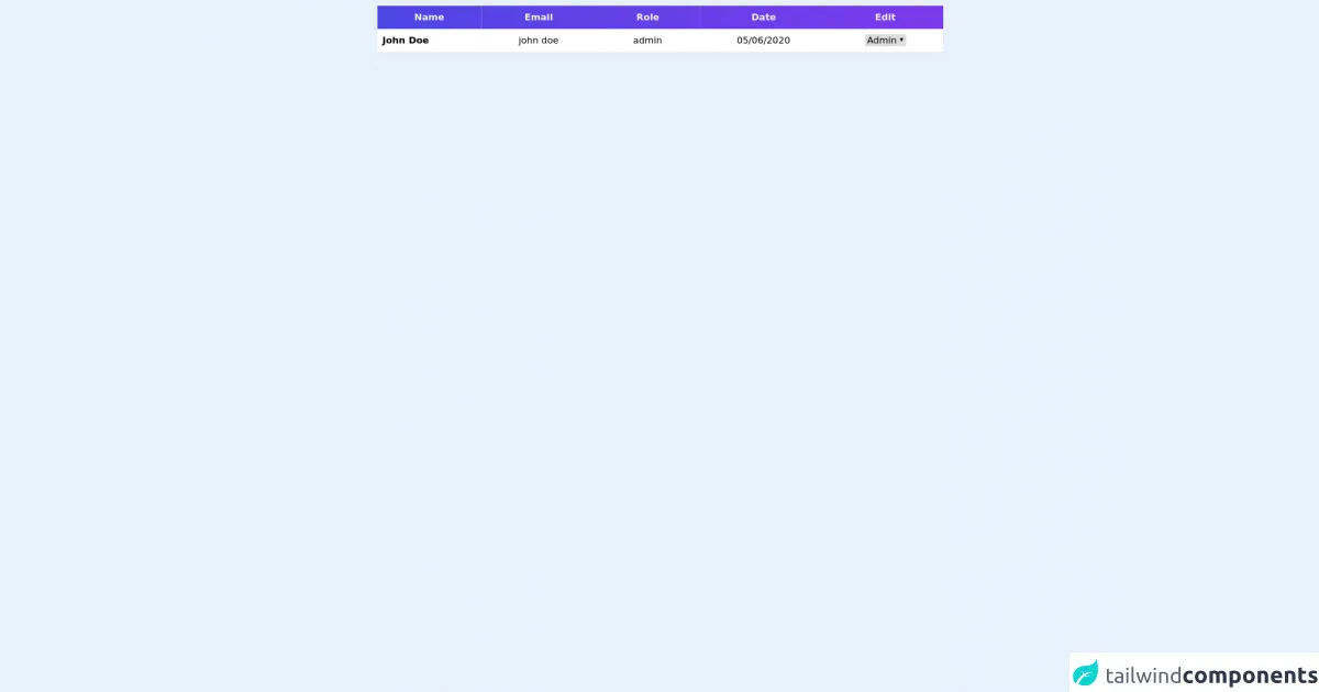
The preview of Table User Role UI component
To create a Table User Role UI component with Tailwind CSS, we will use a combination of HTML and CSS classes. The resulting UI component will be a table that displays a list of users and their corresponding roles.
Free download of the Table User Role's source code
The source code of Table User Role UI component
To create a Table User Role UI component with Tailwind CSS, we will use a combination of HTML and CSS classes. The resulting UI component will be a table that displays a list of users and their corresponding roles.
<div class="mt-2">
  <table class="mx-auto table-auto">
    <thead>
      <tr class="bg-gradient-to-r from-indigo-600 to-purple-600">
        <th class="px-16 py-2">
          <span class="text-gray-100 font-semibold">Name</span>
        </th>
        <th class="px-16 py-2">
          <span class="text-gray-100 font-semibold">Email</span>
        </th>

        <th class="px-16 py-2">
          <span class="text-gray-100 font-semibold">Role</span>
        </th>

        <th class="px-16 py-2">
          <span class="text-gray-100 font-semibold">Date</span>
        </th>

        <th class="px-16 py-2">
          <span class="text-gray-100 font-semibold">Edit</span>
        </th>
      </tr>
    </thead>
    <tbody class="bg-gray-200">
      <tr class="bg-white border-b-2 border-gray-200">
        <td>
          <span class="text-center ml-2 font-semibold">John Doe</span>
        </td>

        <td class="px-16 py-2">
          <span>john doe</span>
        </td>
        <td class="px-16 py-2">
          <span>admin</span>
        </td>
        <td class="px-16 py-2">
          <span>05/06/2020</span>
        </td>

        <td class="px-16 py-2">
          <select name="" id="">
            <option>Admin</option>
            <option>User</option>
          </select>
        </td>
      </tr>
    </tbody>
  </table>
</div>
How to create a Table User Role with Tailwind CSS?
To create a Table User Role UI component with Tailwind CSS, follow these steps:
- Create a new HTML file and add the following code:
<div class="container mx-auto">
  <table class="table-auto">
    <thead>
      <tr>
        <th class="px-4 py-2">Name</th>
        <th class="px-4 py-2">Email</th>
        <th class="px-4 py-2">Role</th>
      </tr>
    </thead>
    <tbody>
      <tr>
        <td class="border px-4 py-2">John Doe</td>
        <td class="border px-4 py-2">[email protected]</td>
        <td class="border px-4 py-2">Admin</td>
      </tr>
      <tr>
        <td class="border px-4 py-2">Jane Doe</td>
        <td class="border px-4 py-2">[email protected]</td>
        <td class="border px-4 py-2">User</td>
      </tr>
    </tbody>
  </table>
</div>
Save the file and open it in your web browser. You should see a table that displays a list of users and their corresponding roles.
To customize the table, you can modify the CSS classes used in the HTML code. For example, you can change the font size of the table headers by adding the
text-lgclass to thethelements:
<th class="px-4 py-2 text-lg">Name</th>
<th class="px-4 py-2 text-lg">Email</th>
<th class="px-4 py-2 text-lg">Role</th>
- You can also change the background color of the table rows by adding the
bg-gray-100class to thetrelements:
<tr class="bg-gray-100">
  <td class="border px-4 py-2">John Doe</td>
  <td class="border px-4 py-2">[email protected]</td>
  <td class="border px-4 py-2">Admin</td>
</tr>
<tr>
  <td class="border px-4 py-2">Jane Doe</td>
  <td class="border px-4 py-2">[email protected]</td>
  <td class="border px-4 py-2">User</td>
</tr>
- Save the file and refresh your web browser. You should see the changes you made to the table.
Conclusion
In this article, we have shown you how to create a Table User Role UI component with Tailwind CSS. Tailwind CSS is a powerful CSS framework that allows you to rapidly build custom user interfaces. By using pre-defined CSS classes, you can easily customize your UI components without writing any custom CSS. We hope this guide has been helpful in getting you started with Tailwind CSS.