- Published on
Ways To Make A Table UI With Tailwind CSS In 60 Minutes
- What is Tailwind CSS?
- The description of Table UI ui component
- Why use Tailwind CSS to create a Table UI ui component?
- The preview of Table UI ui component
- The source code of Table UI ui component
- How to create a Table UI with Tailwind CSS?
- Conclusion
If you're looking to create a Table UI component for your website, Tailwind CSS is an excellent choice. With Tailwind CSS, you can create a Table UI in just 60 minutes. In this article, we'll explore what Tailwind CSS is, why it's a great choice for creating a Table UI, and how you can use it to create your own Table UI.
What is Tailwind CSS?
Tailwind CSS is a utility-first CSS framework that makes it easy to create custom designs without writing any CSS. It provides a set of pre-defined classes that you can use to style your HTML elements. With Tailwind CSS, you can create responsive designs, customize your colors, fonts, and spacing, and more.
The description of Table UI ui component
A Table UI is a user interface element that displays data in a tabular format. It's commonly used in applications that need to display large amounts of data, such as e-commerce sites, financial applications, and more. A Table UI typically consists of rows and columns, with each row representing a record and each column representing a field.
Why use Tailwind CSS to create a Table UI ui component?
Tailwind CSS makes it easy to create a Table UI because it provides pre-defined classes for styling tables. You don't need to write any CSS code to create a Table UI with Tailwind CSS. Additionally, Tailwind CSS is highly customizable, so you can easily customize the look and feel of your Table UI to match your website's design.
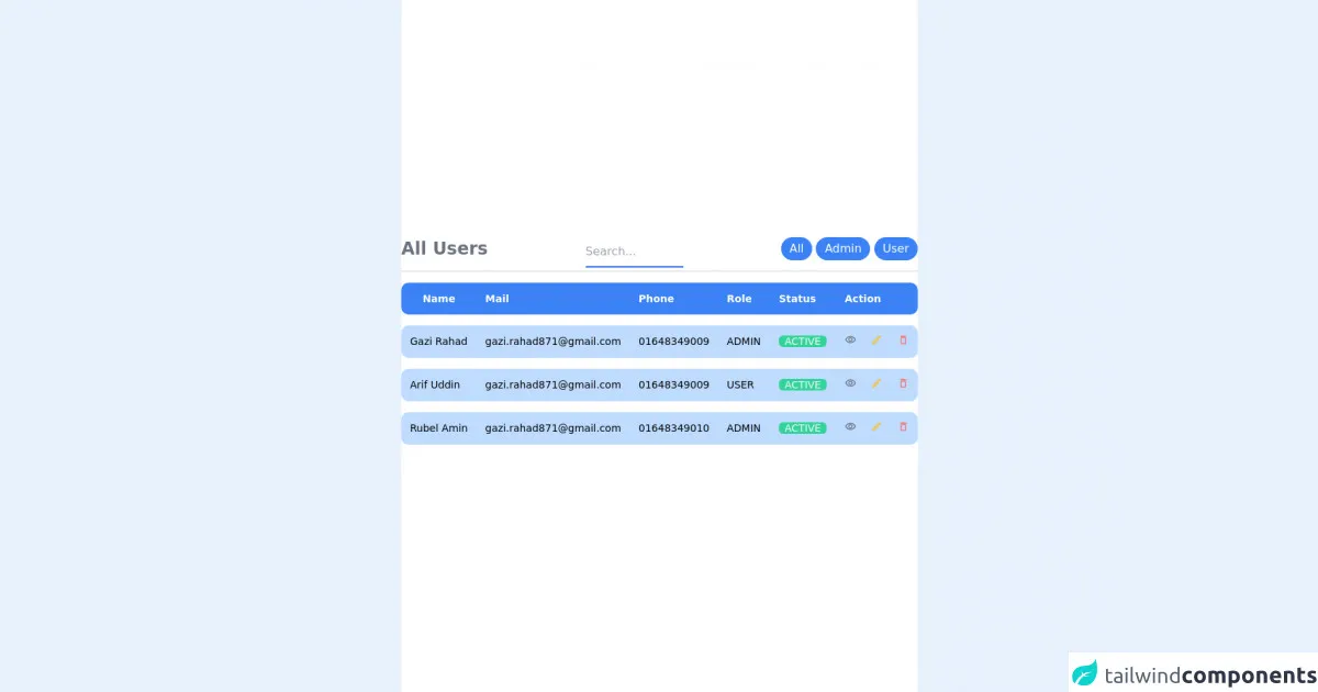
The preview of Table UI ui component
To create a Table UI with Tailwind CSS, you can use the following classes:
table: This class is used to create a basic table.border: This class is used to add a border to the table.divide-y: This class is used to add a vertical divider between table rows.divide-x: This class is used to add a horizontal divider between table columns.hover:bg-gray-100: This class is used to add a background color to a table row when the user hovers over it.
Free download of the Table UI's source code
The source code of Table UI ui component
To create a basic Table UI with Tailwind CSS, you can use the following HTML code:
<table class="table border divide-y divide-x">
  <thead>
    <tr>
      <th class="px-6 py-3 bg-gray-50 text-left text-xs leading-4 font-medium text-gray-500 uppercase tracking-wider">Name</th>
      <th class="px-6 py-3 bg-gray-50 text-left text-xs leading-4 font-medium text-gray-500 uppercase tracking-wider">Title</th>
      <th class="px-6 py-3 bg-gray-50 text-left text-xs leading-4 font-medium text-gray-500 uppercase tracking-wider">Status</th>
      <th class="px-6 py-3 bg-gray-50 text-left text-xs leading-4 font-medium text-gray-500 uppercase tracking-wider">Role</th>
      <th class="px-6 py-3 bg-gray-50"></th>
    </tr>
  </thead>
  <tbody class="bg-white divide-y divide-gray-200">
    <tr>
      <td class="px-6 py-4 whitespace-no-wrap">
        <div class="flex items-center">
          <div class="flex-shrink-0 h-10 w-10">
            <img class="h-10 w-10 rounded-full" src="https://randomuser.me/api/portraits/men/1.jpg" alt="">
          </div>
          <div class="ml-4">
            <div class="text-sm leading-5 font-medium text-gray-900">John Doe</div>
            <div class="text-sm leading-5 text-gray-500">[email protected]</div>
          </div>
        </div>
      </td>
      <td class="px-6 py-4 whitespace-no-wrap">
        <div class="text-sm leading-5 text-gray-900">Software Engineer</div>
        <div class="text-sm leading-5 text-gray-500">Web Development</div>
      </td>
      <td class="px-6 py-4 whitespace-no-wrap">
        <span class="px-2 inline-flex text-xs leading-5 font-semibold rounded-full bg-green-100 text-green-800">
          Active
        </span>
      </td>
      <td class="px-6 py-4 whitespace-no-wrap text-sm leading-5 text-gray-500">
        Admin
      </td>
      <td class="px-6 py-4 whitespace-no-wrap text-right text-sm leading-5 font-medium">
        <a href="#" class="text-indigo-600 hover:text-indigo-900">Edit</a>
      </td>
    </tr>
    <!-- More rows... -->
  </tbody>
</table>
<!-- This is an example component -->


<style>

    .table {
    border-spacing: 0 15px;
  }

  i {
    font-size: 1rem !important;
  }

  .table tr {
    border-radius: 20px;
  }

  tr td:nth-child(n + 6),
  tr th:nth-child(n + 6) {
    border-radius: 0 0.625rem 0.625rem 0;
  }

  tr td:nth-child(1),
  tr th:nth-child(1) {
    border-radius: 0.625rem 0 0 0.625rem;
  }

</style>


<!-- component -->
<link
  href="https://fonts.googleapis.com/css?family=Material+Icons|Material+Icons+Outlined|Material+Icons+Two+Tone|Material+Icons+Round|Material+Icons+Sharp"
  rel="stylesheet"
/>
<div class="flex items-center justify-center min-h-screen bg-white">
  <div class="col-span-12">
    <div class="overflow-auto lg:overflow-visible">
      <div class="flex lg:justify-between border-b-2 border-fuchsia-900 pb-1">
        <h2 class="text-2xl text-gray-500 font-bold">All Users</h2>
        <div class="text-center flex-auto">
          <input
            type="text"
            name="name"
            placeholder="Search..."
            class="
              w-1/3
              py-2
              border-b-2 border-blue-600
              outline-none
              focus:border-yellow-400
            "
          />
        </div>

        <div>
          <a href="#">
            <button
              class="
                bg-blue-500
                hover:bg-blue-700
                text-white
                py-1
                px-3
                sm
                rounded-full
              "
            >
              All
            </button>
          </a>
          <a href="#">
            <button
              class="
                bg-blue-500
                hover:bg-blue-700
                text-white
                py-1
                px-3
                sm
                rounded-full
              "
            >
              Admin
            </button>
          </a>
          <a href="#">
            <button
              class="
                bg-blue-500
                hover:bg-blue-700
                text-white
                py-1
                px-3
                sm
                rounded-full
              "
            >
              User
            </button></a
          >
        </div>
      </div>
      <table class="table text-gray-400 border-separate space-y-6 text-sm">
        <thead class="bg-blue-500 text-white">
          <tr>
            <th class="p-3">Name</th>
            <th class="p-3 text-left">Mail</th>
            <th class="p-3 text-left">Phone</th>
            <th class="p-3 text-left">Role</th>

            <th class="p-3 text-left">Status</th>
            <th class="p-3 text-left">Action</th>
          </tr>
        </thead>
        <tbody>

          <tr class="bg-blue-200 lg:text-black">
            <td class="p-3 font-medium capitalize">Gazi Rahad</td>
            <td class="p-3">[email protected]</td>
            <td class="p-3">01648349009</td>
            <td class="p-3 uppercase">admin</td>

            <td class="p-3">
              <span class="bg-green-400 text-gray-50 rounded-md px-2"
                >ACTIVE</span
              >
            </td>
            <td class="p-3">
              <a href="#" class="text-gray-500 hover:text-gray-100 mr-2">
                <i class="material-icons-outlined text-base">visibility</i>
              </a>
              <a href="#" class="text-yellow-400 hover:text-gray-100 mx-2">
                <i class="material-icons-outlined text-base">edit</i>
              </a>
              <a
                href="#"
                class="text-red-400 hover:text-gray-100 ml-2"
              >
                <i class="material-icons-round text-base">delete_outline</i>
              </a>
            </td>
          </tr>
       <tr class="bg-blue-200 lg:text-black">
            <td class="p-3 font-medium capitalize">Arif Uddin</td>
            <td class="p-3">[email protected]</td>
            <td class="p-3">01648349009</td>
            <td class="p-3 uppercase">user</td>

            <td class="p-3">
              <span class="bg-green-400 text-gray-50 rounded-md px-2"
                >ACTIVE</span
              >
            </td>
            <td class="p-3">
              <a href="#" class="text-gray-500 hover:text-gray-100 mr-2">
                <i class="material-icons-outlined text-base">visibility</i>
              </a>
              <a href="#" class="text-yellow-400 hover:text-gray-100 mx-2">
                <i class="material-icons-outlined text-base">edit</i>
              </a>
              <a
                href="#"
                class="text-red-400 hover:text-gray-100 ml-2"
              >
                <i class="material-icons-round text-base">delete_outline</i>
              </a>
            </td>
          </tr>
             <tr class="bg-blue-200 lg:text-black">
            <td class="p-3 font-medium capitalize">Rubel Amin</td>
            <td class="p-3">[email protected]</td>
            <td class="p-3">01648349010</td>
            <td class="p-3 uppercase">admin</td>

            <td class="p-3">
              <span class="bg-green-400 text-gray-50 rounded-md px-2"
                >ACTIVE</span
              >
            </td>
            <td class="p-3">
              <a href="#" class="text-gray-500 hover:text-gray-100 mr-2">
                <i class="material-icons-outlined text-base">visibility</i>
              </a>
              <a href="#" class="text-yellow-400 hover:text-gray-100 mx-2">
                <i class="material-icons-outlined text-base">edit</i>
              </a>
              <a
                href="#"
                class="text-red-400 hover:text-gray-100 ml-2"
              >
                <i class="material-icons-round text-base">delete_outline</i>
              </a>
            </td>
          </tr>
        </tbody>
      </table>
    </div>
  </div>
</div>
How to create a Table UI with Tailwind CSS?
To create a Table UI with Tailwind CSS, follow these steps:
- Start by creating a new HTML file and adding the necessary HTML code for your Table UI. You can use the code above as a starting point.
- Add the necessary Tailwind CSS classes to your HTML elements to style your Table UI. You can use the classes listed in the preview section above.
- Customize the look and feel of your Table UI by adjusting the colors, fonts, and spacing using Tailwind CSS classes.
- Test your Table UI in different browsers and devices to ensure that it looks and works as expected.
Conclusion
Tailwind CSS is an excellent choice for creating a Table UI component for your website. With Tailwind CSS, you can create a Table UI in just 60 minutes without writing any CSS code. Additionally, Tailwind CSS is highly customizable, so you can easily customize the look and feel of your Table UI to match your website's design.