- Published on
The Ultimate Guide To Help You Build A Table Result With Tailwind CSS
- What is Tailwind CSS?
- The description of Table Result ui component
- Why use Tailwind CSS to create a Table Result ui component?
- The preview of Table Result ui component
- The source code of Table Result ui component
- How to create a Table Result with Tailwind CSS?
- Conclusion
What is Tailwind CSS?
Tailwind CSS is a utility-first CSS framework that provides a set of pre-defined classes to help developers quickly build custom user interfaces. It is highly customizable and can be used with any front-end framework or library.
The description of Table Result ui component
A Table Result is a UI component that displays a set of data in a table format. It is commonly used in web applications to present data in a structured and organized way. A Table Result typically consists of columns and rows, with each column representing a specific data field and each row representing a specific record.
Why use Tailwind CSS to create a Table Result ui component?
Tailwind CSS provides a set of pre-defined classes that can be used to quickly style a Table Result. This saves developers time and effort, as they do not have to write custom CSS styles from scratch. Additionally, Tailwind CSS is highly customizable, which means that developers can easily modify the styles to match their specific design requirements.
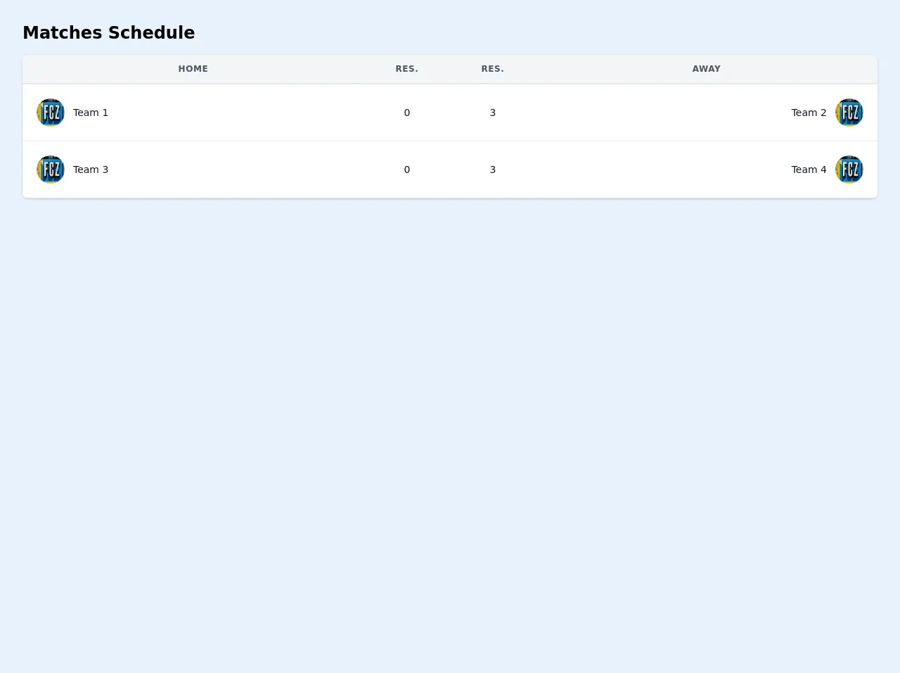
The preview of Table Result ui component
To create a Table Result with Tailwind CSS, we will use a combination of HTML and CSS classes. Here is a preview of what the final Table Result will look like:
Free download of the Table Result's source code
The source code of Table Result ui component
To create the Table Result, we will use a combination of HTML and Tailwind CSS classes. Here is the source code for the Table Result:
<div class="container mx-auto px-4 sm:px-8">
    <div class="py-8">
        <div>
            <h2 class="text-2xl font-semibold leading-tight">Matches Schedule</h2>
        </div>
        <div class="-mx-4 sm:-mx-8 px-4 sm:px-8 py-4 overflow-x-auto">
            <div class="inline-block min-w-full shadow rounded-lg overflow-hidden">
                <table class="min-w-full leading-normal">
                    <thead>
                        <tr>
                            <th
                                class="px-5 py-3 border-b-2 border-gray-200 bg-gray-100 text-center text-xs font-semibold text-gray-600 uppercase tracking-wider">
                                Home
                            </th>
                            <th
                                class="px-5 py-3 border-b-2 border-gray-200 bg-gray-100 text-center text-xs font-semibold text-gray-600 uppercase tracking-wider">
                                Res.
                            </th>
                            <th
                                class="px-5 py-3 border-b-2 border-gray-200 bg-gray-100 text-center text-xs font-semibold text-gray-600 uppercase tracking-wider">
                                Res.
                            </th>
                            <th
                                class="px-5 py-3 border-b-2 border-gray-200 bg-gray-100 text-center text-xs font-semibold text-gray-600 uppercase tracking-wider">
                                Away
                            </th>
                        </tr>
                    </thead>
                    <tbody>
                        <tr>
                            <td class="px-5 py-5 border-b border-gray-200 bg-white text-sm w-2/5">
                                <div class="flex items-center">
                                    <div class="flex-shrink-0 w-10 h-10 hidden sm:table-cell">
                                        <img class="w-full h-full rounded-full"
                                            src="https://images.unsplash.com/photo-1601046668428-94ea13437736?ixid=MXwxMjA3fDB8MHxwaG90by1wYWdlfHx8fGVufDB8fHw%3D&ixlib=rb-1.2.1&auto=format&fit=crop&w=2167&q=80"
                                            alt="" />
                                    </div>
                                    <div class="ml-3">
                                        <p class="text-gray-900 whitespace-no-wrap">
                                            Team 1
                                        </p>
                                    </div>
                                </div>
                            </td>
                            <td class="px-5 py-5 border-b border-gray-200 bg-white text-sm">
                                <p class="text-gray-900 whitespace-no-wrap text-center">0</p>
                            </td>
                            <td class="px-5 py-5 border-b border-gray-200 bg-white text-sm">
                                <p class="text-gray-900 whitespace-no-wrap text-center">
                                    3
                                </p>
                            </td>
                            <td class="px-5 py-5 border-b border-gray-200 bg-white text-sm w-2/5">
                                <div class="flex items-center float-right">
                                    <div class="mr-3">
                                        <p class="text-gray-900 whitespace-no-wrap text-right">
                                            Team 2
                                        </p>
                                    </div>
                                    <div class="flex-shrink-0 w-10 h-10 hidden sm:table-cell">
                                        <img class="w-full h-full rounded-full"
                                            src="https://images.unsplash.com/photo-1601046668428-94ea13437736?ixid=MXwxMjA3fDB8MHxwaG90by1wYWdlfHx8fGVufDB8fHw%3D&ixlib=rb-1.2.1&auto=format&fit=crop&w=2167&q=80"
                                            alt="" />
                                    </div>
                                </div>
                            </td>
                        </tr>
                        <tr>
                            <td class="px-5 py-5 border-b border-gray-200 bg-white text-sm w-2/5">
                                <div class="flex items-center">
                                    <div class="flex-shrink-0 w-10 h-10 hidden sm:table-cell">
                                        <img class="w-full h-full rounded-full"
                                            src="https://images.unsplash.com/photo-1601046668428-94ea13437736?ixid=MXwxMjA3fDB8MHxwaG90by1wYWdlfHx8fGVufDB8fHw%3D&ixlib=rb-1.2.1&auto=format&fit=crop&w=2167&q=80"
                                            alt="" />
                                    </div>
                                    <div class="ml-3">
                                        <p class="text-gray-900 whitespace-no-wrap">
                                            Team 3
                                        </p>
                                    </div>
                                </div>
                            </td>
                            <td class="px-5 py-5 border-b border-gray-200 bg-white text-sm">
                                <p class="text-gray-900 whitespace-no-wrap text-center">0</p>
                            </td>
                            <td class="px-5 py-5 border-b border-gray-200 bg-white text-sm">
                                <p class="text-gray-900 whitespace-no-wrap text-center">
                                    3
                                </p>
                            </td>
                            <td class="px-5 py-5 border-b border-gray-200 bg-white text-sm w-2/5">
                                <div class="flex items-center float-right">
                                    <div class="mr-3">
                                        <p class="text-gray-900 whitespace-no-wrap text-right">
                                            Team 4
                                        </p>
                                    </div>
                                    <div class="flex-shrink-0 w-10 h-10 hidden sm:table-cell">
                                        <img class="w-full h-full rounded-full"
                                            src="https://images.unsplash.com/photo-1601046668428-94ea13437736?ixid=MXwxMjA3fDB8MHxwaG90by1wYWdlfHx8fGVufDB8fHw%3D&ixlib=rb-1.2.1&auto=format&fit=crop&w=2167&q=80"
                                            alt="" />
                                    </div>
                                </div>
                            </td>
                        </tr>
                    </tbody>
                </table>
            </div>
        </div>
    </div>
</div>
How to create a Table Result with Tailwind CSS?
- Start by creating a basic HTML structure for the Table Result. This will include a table element, table head, table body, and table rows.
<table class="min-w-full divide-y divide-gray-200">
  <thead class="bg-gray-50">
    <tr>
      <th scope="col" class="px-6 py-3 text-left text-xs font-medium text-gray-500 uppercase tracking-wider">Name</th>
      <th scope="col" class="px-6 py-3 text-left text-xs font-medium text-gray-500 uppercase tracking-wider">Title</th>
      <th scope="col" class="px-6 py-3 text-left text-xs font-medium text-gray-500 uppercase tracking-wider">Status</th>
      <th scope="col" class="px-6 py-3 text-left text-xs font-medium text-gray-500 uppercase tracking-wider">Role</th>
      <th scope="col" class="relative px-6 py-3">
        <span class="sr-only">Edit</span>
      </th>
    </tr>
  </thead>
  <tbody class="bg-white divide-y divide-gray-200">
    <tr>
      <td class="px-6 py-4 whitespace-nowrap">
        <div class="flex items-center">
          <div class="flex-shrink-0 h-10 w-10">
            <img class="h-10 w-10 rounded-full" src="https://source.unsplash.com/random" alt="">
          </div>
          <div class="ml-4">
            <div class="text-sm font-medium text-gray-900">John Doe</div>
            <div class="text-sm text-gray-500">[email protected]</div>
          </div>
        </div>
      </td>
      <td class="px-6 py-4 whitespace-nowrap">
        <div class="text-sm text-gray-900">Software Engineer</div>
        <div class="text-sm text-gray-500">Web Development</div>
      </td>
      <td class="px-6 py-4 whitespace-nowrap">
        <span class="px-2 inline-flex text-xs leading-5 font-semibold rounded-full bg-green-100 text-green-800">Active</span>
      </td>
      <td class="px-6 py-4 whitespace-nowrap text-sm text-gray-500">
        Admin
      </td>
      <td class="px-6 py-4 whitespace-nowrap text-right text-sm font-medium">
        <a href="#" class="text-indigo-600 hover:text-indigo-900">Edit</a>
      </td>
    </tr>
    <!-- More rows here... -->
  </tbody>
</table>
- Add Tailwind CSS classes to style the Table Result. This will include classes for table headers, table cells, and table rows.
<table class="min-w-full divide-y divide-gray-200">
  <thead class="bg-gray-50">
    <tr>
      <th scope="col" class="px-6 py-3 text-left text-xs font-medium text-gray-500 uppercase tracking-wider">Name</th>
      <th scope="col" class="px-6 py-3 text-left text-xs font-medium text-gray-500 uppercase tracking-wider">Title</th>
      <th scope="col" class="px-6 py-3 text-left text-xs font-medium text-gray-500 uppercase tracking-wider">Status</th>
      <th scope="col" class="px-6 py-3 text-left text-xs font-medium text-gray-500 uppercase tracking-wider">Role</th>
      <th scope="col" class="relative px-6 py-3">
        <span class="sr-only">Edit</span>
      </th>
    </tr>
  </thead>
  <tbody class="bg-white divide-y divide-gray-200">
    <tr>
      <td class="px-6 py-4 whitespace-nowrap">
        <div class="flex items-center">
          <div class="flex-shrink-0 h-10 w-10">
            <img class="h-10 w-10 rounded-full" src="https://source.unsplash.com/random" alt="">
          </div>
          <div class="ml-4">
            <div class="text-sm font-medium text-gray-900">John Doe</div>
            <div class="text-sm text-gray-500">[email protected]</div>
          </div>
        </div>
      </td>
      <td class="px-6 py-4 whitespace-nowrap">
        <div class="text-sm text-gray-900">Software Engineer</div>
        <div class="text-sm text-gray-500">Web Development</div>
      </td>
      <td class="px-6 py-4 whitespace-nowrap">
        <span class="px-2 inline-flex text-xs leading-5 font-semibold rounded-full bg-green-100 text-green-800">Active</span>
      </td>
      <td class="px-6 py-4 whitespace-nowrap text-sm text-gray-500">
        Admin
      </td>
      <td class="px-6 py-4 whitespace-nowrap text-right text-sm font-medium">
        <a href="#" class="text-indigo-600 hover:text-indigo-900">Edit</a>
      </td>
    </tr>
    <!-- More rows here... -->
  </tbody>
</table>
- Customize the Table Result by modifying the Tailwind CSS classes. This can include changing the background color, font size, or padding.
<table class="min-w-full divide-y divide-gray-200">
  <thead class="bg-gray-800 text-white">
    <tr>
      <th scope="col" class="px-6 py-3 text-left text-xs font-medium uppercase tracking-wider">Name</th>
      <th scope="col" class="px-6 py-3 text-left text-xs font-medium uppercase tracking-wider">Title</th>
      <th scope="col" class="px-6 py-3 text-left text-xs font-medium uppercase tracking-wider">Status</th>
      <th scope="col" class="px-6 py-3 text-left text-xs font-medium uppercase tracking-wider">Role</th>
      <th scope="col" class="relative px-6 py-3">
        <span class="sr-only">Edit</span>
      </th>
    </tr>
  </thead>
  <tbody class="bg-white divide-y divide-gray-200">
    <tr>
      <td class="px-6 py-4 whitespace-nowrap">
        <div class="flex items-center">
          <div class="flex-shrink-0 h-10 w-10">
            <img class="h-10 w-10 rounded-full" src="https://source.unsplash.com/random" alt="">
          </div>
          <div class="ml-4">
            <div class="text-sm font-medium text-gray-900">John Doe</div>
            <div class="text-sm text-gray-500">[email protected]</div>
          </div>
        </div>
      </td>
      <td class="px-6 py-4 whitespace-nowrap">
        <div class="text-sm text-gray-900">Software Engineer</div>
        <div class="text-sm text-gray-500">Web Development</div>
      </td>
      <td class="px-6 py-4 whitespace-nowrap">
        <span class="px-2 inline-flex text-xs leading-5 font-semibold rounded-full bg-green-100 text-green-800">Active</span>
      </td>
      <td class="px-6 py-4 whitespace-nowrap text-sm text-gray-500">
        Admin
      </td>
      <td class="px-6 py-4 whitespace-nowrap text-right text-sm font-medium">
        <a href="#" class="text-indigo-600 hover:text-indigo-900">Edit</a>
      </td>
    </tr>
    <!-- More rows here... -->
  </tbody>
</table>
Conclusion
In this article, we have discussed how to create a Table Result UI component using Tailwind CSS. Tailwind CSS provides a set of pre-defined classes that can be used to quickly style a Table Result, saving developers time and effort. Additionally, Tailwind CSS is highly customizable, which means that developers can easily modify the styles to match their specific design requirements. By following the steps outlined in this article, you can create a beautiful and functional Table Result for your web application.