- Published on
The Ninja Guide To How To Build A Responsive Table with Tailwindcss With Tailwind CSS Better
- What is Tailwind CSS?
- The description of Responsive Table with Tailwindcss ui component
- Why use Tailwind CSS to create a Responsive Table with Tailwindcss ui component?
- The preview of Responsive Table with Tailwindcss ui component.
- The source code of Responsive Table with Tailwindcss ui component.
- How to create a Responsive Table with Tailwindcss with Tailwind CSS?
- Conclusion
In today's world, responsive design is a must-have feature for any website. With more and more people accessing the internet on their mobile devices, it's important to make sure that your website looks great on all screen sizes. One of the most important components of any website is the table. In this article, we will show you how to build a responsive table with Tailwind CSS.
What is Tailwind CSS?
Tailwind CSS is a utility-first CSS framework that makes it easy to create responsive designs. It provides a set of pre-defined classes that you can use to style your HTML elements. With Tailwind CSS, you don't need to write any CSS code from scratch. Instead, you can use the pre-defined classes to style your elements.
The description of Responsive Table with Tailwindcss ui component
A responsive table is a table that adjusts its layout based on the screen size. It's important to have a responsive table because it makes it easier for users to view the data on different screen sizes. With Tailwind CSS, you can easily create a responsive table using pre-defined classes.
Why use Tailwind CSS to create a Responsive Table with Tailwindcss ui component?
Tailwind CSS makes it easy to create a responsive table. With pre-defined classes, you don't need to write any CSS code from scratch. You can simply use the classes to style your HTML elements. Tailwind CSS also provides a mobile-first approach, which means that you can design for mobile devices first and then add styles for larger screens.
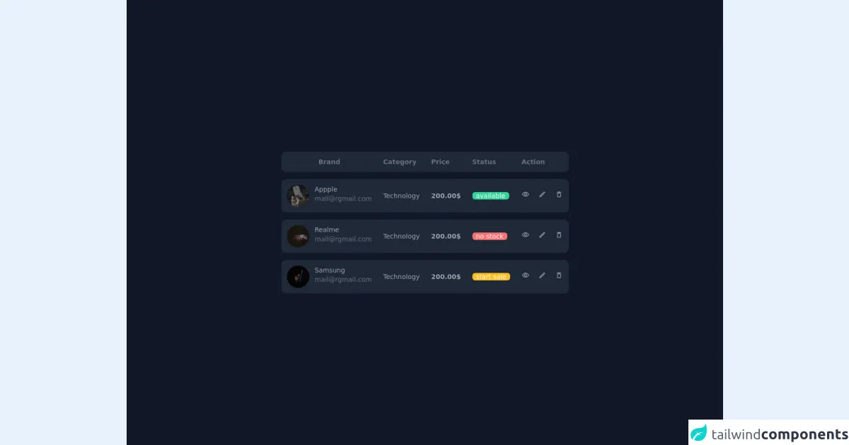
The preview of Responsive Table with Tailwindcss ui component.
To create a responsive table with Tailwind CSS, you can use the following classes:
table: This class is used to create a basic table.table-auto: This class is used to make the table width automatically adjust to its content.min-w-full: This class is used to make the table take up the full width of its container.divide-y: This class is used to add a vertical border between the table rows.divide-gray-200: This class is used to set the color of the vertical border.
Free download of the Responsive Table with Tailwindcss's source code
The source code of Responsive Table with Tailwindcss ui component.
To create a responsive table with Tailwind CSS, you can use the following HTML code:
<div class="table w-full table-auto min-w-full divide-y divide-gray-200">
  <div class="table-row-group">
    <div class="table-row">
      <div class="table-cell">Name</div>
      <div class="table-cell">Age</div>
      <div class="table-cell">Email</div>
    </div>
    <div class="table-row">
      <div class="table-cell">John Doe</div>
      <div class="table-cell">30</div>
      <div class="table-cell">[email protected]</div>
    </div>
    <div class="table-row">
      <div class="table-cell">Jane Doe</div>
      <div class="table-cell">25</div>
      <div class="table-cell">[email protected]</div>
    </div>
  </div>
</div>
<link
	href="https://fonts.googleapis.com/css?family=Material+Icons|Material+Icons+Outlined|Material+Icons+Two+Tone|Material+Icons+Round|Material+Icons+Sharp"
	rel="stylesheet">
<div class="flex items-center justify-center min-h-screen bg-gray-900">
	<div class="col-span-12">
		<div class="overflow-auto lg:overflow-visible ">
			<table class="table text-gray-400 border-separate space-y-6 text-sm">
				<thead class="bg-gray-800 text-gray-500">
					<tr>
						<th class="p-3">Brand</th>
						<th class="p-3 text-left">Category</th>
						<th class="p-3 text-left">Price</th>
						<th class="p-3 text-left">Status</th>
						<th class="p-3 text-left">Action</th>
					</tr>
				</thead>
				<tbody>
					<tr class="bg-gray-800">
						<td class="p-3">
							<div class="flex align-items-center">
								<img class="rounded-full h-12 w-12  object-cover" src="https://images.unsplash.com/photo-1613588718956-c2e80305bf61?ixlib=rb-1.2.1&ixid=MnwxMjA3fDB8MHxwaG90by1wYWdlfHx8fGVufDB8fHx8&auto=format&fit=crop&w=634&q=80" alt="unsplash image">
								<div class="ml-3">
									<div class="">Appple</div>
									<div class="text-gray-500">[email protected]</div>
								</div>
							</div>
						</td>
						<td class="p-3">
							Technology
						</td>
						<td class="p-3 font-bold">
							200.00$
						</td>
						<td class="p-3">
							<span class="bg-green-400 text-gray-50 rounded-md px-2">available</span>
						</td>
						<td class="p-3 ">
							<a href="#" class="text-gray-400 hover:text-gray-100 mr-2">
								<i class="material-icons-outlined text-base">visibility</i>
							</a>
							<a href="#" class="text-gray-400 hover:text-gray-100  mx-2">
								<i class="material-icons-outlined text-base">edit</i>
							</a>
							<a href="#" class="text-gray-400 hover:text-gray-100  ml-2">
								<i class="material-icons-round text-base">delete_outline</i>
							</a>
						</td>
					</tr>
					<tr class="bg-gray-800">
						<td class="p-3">
							<div class="flex align-items-center">
								<img class="rounded-full h-12 w-12   object-cover" src="https://images.unsplash.com/photo-1423784346385-c1d4dac9893a?ixid=MnwxMjA3fDB8MHxwaG90by1wYWdlfHx8fGVufDB8fHx8&ixlib=rb-1.2.1&auto=format&fit=crop&w=1050&q=80" alt="unsplash image">
								<div class="ml-3">
									<div class="">Realme</div>
									<div class="text-gray-500">[email protected]</div>
								</div>
							</div>
						</td>
						<td class="p-3">
							Technology
						</td>
						<td class="p-3 font-bold">
							200.00$
						</td>
						<td class="p-3">
							<span class="bg-red-400 text-gray-50 rounded-md px-2">no stock</span>
						</td>
						<td class="p-3">
							<a href="#" class="text-gray-400 hover:text-gray-100  mr-2">
								<i class="material-icons-outlined text-base">visibility</i>
							</a>
							<a href="#" class="text-gray-400 hover:text-gray-100 mx-2">
								<i class="material-icons-outlined text-base">edit</i>
							</a>
							<a href="#" class="text-gray-400 hover:text-gray-100 ml-2">
								<i class="material-icons-round text-base">delete_outline</i>
							</a>
						</td>
					</tr>
					<tr class="bg-gray-800">
						<td class="p-3">
							<div class="flex align-items-center">
								<img class="rounded-full h-12 w-12   object-cover" src="https://images.unsplash.com/photo-1600856209923-34372e319a5d?ixlib=rb-1.2.1&ixid=MnwxMjA3fDB8MHxwaG90by1wYWdlfHx8fGVufDB8fHx8&auto=format&fit=crop&w=2135&q=80" alt="unsplash image">
								<div class="ml-3">
									<div class="">Samsung</div>
									<div class="text-gray-500">[email protected]</div>
								</div>
							</div>
						</td>
						<td class="p-3">
							Technology
						</td>
						<td class="p-3 font-bold">
							200.00$
						</td>
						<td class="p-3">
							<span class="bg-yellow-400 text-gray-50  rounded-md px-2">start sale</span>
						</td>
						<td class="p-3">
							<a href="#" class="text-gray-400 hover:text-gray-100 mr-2">
								<i class="material-icons-outlined text-base">visibility</i>
							</a>
							<a href="#" class="text-gray-400 hover:text-gray-100 mx-2">
								<i class="material-icons-outlined text-base">edit</i>
							</a>
							<a href="#" class="text-gray-400 hover:text-gray-100 ml-2">
								<i class="material-icons-round text-base">delete_outline</i>
							</a>
						</td>
					</tr>
				</tbody>
			</table>
		</div>
	</div>
</div>
<style>
	.table {
		border-spacing: 0 15px;
	}

	i {
		font-size: 1rem !important;
	}

	.table tr {
		border-radius: 20px;
	}

	tr td:nth-child(n+5),
	tr th:nth-child(n+5) {
		border-radius: 0 .625rem .625rem 0;
	}

	tr td:nth-child(1),
	tr th:nth-child(1) {
		border-radius: .625rem 0 0 .625rem;
	}
</style>
How to create a Responsive Table with Tailwindcss with Tailwind CSS?
To create a responsive table with Tailwind CSS, you can follow these steps:
- Create a new HTML file and add the above HTML code.
- Add the Tailwind CSS stylesheet to your HTML file.
- Open your HTML file in a web browser and you should see the responsive table.
Conclusion
In this article, we showed you how to build a responsive table with Tailwind CSS. With Tailwind CSS, you can easily create a responsive design without writing any CSS code from scratch. We hope this article has been helpful in showing you how to create a responsive table with Tailwind CSS.