- Published on
6 Ideas To Help You Create A Table With Tailwind CSS Like A Pro
- What is Tailwind CSS?
- The description of Table ui component
- Why use Tailwind CSS to create a Table ui component?
- The preview of Table ui component
- The source code of Table ui component
- How to create a Table with Tailwind CSS?
- 1. Define the table structure
- 2. Style the table headers
- 3. Style the table rows
- 4. Style the table cells
- 5. Responsive tables
- 6. Customizing the table style
- Conclusion
What is Tailwind CSS?
Tailwind CSS is a utility-first CSS framework that helps you quickly build custom user interfaces. It provides a set of pre-defined CSS classes that you can use to style your HTML elements. Unlike other CSS frameworks, Tailwind CSS doesn't come with pre-designed components. Instead, it provides you with building blocks that you can use to create your own custom components.
The description of Table ui component
A table is a common UI component used to display data in a tabular format. It consists of rows and columns, with each cell containing a piece of data. Tables are used in a wide range of applications, from simple data grids to complex financial reports.
Why use Tailwind CSS to create a Table ui component?
Tailwind CSS provides a set of utility classes that can help you quickly style your table components. It also allows you to create custom classes that can be reused across your application. This makes it easy to maintain a consistent design language throughout your application.
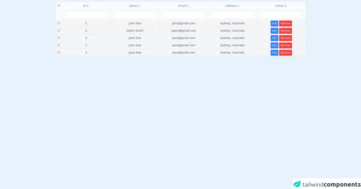
The preview of Table ui component
To create a table with Tailwind CSS, you can use a combination of classes such as table, thead, tbody, tr, th, and td. These classes can be used to define the structure and style of your table.
Free download of the Table's source code
The source code of Table ui component
The source code for a basic table component using Tailwind CSS might look something like this:
<div class="table w-full p-2">
        <table class="w-full border">
            <thead>
                <tr class="bg-gray-50 border-b">
                    <th class="border-r p-2">
                        <input type="checkbox">
                    </th>
                    <th class="p-2 border-r cursor-pointer text-sm font-thin text-gray-500">
                        <div class="flex items-center justify-center">
                            ID
                            <svg xmlns="http://www.w3.org/2000/svg" class="h-4 w-4" fill="none" viewBox="0 0 24 24" stroke="currentColor">
                                <path stroke-linecap="round" stroke-linejoin="round" stroke-width="2" d="M8 9l4-4 4 4m0 6l-4 4-4-4" />
                            </svg>
                        </div>
                    </th>
                    <th class="p-2 border-r cursor-pointer text-sm font-thin text-gray-500">
                        <div class="flex items-center justify-center">
                            Name
                            <svg xmlns="http://www.w3.org/2000/svg" class="h-4 w-4" fill="none" viewBox="0 0 24 24" stroke="currentColor">
                                <path stroke-linecap="round" stroke-linejoin="round" stroke-width="2" d="M8 9l4-4 4 4m0 6l-4 4-4-4" />
                            </svg>
                        </div>
                    </th>
                    <th class="p-2 border-r cursor-pointer text-sm font-thin text-gray-500">
                        <div class="flex items-center justify-center">
                            Email
                            <svg xmlns="http://www.w3.org/2000/svg" class="h-4 w-4" fill="none" viewBox="0 0 24 24" stroke="currentColor">
                                <path stroke-linecap="round" stroke-linejoin="round" stroke-width="2" d="M8 9l4-4 4 4m0 6l-4 4-4-4" />
                            </svg>
                        </div>
                    </th>
                    <th class="p-2 border-r cursor-pointer text-sm font-thin text-gray-500">
                        <div class="flex items-center justify-center">
                            Address
                            <svg xmlns="http://www.w3.org/2000/svg" class="h-4 w-4" fill="none" viewBox="0 0 24 24" stroke="currentColor">
                                <path stroke-linecap="round" stroke-linejoin="round" stroke-width="2" d="M8 9l4-4 4 4m0 6l-4 4-4-4" />
                            </svg>
                        </div>
                    </th>
                    <th class="p-2 border-r cursor-pointer text-sm font-thin text-gray-500">
                        <div class="flex items-center justify-center">
                            Action
                            <svg xmlns="http://www.w3.org/2000/svg" class="h-4 w-4" fill="none" viewBox="0 0 24 24" stroke="currentColor">
                                <path stroke-linecap="round" stroke-linejoin="round" stroke-width="2" d="M8 9l4-4 4 4m0 6l-4 4-4-4" />
                            </svg>
                        </div>
                    </th>
                </tr>
            </thead>
            <tbody>
                <tr class="bg-gray-50 text-center">
                    <td class="p-2 border-r">

                    </td>
                    <td class="p-2 border-r">
                        <input type="text" class="border p-1">
                    </td>
                    <td class="p-2 border-r">
                        <input type="text" class="border p-1">
                    </td>
                    <td class="p-2 border-r">
                        <input type="text" class="border p-1">
                    </td>
                    <td class="p-2 border-r">
                        <input type="text" class="border p-1">
                    </td>
                    <td class="p-2">
                        <input type="text" class="border p-1">
                    </td>


                </tr>
                <tr class="bg-gray-100 text-center border-b text-sm text-gray-600">
                    <td class="p-2 border-r">
                        <input type="checkbox">
                    </td>
                    <td class="p-2 border-r">1</td>
                    <td class="p-2 border-r">John Doe</td>
                    <td class="p-2 border-r">[email protected]</td>
                    <td class="p-2 border-r">Sydney, Australia</td>
                    <td>
                        <a href="#" class="bg-blue-500 p-2 text-white hover:shadow-lg text-xs font-thin">Edit</a>
                        <a href="#" class="bg-red-500 p-2 text-white hover:shadow-lg text-xs font-thin">Remove</a>
                    </td>
                </tr>
                <tr class="bg-gray-100 text-center border-b text-sm text-gray-600">
                    <td class="p-2 border-r">
                        <input type="checkbox">
                    </td>
                    <td class="p-2 border-r">2</td>
                    <td class="p-2 border-r">Adam Smith</td>
                    <td class="p-2 border-r">[email protected]</td>
                    <td class="p-2 border-r">Sydney, Australia</td>
                    <td>
                        <a href="#" class="bg-blue-500 p-2 text-white hover:shadow-lg text-xs font-thin">Edit</a>
                        <a href="#" class="bg-red-500 p-2 text-white hover:shadow-lg text-xs font-thin">Remove</a>
                    </td>
                </tr>
                <tr class="bg-gray-100 text-center border-b text-sm text-gray-600">
                    <td class="p-2 border-r">
                        <input type="checkbox">
                    </td>
                    <td class="p-2 border-r">3</td>
                    <td class="p-2 border-r">Jean Doe</td>
                    <td class="p-2 border-r">[email protected]</td>
                    <td class="p-2 border-r">Sydney, Australia</td>
                    <td>
                        <a href="#" class="bg-blue-500 p-2 text-white hover:shadow-lg text-xs font-thin">Edit</a>
                        <a href="#" class="bg-red-500 p-2 text-white hover:shadow-lg text-xs font-thin">Remove</a>
                    </td>
                </tr>
            </tbody>
        </table>
    </div>
How to create a Table with Tailwind CSS?
Here are 6 ideas to help you create a table with Tailwind CSS like a pro:
1. Define the table structure
To create a table, you'll need to define the structure of your table using the table, thead, tbody, tr, th, and td classes. Here's an example:
<table class="table">
  <thead>
    <tr>
      <th class="px-4 py-2">#</th>
      <th class="px-4 py-2">Name</th>
      <th class="px-4 py-2">Email</th>
      <th class="px-4 py-2">Role</th>
    </tr>
  </thead>
  <tbody>
    <tr>
      <td class="border px-4 py-2">1</td>
      <td class="border px-4 py-2">John Doe</td>
      <td class="border px-4 py-2">[email protected]</td>
      <td class="border px-4 py-2">Admin</td>
    </tr>
    <tr>
      <td class="border px-4 py-2">2</td>
      <td class="border px-4 py-2">Jane Doe</td>
      <td class="border px-4 py-2">[email protected]</td>
      <td class="border px-4 py-2">User</td>
    </tr>
  </tbody>
</table>
2. Style the table headers
To style the table headers, you can use the bg-gray-100 class to add a light gray background color and the text-left class to align the text to the left. Here's an example:
<thead class="bg-gray-100">
  <tr>
    <th class="px-4 py-2 text-left">#</th>
    <th class="px-4 py-2 text-left">Name</th>
    <th class="px-4 py-2 text-left">Email</th>
    <th class="px-4 py-2 text-left">Role</th>
  </tr>
</thead>
3. Style the table rows
To style the table rows, you can use the hover:bg-gray-100 class to add a light gray background color when the row is hovered over. You can also use the even:bg-gray-50 class to add a light gray background color to every other row. Here's an example:
<tbody>
  <tr class="hover:bg-gray-100">
    <td class="border px-4 py-2">1</td>
    <td class="border px-4 py-2">John Doe</td>
    <td class="border px-4 py-2">[email protected]</td>
    <td class="border px-4 py-2">Admin</td>
  </tr>
  <tr class="hover:bg-gray-100 even:bg-gray-50">
    <td class="border px-4 py-2">2</td>
    <td class="border px-4 py-2">Jane Doe</td>
    <td class="border px-4 py-2">[email protected]</td>
    <td class="border px-4 py-2">User</td>
  </tr>
</tbody>
4. Style the table cells
To style the table cells, you can use the border class to add a border around each cell. You can also use the px-4 and py-2 classes to add padding to each cell. Here's an example:
<td class="border px-4 py-2">John Doe</td>
5. Responsive tables
To make your tables responsive, you can use the overflow-x-auto class to add horizontal scrolling to your table on smaller screens. Here's an example:
<div class="overflow-x-auto">
  <table class="table">
    <!-- table content -->
  </table>
</div>
6. Customizing the table style
Tailwind CSS provides a wide range of utility classes that you can use to customize the style of your table. For example, you can use the bg-blue-500 class to add a blue background color to your table, or the text-white class to change the text color to white. Here's an example:
<table class="table bg-blue-500 text-white">
  <!-- table content -->
</table>
Conclusion
Creating a table with Tailwind CSS is easy and straightforward. By using a combination of utility classes, you can quickly style your table components and create a consistent design language throughout your application. With these 6 ideas, you'll be able to create a table with Tailwind CSS like a pro in no time!