- Published on
6 Steps To Build A tabbar-responsive With Tailwind CSS Like A Pro In Under An Hour
- What is Tailwind CSS?
- The description of tabbar-responsive ui component
- Why use Tailwind CSS to create a tabbar-responsive ui component?
- The preview of tabbar-responsive ui component.
- The source code of tabbar-responsive ui component.
- How to create a tabbar-responsive with Tailwind CSS?
- Step 1: Set up your project
- Step 2: Create the HTML structure
- Step 3: Style the tabbar-responsive UI component
- Step 4: Make the tabbar-responsive UI component responsive
- Step 5: Add JavaScript functionality
- Step 6: Test the tabbar-responsive UI component
- Conclusion
What is Tailwind CSS?
Tailwind CSS is a utility-first CSS framework that provides a set of pre-defined classes to help developers quickly build responsive and customizable user interfaces. It allows developers to focus on the functionality of their application rather than spending time on writing custom CSS code.
The description of tabbar-responsive ui component
A tabbar-responsive is a user interface component that is commonly used in mobile applications. It consists of a horizontal bar that contains a set of tabs, each representing a different view or functionality of the application. When a user clicks on a tab, the corresponding view is displayed.
Why use Tailwind CSS to create a tabbar-responsive ui component?
Tailwind CSS provides a set of pre-defined classes that can be used to quickly build a tabbar-responsive UI component. It also provides responsive classes that allow the component to adapt to different screen sizes and devices. This makes it easy for developers to create a responsive and customizable tabbar-responsive UI component without spending time on writing custom CSS code.
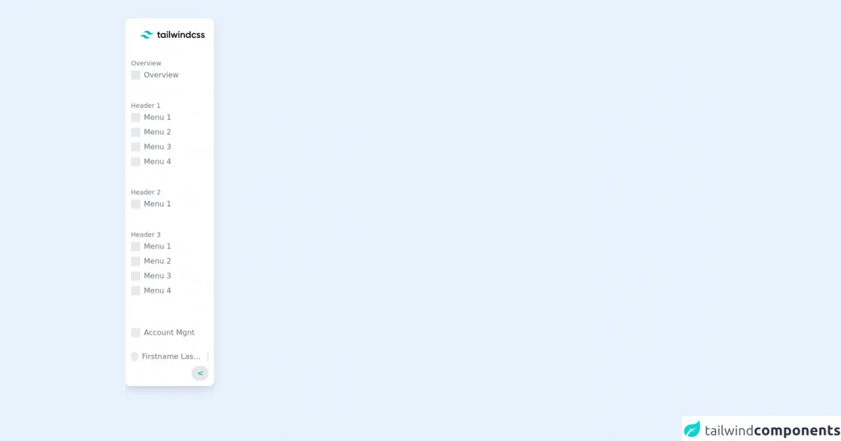
The preview of tabbar-responsive ui component.
To give you an idea of what a tabbar-responsive UI component looks like, here is a preview:
Free download of the tabbar-responsive's source code
The source code of tabbar-responsive ui component.
Here is the source code for a basic tabbar-responsive UI component:
<!-- full animate https://play.tailwindcss.com/kxQ0ePcRug  -->

<div id="side-bar" class="fixed lg:visible invisible -translate-x-48  lg:-translate-x-0 duration-300 ease-in-out h-5/6 w-48 top-10 rounded-xl bg-white shadow-lg py-3 pl-3">
  <div class="h-full flex flex-col justify-between">
    <img class="px-5 pt-3 mx-auto mb-10" src="https://v1.tailwindcss.com/_next/static/media/tailwindcss-logotype.5d127e1d767d06efa2b03fe4de5f3d84.svg" />

    <div class="hover:overflow-auto overflow-hidden">
      <div class="mb-10">
        <div class="text-sm text-gray-500">Overview</div>
        <div class="flex items-center hover:border-r-4 border-green-500 h-8 cursor-pointer">
          <i class="animate-pulse h-5 w-5 rounded-sm bg-gray-300 mr-2"></i>
          <span class="text-gray-500">Overview</span>
        </div>
      </div>

      <div class="mb-10">
        <div class="text-sm text-gray-500">Header 1</div>
        <div class="flex items-center hover:border-r-4 border-green-500 h-8 cursor-pointer">
          <i class="animate-pulse h-5 w-5 rounded-sm bg-gray-300 mr-2"></i>
          <span class="text-gray-500">Menu 1</span>
        </div>
        <div class="flex items-center hover:border-r-4 border-green-500 h-8 cursor-pointer">
          <i class="animate-pulse h-5 w-5 rounded-sm bg-gray-300 mr-2"></i>
          <span class="text-gray-500">Menu 2</span>
        </div>
        <div class="flex items-center hover:border-r-4 border-green-500 h-8 cursor-pointer">
          <i class="animate-pulse h-5 w-5 rounded-sm bg-gray-300 mr-2"></i>
          <span class="text-gray-500">Menu 3</span>
        </div>
        <div class="flex items-center hover:border-r-4 border-green-500 h-8 cursor-pointer">
          <i class="animate-pulse h-5 w-5 rounded-sm bg-gray-300 mr-2"></i>
          <span class="text-gray-500">Menu 4</span>
        </div>
      </div>

      <div class="mb-10">
        <div class="text-sm text-gray-500">Header 2</div>
        <div class="flex items-center hover:border-r-4 border-green-500 h-8 cursor-pointer">
          <i class="animate-pulse h-5 w-5 rounded-sm bg-gray-300 mr-2"></i>
          <span class="text-gray-500">Menu 1</span>
        </div>
      </div>

      <div class="mb-10">
        <div class="text-sm text-gray-500">Header 3</div>
        <div class="flex items-center hover:border-r-4 border-green-500 h-8 cursor-pointer">
          <i class="animate-pulse h-5 w-5 rounded-sm bg-gray-300 mr-2"></i>
          <span class="text-gray-500">Menu 1</span>
        </div>
        <div class="flex items-center hover:border-r-4 border-green-500 h-8 cursor-pointer">
          <i class="animate-pulse h-5 w-5 rounded-sm bg-gray-300 mr-2"></i>
          <span class="text-gray-500">Menu 2</span>
        </div>
        <div class="flex items-center hover:border-r-4 border-green-500 h-8 cursor-pointer">
          <i class="animate-pulse h-5 w-5 rounded-sm bg-gray-300 mr-2"></i>
          <span class="text-gray-500">Menu 3</span>
        </div>
        <div class="flex items-center hover:border-r-4 border-green-500 h-8 cursor-pointer">
          <i class="animate-pulse h-5 w-5 rounded-sm bg-gray-300 mr-2"></i>
          <span class="text-gray-500">Menu 4</span>
        </div>
      </div>

      <div class="mb-10">
        <div class="text-sm text-gray-500">Header 4</div>
        <div class="flex items-center hover:border-r-4 border-green-500 h-8 cursor-pointer">
          <i class="animate-pulse h-5 w-5 rounded-sm bg-gray-300 mr-2"></i>
          <span class="text-gray-500">Menu 1</span>
        </div>
        <div class="flex items-center hover:border-r-4 border-green-500 h-8 cursor-pointer">
          <i class="animate-pulse h-5 w-5 rounded-sm bg-gray-300 mr-2"></i>
          <span class="text-gray-500">Menu 2</span>
        </div>
        <div class="flex items-center hover:border-r-4 border-green-500 h-8 cursor-pointer">
          <i class="animate-pulse h-5 w-5 rounded-sm bg-gray-300 mr-2"></i>
          <span class="text-gray-500">Menu 3</span>
        </div>
        <div class="flex items-center hover:border-r-4 border-green-500 h-8 cursor-pointer">
          <i class="animate-pulse h-5 w-5 rounded-sm bg-gray-300 mr-2"></i>
          <span class="text-gray-500">Menu 4</span>
        </div>
      </div>
    </div>

    <div class="mt-10">
      <div class="flex items-center hover:border-r-4 border-green-500 h-8 cursor-pointer">
        <i class="animate-pulse h-5 w-5 rounded-sm bg-gray-300 mr-2"></i>
        <span class="text-gray-500">Account Mgnt</span>
      </div>
    </div>

    <div class="mt-6">
      <div class="flex items-center cursor-pointer">
        <i class="animate-pulse h-5 w-5 rounded-full bg-gray-300 mr-2"></i>
        <span class="text-gray-500 truncate">Firstname Lastname</span>
        <i class="animate-pulse h-5 w-1 bg-gray-300 mx-3"></i>
      </div>
    </div>
    <div class="flex justify-end mt-2">
      <i class="text-green-500 font-bold bg-gray-200 px-3 py-1 rounded-full  text-right mr-3 cursor-pointer"><</i>
    </div>
  </div>
</div>

<div class="fixed top-1/2 bg-white left-4 visible lg:invisible lg:-translate-x-20 -translate-x-0 duration-300 ease-in-out rounded-lg shadow-lg">
  <div class="mx-1 my-10">
    <i class="text-green-500 font-bold text-center cursor-pointer bg-gray-200 px-3 py-2 rounded-full">></i>
  </div>
</div>
How to create a tabbar-responsive with Tailwind CSS?
Now that you have an idea of what a tabbar-responsive UI component looks like and its source code, let's dive into the steps to create one with Tailwind CSS.
Step 1: Set up your project
To get started, you need to set up a new project. You can either create a new HTML file or use an existing one. Make sure to include the Tailwind CSS stylesheet in your HTML file.
<link rel="stylesheet" href="https://cdn.jsdelivr.net/npm/[email protected]/dist/tailwind.min.css">
Step 2: Create the HTML structure
Next, you need to create the HTML structure for the tabbar-responsive UI component. This consists of a horizontal bar that contains a set of tabs.
<div class="tabbar">
  <a href="#" class="tabbar-item active">Home</a>
  <a href="#" class="tabbar-item">Profile</a>
  <a href="#" class="tabbar-item">Settings</a>
</div>
Step 3: Style the tabbar-responsive UI component
Now that you have the HTML structure in place, it's time to style the tabbar-responsive UI component using Tailwind CSS classes.
<div class="tabbar bg-gray-100 shadow-lg">
  <a href="#" class="tabbar-item active text-blue-500 border-b-2 border-blue-500">Home</a>
  <a href="#" class="tabbar-item text-gray-500 hover:text-blue-500">Profile</a>
  <a href="#" class="tabbar-item text-gray-500 hover:text-blue-500">Settings</a>
</div>
In the above code, we have added the bg-gray-100 class to give the tabbar-responsive UI component a light gray background. We have also added the shadow-lg class to give it a shadow effect.
For the active tab, we have added the active, text-blue-500, and border-b-2 border-blue-500 classes to give it a blue color and a bottom border.
For the inactive tabs, we have added the text-gray-500 class to give them a gray color. We have also added the hover:text-blue-500 class to change their color to blue when the user hovers over them.
Step 4: Make the tabbar-responsive UI component responsive
To make the tabbar-responsive UI component responsive, we need to add some responsive classes. We can use the flex and flex-col classes to make the tabbar-responsive UI component stack vertically on small screens.
<div class="tabbar bg-gray-100 shadow-lg flex flex-col sm:flex-row">
  <a href="#" class="tabbar-item active text-blue-500 border-b-2 border-blue-500">Home</a>
  <a href="#" class="tabbar-item text-gray-500 hover:text-blue-500">Profile</a>
  <a href="#" class="tabbar-item text-gray-500 hover:text-blue-500">Settings</a>
</div>
Step 5: Add JavaScript functionality
Finally, we need to add some JavaScript functionality to the tabbar-responsive UI component to make it work. We can use JavaScript to toggle the active class on the clicked tab and show the corresponding view.
<div class="tabbar bg-gray-100 shadow-lg flex flex-col sm:flex-row">
  <a href="#" class="tabbar-item active text-blue-500 border-b-2 border-blue-500" onclick="openTab(event, 'home')">Home</a>
  <a href="#" class="tabbar-item text-gray-500 hover:text-blue-500" onclick="openTab(event, 'profile')">Profile</a>
  <a href="#" class="tabbar-item text-gray-500 hover:text-blue-500" onclick="openTab(event, 'settings')">Settings</a>
</div>

<div id="home" class="tabcontent">
  Home content
</div>

<div id="profile" class="tabcontent">
  Profile content
</div>

<div id="settings" class="tabcontent">
  Settings content
</div>

<script>
function openTab(evt, tabName) {
  var i, tabcontent, tablinks;
  tabcontent = document.getElementsByClassName("tabcontent");
  for (i = 0; i < tabcontent.length; i++) {
    tabcontent[i].style.display = "none";
  }
  tablinks = document.getElementsByClassName("tabbar-item");
  for (i = 0; i < tablinks.length; i++) {
    tablinks[i].className = tablinks[i].className.replace(" active", "");
  }
  document.getElementById(tabName).style.display = "block";
  evt.currentTarget.className += " active";
}
</script>
In the above code, we have added the onclick event to each tab to call the openTab() function. This function hides all the tab content and removes the active class from all the tabs. It then shows the corresponding tab content and adds the active class to the clicked tab.
Step 6: Test the tabbar-responsive UI component
Now that we have created the tabbar-responsive UI component, it's time to test it. Open the HTML file in your browser and click on each tab to see the corresponding content.
Conclusion
In this article, we have gone through the steps to create a tabbar-responsive UI component using Tailwind CSS. We have seen how Tailwind CSS makes it easy to create a responsive and customizable UI component without spending time on writing custom CSS code. By following the steps outlined in this article, you can create your own tabbar-responsive UI component in under an hour.