- Published on
Best Ways To Create A Tab with Peer With Tailwind CSS
- What is Tailwind CSS?
- The description of Tab with Peer UI component
- Why use Tailwind CSS to create a Tab with Peer UI component?
- The preview of Tab with Peer UI component
- The source code of Tab with Peer UI component
- How to create a Tab with Peer with Tailwind CSS?
- Step 1: Create the HTML structure of the Tab with Peer UI component
- Step 2: Style the Tab with Peer UI component using Tailwind CSS classes
- Step 3: Add interactivity to the Tab with Peer UI component using JavaScript
- Conclusion
As a FrontEnd technology blogger, it is important to stay up-to-date with the latest trends and tools in the industry. One such tool that has gained a lot of popularity in recent times is Tailwind CSS. Tailwind CSS is a utility-first CSS framework that makes it easy to create responsive and customizable UI components. In this article, we will discuss the best ways to create a Tab with Peer UI component using Tailwind CSS.
What is Tailwind CSS?
Tailwind CSS is a utility-first CSS framework that provides a set of pre-defined classes that can be used to style HTML elements. It is designed to make it easy to create responsive and customizable UI components without having to write custom CSS. Tailwind CSS provides a wide range of classes that can be used to style everything from typography to layout.
The description of Tab with Peer UI component
Tab with Peer is a UI component that is commonly used in web applications to display content in a tabbed interface. It consists of a set of tabs that can be clicked to display different content panels. The Tab with Peer UI component is commonly used in e-commerce websites, social media platforms, and other web applications.
Why use Tailwind CSS to create a Tab with Peer UI component?
Tailwind CSS provides a set of pre-defined classes that can be used to create a Tab with Peer UI component quickly and easily. It eliminates the need to write custom CSS, which can be time-consuming and error-prone. Tailwind CSS also provides responsive classes that can be used to create a Tab with Peer UI component that is optimized for different screen sizes.
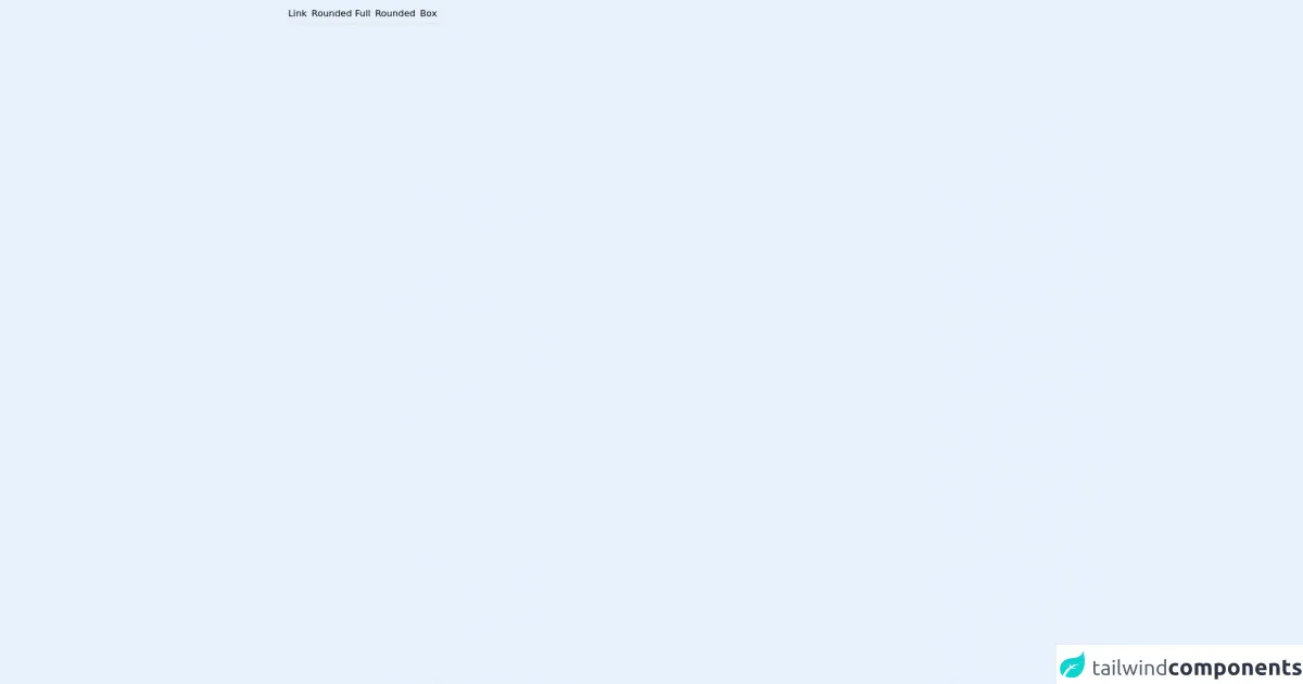
The preview of Tab with Peer UI component
Tab with Peer UI component is a popular UI component that is commonly used in web applications. It consists of a set of tabs that can be clicked to display different content panels.
Free download of the Tab with Peer's source code
The source code of Tab with Peer UI component
To create a Tab with Peer UI component using Tailwind CSS, we will need to use HTML, CSS, and JavaScript. The HTML code will define the structure of the Tab with Peer UI component, the CSS code will style the component, and the JavaScript code will add interactivity to the component.
<div class="relative w-fit mx-auto my-auto">
    <ul class="flex flex-col justify-center">
        <li class="flex">
            <!-- Place it with the tab's selection option -->
            <label id="tab1" onclick="changeFocus('tab1')" for="option1" class="border-b-2 hover:border-black my-2 p-1 text-center cursor-pointer">Link</label>
            <label id="tab2" onclick="changeFocus('tab2')" for="option2" class="border-b-2 hover:border-black my-2 p-1 text-center cursor-pointer">Rounded Full</label>
            <label id="tab3" onclick="changeFocus('tab3')" for="option3" class="border-b-2 hover:border-black my-2 p-1 text-center cursor-pointer">Rounded</label>
            <label id="tab4" onclick="changeFocus('tab4')" for="option4" class="border-b-2 hover:border-black my-2 p-1 text-center cursor-pointer">Box</label>
        </li>
        <li>
            <div class="flex flex-col gap-2">
                <input name="button-type" id="option1" type="radio" class="hidden peer" checked />
                <div class="w-96 h-20 rounded-xl border border-black  place-content-center place-items-center hidden peer-checked:flex">
                    <!-- Place it with the tab's content -->
                    Content Link
                </div>
            </div>
            <div class="flex flex-col gap-2">
                <input name="button-type" id="option2" type="radio" class="hidden peer" />
                <div class="w-96 h-20 rounded-xl border border-black  place-content-center place-items-center hidden peer-checked:flex">
                    <!-- Place it with the tab's content -->
                    Content Rounded Full
                </div>
            </div>
            <div class="flex flex-col gap-2">
                <input name="button-type" id="option3" type="radio" class="hidden peer" />
                <div class="w-96 h-20 rounded-xl border border-black  place-content-center place-items-center hidden peer-checked:flex">
                    <!-- Place it with the tab's content -->
                    Content Rounded
                </div>
            </div>
            <div class="flex flex-col gap-2">
                <input name="button-type" id="option4" type="radio" class="hidden peer" />
                <div class="w-96 h-20 rounded-xl border border-black  place-content-center place-items-center hidden peer-checked:flex">
                    <!-- Place it with the tab's content -->
                    Content Box
                </div>
            </div>
        </li>
    </ul>
</div>
How to create a Tab with Peer with Tailwind CSS?
To create a Tab with Peer UI component using Tailwind CSS, we will need to follow these steps:
- Create the HTML structure of the Tab with Peer UI component.
- Style the Tab with Peer UI component using Tailwind CSS classes.
- Add interactivity to the Tab with Peer UI component using JavaScript.
Step 1: Create the HTML structure of the Tab with Peer UI component
The HTML structure of the Tab with Peer UI component consists of a set of tabs and content panels. Each tab is associated with a content panel, and clicking on a tab displays the associated content panel. Here is the HTML structure of the Tab with Peer UI component:
<div class="tab-with-peer">
  <div class="tab-header">
    <div class="tab-item active" data-tab="tab-1">Tab 1</div>
    <div class="tab-item" data-tab="tab-2">Tab 2</div>
    <div class="tab-item" data-tab="tab-3">Tab 3</div>
  </div>
  <div class="tab-content">
    <div class="tab-panel active" data-tab="tab-1">
      Content for Tab 1 goes here
    </div>
    <div class="tab-panel" data-tab="tab-2">
      Content for Tab 2 goes here
    </div>
    <div class="tab-panel" data-tab="tab-3">
      Content for Tab 3 goes here
    </div>
  </div>
</div>
Step 2: Style the Tab with Peer UI component using Tailwind CSS classes
To style the Tab with Peer UI component using Tailwind CSS classes, we will need to define styles for the tab header, tab items, tab content, and tab panels. Here is the CSS code to style the Tab with Peer UI component:
.tab-with-peer {
  display: flex;
  flex-direction: column;
  height: 100%;
}

.tab-header {
  display: flex;
  flex-wrap: wrap;
  justify-content: space-between;
  padding: 0.5rem;
  background-color: #f7fafc;
  border-bottom: 1px solid #edf2f7;
}

.tab-item {
  padding: 0.5rem;
  cursor: pointer;
  border: 1px solid transparent;
  border-bottom: none;
  transition: all 0.2s ease-in-out;
}

.tab-item:hover {
  border-color: #e2e8f0;
}

.tab-item.active {
  border-color: #e2e8f0;
  border-bottom: none;
  background-color: #fff;
}

.tab-content {
  flex: 1;
  padding: 0.5rem;
  border: 1px solid #edf2f7;
  border-top: none;
}

.tab-panel {
  display: none;
}

.tab-panel.active {
  display: block;
}
Step 3: Add interactivity to the Tab with Peer UI component using JavaScript
To add interactivity to the Tab with Peer UI component using JavaScript, we will need to define a click event listener for each tab item. When a tab item is clicked, we will need to hide all the content panels and show the content panel associated with the clicked tab item. Here is the JavaScript code to add interactivity to the Tab with Peer UI component:
const tabItems = document.querySelectorAll('.tab-item');
const tabPanels = document.querySelectorAll('.tab-panel');

tabItems.forEach((item) => {
  item.addEventListener('click', () => {
    const tab = item.dataset.tab;

    tabItems.forEach((item) => {
      item.classList.remove('active');
    });

    tabPanels.forEach((panel) => {
      panel.classList.remove('active');
    });

    item.classList.add('active');

    const panel = document.querySelector(`[data-tab="${tab}"]`);
    panel.classList.add('active');
  });
});
Conclusion
In conclusion, Tailwind CSS is a powerful tool that makes it easy to create responsive and customizable UI components. The Tab with Peer UI component is a popular UI component that is commonly used in web applications. By using Tailwind CSS, we can create a Tab with Peer UI component quickly and easily without having to write custom CSS. We hope this article has been helpful in showing you the best ways to create a Tab with Peer UI component using Tailwind CSS.