- Published on
Here Are 6 Ways To Make A Tab navigation With Tailwind CSS
- What is Tailwind CSS?
- The description of Tab navigation ui component
- Why use Tailwind CSS to create a Tab navigation ui component?
- The preview of Tab navigation ui component
- The source code of Tab navigation ui component
- How to create a Tab navigation with Tailwind CSS?
- Step 1: Create the HTML structure
- Step 2: Style the tabs
- Step 3: Style the content sections
- Step 4: Add JavaScript functionality
- Conclusion
As a FrontEnd technology blogger, I'm always on the lookout for new and exciting ways to create beautiful and functional user interfaces. One of the most popular UI components is the Tab navigation, which allows users to switch between different sections of content within a single page. In this article, I'll show you how to create a Tab navigation using Tailwind CSS, a popular utility-first CSS framework.
What is Tailwind CSS?
Tailwind CSS is a utility-first CSS framework that provides a set of pre-defined CSS classes that you can use to style your HTML elements. It is designed to be highly customizable and easy to use, making it a popular choice among developers who want to create beautiful and responsive user interfaces quickly.
The description of Tab navigation ui component
A Tab navigation is a user interface component that allows users to switch between different sections of content within a single page. It typically consists of a set of tabs, each of which represents a different section of content. When a user clicks on a tab, the corresponding section of content is displayed while the other sections are hidden.
Why use Tailwind CSS to create a Tab navigation ui component?
Tailwind CSS provides a set of pre-defined CSS classes that you can use to style your HTML elements. This makes it easy to create a Tab navigation without having to write custom CSS code. Additionally, Tailwind CSS is highly customizable, which means that you can easily modify the styles of your Tab navigation to match the design of your website or application.
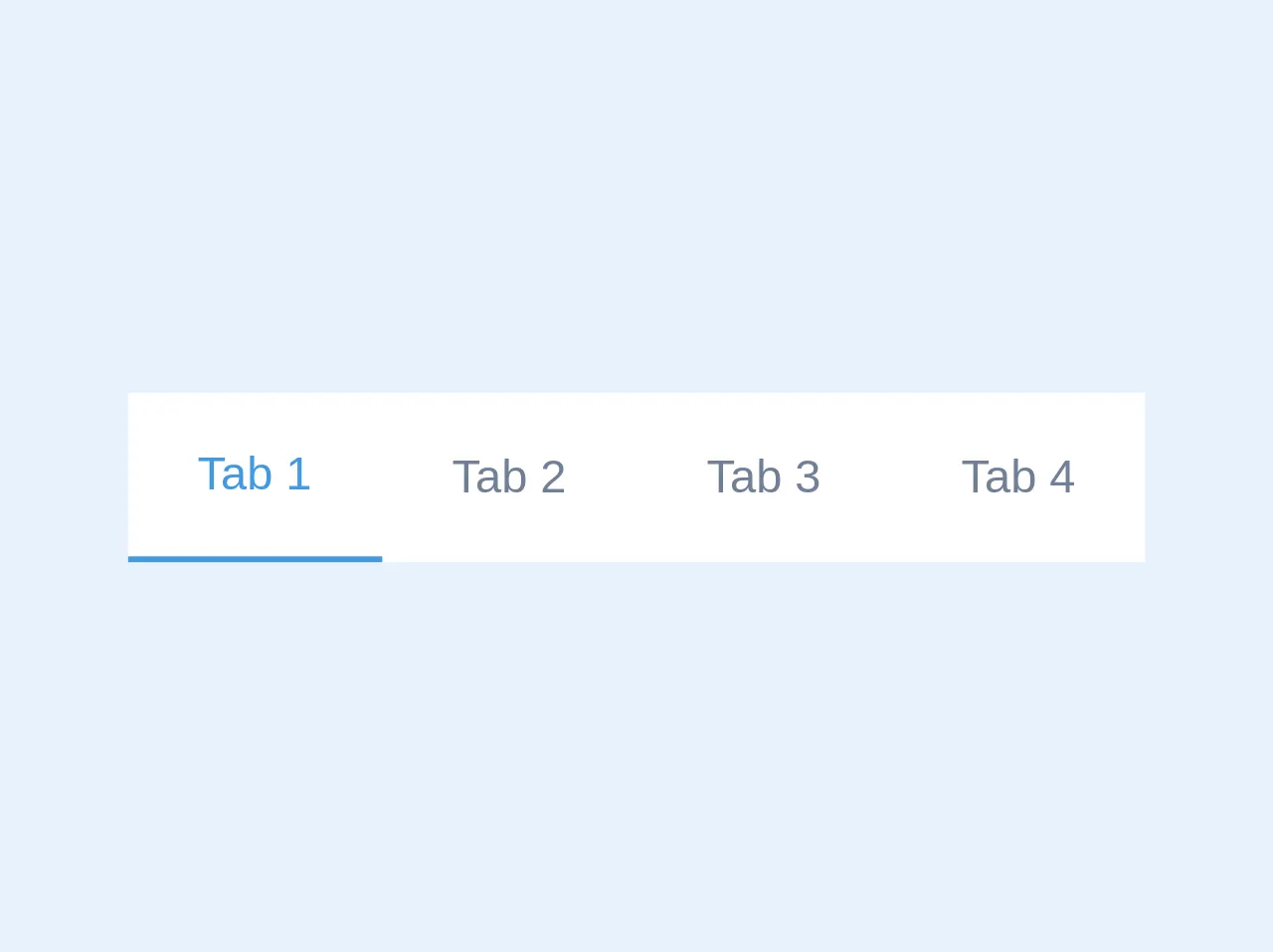
The preview of Tab navigation ui component
To create a Tab navigation with Tailwind CSS, we'll need to use a combination of HTML and CSS. Here's a preview of what our Tab navigation will look like:
Free download of the Tab navigation's source code
The source code of Tab navigation ui component
To create a Tab navigation with Tailwind CSS, we'll need to use a combination of HTML and CSS. Here's the source code for our Tab navigation:
<div class="bg-white">
    <nav class="flex flex-col sm:flex-row">
        <button class="text-gray-600 py-4 px-6 block hover:text-blue-500 focus:outline-none text-blue-500 border-b-2 font-medium border-blue-500">
            Tab 1
        </button><button class="text-gray-600 py-4 px-6 block hover:text-blue-500 focus:outline-none">
            Tab 2
        </button><button class="text-gray-600 py-4 px-6 block hover:text-blue-500 focus:outline-none">
            Tab 3
        </button><button class="text-gray-600 py-4 px-6 block hover:text-blue-500 focus:outline-none">
            Tab 4
        </button>
    </nav>
</div>
How to create a Tab navigation with Tailwind CSS?
Now that we've seen what our Tab navigation will look like and what the source code looks like, let's dive into the steps for creating a Tab navigation with Tailwind CSS.
Step 1: Create the HTML structure
The first step in creating a Tab navigation is to create the HTML structure. We'll need to create a set of tabs, each of which represents a different section of content. Here's an example of what our HTML structure might look like:
<div class="tabs">
  <div class="tab active">Tab 1</div>
  <div class="tab">Tab 2</div>
  <div class="tab">Tab 3</div>
</div>

<div class="tab-content">
  <div class="tab-pane active">Content for Tab 1</div>
  <div class="tab-pane">Content for Tab 2</div>
  <div class="tab-pane">Content for Tab 3</div>
</div>
In this example, we've created a set of tabs using the <div> element with the class tab. We've also created a set of content sections using the <div> element with the class tab-pane. We've set the first tab and content section to be active by default using the active class.
Step 2: Style the tabs
The next step is to style the tabs using Tailwind CSS. We'll use the flex and justify-between classes to create a horizontal layout for the tabs. We'll also use the border-b and border-gray-300 classes to add a border to the bottom of each tab. Here's an example of what our CSS might look like:
.tabs {
  display: flex;
  justify-content: space-between;
  border-bottom: 1px solid #ccc;
}

.tab {
  border-bottom: 3px solid transparent;
  cursor: pointer;
}

.tab.active {
  border-bottom-color: #000;
}
In this example, we've used the flex and justify-between classes to create a horizontal layout for the tabs. We've also used the border-b and border-gray-300 classes to add a border to the bottom of each tab. We've set the border-bottom-color of the active tab to be black using the active class.
Step 3: Style the content sections
The next step is to style the content sections using Tailwind CSS. We'll use the hidden and block classes to show and hide the content sections based on which tab is active. Here's an example of what our CSS might look like:
.tab-content {
  display: none;
}

.tab-pane.active {
  display: block;
}
In this example, we've used the hidden class to hide the content sections by default. We've also used the block class to show the active content section.
Step 4: Add JavaScript functionality
The final step is to add JavaScript functionality to our Tab navigation. We'll use JavaScript to add and remove the active class from the tabs and content sections based on which tab is clicked. Here's an example of what our JavaScript might look like:
const tabs = document.querySelectorAll('.tab');
const tabContent = document.querySelectorAll('.tab-pane');

tabs.forEach((tab, index) => {
  tab.addEventListener('click', () => {
    tabs.forEach((tab) => tab.classList.remove('active'));
    tab.classList.add('active');

    tabContent.forEach((content) => content.classList.remove('active'));
    tabContent[index].classList.add('active');
  });
});
In this example, we've used JavaScript to add and remove the active class from the tabs and content sections based on which tab is clicked. We've used the querySelectorAll method to select all of the tabs and content sections, and we've used a forEach loop to add an event listener to each tab.
Conclusion
In this article, we've learned how to create a Tab navigation using Tailwind CSS. We've seen how Tailwind CSS provides a set of pre-defined CSS classes that you can use to style your HTML elements, making it easy to create beautiful and responsive user interfaces quickly. We've also seen how to use HTML, CSS, and JavaScript to create a Tab navigation that is both functional and visually appealing. With these skills, you can create your own Tab navigation and take your user interface design to the next level.