- Published on
Learn How To Make A Dark mode toggle With Tailwind CSS from the Pros
- What is Tailwind CSS?
- The description of Dark mode toggle ui component
- Why use Tailwind CSS to create a Dark mode toggle ui component?
- The preview of Dark mode toggle ui component
- The source code of Dark mode toggle ui component
- How to create a Dark mode toggle with Tailwind CSS?
- Conclusion
As a FrontEnd technology blogger, it is important to stay up-to-date with the latest trends and techniques. One of the most popular trends in web design right now is the implementation of dark mode. Dark mode is a feature that allows users to switch the color scheme of a website to a darker palette, which can be easier on the eyes and provide a more immersive experience. In this article, we will show you how to create a dark mode toggle with Tailwind CSS.
What is Tailwind CSS?
Tailwind CSS is a utility-first CSS framework that allows developers to quickly and easily create custom designs. It provides a set of pre-defined classes that can be used to style HTML elements without the need for custom CSS. This makes it a great choice for developers who want to create responsive designs quickly and efficiently.
The description of Dark mode toggle ui component
A dark mode toggle is a user interface component that allows users to switch between light and dark color schemes. It is typically represented by a switch or button that changes the color scheme of the website when clicked.
Why use Tailwind CSS to create a Dark mode toggle ui component?
Tailwind CSS is a great choice for creating a dark mode toggle because it provides a set of pre-defined classes that can be used to style the toggle button and the elements that need to be changed when the toggle is clicked. This makes it easy to create a dark mode toggle that is both functional and visually appealing.
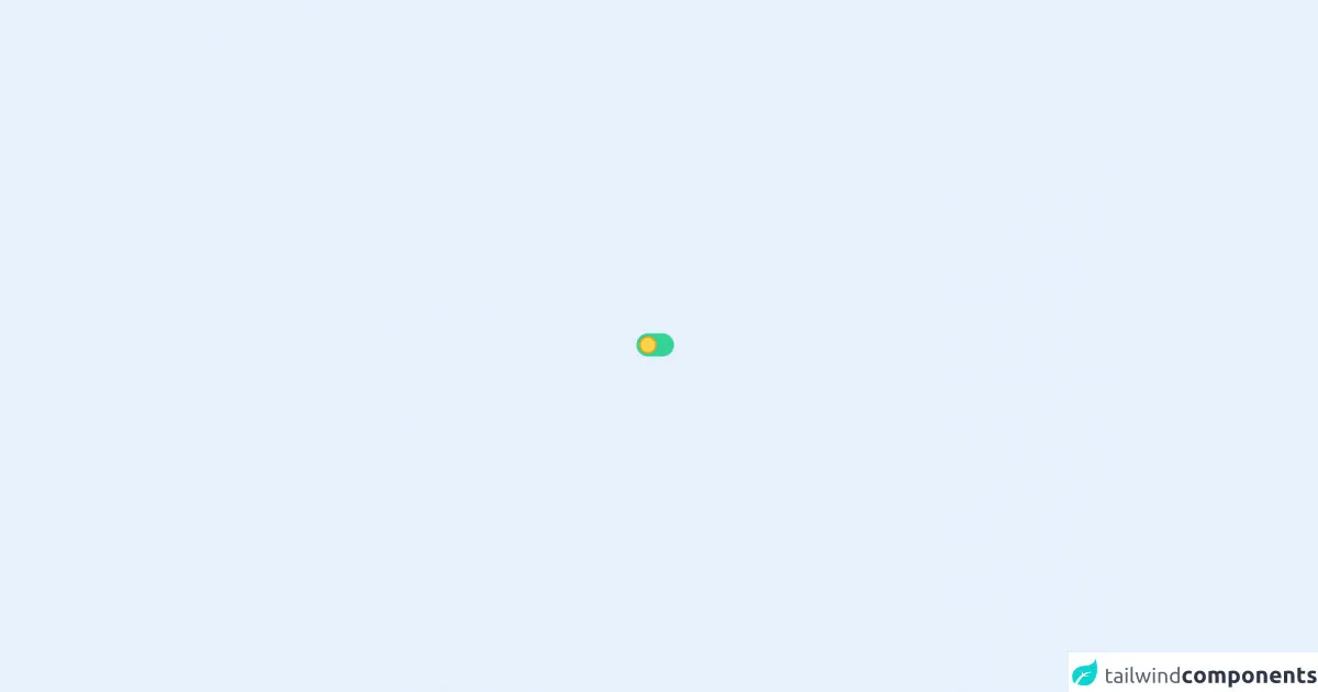
The preview of Dark mode toggle ui component
To create a dark mode toggle with Tailwind CSS, we will use a switch component that changes the color scheme of the website when clicked. The switch will be styled using Tailwind CSS classes to create a visually appealing design.
Free download of the Dark mode toggle's source code
The source code of Dark mode toggle ui component
To create a dark mode toggle with Tailwind CSS, we will need to write some HTML and CSS code. The HTML code will include a switch component that will be styled using Tailwind CSS classes. The CSS code will define the styles for the switch component and the elements that need to be changed when the toggle is clicked.
<style>
    .toggle-checkbox:checked {
        right: 0;
        border: none;
        background-color: rgb(129 124 214);
        background-image: url("data:image/svg+xml;utf8,<svg xmlns='http://www.w3.org/2000/svg' className='h-10 w-10' fill='%23FFF' viewBox='0 0 24 24' stroke='rgb(129 124 214)' > <path strokeLinecap='round' strokeLinejoin='round' d='M20.354 15.354A9 9 0 018.646 3.646 9.003 9.003 0 0012 21a9.003 9.003 0 008.354-5.646z' /> </svg>");
    }
    .toggle-checkbox:checked + .toggle-label {
        background-color: rgb(76 73 188);
    }
</style>
<div class='h-screen flex items-center justify-center'>
    <div
            class="relative inline-block w-12 mr-2 align-middle select-none transition duration-200 ease-in"
    >
        <input
                type="checkbox"
                name="toggle"
                id="toggle"
                class="bg-yellow-300 border-yellow-500 mr-1 focus:ring-transparent toggle-checkbox absolute block w-6 h-6 rounded-full border-2 appearance-none cursor-pointer"
        />
        <label
                for="toggle"
                class="toggle-label block h-8 -ml-1 -mt-1 rounded-full bg-green-400 cursor-pointer"
        ></label>
    </div>
</div>
How to create a Dark mode toggle with Tailwind CSS?
To create a dark mode toggle with Tailwind CSS, follow these steps:
- Create a switch component in HTML.
<div class="relative inline-block w-10 mr-2 align-middle select-none transition duration-200 ease-in">
  <input type="checkbox" name="toggle" id="toggle" class="toggle-checkbox absolute block w-6 h-6 rounded-full bg-white border-4 appearance-none cursor-pointer" />
  <label for="toggle" class="toggle-label block overflow-hidden h-6 rounded-full bg-gray-300 cursor-pointer"></label>
</div>
- Style the switch component using Tailwind CSS classes.
.toggle-checkbox:checked + .toggle-label {
  transform: translateX(100%);
  background-color: #4F46E5;
}

.toggle-label {
  background-color: #F3F4F6;
}

.toggle-checkbox:checked ~ .toggle-label {
  background-color: #4F46E5;
}

.toggle-checkbox:checked ~ .toggle-label::before {
  transform: translateX(0);
  content: "\f186";
}

.toggle-label::before {
  content: "\f185";
  font-family: "Font Awesome 5 Free";
  font-weight: 900;
  font-size: 14px;
  color: #F3F4F6;
  display: block;
  position: absolute;
  top: 50%;
  left: 50%;
  transform: translate(-50%, -50%);
}
- Add the necessary classes to the elements that need to be changed when the toggle is clicked.
<body class="bg-white dark:bg-gray-800">
  <div class="container mx-auto py-10">
    <div class="flex items-center justify-between mb-10">
      <h1 class="text-3xl font-bold text-gray-900 dark:text-white">Dark mode toggle</h1>
      <div class="relative inline-block w-10 mr-2 align-middle select-none transition duration-200 ease-in">
        <input type="checkbox" name="toggle" id="toggle" class="toggle-checkbox absolute block w-6 h-6 rounded-full bg-white border-4 appearance-none cursor-pointer" />
        <label for="toggle" class="toggle-label block overflow-hidden h-6 rounded-full bg-gray-300 cursor-pointer"></label>
      </div>
    </div>
    <p class="text-gray-700 dark:text-gray-300">Lorem ipsum dolor sit amet, consectetur adipiscing elit. Sed ac elit auctor, congue massa id, eleifend ex. Nulla facilisi. Sed eget justo nec ex tincidunt interdum. Donec vel velit vel elit tempor faucibus. Sed euismod, augue sit amet lacinia bibendum, mi velit aliquam enim, nec gravida massa lacus vel ante. Donec auctor, odio et bibendum mollis, urna tortor bibendum enim, vel tristique dolor nisl ac velit.</p>
  </div>
</body>
- Add JavaScript code to toggle the dark mode class on the body element.
const toggleSwitch = document.querySelector('.toggle-checkbox');

toggleSwitch.addEventListener('change', function(e) {
  if (e.target.checked) {
    document.body.classList.add('dark');
  } else {
    document.body.classList.remove('dark');
  }
});
Conclusion
In this article, we have shown you how to create a dark mode toggle with Tailwind CSS. By following these steps, you can create a functional and visually appealing dark mode toggle that will enhance the user experience of your website. Whether you are a beginner or an experienced developer, Tailwind CSS is a great choice for creating custom designs quickly and efficiently.