- Published on
6 Critical Skills To Build A Sign-in With Tailwind CSS Remarkably Well
- What is Tailwind CSS?
- The description of Sign-in UI component
- Why use Tailwind CSS to create a Sign-in UI component?
- The preview of Sign-in UI component
- The source code of Sign-in UI component
- How to create a Sign-in with Tailwind CSS?
- 1. Understanding of Tailwind CSS utility classes
- 2. Knowledge of HTML and CSS
- 3. Understanding of responsive design
- 4. Knowledge of form validation
- 5. Understanding of accessibility
- 6. Knowledge of JavaScript
- Conclusion
As a FrontEnd technology blogger, you may have heard of Tailwind CSS, a utility-first CSS framework that helps you to create responsive and modern user interfaces with ease. In this article, we will discuss how to build a Sign-in UI component with Tailwind CSS and the critical skills required to do it remarkably well.
What is Tailwind CSS?
Tailwind CSS is a utility-first CSS framework that provides a set of pre-defined CSS classes to help you create responsive and modern user interfaces. Unlike other CSS frameworks, Tailwind CSS does not provide pre-built components, but instead, it provides a set of low-level utility classes that you can use to build your own custom components.
The description of Sign-in UI component
The Sign-in UI component is a critical part of any web application that requires user authentication. It is the first point of contact between the user and the application and needs to be designed well to provide a seamless user experience. The Sign-in UI component typically consists of two input fields for the user's email and password, a "Sign-in" button, and a "Forgot password" link.
Why use Tailwind CSS to create a Sign-in UI component?
Tailwind CSS provides a set of pre-defined utility classes that can help you create a Sign-in UI component with ease. It also provides responsive design classes that make your Sign-in UI component look great on all screen sizes. Additionally, Tailwind CSS is easy to learn and use, making it an ideal choice for building Sign-in UI components.
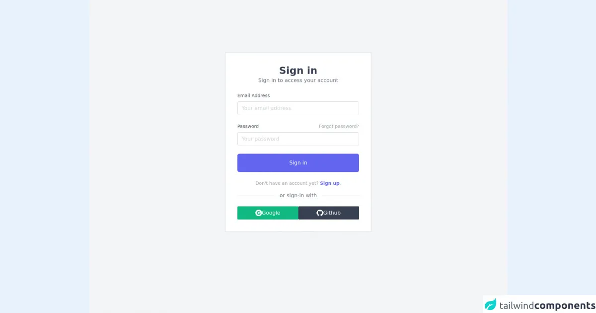
The preview of Sign-in UI component
To create a Sign-in UI component with Tailwind CSS, you can use the following HTML code:
<div class="bg-gray-100 min-h-screen flex items-center justify-center">
  <div class="bg-white p-16 rounded shadow-md">
    <h2 class="text-2xl font-bold mb-8">Sign in to your account</h2>
    <form>
      <div class="mb-4">
        <label class="block text-gray-700 font-bold mb-2" for="email">
          Email
        </label>
        <input
          class="appearance-none border rounded w-full py-2 px-3 text-gray-700 leading-tight focus:outline-none focus:shadow-outline"
          id="email"
          type="email"
          placeholder="Email"
        />
      </div>
      <div class="mb-6">
        <label class="block text-gray-700 font-bold mb-2" for="password">
          Password
        </label>
        <input
          class="appearance-none border rounded w-full py-2 px-3 text-gray-700 leading-tight focus:outline-none focus:shadow-outline"
          id="password"
          type="password"
          placeholder="Password"
        />
      </div>
      <div class="flex items-center justify-between">
        <button
          class="bg-blue-500 hover:bg-blue-700 text-white font-bold py-2 px-4 rounded focus:outline-none focus:shadow-outline"
          type="button"
        >
          Sign In
        </button>
        <a
          class="inline-block align-baseline font-bold text-sm text-blue-500 hover:text-blue-800"
          href="#"
        >
          Forgot Password?
        </a>
      </div>
    </form>
  </div>
</div>
Free download of the Sign-in's source code
The source code of Sign-in UI component
To create the Sign-in UI component with Tailwind CSS, you need to have a basic understanding of HTML and CSS. You can use the following HTML code as a starting point:
<div class="bg-gray-100 min-h-screen flex items-center justify-center">
  <div class="bg-white p-16 rounded shadow-md">
    <h2 class="text-2xl font-bold mb-8">Sign in to your account</h2>
    <form>
      <div class="mb-4">
        <label class="block text-gray-700 font-bold mb-2" for="email">
          Email
        </label>
        <input
          class="appearance-none border rounded w-full py-2 px-3 text-gray-700 leading-tight focus:outline-none focus:shadow-outline"
          id="email"
          type="email"
          placeholder="Email"
        />
      </div>
      <div class="mb-6">
        <label class="block text-gray-700 font-bold mb-2" for="password">
          Password
        </label>
        <input
          class="appearance-none border rounded w-full py-2 px-3 text-gray-700 leading-tight focus:outline-none focus:shadow-outline"
          id="password"
          type="password"
          placeholder="Password"
        />
      </div>
      <div class="flex items-center justify-between">
        <button
          class="bg-blue-500 hover:bg-blue-700 text-white font-bold py-2 px-4 rounded focus:outline-none focus:shadow-outline"
          type="button"
        >
          Sign In
        </button>
        <a
          class="inline-block align-baseline font-bold text-sm text-blue-500 hover:text-blue-800"
          href="#"
        >
          Forgot Password?
        </a>
      </div>
    </form>
  </div>
</div>
<div class="flex justify-center min-h-screen bg-gray-100">
<div class="container sm:mt-40 mt-24 my-auto max-w-md border-2 border-gray-200 p-3 bg-white">
<!-- header -->
<div class="text-center my-6">
<h1 class="text-3xl font-semibold text-gray-700">Sign in</h1>
<p class="text-gray-500">Sign in to access your account</p>
</div>
<!-- sign-in -->
<div class="m-6">
<form class="mb-4">
<div class="mb-6">
<label for="email" class="block mb-2 text-sm text-gray-600 dark:text-gray-400">Email Address</label>
<input type="email" name="email" id="email" placeholder="Your email address" class="w-full px-3 py-2 placeholder-gray-300 border border-gray-300 rounded-md focus:outline-none focus:ring focus:ring-indigo-100 focus:border-indigo-300 dark:bg-gray-700 dark:text-white dark:placeholder-gray-500 dark:border-gray-600 dark:focus:ring-gray-900 dark:focus:border-gray-500" />
</div>
<div class="mb-6">
<div class="flex justify-between mb-2">
<label for="password" class="text-sm text-gray-600 dark:text-gray-400">Password</label>
<a href="#!" class="text-sm text-gray-400 focus:outline-none focus:text-indigo-500 hover:text-indigo-500 dark:hover:text-indigo-300">Forgot password?</a>
</div>
<input type="password" name="password" id="password" placeholder="Your password" class="w-full px-3 py-2 placeholder-gray-300 border border-gray-300 rounded-md focus:outline-none focus:ring focus:ring-indigo-100 focus:border-indigo-300 dark:bg-gray-700 dark:text-white dark:placeholder-gray-500 dark:border-gray-600 dark:focus:ring-gray-900 dark:focus:border-gray-500" />
</div>
<div class="mb-6">
<button type="button" class="w-full px-3 py-4 text-white bg-indigo-500 rounded-md hover:bg-indigo-600 focus:outline-none duration-100 ease-in-out">Sign in</button>
</div>
<p class="text-sm text-center text-gray-400">
Don't have an account yet?
<a href="#!" class="font-semibold text-indigo-500 focus:text-indigo-600 focus:outline-none focus:underline">Sign up</a>.
</p>
</form>
<!-- seperator -->
<div class="flex flex-row justify-center mb-8">
<span class="absolute bg-white px-4 text-gray-500">or sign-in with</span>
<div class="w-full bg-gray-200 mt-3 h-px"></div>
</div>
<!-- alternate sign-in -->
<div class="flex flex-row gap-2">
<button class="bg-green-500 text-white w-full p-2 flex flex-row justify-center gap-2 items-center rounded-sm hover:bg-green-600 duration-100 ease-in-out">
<svg xmlns="http://www.w3.org/2000/svg" xmlns:xlink="http://www.w3.org/1999/xlink" aria-hidden="true" role="img" class="w-5" preserveAspectRatio="xMidYMid meet" viewBox="0 0 24 24"><g fill="none"><path fill-rule="evenodd" clip-rule="evenodd" d="M12 0C5.372 0 0 5.373 0 12s5.372 12 12 12c6.627 0 12-5.373 12-12S18.627 0 12 0zm.14 19.018c-3.868 0-7-3.14-7-7.018c0-3.878 3.132-7.018 7-7.018c1.89 0 3.47.697 4.682 1.829l-1.974 1.978v-.004c-.735-.702-1.667-1.062-2.708-1.062c-2.31 0-4.187 1.956-4.187 4.273c0 2.315 1.877 4.277 4.187 4.277c2.096 0 3.522-1.202 3.816-2.852H12.14v-2.737h6.585c.088.47.135.96.135 1.474c0 4.01-2.677 6.86-6.72 6.86z" fill="currentColor"/></g></svg>
Google
</button>
<button class="bg-gray-700 text-white w-full p-2 flex flex-row justify-center gap-2 items-center rounded-sm hover:bg-gray-800 duration-100 ease-in-out">
<svg xmlns="http://www.w3.org/2000/svg" xmlns:xlink="http://www.w3.org/1999/xlink" aria-hidden="true" role="img" class="w-5" preserveAspectRatio="xMidYMid meet" viewBox="0 0 24 24"><g fill="none"><path fill-rule="evenodd" clip-rule="evenodd" d="M12 0C5.37 0 0 5.37 0 12c0 5.31 3.435 9.795 8.205 11.385c.6.105.825-.255.825-.57c0-.285-.015-1.23-.015-2.235c-3.015.555-3.795-.735-4.035-1.41c-.135-.345-.72-1.41-1.23-1.695c-.42-.225-1.02-.78-.015-.795c.945-.015 1.62.87 1.845 1.23c1.08 1.815 2.805 1.305 3.495.99c.105-.78.42-1.305.765-1.605c-2.67-.3-5.46-1.335-5.46-5.925c0-1.305.465-2.385 1.23-3.225c-.12-.3-.54-1.53.12-3.18c0 0 1.005-.315 3.3 1.23c.96-.27 1.98-.405 3-.405s2.04.135 3 .405c2.295-1.56 3.3-1.23 3.3-1.23c.66 1.65.24 2.88.12 3.18c.765.84 1.23 1.905 1.23 3.225c0 4.605-2.805 5.625-5.475 5.925c.435.375.81 1.095.81 2.22c0 1.605-.015 2.895-.015 3.3c0 .315.225.69.825.57A12.02 12.02 0 0 0 24 12c0-6.63-5.37-12-12-12z" fill="currentColor"/></g></svg>
Github
</button>
</div>
</div>
</div>
</div>
How to create a Sign-in with Tailwind CSS?
To create a Sign-in UI component with Tailwind CSS, you will need to have the following critical skills:
1. Understanding of Tailwind CSS utility classes
Tailwind CSS provides a set of utility classes that you can use to style your HTML elements. You will need to have a good understanding of these utility classes to create a Sign-in UI component with Tailwind CSS.
2. Knowledge of HTML and CSS
You will need to have a good understanding of HTML and CSS to create a Sign-in UI component with Tailwind CSS. You will need to know how to structure your HTML code and apply the appropriate CSS classes to style your HTML elements.
3. Understanding of responsive design
Responsive design is critical when creating a Sign-in UI component. You will need to ensure that your Sign-in UI component looks great on all screen sizes, from desktop to mobile devices.
4. Knowledge of form validation
Form validation is essential when creating a Sign-in UI component. You will need to ensure that the user enters valid input into the email and password fields and provide appropriate error messages if the input is invalid.
5. Understanding of accessibility
Accessibility is critical when creating a Sign-in UI component. You will need to ensure that your Sign-in UI component is accessible to all users, including those with disabilities.
6. Knowledge of JavaScript
JavaScript is essential when creating a Sign-in UI component. You will need to use JavaScript to handle form submission, form validation, and error messages.
Conclusion
In conclusion, creating a Sign-in UI component with Tailwind CSS requires a good understanding of Tailwind CSS utility classes, HTML and CSS, responsive design, form validation, accessibility, and JavaScript. By mastering these critical skills, you can create a Sign-in UI component that provides a seamless user experience and enhances the overall usability of your web application.