- Published on
6 Ideas To Help You Build A Subscribe Banner With Tailwind CSS Like A Pro
- What is Tailwind CSS?
- The description of Subscribe Banner ui component
- Why use Tailwind CSS to create a Subscribe Banner ui component?
- The preview of Subscribe Banner ui component
- The source code of Subscribe Banner ui component
- How to create a Subscribe Banner with Tailwind CSS?
- 1. Use a fixed position
- 2. Add a close button
- 3. Use a contrasting color
- 4. Add animation
- 5. Use a gradient background
- 6. Make it sticky
- Conclusion
What is Tailwind CSS?
Tailwind CSS is a utility-first CSS framework that provides a set of pre-defined CSS classes to help you build custom user interfaces quickly. It is designed to be highly customizable and easy to use, making it a popular choice for front-end developers.
The description of Subscribe Banner ui component
A Subscribe Banner is a user interface component that is commonly used to encourage users to subscribe to a newsletter or mailing list. It typically consists of a banner that appears at the top or bottom of a webpage, with a call-to-action button that prompts users to enter their email address and subscribe.
Why use Tailwind CSS to create a Subscribe Banner ui component?
Tailwind CSS provides a number of benefits when it comes to creating a Subscribe Banner ui component:
- Customizable: Tailwind CSS provides a set of pre-defined CSS classes that can be easily customized to match your branding and design requirements.
- Responsive: Tailwind CSS includes a range of responsive design utilities that make it easy to create a Subscribe Banner that looks great on any device.
- Easy to use: Tailwind CSS is designed to be easy to use, with intuitive class names that make it easy to understand and use.
- Fast: Tailwind CSS is optimized for performance, with a small file size and minimal CSS output.
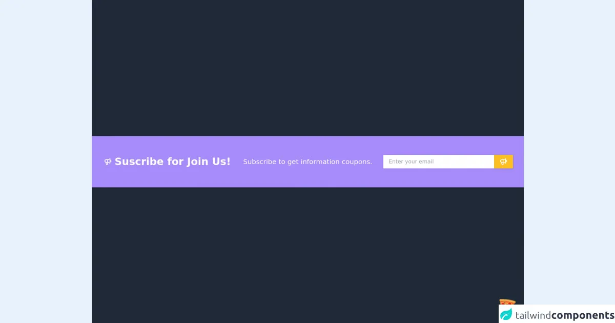
The preview of Subscribe Banner ui component
Free download of the Subscribe Banner's source code
The source code of Subscribe Banner ui component
<div class="flex justify-center items-center w-screen h-screen bg-gray-800">
	<!-- COMPONENT CODE -->
	<section class="w-full bg-purple-400">
		<div class="container px-4 mx-auto">
			<div class="grid grid-cols-1 my-4 lg:grid-cols-3">
				<div class="flex flex-row text-center justify-center text-white my-auto ">
					<svg xmlns="http://www.w3.org/2000/svg" class="h-6 w-6 text-white my-auto mr-2" fill="none" viewBox="0 0 24 24" stroke="currentColor">
                        <path stroke-linecap="round" stroke-linejoin="round" stroke-width="2" d="M11 5.882V19.24a1.76 1.76 0 01-3.417.592l-2.147-6.15M18 13a3 3 0 100-6M5.436 13.683A4.001 4.001 0 017 6h1.832c4.1 0 7.625-1.234 9.168-3v14c-1.543-1.766-5.067-3-9.168-3H7a3.988 3.988 0 01-1.564-.317z" />
                    </svg>
                    <h1 class="font-bold text-3xl">Suscribe for Join Us!</h1>
                </div>
                <div class="text-center text-white my-auto">
                    <h2 class="text-xl">Subscribe to get information coupons.</h2>
                </div>
                <div class="py-2 mx-4 lg:py-10">
                    <div class="bg-white shadow flex w-full">
                        <input
                            type="text"
                            placeholder="Enter your email"
                            class="w-full rounded-tl-full rounded-bl-full py-2 px-4" />
                        <button class="bg-yellow-400 hover:bg-purple-300 py-2 px-4">
                            <svg xmlns="http://www.w3.org/2000/svg" class="h-6 w-6 text-white" fill="none" viewBox="0 0 24 24" stroke="currentColor">
                                <path stroke-linecap="round" stroke-linejoin="round" stroke-width="2" d="M11 5.882V19.24a1.76 1.76 0 01-3.417.592l-2.147-6.15M18 13a3 3 0 100-6M5.436 13.683A4.001 4.001 0 017 6h1.832c4.1 0 7.625-1.234 9.168-3v14c-1.543-1.766-5.067-3-9.168-3H7a3.988 3.988 0 01-1.564-.317z" />
                            </svg>
                        </button>
                    </div>
                </div>
          </div>
      </div>
    </section>
    <!-- COMPONENT CODE -->
</div>

<!-- BUY ME A PIZZA AND HELP SUPPORT OPEN-SOURCE RESOURCES -->
<div class="flex items-end justify-end fixed bottom-0 right-0 mb-4 mr-4 z-10">
  <div>
    <a title="Buy me a pizza" href="https://www.buymeacoffee.com/Dekartmc" target="_blank" class="block w-16 h-16 rounded-full transition-all shadow hover:shadow-lg transform hover:scale-110 hover:rotate-12">
      <img class="object-cover object-center w-full h-full rounded-full" src="https://img.icons8.com/emoji/48/000000/pizza-emoji.png"/>
    </a>
  </div>
</div>
How to create a Subscribe Banner with Tailwind CSS?
Here are 6 ideas to help you build a Subscribe Banner with Tailwind CSS like a pro:
1. Use a fixed position
To ensure that your Subscribe Banner is always visible to users, consider using a fixed position. This will keep the banner in place as the user scrolls down the page, making it more likely that they will see and interact with it.
<div class="fixed bottom-0 left-0 w-full bg-gray-800 text-white p-4">
  <p>Subscribe to our newsletter!</p>
  <button class="bg-white text-gray-800 px-4 py-2 rounded">Subscribe</button>
</div>
2. Add a close button
Some users may find a Subscribe Banner intrusive or annoying, so it's a good idea to provide them with an option to close it. You can do this by adding a close button to the banner.
<div class="fixed bottom-0 left-0 w-full bg-gray-800 text-white p-4">
<p>Subscribe to our newsletter!</p>
<button class="bg-white text-gray-800 px-4 py-2 rounded">Subscribe</button>
<button class="absolute top-0 right-0 text-white hover:text-gray-500">×</button>
</div>
3. Use a contrasting color
To make your Subscribe Banner stand out and grab the user's attention, consider using a contrasting color for the background and text.
<div class="fixed bottom-0 left-0 w-full bg-indigo-500 text-white p-4">
  <p>Subscribe to our newsletter!</p>
  <button class="bg-white text-indigo-500 px-4 py-2 rounded">Subscribe</button>
</div>
4. Add animation
Adding animation to your Subscribe Banner can make it more eye-catching and engaging for users. You can use Tailwind CSS's built-in animation classes to create a simple fade-in effect.
<div class="fixed bottom-0 left-0 w-full bg-gray-800 text-white p-4 animate-fade-in">
  <p>Subscribe to our newsletter!</p>
  <button class="bg-white text-gray-800 px-4 py-2 rounded">Subscribe</button>
</div>
5. Use a gradient background
Using a gradient background can add depth and visual interest to your Subscribe Banner. You can use Tailwind CSS's built-in gradient classes to create a gradient background.
<div class="fixed bottom-0 left-0 w-full bg-gradient-to-r from-purple-500 to-pink-500 text-white p-4">
  <p>Subscribe to our newsletter!</p>
  <button class="bg-white text-gray-800 px-4 py-2 rounded">Subscribe</button>
</div>
6. Make it sticky
If you want your Subscribe Banner to be visible at all times, even when the user scrolls down the page, consider making it sticky. You can use Tailwind CSS's built-in sticky class to achieve this.
<div class="sticky top-0 bg-gray-800 text-white p-4">
  <p>Subscribe to our newsletter!</p>
  <button class="bg-white text-gray-800 px-4 py-2 rounded">Subscribe</button>
</div>
Conclusion
Creating a Subscribe Banner with Tailwind CSS is a great way to encourage users to subscribe to your newsletter or mailing list. With Tailwind CSS's pre-defined CSS classes and responsive design utilities, you can create a professional-looking Subscribe Banner that looks great on any device. By following these 6 ideas, you can build a Subscribe Banner with Tailwind CSS like a pro.