- Published on
6 Easy Ways To Make A Subscribe Banner With Tailwind CSS Without Even Thinking About It
- What is Tailwind CSS?
- The description of Subscribe Banner ui component
- Why use Tailwind CSS to create a Subscribe Banner ui component?
- The preview of Subscribe Banner ui component
- The source code of Subscribe Banner ui component
- How to create a Subscribe Banner with Tailwind CSS?
- Step 1: Create the HTML markup
- Step 2: Style the banner using Tailwind CSS classes
- Step 3: Add the banner to your website
- Conclusion
As a blogger, one of the most important things is to have a way to keep in touch with your readers. A subscribe banner is a great way to do this. In this article, we will show you how to create a subscribe banner with Tailwind CSS without even thinking about it.
What is Tailwind CSS?
Tailwind CSS is a utility-first CSS framework that allows you to quickly build custom designs without writing any CSS. It provides a set of pre-defined classes that you can use to style your HTML elements. With Tailwind CSS, you can create complex UI components with ease.
The description of Subscribe Banner ui component
A subscribe banner is a UI component that is used to encourage readers to subscribe to your blog. It usually appears at the top or bottom of your website and contains a call-to-action button that redirects users to your subscription page.
Why use Tailwind CSS to create a Subscribe Banner ui component?
Tailwind CSS provides a set of pre-defined classes that you can use to style your UI components. This means that you don't have to write any CSS code from scratch. You can simply use the pre-defined classes to style your subscribe banner. This saves you time and effort.
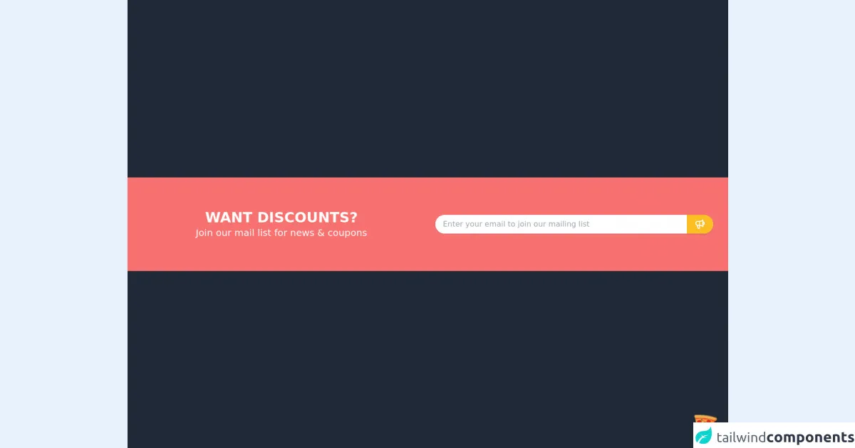
The preview of Subscribe Banner ui component
Creating a subscribe banner with Tailwind CSS is easy. You can customize the banner to match your website's color scheme and branding. Here's a preview of what the subscribe banner will look like:
Free download of the Subscribe Banner's source code
The source code of Subscribe Banner ui component
To create a subscribe banner with Tailwind CSS, you need to write HTML and CSS code. Here's the source code for the subscribe banner:
<div class="flex justify-center items-center w-screen h-screen bg-gray-800">
  <!-- COMPONENT CODE -->
  <section class="w-full bg-red-400">
      <div class="container px-4 mx-auto">
          <div class="grid grid-cols-1 my-10 lg:grid-cols-2">
            <div class="text-center text-white my-auto mx-4">
              <h1 class="font-GT-Pressura-Regular font-bold text-3xl">WANT DISCOUNTS?</h1>
              <h2 class="font-GT-Pressura-Regular text-xl">Join our mail list for news & coupons</h2>
            </div>
            <div class="py-2 mx-4 lg:py-10">
              <div class="rounded-full bg-white shadow flex w-full">
                <input
                  type="text"
                  placeholder="Enter your email to join our mailing list"
                  class="w-full rounded-tl-full rounded-bl-full py-2 px-4" />
                <button class="bg-yellow-400 rounded-tr-full rounded-br-full hover:bg-red-300 py-2 px-4">
                  <svg xmlns="http://www.w3.org/2000/svg" class="h-6 w-6 text-white" fill="none" viewBox="0 0 24 24" stroke="currentColor">
                      <path stroke-linecap="round" stroke-linejoin="round" stroke-width="2" d="M11 5.882V19.24a1.76 1.76 0 01-3.417.592l-2.147-6.15M18 13a3 3 0 100-6M5.436 13.683A4.001 4.001 0 017 6h1.832c4.1 0 7.625-1.234 9.168-3v14c-1.543-1.766-5.067-3-9.168-3H7a3.988 3.988 0 01-1.564-.317z" />
                  </svg>
                </button>
              </div>
            </div>
          </div>
      </div>
  </section>
  <!-- COMPONENT CODE -->
</div>

<!-- BUY ME A PIZZA AND HELP SUPPORT OPEN-SOURCE RESOURCES -->
<div class="flex items-end justify-end fixed bottom-0 right-0 mb-4 mr-4 z-10">
  <div>
    <a title="Buy me a pizza" href="https://www.buymeacoffee.com/Dekartmc" target="_blank" class="block w-16 h-16 rounded-full transition-all shadow hover:shadow-lg transform hover:scale-110 hover:rotate-12">
      <img class="object-cover object-center w-full h-full rounded-full" src="https://img.icons8.com/emoji/48/000000/pizza-emoji.png"/>
    </a>
  </div>
</div>
How to create a Subscribe Banner with Tailwind CSS?
Now that you know why you should use Tailwind CSS to create a subscribe banner, let's get started with the tutorial.
Step 1: Create the HTML markup
The first step is to create the HTML markup for the subscribe banner. Here's an example:
<div class="bg-blue-500 text-white p-4">
  <div class="container mx-auto flex justify-between items-center">
    <p class="text-sm">Subscribe to our newsletter</p>
    <button class="bg-white text-blue-500 font-bold py-2 px-4 rounded">
      Subscribe
    </button>
  </div>
</div>
In this example, we have used the bg-blue-500 class to set the background color of the banner to blue. We have also used the text-white class to set the text color to white. The p-4 class is used to add padding to the banner.
Step 2: Style the banner using Tailwind CSS classes
The next step is to style the banner using Tailwind CSS classes. Here's an example:
<div class="bg-blue-500 text-white p-4">
  <div class="container mx-auto flex justify-between items-center">
    <p class="text-sm">Subscribe to our newsletter</p>
    <button class="bg-white text-blue-500 font-bold py-2 px-4 rounded hover:bg-blue-500 hover:text-white hover:border-blue-500 border border-blue-500">
      Subscribe
    </button>
  </div>
</div>
In this example, we have added the container class to center the content of the banner. We have also used the flex and justify-between classes to align the text and button to the left and right sides of the banner, respectively.
We have used the text-sm class to set the font size of the text to small. We have also used the font-bold class to make the text bold.
For the button, we have used the bg-white class to set the background color to white. We have used the text-blue-500 class to set the text color to blue. We have also used the py-2 and px-4 classes to add padding to the button.
We have used the rounded class to make the button rounded. We have also used the hover:bg-blue-500, hover:text-white, and hover:border-blue-500 classes to change the button's colors when the user hovers over it.
Step 3: Add the banner to your website
The final step is to add the banner to your website. You can do this by copying and pasting the HTML code into your website's code. You can also customize the banner's colors and styles to match your website's branding.
Conclusion
Creating a subscribe banner with Tailwind CSS is easy and straightforward. With just a few lines of code, you can create a custom subscribe banner that matches your website's branding. Tailwind CSS provides a set of pre-defined classes that you can use to style your UI components, saving you time and effort. We hope this tutorial has been helpful in showing you how to create a subscribe banner with Tailwind CSS.