- Published on
Surprisingly Effective Ways To Create A Subscribe banner With Tailwind CSS
- What is Tailwind CSS?
- The description of Subscribe banner ui component
- Why use Tailwind CSS to create a Subscribe banner ui component?
- The preview of Subscribe banner ui component
- The source code of Subscribe banner ui component
- How to create a Subscribe banner with Tailwind CSS?
- Step 1: Set up your HTML
- Step 2: Customize your design
- Step 3: Add interactivity
- Conclusion
As a FrontEnd technology blogger, you may know that Tailwind CSS is a utility-first CSS framework that allows you to quickly build custom designs without writing any CSS. In this article, we will explore how to create a Subscribe banner with Tailwind CSS.
What is Tailwind CSS?
Tailwind CSS is a highly customizable, low-level CSS framework that provides a set of pre-defined CSS classes that can be used to build any design. It is designed to be highly customizable, and it allows you to build complex designs without writing any CSS.
The description of Subscribe banner ui component
A Subscribe banner is a UI component that is commonly used on websites and blogs to encourage visitors to subscribe to a newsletter or mailing list. It typically includes a call-to-action (CTA) button, a brief description of the newsletter or mailing list, and a form for visitors to enter their email address.
Why use Tailwind CSS to create a Subscribe banner ui component?
Tailwind CSS is an excellent choice for creating a Subscribe banner UI component for several reasons:
- Tailwind CSS provides a set of pre-defined CSS classes that can be used to quickly build custom designs without writing any CSS.
- Tailwind CSS is highly customizable, which means you can easily tweak the design of your Subscribe banner to match the style of your website or blog.
- Tailwind CSS is easy to learn, which means you can quickly get up to speed and start building your Subscribe banner.
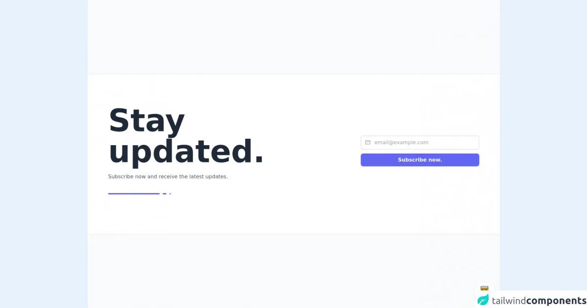
The preview of Subscribe banner ui component
To give you an idea of what a Subscribe banner UI component looks like, here is a preview:
Free download of the Subscribe banner's source code
The source code of Subscribe banner ui component
Here is the source code for the Subscribe banner UI component:
<style>@import url('https://cdnjs.cloudflare.com/ajax/libs/MaterialDesign-Webfont/5.3.45/css/materialdesignicons.min.css')</style>

<div class="min-w-screen min-h-screen bg-gray-50 flex items-center justify-center py-5">
    <div class="w-full bg-white border-t border-b border-gray-200 px-5 py-16 md:py-24 text-gray-800 font-light">
        <div class="w-full max-w-6xl mx-auto pb-5">
            <div class="-mx-3 md:flex items-center">
                <div class="px-3 md:w-2/3 mb-10 md:mb-0">
                    <h1 class="text-6xl md:text-8xl font-bold mb-5 leading-tight">Stay <br class="hidden md:block">updated.</h1>
                    <h3 class="text-gray-600 mb-7 leading-tight">Subscribe now and receive the latest updates.</h3>
                    <div>
                        <span class="inline-block w-40 h-1 rounded-full bg-indigo-500"></span>
                        <span class="inline-block w-3 h-1 rounded-full bg-indigo-500 ml-1"></span>
                        <span class="inline-block w-1 h-1 rounded-full bg-indigo-500 ml-1"></span>
                    </div>
                </div>
                <div class="px-3 md:w-1/3">
                    <form>
                        <div class="flex mb-3">
                            <div class="w-10 z-10 pl-1 text-center pointer-events-none flex items-center justify-center"><i class="mdi mdi-email-outline text-gray-400 text-lg"></i></div>
                            <input type="email" class="w-full -ml-10 pl-10 pr-3 py-2 rounded-lg border-2 border-gray-200 outline-none focus:border-indigo-500" placeholder="[email protected]">
                        </div>
                        <div>
                            <button class="block w-full bg-indigo-500 hover:bg-indigo-700 focus:bg-indigo-700 transition-colors text-white rounded-lg px-3 py-2 font-semibold">Subscribe now.</button>
                        </div>
                    </form>
                </div>
            </div>
        </div>
    </div>
</div>

<!-- BUY ME A BEER AND HELP SUPPORT OPEN-SOURCE RESOURCES -->
<div class="flex items-end justify-end fixed bottom-0 right-0 mb-4 mr-4 z-10">
    <div>
        <a title="Buy me a beer" href="https://www.buymeacoffee.com/scottwindon" target="_blank" class="block w-16 h-16 rounded-full transition-all shadow hover:shadow-lg transform hover:scale-110 hover:rotate-12">
            <img class="object-cover object-center w-full h-full rounded-full" src="https://i.pinimg.com/originals/60/fd/e8/60fde811b6be57094e0abc69d9c2622a.jpg"/>
        </a>
    </div>
</div>
How to create a Subscribe banner with Tailwind CSS?
Now that we have a basic understanding of what a Subscribe banner UI component is and why Tailwind CSS is an excellent choice for creating one, let's dive into the steps to create a Subscribe banner with Tailwind CSS.
Step 1: Set up your HTML
The first step is to set up your HTML. Here is an example of what your HTML might look like:
<div class="bg-blue-500 text-white py-4">
  <div class="container mx-auto flex items-center justify-between">
    <p>Subscribe to our newsletter for the latest updates.</p>
    <form class="ml-4">
      <input type="email" placeholder="Enter your email address" class="border-2 border-white rounded py-2 px-4">
      <button type="submit" class="bg-white text-blue-500 py-2 px-4 rounded">Subscribe</button>
    </form>
  </div>
</div>
In this example, we have used Tailwind CSS classes to style the background color, text color, padding, container, flexbox, form, input, and button.
Step 2: Customize your design
The next step is to customize your design. You can use Tailwind CSS classes to customize the font size, font weight, line height, margin, padding, border, background color, text color, and more.
For example, you can add the following classes to your HTML to customize the font size and font weight:
<p class="text-lg font-medium">Subscribe to our newsletter for the latest updates.</p>
Step 3: Add interactivity
The final step is to add interactivity. You can use JavaScript to add interactivity to your Subscribe banner, such as showing a success message when a user subscribes to your newsletter.
Here is an example of how you can use JavaScript to show a success message:
const form = document.querySelector('form');

form.addEventListener('submit', (event) => {
  event.preventDefault();
  const email = event.target.elements.email.value;
  // Send email to server
  const successMessage = document.createElement('p');
  successMessage.textContent = 'Thank you for subscribing!';
  form.parentNode.appendChild(successMessage);
  form.reset();
});
Conclusion
Creating a Subscribe banner with Tailwind CSS is a quick and easy way to add a professional-looking UI component to your website or blog. With Tailwind CSS, you can customize your design to match the style of your website or blog, and you can easily add interactivity using JavaScript. So, give it a try and see how it can enhance your website or blog!