- Published on
Surprisingly Effective Ways To Build A Story Bar With Tailwind CSS
- What is Tailwind CSS?
- The description of Story Bar UI component
- Why use Tailwind CSS to create a Story Bar UI component?
- The preview of Story Bar UI component
- The source code of Story Bar UI component
- How to create a Story Bar with Tailwind CSS?
- Step 1: Create the HTML structure
- Step 2: Style the Story Bar with Tailwind CSS
- Step 3: Customize the Story Bar
- Conclusion
In the world of web development, creating a UI component that is both visually appealing and functional can be a daunting task. However, with the help of Tailwind CSS, building a Story Bar UI component can be surprisingly easy. In this article, we will explore the steps to create a Story Bar with Tailwind CSS and why it is a great choice for this project.
What is Tailwind CSS?
Tailwind CSS is a utility-first CSS framework that provides a set of pre-defined classes that can be used to style HTML elements. It is designed to be highly customizable and easy to use, making it a popular choice for front-end developers. With Tailwind CSS, you can create complex layouts and UI components without writing a lot of custom CSS.
The description of Story Bar UI component
A Story Bar is a UI component that is commonly used in mobile applications and websites to display a series of images or videos that users can swipe through. It is similar to the Stories feature found in social media apps like Instagram and Snapchat. A Story Bar typically consists of a series of small circles or squares that represent each story, along with a progress bar that shows the user's progress through the stories.
Why use Tailwind CSS to create a Story Bar UI component?
Tailwind CSS is a great choice for creating a Story Bar UI component for several reasons. First, it provides a set of pre-defined classes that can be used to create the basic structure of the Story Bar, such as the circles or squares that represent each story. Second, it makes it easy to add custom styles to the Story Bar, such as changing the color of the circles or squares. Finally, Tailwind CSS is highly customizable, so you can easily modify the Story Bar to fit the specific needs of your project.
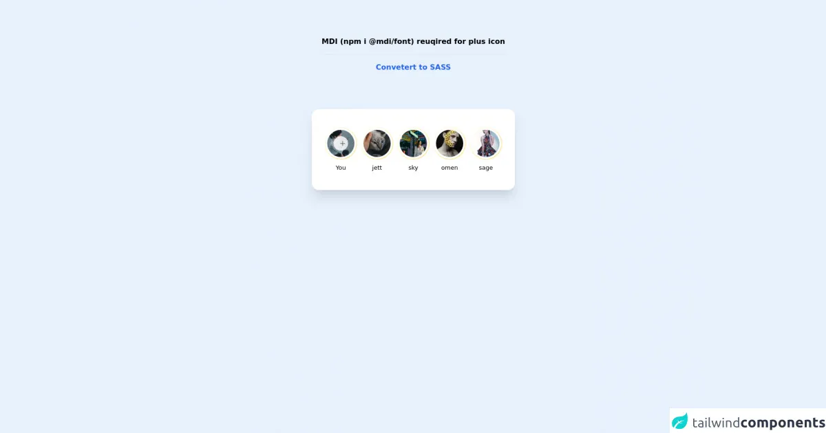
The preview of Story Bar UI component
To give you an idea of what a Story Bar UI component looks like, here is an example:
Free download of the Story Bar's source code
The source code of Story Bar UI component
Here is the source code for a basic Story Bar UI component created with Tailwind CSS:
<!-- MDI Icons -->
<link rel="stylesheet" href="//cdn.materialdesignicons.com/6.5.95/css/materialdesignicons.min.css">


<style>
    .story-ring {
        padding: 2px;
    }

    .story-text {
        font-size: 13px;
    }
</style>

<!-- Story Bar Container -->
<div class="flex flex-col items-center justify-center">
    <span class="text-center font-bold my-20">
        MDI (npm i @mdi/font) reuqired for plus icon

        <hr class="my-4">

        <a href="https://egoistdeveloper.github.io/twcss-to-sass-playground/" target="_blank" class="text-blue-600">
            Convetert to SASS
        </a>
    </span>

    <div class="w-full max-w-md px-7 py-10 mx-auto bg-white rounded-2xl shadow-xl">
        <div class="flex flex-col">
            <div class="flex">
                <!-- Story Bar -->
                <ul class="flex items-center justify-center space-x-2">
                    <!-- Add Story -->
                    <li class="flex flex-col items-center space-y-2">
                        <!-- Ring -->
                        <div class="story-ring flex justify-center items-center
                                bg-gradient-to-tl from-yellow-200 to-orange-500
                                rounded-full relative cursor-pointer
                                hover:from-orange-300 hover:to-red-400
                                transition-all duration-150 delay-100">
                            <a class="block bg-white p-1 rounded-full" href="#">
                                <!-- Thumbnail -->
                                <img class="w-16 rounded-full"
                                    src="https://images.unsplash.com/photo-1638687110777-b3fcdf2f9c57?ixlib=rb-1.2.1&ixid=MnwxMjA3fDB8MHxwaG90by1wYWdlfHx8fGVufDB8fHx8&auto=format&fit=crop&w=200&h=200&q=80">
                            </a>

                            <button class="absolute transition duration-500 bg-white border-gray-400
                                    h-8 w-8 rounded-full text-white border-2
                                    border-white flex justify-center items-center opacity-80
                                    hover:opacity-60">
                            </button>

                            <i class="absolute mdi mdi-plus mdi-18px mx-1 text-gray-500"></i>
                        </div>

                        <!-- Username -->
                        <span class="story-text font-medium">
                            You
                        </span>
                    </li>

                    <!-- Story #1 -->
                    <li class="flex flex-col items-center space-y-2">
                        <!-- Ring -->
                        <div class="story-ring flex justify-center items-center
                                bg-gradient-to-tl from-yellow-200 to-orange-500
                                rounded-full relative cursor-pointer
                                hover:from-orange-300 hover:to-red-400
                                transition-all duration-150 delay-100">
                            <a class="block bg-white p-1 rounded-full" href="#">
                                <!-- Thumbnail -->
                                <img class="w-16 rounded-full"
                                    src="https://images.unsplash.com/photo-1638649602320-450b717fa622?ixlib=rb-1.2.1&ixid=MnwxMjA3fDB8MHxwaG90by1wYWdlfHx8fGVufDB8fHx8&auto=format&fit=crop&w=200&h=200&q=80">
                            </a>
                        </div>

                        <!-- Username -->
                        <span class="story-text">
                            jett
                        </span>
                    </li>

                    <!-- Story #2 -->
                    <li class="flex flex-col items-center space-y-2">
                        <!-- Ring -->
                        <div class="story-ring flex justify-center items-center
                                bg-gradient-to-tl from-yellow-200 to-orange-500
                                rounded-full relative cursor-pointer
                                hover:from-orange-300 hover:to-red-400
                                transition-all duration-150 delay-100">
                            <a class="block bg-white p-1 rounded-full" href="#">
                                <!-- Thumbnail -->
                                <img class="w-16 rounded-full"
                                    src="https://images.unsplash.com/photo-1638708644743-2502f38000a0?ixlib=rb-1.2.1&ixid=MnwxMjA3fDB8MHxwaG90by1wYWdlfHx8fGVufDB8fHx8&auto=format&fit=crop&w=200&h=200&q=80">
                            </a>
                        </div>

                        <!-- Username -->
                        <span class="story-text">
                            sky
                        </span>
                    </li>

                    <!-- Story #3 -->
                    <li class="flex flex-col items-center space-y-2">
                        <!-- Ring -->
                        <div class="story-ring flex justify-center items-center
                                bg-gradient-to-tl from-yellow-200 to-orange-500
                                rounded-full relative cursor-pointer
                                hover:from-orange-300 hover:to-red-400
                                transition-all duration-150 delay-100">
                            <a class="block bg-white p-1 rounded-full" href="#">
                                <!-- Thumbnail -->
                                <img class="w-16 rounded-full"
                                    src="https://images.unsplash.com/photo-1638691899851-0e955bceba1f?ixlib=rb-1.2.1&ixid=MnwxMjA3fDB8MHxwaG90by1wYWdlfHx8fGVufDB8fHx8&auto=format&fit=crop&w=200&h=200&q=80">
                            </a>
                        </div>

                        <!-- Username -->
                        <span class="story-text">
                            omen
                        </span>
                    </li>

                    <!-- Story #4 -->
                    <li class="flex flex-col items-center space-y-2">
                        <!-- Ring -->
                        <div class="story-ring flex justify-center items-center
                                bg-gradient-to-tl from-yellow-200 to-orange-500
                                rounded-full relative cursor-pointer
                                hover:from-orange-300 hover:to-red-400
                                transition-all duration-150 delay-100
                                hover:animate-pulse">
                            <a class="block bg-white p-1 rounded-full" href="#">
                                <img class="w-16 rounded-full"
                                    src="https://images.unsplash.com/photo-1638612913771-8f00622b96fb?ixlib=rb-1.2.1&ixid=MnwxMjA3fDB8MHxwaG90by1wYWdlfHx8fGVufDB8fHx8&auto=format&fit=crop&w=200&h=200&q=80">
                            </a>
                        </div>

                        <!-- Username -->
                        <span class="story-text">
                            sage
                        </span>
                    </li>
                </ul>
            </div>
        </div>
    </div>
</div>
How to create a Story Bar with Tailwind CSS?
Now that we have covered the basics, let's dive into the steps to create a Story Bar with Tailwind CSS.
Step 1: Create the HTML structure
The first step is to create the HTML structure for the Story Bar. This typically consists of a container element that holds the circles or squares that represent each story, along with a progress bar that shows the user's progress through the stories. Here is an example HTML structure:
<div class="story-bar">
  <div class="story-bar__item"></div>
  <div class="story-bar__item"></div>
  <div class="story-bar__item"></div>
  <div class="story-bar__item"></div>
  <div class="story-bar__item"></div>
  <div class="story-bar__progress"></div>
</div>
Step 2: Style the Story Bar with Tailwind CSS
The next step is to style the Story Bar using Tailwind CSS. We can use the flex and justify-between classes to create a horizontal layout for the Story Bar, and the w-4 and h-4 classes to define the size of each circle or square. Here is an example of the CSS:
.story-bar {
  display: flex;
  justify-content: space-between;
}

.story-bar__item {
  width: 0.75rem;
  height: 0.75rem;
  border-radius: 50%;
  background-color: #ccc;
}

.story-bar__progress {
  height: 0.125rem;
  background-color: #ccc;
}
Step 3: Customize the Story Bar
Finally, we can customize the Story Bar to fit the specific needs of our project. For example, we can change the color of the circles or squares by using the bg- prefix followed by a color name or hex code. We can also add animations or transitions to make the Story Bar more interactive. Here is an example of a customized Story Bar:
.story-bar__item {
  width: 0.75rem;
  height: 0.75rem;
  border-radius: 50%;
  background-color: #ff6b6b;
  transition: all 0.2s ease-in-out;
}

.story-bar__item.active {
  transform: scale(1.2);
}

.story-bar__progress {
  height: 0.125rem;
  background-color: #ff6b6b;
  width: 0%;
  transition: all 0.2s ease-in-out;
}

.story-bar__item.active ~ .story-bar__progress {
  width: 20%;
}
Conclusion
In conclusion, building a Story Bar UI component with Tailwind CSS is surprisingly easy and highly customizable. With the help of pre-defined classes and custom styles, you can create a visually appealing and functional Story Bar for your web project. So why not give it a try?