- Published on
A Complete Guide To Make A Stock page With Tailwind CSS
- What is Tailwind CSS?
- The description of Stock page ui component
- Why use Tailwind CSS to create a Stock page ui component?
- The preview of Stock page ui component
- The source code of Stock page ui component
- How to create a Stock page with Tailwind CSS?
- Step 1: Set up your development environment
- Step 2: Create the HTML structure
- Step 3: Add Tailwind CSS to your project
- Step 4: Style your stock page with Tailwind CSS
- Step 5: Add interactivity with JavaScript
- Conclusion
As a FrontEnd technology blogger, it is important to stay up-to-date with the latest trends and tools in web development. One such tool that has gained immense popularity in recent times is Tailwind CSS. In this article, we will explore how to create a Stock page with Tailwind CSS.
What is Tailwind CSS?
Tailwind CSS is a utility-first CSS framework that provides a set of pre-defined classes to help you quickly build custom user interfaces. It is designed to be highly customizable and flexible, allowing developers to create unique designs without writing custom CSS.
The description of Stock page ui component
A stock page is a user interface component that displays information about a particular stock, such as its current price, historical data, and news articles related to the stock. The stock page typically includes a chart that displays the stock's performance over time, as well as various other metrics such as market cap, volume, and dividend yield.
Why use Tailwind CSS to create a Stock page ui component?
Tailwind CSS is an excellent choice for creating a stock page ui component for several reasons. Firstly, it provides a wide range of pre-defined classes that can be used to create complex layouts and styles without writing custom CSS. Secondly, it is highly customizable, allowing you to easily modify the appearance of your stock page to match your brand's style. Finally, it is lightweight and fast, ensuring that your stock page loads quickly and provides a smooth user experience.
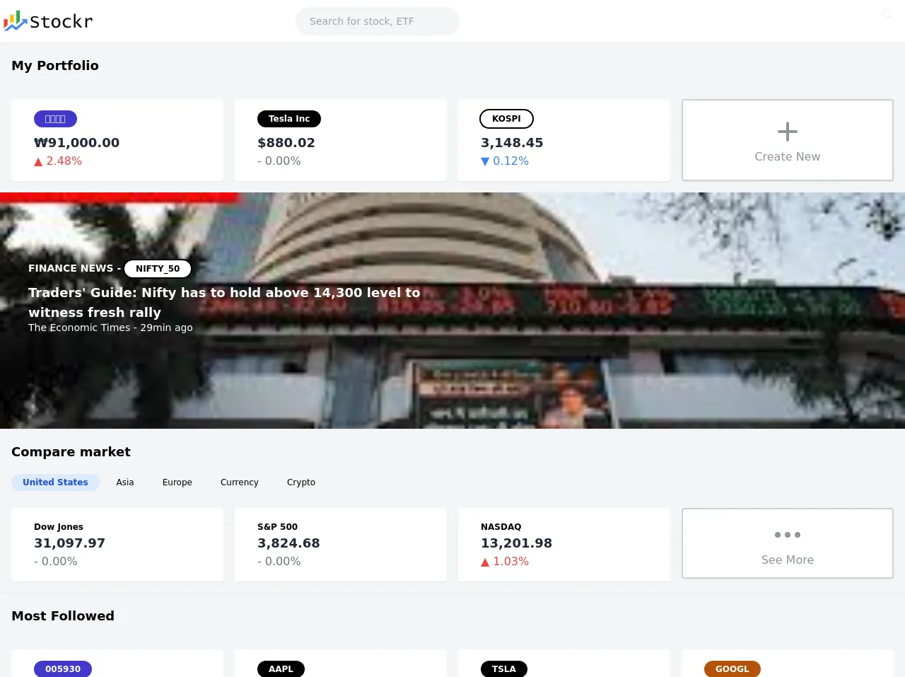
The preview of Stock page ui component
To give you an idea of what a stock page created with Tailwind CSS might look like, here is a preview:
Free download of the Stock page's source code
The source code of Stock page ui component
To create a stock page with Tailwind CSS, you will need to write HTML and CSS code. Here is an example of what the HTML and CSS code for a stock page might look like:
<header class="text-gray-100 bg-white body-font shadow w-full">
        <div class="container mx-auto flex flex-wrap flex-col md:flex-row items-center">
 <a class="">
                <img src="https://i.imgur.com/K6AIhk2.png" style="height: 40px; margin-top: 10px; margin-bottom: 10px;" alt="logo">

            </a>
                </nav>

            <div class="lg:w-2/5 inline-flex lg:justify-end ml-5 lg:ml-0">
  <input type="search" name="serch" placeholder="Search for stock, ETF" class="bg-gray-100 h-10 px-5 pr-10 rounded-full text-sm focus:outline-none">
  <button type="submit" class="absolute right-0 top-0 mt-3 mr-4">
    <svg class="h-4 w-4 fill-current" xmlns="http://www.w3.org/2000/svg" xmlns:xlink="http://www.w3.org/1999/xlink" version="1.1" id="Capa_1" x="0px" y="0px" viewBox="0 0 56.966 56.966" style="enable-background:new 0 0 56.966 56.966;" xml:space="preserve" width="512px" height="512px">
      <path d="M55.146,51.887L41.588,37.786c3.486-4.144,5.396-9.358,5.396-14.786c0-12.682-10.318-23-23-23s-23,10.318-23,23  s10.318,23,23,23c4.761,0,9.298-1.436,13.177-4.162l13.661,14.208c0.571,0.593,1.339,0.92,2.162,0.92  c0.779,0,1.518-0.297,2.079-0.837C56.255,54.982,56.293,53.08,55.146,51.887z M23.984,6c9.374,0,17,7.626,17,17s-7.626,17-17,17  s-17-7.626-17-17S14.61,6,23.984,6z"/>
    </svg>
  </button>
            </div>
        </div>
    </header>

<header class="flex-none flex h-16 bg-gray-100 border-t px-4 items-center">

      <h1 class="font-semibold text-lg">My Portfolio</h1>

    </header>
<div class="flex items-center bg-gray-100  text-gray-800">
  <div class="p-4 w-full">
    <div class="grid grid-cols-12 gap-4">
      <div class="col-span-12 sm:col-span-6 md:col-span-3">
        <div class="flex flex-row bg-white shadow-sm rounded p-4">

          <div class="flex flex-col flex-grow ml-4">
            <div class="text-sm text-gray-500">
<div class="col-span-12 lg:col-span-8">
                        <a href="#" class="inline-block rounded-full text-white
                            bg-indigo-700
                            text-xs font-bold
                            mr-1 md:mr-2 mb-2 px-2 md:px-4 py-1 ">
                            삼성전자
                        </a>
                    </div></div>
            <div class="font-bold text-lg">₩91,000.00</div>
            <span class="text-red-500">▲ 2.48%</span>
          </div>
        </div>
      </div>
      <div class="col-span-12 sm:col-span-6 md:col-span-3">
               <div class="flex flex-row bg-white shadow-sm rounded p-4">

          <div class="flex flex-col flex-grow ml-4">
            <div class="text-sm text-gray-500">
<div class="col-span-12 lg:col-span-8">
                        <a href="#" class="inline-block rounded-full text-white
                            bg-black
                            text-xs font-bold
                            mr-1 md:mr-2 mb-2 px-2 md:px-4 py-1 ">
                            Tesla Inc
                        </a>
                    </div></div>
            <div class="font-bold text-lg">$880.02</div>
            <span class="text-gray-500">- 0.00%</span>
          </div>
        </div>
      </div>
      <div class="col-span-12 sm:col-span-6 md:col-span-3">
                <div class="flex flex-row bg-white shadow-sm rounded p-4">

          <div class="flex flex-col flex-grow ml-4">
            <div class="text-sm text-gray-500">
<div class="col-span-12 lg:col-span-8">
                        <a href="#" class="inline-block rounded-full text-black
                            ring-black ring-2
                            text-xs font-bold
                            mr-1 md:mr-2 mb-2 px-2 md:px-4 py-1 ">
                            KOSPI
                        </a>
                    </div></div>
            <div class="font-bold text-lg">3,148.45</div>
            <span class="text-blue-500">▼ 0.12%</span>
          </div>
        </div>
      </div>
      <div class="col-span-12 sm:col-span-6 md:col-span-3">
        <div class="flex flex-row bg-white shadow-sm rounded">

          <div id="empty-cover-art" class="py-5 h-full rounded sm:w-full  text-center opacity-50 md:border-solid md:border-2 md:border-gray-400">
 <center><svg width="48" xmlns="http://www.w3.org/2000/svg" fill="none" viewBox="0 0 24 24" stroke="currentColor">
  <path stroke-linecap="round" stroke-linejoin="round" stroke-width="2" d="M12 6v6m0 0v6m0-6h6m-6 0H6" />
</svg></center>
  <div class="">
    Create New
  </div>
</div>

        </div>


      </div>
    </div>
  </div>
</div>
<div class="bg-cover bg-center  h-auto text-white py-24 px-10 object-fill" style="background-image: url(https://encrypted-tbn0.gstatic.com/images?q=tbn:ANd9GcSxJPlSKDyfGg_WEpda49DZyo_fSKrdmxoIaqosNxD_luNQ0QaDKRqnU6CWEB8)">
       <div class="md:w-1/2">
        <p class="font-bold text-sm uppercase">FINANCE NEWS - <a href="#" class="inline-block rounded-full text-black
                            ring-black ring-2
                            text-xs font-bold bg-white
                            mr-1 md:mr-2 mb-2 px-2 md:px-4 py-1 ">
                            Nifty_50
                        </a></p>
        <p class="text-lg font-bold">Traders' Guide: Nifty has to hold above 14,300 level to witness fresh rally</p>
        <p class="text-sm mb-10 leading-none">The Economic Times - 29min ago</p>
</div>
    </div>
<header class="flex-none flex h-16 bg-gray-100 border-t px-4 items-center">

      <h1 class="font-semibold text-lg">Compare market</h1>
    </header>
<header class="flex-none flex  bg-gray-100 px-4 items-center">

     <a href="#" class="inline-block rounded-full text-blue-700
                            bg-blue-100
                            text-xs font-bold
                            mr-1 md:mr-2 mb-2 px-2 md:px-4 py-1 ">
                            United States
                        </a>
         <a href="#" class="inline-block rounded-full text-black

                            text-xs
                            mr-1 md:mr-2 mb-2 px-2 md:px-4 py-1 ">
                            Asia
                        </a>
         <a href="#" class="inline-block rounded-full text-black

                            text-xs
                            mr-1 md:mr-2 mb-2 px-2 md:px-4 py-1 ">
                            Europe
                        </a>
         <a href="#" class="inline-block rounded-full text-black

                            text-xs
                            mr-1 md:mr-2 mb-2 px-2 md:px-4 py-1 ">
                            Currency
                        </a>
                 <a href="#" class="inline-block rounded-full text-black

                            text-xs
                            mr-1 md:mr-2 mb-2 px-2 md:px-4 py-1 ">
                            Crypto
                        </a>
    </header>

<div class="flex items-center bg-gray-100  text-gray-800">
  <div class="p-4 w-full">
    <div class="grid grid-cols-12 gap-4">
      <div class="col-span-12 sm:col-span-6 md:col-span-3">
        <div class="flex flex-row bg-white shadow-sm rounded p-4">

          <div class="flex flex-col flex-grow ml-4">
            <div class="text-sm text-gray-500">
<div class="col-span-12 lg:col-span-8">
                        <a href="#" class="inline-block rounded-full text-black
                            text-xs font-bold ">
                           Dow Jones
                        </a>
                    </div></div>
            <div class="font-bold text-lg">31,097.97</div>
             <span class="text-gray-500">- 0.00%</span>
          </div>
        </div>
      </div>
      <div class="col-span-12 sm:col-span-6 md:col-span-3">
               <div class="flex flex-row bg-white shadow-sm rounded p-4">

          <div class="flex flex-col flex-grow ml-4">
            <div class="text-sm text-gray-500">
<div class="col-span-12 lg:col-span-8">
                        <a href="#" class="inline-block rounded-full text-black
                            text-xs font-bold ">
                            S&P 500
                        </a>
                    </div></div>
            <div class="font-bold text-lg">3,824.68</div>
            <span class="text-gray-500">- 0.00%</span>
          </div>
        </div>
      </div>
      <div class="col-span-12 sm:col-span-6 md:col-span-3">
                <div class="flex flex-row bg-white shadow-sm rounded p-4">

          <div class="flex flex-col flex-grow ml-4">
            <div class="text-sm text-gray-500">
<div class="col-span-12 lg:col-span-8">
                        <a href="#" class="inline-block rounded-full text-black
                            text-xs font-bold ">
                            NASDAQ
                        </a>
                    </div></div>
            <div class="font-bold text-lg">13,201.98</div>
            <span class="text-red-500">▲ 1.03%</span>
          </div>
        </div>
      </div>
      <div class="col-span-12 sm:col-span-6 md:col-span-3">
        <div class="flex flex-row bg-white shadow-sm rounded">

          <div id="empty-cover-art" class="py-3 h-full rounded sm:w-full  text-center opacity-50 md:border-solid md:border-2 md:border-gray-400">
 <center><svg width="48" xmlns="http://www.w3.org/2000/svg" fill="none" viewBox="0 0 24 24" stroke="currentColor">
  <path stroke-linecap="round" stroke-linejoin="round" stroke-width="2" d="M5 12h.01M12 12h.01M19 12h.01M6 12a1 1 0 11-2 0 1 1 0 012 0zm7 0a1 1 0 11-2 0 1 1 0 012 0zm7 0a1 1 0 11-2 0 1 1 0 012 0z" />
</svg></center>
  <div class="">
    See More
  </div>
</div>

        </div>


      </div>
    </div>
  </div>
</div>

<header class="flex-none flex h-16 bg-gray-100 border-t px-4 items-center">

      <h1 class="font-semibold text-lg">Most Followed</h1>

    </header>
    <div class="flex items-center bg-gray-100  text-gray-800">
  <div class="p-4 w-full">
    <div class="grid grid-cols-12 gap-4">
      <div class="col-span-12 sm:col-span-6 md:col-span-3">
        <div class="flex flex-row bg-white shadow-sm rounded p-4">

          <div class="flex flex-col flex-grow ml-4">
            <div class="text-sm text-gray-500">
<div class="col-span-12 lg:col-span-8">
                        <a href="#" class="inline-block rounded-full text-white
                            bg-indigo-700
                            text-xs font-bold
                            mr-1 md:mr-2 mb-2 px-2 md:px-4 py-1 ">
                            005930
                        </a>
                    </div></div>
            <div class="font-bold text-lg">23.6K </div>
            <div class="text-gray-300 text-sm">Followers</div>

          </div>
        </div>
      </div>
      <div class="col-span-12 sm:col-span-6 md:col-span-3">
               <div class="flex flex-row bg-white shadow-sm rounded p-4">

          <div class="flex flex-col flex-grow ml-4">
            <div class="text-sm text-gray-500">
<div class="col-span-12 lg:col-span-8">
                        <a href="#" class="inline-block rounded-full text-white
                            bg-black
                            text-xs font-bold
                            mr-1 md:mr-2 mb-2 px-2 md:px-4 py-1 ">
                            AAPL
                        </a>
                    </div></div>
    <div class="font-bold text-lg">13.8K </div>
            <div class="text-gray-300 text-sm">Followers</div>
          </div>
        </div>
      </div>
      <div class="col-span-12 sm:col-span-6 md:col-span-3">
                <div class="flex flex-row bg-white shadow-sm rounded p-4">

          <div class="flex flex-col flex-grow ml-4">
            <div class="text-sm text-gray-500">
<div class="col-span-12 lg:col-span-8">
                           <a href="#" class="inline-block rounded-full text-white
                            bg-black
                            text-xs font-bold
                            mr-1 md:mr-2 mb-2 px-2 md:px-4 py-1 ">
                            TSLA
                        </a>
                    </div></div>
         <div class="font-bold text-lg">23.6K </div>
            <div class="text-gray-300 text-sm">Followers</div>
          </div>
        </div>
      </div>
      <div class="col-span-12 sm:col-span-6 md:col-span-3">
                       <div class="flex flex-row bg-white shadow-sm rounded p-4">

          <div class="flex flex-col flex-grow ml-4">
            <div class="text-sm text-gray-500">
<div class="col-span-12 lg:col-span-8">
                         <a href="#" class="inline-block rounded-full text-white
                            bg-yellow-700
                            text-xs font-bold
                            mr-1 md:mr-2 mb-2 px-2 md:px-4 py-1 ">
                            GOOGL
                        </a>
                    </div></div>
                 <div class="font-bold text-lg">7.74K </div>
            <div class="text-gray-300 text-sm">Followers</div>
          </div>
        </div>
      </div></div></div></div>

<header class="flex-none flex h-16 bg-gray-100 border-t px-4 items-center">

      <h1 class="font-semibold text-lg">Market Status</h1>

    </header>
<header class="flex-none flex  bg-gray-100 px-4 items-center">

     <a href="#" class="inline-block rounded-full text-blue-700
                            bg-blue-100
                            text-xs font-bold
                            mr-1 md:mr-2 mb-2 px-2 md:px-4 py-1 ">
                           Hot
                        </a>
         <a href="#" class="inline-block rounded-full text-black

                            text-xs
                            mr-1 md:mr-2 mb-2 px-2 md:px-4 py-1 ">
                            Upside
                        </a>
         <a href="#" class="inline-block rounded-full text-black

                            text-xs
                            mr-1 md:mr-2 mb-2 px-2 md:px-4 py-1 ">
                            Downside
                        </a>
    </header>

   <ul class="flex flex-col bg-gray-100 p-4">

             <li class="border-gray-400 flex flex-row mb-2">
          <div class="select-none cursor-pointer bg-white rounded-md flex flex-1 items-center p-4  transition duration-200 ease-in-out transform hover:-translate-y-1 hover:shadow">
            <div class="flex-1 pl-1 mr-16">
              <div class="font-medium">Company A</div>
              <div class="text-gray-600 text-sm"> <a href="#" class="inline-block rounded-full text-white
                            bg-yellow-700
                            text-xs font-bold
                            mr-1 md:mr-2 mb-2 px-2 md:px-4 py-1 ">
                            COMPA
                        </a>   </div>
            </div>
            <div class="text-red-500 ">↑ 3.45%</div>
          </div>
        </li>
             <li class="border-gray-400 flex flex-row mb-2">
          <div class="select-none cursor-pointer bg-white rounded-md flex flex-1 items-center p-4  transition duration-200 ease-in-out transform hover:-translate-y-1 hover:shadow">
            <div class="flex-1 pl-1 mr-16">
              <div class="font-medium">Company B</div>
              <div class="text-gray-600 text-sm"> <a href="#" class="inline-block rounded-full text-white
                            bg-pink-300
                            text-xs font-bold
                            mr-1 md:mr-2 mb-2 px-2 md:px-4 py-1 ">
                            COMPB
                        </a>   </div>
            </div>
            <div class="text-gray-500 ">- 0.0%</div>
          </div>
        </li>
                 <li class="border-gray-400 flex flex-row mb-2">
          <div class="select-none cursor-pointer bg-white rounded-md flex flex-1 items-center p-4  transition duration-200 ease-in-out transform hover:-translate-y-1 hover:shadow">
            <div class="flex-1 pl-1 mr-16">
              <div class="font-medium">Company C</div>
              <div class="text-blue-500 text-sm"> <a href="#" class="inline-block rounded-full text-white
                            bg-blue-500
                            text-xs font-bold
                            mr-1 md:mr-2 mb-2 px-2 md:px-4 py-1 ">
                            COMPC
                        </a>   </div>
            </div>
            <div class="text-blue-500 ">↓ 56.78%</div>
          </div>
        </li>
    </ul>
How to create a Stock page with Tailwind CSS?
Now that we have covered the basics of Tailwind CSS and the stock page ui component, let's dive into how to create a stock page with Tailwind CSS.
Step 1: Set up your development environment
To get started, you will need to set up your development environment. This will typically involve installing a code editor, such as Visual Studio Code, and a local web server, such as XAMPP or WAMP.
Step 2: Create the HTML structure
Next, you will need to create the HTML structure for your stock page. This will typically involve creating a container element for the entire page, as well as separate elements for the header, main content, and footer.
Step 3: Add Tailwind CSS to your project
To use Tailwind CSS in your project, you will need to add it to your project's CSS file. You can do this by downloading the Tailwind CSS library and linking to it in your HTML file, or by using a package manager such as npm or yarn.
Step 4: Style your stock page with Tailwind CSS
Once you have set up your HTML structure and added Tailwind CSS to your project, you can start styling your stock page using Tailwind CSS classes. This will typically involve using classes such as bg-gray-100 to set the background color of elements, text-lg to set the font size of text, and flex to create flexible layouts.
Step 5: Add interactivity with JavaScript
Finally, you can add interactivity to your stock page using JavaScript. This might involve using a charting library such as Chart.js to create a chart that displays the stock's performance over time, or using an API to fetch news articles related to the stock.
Conclusion
In conclusion, Tailwind CSS is an excellent choice for creating a stock page ui component. Its pre-defined classes, customizability, and lightweight nature make it ideal for creating complex user interfaces that load quickly and provide a smooth user experience. By following the steps outlined in this article, you can create a stock page with Tailwind CSS that looks great and provides valuable information to your users.