- Published on
Learn How To Create A Sticky Table Header With Tailwind CSS Like an Expert
- What is Tailwind CSS?
- The description of Sticky Table Header ui component
- Why use Tailwind CSS to create a Sticky Table Header ui component?
- The preview of Sticky Table Header ui component
- The source code of Sticky Table Header ui component
- How to create a Sticky Table Header with Tailwind CSS?
- Step 1: Create the HTML structure
- Step 2: Style the table with Tailwind CSS
- Step 3: Add JavaScript to make the headers sticky
- Step 4: Add Tailwind CSS to your project
- Step 5: Add the JavaScript to your project
- Conclusion
As a FrontEnd technology blogger, you must have heard of Tailwind CSS. It is a utility-first CSS framework that helps developers to create responsive and customizable designs with ease. In this article, we will learn how to create a Sticky Table Header with Tailwind CSS like an expert.
What is Tailwind CSS?
Tailwind CSS is a utility-first CSS framework that provides a set of pre-defined classes to style HTML elements. It is designed to help developers create responsive and customizable designs with ease. Tailwind CSS provides a wide range of utility classes that can be combined to create complex layouts and designs.
The description of Sticky Table Header ui component
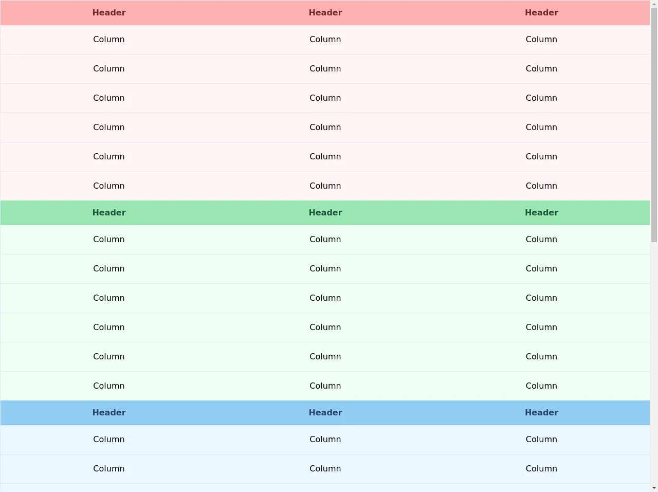
A Sticky Table Header is a user interface component that is used to keep the header of a table fixed while the user scrolls through the table content. This component is useful when dealing with large tables that have many rows of data. The Sticky Table Header ensures that the header is always visible to the user, making it easier to read and understand the table content.
Why use Tailwind CSS to create a Sticky Table Header ui component?
Tailwind CSS provides a set of utility classes that can be used to create a Sticky Table Header with ease. These classes can be combined to create a responsive and customizable design that fits your needs. Using Tailwind CSS also ensures that your code is maintainable and easy to read.
The preview of Sticky Table Header ui component
To create a Sticky Table Header with Tailwind CSS, we will use a combination of CSS and JavaScript. The CSS will be used to style the table and the JavaScript will be used to add the sticky behavior. Here is a preview of what the Sticky Table Header will look like:
Free download of the Sticky Table Header's source code
The source code of Sticky Table Header ui component
To create the Sticky Table Header, we will need to use some CSS and JavaScript. Here is the source code that we will use:
<div class="flex flex-col h-screen">
    <div class="flex-grow overflow-auto">
      <table class="relative w-full border">
        <thead>
          <tr>
            <th class="sticky top-0 px-6 py-3 text-red-900 bg-red-300">Header</th>
            <th class="sticky top-0 px-6 py-3 text-red-900 bg-red-300">Header</th>
            <th class="sticky top-0 px-6 py-3 text-red-900 bg-red-300">Header</th>
          </tr>
        </thead>
        <tbody class="divide-y bg-red-100">
          <tr>
            <td class="px-6 py-4 text-center">Column</td>
            <td class="px-6 py-4 text-center">Column</td>
            <td class="px-6 py-4 text-center">Column</td>
          </tr>
          <tr>
            <td class="px-6 py-4 text-center">Column</td>
            <td class="px-6 py-4 text-center">Column</td>
            <td class="px-6 py-4 text-center">Column</td>
          </tr>
          <tr>
            <td class="px-6 py-4 text-center">Column</td>
            <td class="px-6 py-4 text-center">Column</td>
            <td class="px-6 py-4 text-center">Column</td>
          </tr>
          <tr>
            <td class="px-6 py-4 text-center">Column</td>
            <td class="px-6 py-4 text-center">Column</td>
            <td class="px-6 py-4 text-center">Column</td>
          </tr>
          <tr>
            <td class="px-6 py-4 text-center">Column</td>
            <td class="px-6 py-4 text-center">Column</td>
            <td class="px-6 py-4 text-center">Column</td>
          </tr>
          <tr>
            <td class="px-6 py-4 text-center">Column</td>
            <td class="px-6 py-4 text-center">Column</td>
            <td class="px-6 py-4 text-center">Column</td>
          </tr>
        </tbody>
        <thead>
          <tr>
            <th class="sticky top-0 px-6 py-3 text-green-900 bg-green-300">Header</th>
            <th class="sticky top-0 px-6 py-3 text-green-900 bg-green-300">Header</th>
            <th class="sticky top-0 px-6 py-3 text-green-900 bg-green-300">Header</th>
          </tr>
        </thead>
        <tbody class="divide-y bg-green-100">
          <tr>
            <td class="px-6 py-4 text-center">Column</td>
            <td class="px-6 py-4 text-center">Column</td>
            <td class="px-6 py-4 text-center">Column</td>
          </tr>
          <tr>
            <td class="px-6 py-4 text-center">Column</td>
            <td class="px-6 py-4 text-center">Column</td>
            <td class="px-6 py-4 text-center">Column</td>
          </tr>
          <tr>
            <td class="px-6 py-4 text-center">Column</td>
            <td class="px-6 py-4 text-center">Column</td>
            <td class="px-6 py-4 text-center">Column</td>
          </tr>
          <tr>
            <td class="px-6 py-4 text-center">Column</td>
            <td class="px-6 py-4 text-center">Column</td>
            <td class="px-6 py-4 text-center">Column</td>
          </tr>
          <tr>
            <td class="px-6 py-4 text-center">Column</td>
            <td class="px-6 py-4 text-center">Column</td>
            <td class="px-6 py-4 text-center">Column</td>
          </tr>
          <tr>
            <td class="px-6 py-4 text-center">Column</td>
            <td class="px-6 py-4 text-center">Column</td>
            <td class="px-6 py-4 text-center">Column</td>
          </tr>
        </tbody>
        <thead>
          <tr>
            <th class="sticky top-0 px-6 py-3 text-blue-900 bg-blue-300">Header</th>
            <th class="sticky top-0 px-6 py-3 text-blue-900 bg-blue-300">Header</th>
            <th class="sticky top-0 px-6 py-3 text-blue-900 bg-blue-300">Header</th>
          </tr>
        </thead>
        <tbody class="divide-y bg-blue-100">
          <tr>
            <td class="px-6 py-4 text-center">Column</td>
            <td class="px-6 py-4 text-center">Column</td>
            <td class="px-6 py-4 text-center">Column</td>
          </tr>
          <tr>
            <td class="px-6 py-4 text-center">Column</td>
            <td class="px-6 py-4 text-center">Column</td>
            <td class="px-6 py-4 text-center">Column</td>
          </tr>
          <tr>
            <td class="px-6 py-4 text-center">Column</td>
            <td class="px-6 py-4 text-center">Column</td>
            <td class="px-6 py-4 text-center">Column</td>
          </tr>
          <tr>
            <td class="px-6 py-4 text-center">Column</td>
            <td class="px-6 py-4 text-center">Column</td>
            <td class="px-6 py-4 text-center">Column</td>
          </tr>
          <tr>
            <td class="px-6 py-4 text-center">Column</td>
            <td class="px-6 py-4 text-center">Column</td>
            <td class="px-6 py-4 text-center">Column</td>
          </tr>
          <tr>
            <td class="px-6 py-4 text-center">Column</td>
            <td class="px-6 py-4 text-center">Column</td>
            <td class="px-6 py-4 text-center">Column</td>
          </tr>
        </tbody>
        <thead>
          <tr>
            <th class="sticky top-0 px-6 py-3 text-yellow-900 bg-yellow-300">Header</th>
            <th class="sticky top-0 px-6 py-3 text-yellow-900 bg-yellow-300">Header</th>
            <th class="sticky top-0 px-6 py-3 text-yellow-900 bg-yellow-300">Header</th>
          </tr>
        </thead>
        <tbody class="divide-y bg-yellow-100">
          <tr>
            <td class="px-6 py-4 text-center">Column</td>
            <td class="px-6 py-4 text-center">Column</td>
            <td class="px-6 py-4 text-center">Column</td>
          </tr>
          <tr>
            <td class="px-6 py-4 text-center">Column</td>
            <td class="px-6 py-4 text-center">Column</td>
            <td class="px-6 py-4 text-center">Column</td>
          </tr>
          <tr>
            <td class="px-6 py-4 text-center">Column</td>
            <td class="px-6 py-4 text-center">Column</td>
            <td class="px-6 py-4 text-center">Column</td>
          </tr>
          <tr>
            <td class="px-6 py-4 text-center">Column</td>
            <td class="px-6 py-4 text-center">Column</td>
            <td class="px-6 py-4 text-center">Column</td>
          </tr>
          <tr>
            <td class="px-6 py-4 text-center">Column</td>
            <td class="px-6 py-4 text-center">Column</td>
            <td class="px-6 py-4 text-center">Column</td>
          </tr>
          <tr>
            <td class="px-6 py-4 text-center">Column</td>
            <td class="px-6 py-4 text-center">Column</td>
            <td class="px-6 py-4 text-center">Column</td>
          </tr>
        </tbody>
        <thead>
          <tr>
            <th class="sticky top-0 px-6 py-3 text-purple-900 bg-purple-300">Header</th>
            <th class="sticky top-0 px-6 py-3 text-purple-900 bg-purple-300">Header</th>
            <th class="sticky top-0 px-6 py-3 text-purple-900 bg-purple-300">Header</th>
          </tr>
        </thead>
        <tbody class="divide-y bg-purple-100">
          <tr>
            <td class="px-6 py-4 text-center">Column</td>
            <td class="px-6 py-4 text-center">Column</td>
            <td class="px-6 py-4 text-center">Column</td>
          </tr>
          <tr>
            <td class="px-6 py-4 text-center">Column</td>
            <td class="px-6 py-4 text-center">Column</td>
            <td class="px-6 py-4 text-center">Column</td>
          </tr>
          <tr>
            <td class="px-6 py-4 text-center">Column</td>
            <td class="px-6 py-4 text-center">Column</td>
            <td class="px-6 py-4 text-center">Column</td>
          </tr>
          <tr>
            <td class="px-6 py-4 text-center">Column</td>
            <td class="px-6 py-4 text-center">Column</td>
            <td class="px-6 py-4 text-center">Column</td>
          </tr>
          <tr>
            <td class="px-6 py-4 text-center">Column</td>
            <td class="px-6 py-4 text-center">Column</td>
            <td class="px-6 py-4 text-center">Column</td>
          </tr>
          <tr>
            <td class="px-6 py-4 text-center">Column</td>
            <td class="px-6 py-4 text-center">Column</td>
            <td class="px-6 py-4 text-center">Column</td>
          </tr>
        </tbody>
      </table>
    </div>
  </div>
How to create a Sticky Table Header with Tailwind CSS?
To create a Sticky Table Header with Tailwind CSS, we will follow these steps:
Step 1: Create the HTML structure
We will start by creating the HTML structure for the table. Here is an example:
<div class="table-container">
  <table class="table">
    <thead>
      <tr>
        <th class="sticky-header">Header 1</th>
        <th class="sticky-header">Header 2</th>
        <th class="sticky-header">Header 3</th>
      </tr>
    </thead>
    <tbody>
      <tr>
        <td>Data 1</td>
        <td>Data 2</td>
        <td>Data 3</td>
      </tr>
      <tr>
        <td>Data 4</td>
        <td>Data 5</td>
        <td>Data 6</td>
      </tr>
      <!-- more rows -->
    </tbody>
  </table>
</div>
In this example, we have a div container that wraps the table element. The thead element contains the table headers, which are wrapped in th elements with a sticky-header class. The tbody element contains the table data, which is wrapped in tr and td elements.
Step 2: Style the table with Tailwind CSS
We will now use Tailwind CSS to style the table. Here is the CSS that we will use:
.table-container {
  overflow-x: auto;
  max-width: 100%;
}

.table {
  border-collapse: collapse;
  width: 100%;
}

.sticky-header {
  position: sticky;
  top: 0;
  background-color: #fff;
  z-index: 1;
}
In this CSS, we set the overflow-x property of the container to auto to enable horizontal scrolling. We also set the max-width property to 100% to ensure that the table fits the container width.
We set the border-collapse property of the table to collapse to remove the borders between cells. We also set the width property to 100% to ensure that the table fills the container width.
We set the position property of the headers to sticky to make them stick to the top of the container. We also set the top property to 0 to ensure that the headers are always visible. We set the background-color property to #fff to make the headers stand out from the table content. Finally, we set the z-index property to 1 to ensure that the headers are always on top of the table content.
Step 3: Add JavaScript to make the headers sticky
We will now add JavaScript to make the headers sticky. Here is the JavaScript that we will use:
const table = document.querySelector('.table');
const headers = table.querySelectorAll('.sticky-header');

window.addEventListener('scroll', () => {
  const top = window.scrollY;
  headers.forEach(header => {
    header.style.transform = `translateY(${top}px)`;
  });
});
In this JavaScript, we select the table element and all the headers with a sticky-header class. We add an event listener to the window object that listens for the scroll event. When the user scrolls, we get the current scroll position with window.scrollY. We then loop through all the headers and set their transform property to translateY(${top}px) to move them along with the scroll.
Step 4: Add Tailwind CSS to your project
To use Tailwind CSS in your project, you can either download the CSS file from the official website or use a package manager like npm or yarn. Once you have the CSS file, you can include it in your HTML file like this:
<link rel="stylesheet" href="path/to/tailwind.css">
Step 5: Add the JavaScript to your project
To add the JavaScript to your project, you can either include it in your HTML file or create a separate JavaScript file and include it in your HTML file like this:
<script src="path/to/sticky-header.js"></script>
Conclusion
In this article, we learned how to create a Sticky Table Header with Tailwind CSS like an expert. We used a combination of CSS and JavaScript to create a responsive and customizable design that fits our needs. Using Tailwind CSS made it easy to create the design and ensured that our code is maintainable and easy to read.