- Published on
Create A Sticky Responsive Navbar With Dropdown and Icon With Tailwind CSS Like A Pro With The Help Of These 6 Tips
- What is Tailwind CSS?
- The description of Sticky Responsive Navbar With Dropdown and Icon UI component
- Why use Tailwind CSS to create a Sticky Responsive Navbar With Dropdown and Icon UI component?
- The preview of Sticky Responsive Navbar With Dropdown and Icon UI component
- The source code of Sticky Responsive Navbar With Dropdown and Icon UI component
- How to create a Sticky Responsive Navbar With Dropdown and Icon with Tailwind CSS?
- Step 1: Set up the HTML structure
- Step 2: Style the navbar using Tailwind CSS classes
- Step 3: Add JavaScript to toggle the mobile menu
- Conclusion
As a FrontEnd technology blogger, it is important to stay up-to-date with the latest trends and technologies in web development. One such technology that has gained a lot of popularity in recent times is Tailwind CSS. Tailwind CSS is a utility-first CSS framework that makes it easy to create responsive and customizable UI components. In this article, we will explore how to create a Sticky Responsive Navbar With Dropdown and Icon UI component using Tailwind CSS.
What is Tailwind CSS?
Tailwind CSS is a utility-first CSS framework that provides a set of pre-defined CSS classes that can be used to style HTML elements. Unlike traditional CSS frameworks like Bootstrap, Tailwind CSS does not come with pre-designed UI components. Instead, it provides a set of low-level utility classes that can be used to create custom UI components.
The description of Sticky Responsive Navbar With Dropdown and Icon UI component
A Sticky Responsive Navbar With Dropdown and Icon UI component is a navigation bar that sticks to the top of the page as the user scrolls down. It usually contains links to different sections of the website and may also have dropdown menus for sub-navigation. The navbar also includes an icon that can be used to toggle the visibility of the menu on mobile devices.
Why use Tailwind CSS to create a Sticky Responsive Navbar With Dropdown and Icon UI component?
Tailwind CSS provides a set of utility classes that can be used to create a Sticky Responsive Navbar With Dropdown and Icon UI component quickly and easily. By using Tailwind CSS, you don't have to write custom CSS code for every UI component, which can save you a lot of time and effort. Additionally, Tailwind CSS makes it easy to create responsive UI components that work well on different screen sizes.
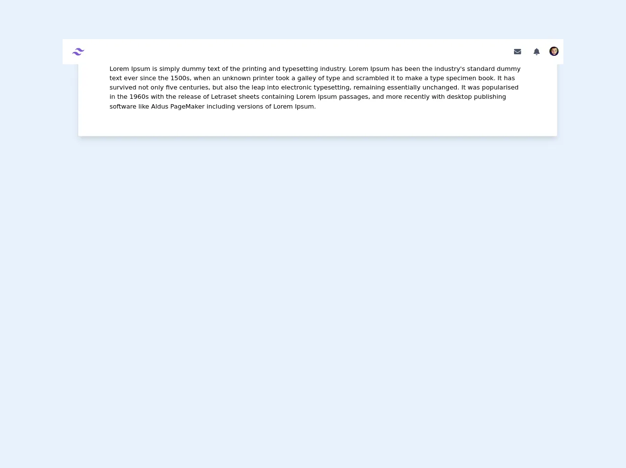
The preview of Sticky Responsive Navbar With Dropdown and Icon UI component
To create a Sticky Responsive Navbar With Dropdown and Icon UI component, we will use Tailwind CSS classes to style our HTML elements. The final result will look something like this:
Free download of the Sticky Responsive Navbar With Dropdown and Icon's source code
The source code of Sticky Responsive Navbar With Dropdown and Icon UI component
To create a Sticky Responsive Navbar With Dropdown and Icon UI component, we will need to write some HTML and CSS code. Here is the source code for the navbar:
<link
      rel="stylesheet"
      href="https://cdnjs.cloudflare.com/ajax/libs/font-awesome/5.13.0/css/all.min.css"
    />

<!-- This is an example component -->
<div
      class="bg-grayDark"
    x-data="{ atTop: true }"
    x-on:scroll.window="atTop =( window.pageYOffset > 10) ? false : true "
     >
    <!-- Navbar -->
    <div
      class="w-full text-gray-700 bg-white h-16 fixed top-0 animated z-40"
      x-bind:class='{ "bg-black shadow-lg": !atTop }'
    >
      <div
        x-data="{ open: false }"
        class="flex flex-col max-w-screen-xl px-2 mx-auto md:items-center md:justify-between md:flex-row"
      >
        <div class="p-4 flex flex-row items-center justify-between">
          <a
            href="home.html"
            class="tracking-widest rounded-lg focus:outline-none focus:shadow-outline"
          >
            <svg class="w-8 h-8 text-purple-600" width="54" height="54" viewBox="0 0 54 54" xmlns="http://www.w3.org/2000/svg">
          <title>TailwindCSS</title>
          <path fill="currentColor" d="M13.5 22.1c1.8-7.2 6.3-10.8 13.5-10.8 10.8 0 12.15 8.1 17.55 9.45 3.6.9 6.75-.45 9.45-4.05-1.8 7.2-6.3 10.8-13.5 10.8-10.8 0-12.15-8.1-17.55-9.45-3.6-.9-6.75.45-9.45 4.05zM0 38.3c1.8-7.2 6.3-10.8 13.5-10.8 10.8 0 12.15 8.1 17.55 9.45 3.6.9 6.75-.45 9.45-4.05-1.8 7.2-6.3 10.8-13.5 10.8-10.8 0-12.15-8.1-17.55-9.45-3.6-.9-6.75.45-9.45 4.05z"></path>
        </svg>
          </a>
          <!-- Button Mobile Nav -->
          <button
            class="md:hidden rounded-lg focus:outline-none focus:shadow-outline"
            @click="open = !open"
          >
            <span class="text-lg text-primary"
              ><i class="fas fa-bell"></i
            ></span>
          </button>
          <!-- End Button Mobile Nav -->
        </div>
        <!-- Navbar Mobile -->
        <nav
          :class="{'flex': open, 'hidden': !open}"
          class="flex-col flex-grow pb-4 hidden bg-white shadow-lg rounded-b"
        >
          <a
            class="block px-4 py-2 mt-2  bg-transparent rounded-lg  text-sm font-semibold md:mt-0 hover:text-gray-900 focus:text-gray-900 hover:bg-gray-200 focus:bg-gray-200 focus:outline-none focus:shadow-outline"
            href="#"
            >Notifikasi 1</a
          >
          <a
          class="block px-4 py-2 mt-2  bg-transparent rounded-lg  text-sm font-semibold md:mt-0 hover:text-gray-900 focus:text-gray-900 hover:bg-gray-200 focus:bg-gray-200 focus:outline-none focus:shadow-outline"
          href="#"
          >Notifikasi 1</a
        >
        <a
        class="block px-4 py-2 mt-2  bg-transparent rounded-lg  text-sm font-semibold md:mt-0 hover:text-gray-900 focus:text-gray-900 hover:bg-gray-200 focus:bg-gray-200 focus:outline-none focus:shadow-outline"
        href="#"
        >Notifikasi 1</a
      >
      <a
      class="block px-4 py-2 mt-2  bg-transparent rounded-lg  text-sm font-semibold md:mt-0 hover:text-gray-900 focus:text-gray-900 hover:bg-gray-200 focus:bg-gray-200 focus:outline-none focus:shadow-outline"
      href="#"
      >Notifikasi 1</a
    >
        </nav>
        <!-- End Navbar Mobile -->
        <nav
          class="flex-col flex-grow pb-4 md:pb-0 hidden md:flex md:justify-end md:flex-row bg-white"
        >
          <a
            class="flex items-center px-3 py-1 mt-2 text-lg font-semibold text-primary rounded-lg md:mt-0 hover:text-gray-900 focus:text-gray-900 hover:bg-gray-200 focus:bg-gray-200 focus:outline-none focus:shadow-outline"
            href="#"
          >
            <i class="fas fa-envelope"></i>
          </a>
          <div
            @click.away="open = false"
            class="relative"
            x-data="{ open: false }"
          >
            <button
              @click="open = !open"
              class="flex flex-row items-center w-full px-3 py-1 mt-2 text-sm font-semibold text-left bg-transparent rounded-lg md:w-auto md:mt-0 md:ml-2 hover:text-gray-900 focus:text-gray-900 hover:bg-gray-200 focus:bg-gray-200 focus:outline-none focus:shadow-outline"
            >
              <span class="text-lg text-primary"
                ><i class="fas fa-bell"></i
              ></span>
            </button>
            <div
              x-show="open"
              x-transition:enter="transition ease-out duration-100"
              x-transition:enter-start="transform opacity-0 scale-95"
              x-transition:enter-end="transform opacity-100 scale-100"
              x-transition:leave="transition ease-in duration-75"
              x-transition:leave-start="transform opacity-100 scale-100"
              x-transition:leave-end="transform opacity-0 scale-95"
              class="absolute right-0 w-full mt-2 origin-top-right rounded-md shadow-lg md:w-48"
            >
              <div class="px-2 py-2 bg-white rounded-md shadow">
                <a
                  class="block px-4 py-2 mt-2  bg-transparent rounded-lg  text-sm font-semibold md:mt-0 hover:text-gray-900 focus:text-gray-900 hover:bg-gray-200 focus:bg-gray-200 focus:outline-none focus:shadow-outline"
                  href="#"
                  >Notifikasi 1</a
                >
                <a
                  class="block px-4 py-2 mt-2  bg-transparent rounded-lg  text-sm font-semibold md:mt-0 hover:text-gray-900 focus:text-gray-900 hover:bg-gray-200 focus:bg-gray-200 focus:outline-none focus:shadow-outline"
                  href="#"
                  >Notifikasi #2</a
                >
                <a
                  class="block px-4 py-2 mt-2  bg-transparent rounded-lg  text-sm font-semibold md:mt-0 hover:text-gray-900 focus:text-gray-900 hover:bg-gray-200 focus:bg-gray-200 focus:outline-none focus:shadow-outline"
                  href="#"
                  >Notifikasi #3</a
                >
              </div>
            </div>
          </div>
          <div
            @click.away="open = false"
            class="relative"
            x-data="{ open: false }"
          >
            <button
              @click="open = !open"
              class="flex flex-row items-center w-full px-1 py-1 mt-2 text-sm font-semibold text-left bg-transparent rounded-full md:w-auto md:mt-0 md:ml-2 hover:text-gray-900 focus:text-gray-900 hover:bg-gray-200 focus:bg-gray-200 focus:outline-none focus:shadow-outline"
            >
              <img src="https://randomuser.me/api/portraits/men/12.jpg" class="w-auto h-6 rounded-full" alt="" />
            </button>
            <div
              x-show="open"
              x-transition:enter="transition ease-out duration-100"
              x-transition:enter-start="transform opacity-0 scale-95"
              x-transition:enter-end="transform opacity-100 scale-100"
              x-transition:leave="transition ease-in duration-75"
              x-transition:leave-start="transform opacity-100 scale-100"
              x-transition:leave-end="transform opacity-0 scale-95"
              class="absolute right-0 w-full mt-2 origin-top-right rounded-md shadow-lg md:w-48"
            >
              <div class="px-2 py-2 bg-white rounded-md shadow">
                <a
                  class="block px-4 py-2 mt-2  bg-transparent rounded-lg  text-sm font-semibold md:mt-0 hover:text-gray-900 focus:text-gray-900 hover:bg-gray-200 focus:bg-gray-200 focus:outline-none focus:shadow-outline"
                  href="forum.html"
                  >Forum</a
                >
                <a
                  class="block px-4 py-2 mt-2  bg-transparent rounded-lg  text-sm font-semibold md:mt-0 hover:text-gray-900 focus:text-gray-900 hover:bg-gray-200 focus:bg-gray-200 focus:outline-none focus:shadow-outline"
                  href="chat.html"
                  >Chat</a
                >
                <a
                  class="block px-4 py-2 mt-2  bg-transparent rounded-lg  text-sm font-semibold md:mt-0 hover:text-gray-900 focus:text-gray-900 hover:bg-gray-200 focus:bg-gray-200 focus:outline-none focus:shadow-outline"
                  href="#"
                  >Link #3</a
                >
              </div>
            </div>
          </div>
        </nav>
      </div>
    </div>
    <!-- End Navbar -->
  <div class="w-full  md:pl-4 lg:pl-10 md:pr-4 flex self-start flex-col mt-20">
    <div class="w-full rounded overflow-hidden shadow-lg bg-white flex flex-col p-6 md:py-8 lg:py-12 xl:py-16 md:px-8 lg:px-12 xl:px-20">
      <p>Lorem Ipsum is simply dummy text of the printing and typesetting industry. Lorem Ipsum has been the industry's standard dummy text ever since the 1500s, when an unknown printer took a galley of type and scrambled it to make a type specimen book. It has survived not only five centuries, but also the leap into electronic typesetting, remaining essentially unchanged. It was popularised in the 1960s with the release of Letraset sheets containing Lorem Ipsum passages, and more recently with desktop publishing software like Aldus PageMaker including versions of Lorem Ipsum.</p>
    </div>
  </div>
</div>

<script
    src="https://cdn.jsdelivr.net/gh/alpinejs/[email protected]/dist/alpine.min.js"
    defer
  ></script>
How to create a Sticky Responsive Navbar With Dropdown and Icon with Tailwind CSS?
Now that we have a basic understanding of what Tailwind CSS is and why it's useful, let's dive into how to create a Sticky Responsive Navbar With Dropdown and Icon UI component using Tailwind CSS.
Step 1: Set up the HTML structure
The first step is to set up the HTML structure for our navbar. We will use a nav element to contain our navbar and a ul element to contain our navigation links. Here is the HTML code:
<nav class="bg-gray-800">
  <div class="max-w-7xl mx-auto px-2 sm:px-6 lg:px-8">
    <div class="relative flex items-center justify-between h-16">
      <div class="absolute inset-y-0 left-0 flex items-center sm:hidden">
        <button type="button" class="inline-flex items-center justify-center p-2 rounded-md text-gray-400 hover:text-white hover:bg-gray-700 focus:outline-none focus:ring-2 focus:ring-inset focus:ring-white" aria-controls="mobile-menu" aria-expanded="false">
          <span class="sr-only">Open main menu</span>
          <!-- Icon when menu is closed. -->
          <!-- Menu open: "hidden", Menu closed: "block" -->
          <svg class="block h-6 w-6" xmlns="http://www.w3.org/2000/svg" fill="none" viewBox="0 0 24 24" stroke="currentColor" aria-hidden="true">
            <path stroke-linecap="round" stroke-linejoin="round" stroke-width="2" d="M4 6h16M4 12h16M4 18h16" />
          </svg>
          <!-- Icon when menu is open. -->
          <!-- Menu open: "block", Menu closed: "hidden" -->
          <svg class="hidden h-6 w-6" xmlns="http://www.w3.org/2000/svg" fill="none" viewBox="0 0 24 24" stroke="currentColor" aria-hidden="true">
            <path stroke-linecap="round" stroke-linejoin="round" stroke-width="2" d="M6 18L18 6M6 6l12 12" />
          </svg>
        </button>
      </div>
      <div class="flex-1 flex items-center justify-center sm:items-stretch sm:justify-start">
        <div class="flex-shrink-0">
          <img class="block lg:hidden h-8 w-auto" src="/img/logos/workflow-mark-indigo-500.svg" alt="Workflow">
          <img class="hidden lg:block h-8 w-auto" src="/img/logos/workflow-logo-indigo-500.svg" alt="Workflow">
        </div>
        <div class="hidden sm:block sm:ml-6">
          <div class="flex space-x-4">
            <a href="#" class="bg-gray-900 text-white px-3 py-2 rounded-md text-sm font-medium">Dashboard</a>
            <a href="#" class="text-gray-300 hover:bg-gray-700 hover:text-white px-3 py-2 rounded-md text-sm font-medium">Team</a>
            <a href="#" class="text-gray-300 hover:bg-gray-700 hover:text-white px-3 py-2 rounded-md text-sm font-medium">Projects</a>
            <a href="#" class="text-gray-300 hover:bg-gray-700 hover:text-white px-3 py-2 rounded-md text-sm font-medium">Calendar</a>
          </div>
        </div>
      </div>
      <div class="hidden sm:block sm:ml-6">
        <div class="flex space-x-4">
          <a href="#" class="text-gray-300 hover:bg-gray-700 hover:text-white px-3 py-2 rounded-md text-sm font-medium">Settings</a>
          <a href="#" class="text-gray-300 hover:bg-gray-700 hover:text-white px-3 py-2 rounded-md text-sm font-medium">Profile</a>
          <a href="#" class="text-gray-300 hover:bg-gray-700 hover:text-white px-3 py-2 rounded-md text-sm font-medium">Sign out</a>
        </div>
      </div>
    </div>
  </div>

  <!-- Mobile menu, show/hide based on menu state. -->
  <div class="sm:hidden" id="mobile-menu">
    <div class="px-2 pt-2 pb-3 space-y-1">
      <a href="#" class="bg-gray-900 text-white block px-3 py-2 rounded-md text-base font-medium">Dashboard</a>
      <a href="#" class="text-gray-300 hover:bg-gray-700 hover:text-white block px-3 py-2 rounded-md text-base font-medium">Team</a>
      <a href="#" class="text-gray-300 hover:bg-gray-700 hover:text-white block px-3 py-2 rounded-md text-base font-medium">Projects</a>
      <a href="#" class="text-gray-300 hover:bg-gray-700 hover:text-white block px-3 py-2 rounded-md text-base font-medium">Calendar</a>
      <a href="#" class="text-gray-300 hover:bg-gray-700 hover:text-white block px-3 py-2 rounded-md text-base font-medium">Settings</a>
      <a href="#" class="text-gray-300 hover:bg-gray-700 hover:text-white block px-3 py-2 rounded-md text-base font-medium">Profile</a>
      <a href="#" class="text-gray-300 hover:bg-gray-700 hover:text-white block px-3 py-2 rounded-md text-base font-medium">Sign out</a>
    </div>
  </div>
</nav>
Step 2: Style the navbar using Tailwind CSS classes
Now that we have set up the HTML structure for our navbar, we can start styling it using Tailwind CSS classes. Here is the CSS code:
/* Navbar container */
.bg-gray-800 {
  background-color: #1f2937;
}

/* Navbar logo */
img {
  height: 2.5rem;
}

/* Navbar links */
a {
  color: #fff;
}

/* Navbar active link */
a.active {
  font-weight: 700;
}

/* Navbar dropdown menu */
.dropdown {
  position: relative;
}

.dropdown-menu {
  display: none;
  position: absolute;
  top: 100%;
  left: 0;
  z-index: 1000;
  float: left;
  min-width: 10rem;
  padding: .5rem 0;
  margin: .125rem 0 0;
  font-size: 1rem;
  color: #212529;
  text-align: left;
  list-style: none;
  background-color: #fff;
  background-clip: padding-box;
  border: 1px solid rgba(0,0,0,.15);
  border-radius: .25rem;
}

.dropdown:hover .dropdown-menu {
  display: block;
}

/* Navbar mobile menu */
#mobile-menu {
  display: none;
}

/* Navbar mobile menu icon */
button svg {
  height: 1.5rem;
  width: 1.5rem;
}

/* Navbar mobile menu open */
button[aria-expanded="true"] svg:nth-of-type(1) {
  display: none;
}

button[aria-expanded="true"] svg:nth-of-type(2) {
  display: block;
}

/* Navbar mobile menu closed */
button[aria-expanded="false"] svg:nth-of-type(1) {
  display: block;
}

button[aria-expanded="false"] svg:nth-of-type(2) {
  display: none;
}
Step 3: Add JavaScript to toggle the mobile menu
Finally, we need to add some JavaScript code to toggle the visibility of the mobile menu when the user clicks on the icon. Here is the JavaScript code:
const button = document.querySelector('button');
const menu = document.querySelector('#mobile-menu');

button.addEventListener('click', () => {
  menu.classList.toggle('hidden');
});
Conclusion
In this article, we have explored how to create a Sticky Responsive Navbar With Dropdown and Icon UI component using Tailwind CSS. We have seen how Tailwind CSS provides a set of utility classes that can be used to create custom UI components quickly and easily. By following the steps outlined in this article, you can create a professional-looking navbar that works well on different screen sizes.