- Published on
6 Tips To Make A Sticky Navbar Component With Tailwind CSS
- What is Tailwind CSS?
- The description of Sticky Navbar Component UI component
- Why use Tailwind CSS to create a Sticky Navbar Component UI component?
- The preview of Sticky Navbar Component UI component
- The source code of Sticky Navbar Component UI component
- How to create a Sticky Navbar Component with Tailwind CSS?
- 1. Add the necessary HTML markup
- 2. Use the fixed class to fix the navbar at the top of the page
- 3. Use the z-10 class to set the z-index of the navbar
- 4. Use the bg-white class to set the background color of the navbar
- 5. Use the w-full class to set the width of the navbar to 100%
- 6. Use the px-4 and py-3 classes to add padding to the navbar
- Conclusion
What is Tailwind CSS?
Tailwind CSS is a utility-first CSS framework that provides pre-defined classes to create custom designs. It is a popular choice among developers because it allows them to create clean and responsive designs quickly. Tailwind CSS is easy to use and provides a lot of flexibility in creating UI components.
The description of Sticky Navbar Component UI component
A sticky navbar is a UI component that stays fixed at the top of the page even when the user scrolls down. It is a popular design pattern that helps users navigate through the website easily. A sticky navbar is an essential component of any website that has a lot of content.
Why use Tailwind CSS to create a Sticky Navbar Component UI component?
Tailwind CSS provides pre-defined classes that make it easy to create a sticky navbar. It also provides a lot of flexibility in customizing the design of the navbar. With Tailwind CSS, you can create a sticky navbar that is responsive and looks great on all devices.
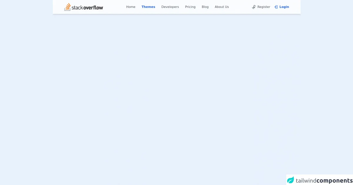
The preview of Sticky Navbar Component UI component
A sticky navbar is a UI component that stays fixed at the top of the page even when the user scrolls down. It is a popular design pattern that helps users navigate through the website easily. A sticky navbar is an essential component of any website that has a lot of content.
Free download of the Sticky Navbar Component's source code
The source code of Sticky Navbar Component UI component
To create a sticky navbar with Tailwind CSS, you need to use the following classes:
fixed: This class is used to fix the navbar at the top of the page.z-10: This class is used to set the z-index of the navbar so that it appears above other elements on the page.bg-white: This class is used to set the background color of the navbar.w-full: This class is used to set the width of the navbar to 100%.px-4: This class is used to add padding to the left and right of the navbar.py-3: This class is used to add padding to the top and bottom of the navbar.
<!-- AlpineJS -->
<script src="https://cdnjs.cloudflare.com/ajax/libs/alpinejs/3.8.1/cdn.min.js" defer></script>

<!-- Slider Component Container -->
<div class="flex flex-col items-center justify-center mt-32" x-cloak x-data="appData()" x-init="appInit()">
    <div class="flex flex-col">
        <!-- Page Scroll Progress -->
        <div class="fixed inset-x-0 top-0 z-50 h-0.5 mt-0.5
            bg-blue-500" :style="`width: ${percent}%`"></div>

        <!-- Navbar -->
        <nav class="flex justify-around py-4 bg-white/80
            backdrop-blur-md shadow-md w-full
            fixed top-0 left-0 right-0 z-10">

            <!-- Logo Container -->
            <div class="flex items-center">
                <!-- Logo -->
                <a class="cursor-pointer">
                    <h3 class="text-2xl font-medium text-blue-500">
                        <img class="h-10 object-cover"
                            src="https://stackoverflow.design/assets/img/logos/so/logo-stackoverflow.svg" alt="Store Logo">
                    </h3>
                </a>
            </div>

            <!-- Links Section -->
            <div class="items-center hidden space-x-8 lg:flex">
                <a class="flex text-gray-600 hover:text-blue-500
                    cursor-pointer transition-colors duration-300">
                    Home
                </a>

                <a class="flex text-gray-600
                    cursor-pointer transition-colors duration-300
                    font-semibold text-blue-600">
                    Themes
                </a>

                <a class="flex text-gray-600 hover:text-blue-500
                    cursor-pointer transition-colors duration-300">
                    Developers
                </a>

                <a class="flex text-gray-600 hover:text-blue-500
                    cursor-pointer transition-colors duration-300">
                    Pricing
                </a>

                <a class="flex text-gray-600 hover:text-blue-500
                    cursor-pointer transition-colors duration-300">
                    Blog
                </a>

                <a class="flex text-gray-600 hover:text-blue-500
                    cursor-pointer transition-colors duration-300">
                    About Us
                </a>
            </div>

            <!-- Icon Menu Section -->
            <div class="flex items-center space-x-5">
                <!-- Register -->
                <a class="flex text-gray-600 hover:text-blue-500
                    cursor-pointer transition-colors duration-300">

                    <svg class="fill-current h-5 w-5 mr-2 mt-0.5" xmlns="http://www.w3.org/2000/svg"
                        xmlns:xlink="http://www.w3.org/1999/xlink" version="1.1" width="24" height="24"
                        viewBox="0 0 24 24">
                        <path
                            d="M12 0L11.34 .03L15.15 3.84L16.5 2.5C19.75 4.07 22.09 7.24 22.45 11H23.95C23.44 4.84 18.29 0 12 0M12 4C10.07 4 8.5 5.57 8.5 7.5C8.5 9.43 10.07 11 12 11C13.93 11 15.5 9.43 15.5 7.5C15.5 5.57 13.93 4 12 4M12 6C12.83 6 13.5 6.67 13.5 7.5C13.5 8.33 12.83 9 12 9C11.17 9 10.5 8.33 10.5 7.5C10.5 6.67 11.17 6 12 6M.05 13C.56 19.16 5.71 24 12 24L12.66 23.97L8.85 20.16L7.5 21.5C4.25 19.94 1.91 16.76 1.55 13H.05M12 13C8.13 13 5 14.57 5 16.5V18H19V16.5C19 14.57 15.87 13 12 13M12 15C14.11 15 15.61 15.53 16.39 16H7.61C8.39 15.53 9.89 15 12 15Z" />
                    </svg>

                    Register
                </a>

                <!-- Login -->
                <a class="flex text-gray-600
                    cursor-pointer transition-colors duration-300
                    font-semibold text-blue-600">

                    <svg class="fill-current h-5 w-5 mr-2 mt-0.5" xmlns="http://www.w3.org/2000/svg"
                        xmlns:xlink="http://www.w3.org/1999/xlink" version="1.1" width="24" height="24"
                        viewBox="0 0 24 24">
                        <path
                            d="M10,17V14H3V10H10V7L15,12L10,17M10,2H19A2,2 0 0,1 21,4V20A2,2 0 0,1 19,22H10A2,2 0 0,1 8,20V18H10V20H19V4H10V6H8V4A2,2 0 0,1 10,2Z" />
                    </svg>

                    Login
                </a>
            </div>
        </nav>
    </div>

    <!-- Dummy Scrollable Content -->
    <div class="flex flex-wrap" style="width: 1000px;">
        <div class="bg-orange-200 h-52 w-52 m-5"></div>
        <div class="bg-orange-200 h-52 w-52 m-5"></div>
        <div class="bg-orange-200 h-52 w-52 m-5"></div>
        <div class="bg-orange-200 h-52 w-52 m-5"></div>
        <div class="bg-orange-200 h-52 w-52 m-5"></div>
        <div class="bg-orange-200 h-52 w-52 m-5"></div>
        <div class="bg-orange-200 h-52 w-52 m-5"></div>
        <div class="bg-orange-200 h-52 w-52 m-5"></div>
        <div class="bg-orange-200 h-52 w-52 m-5"></div>
        <div class="bg-orange-200 h-52 w-52 m-5"></div>
        <div class="bg-orange-200 h-52 w-52 m-5"></div>
        <div class="bg-orange-200 h-52 w-52 m-5"></div>
        <div class="bg-orange-200 h-52 w-52 m-5"></div>
        <div class="bg-orange-200 h-52 w-52 m-5"></div>
        <div class="bg-orange-200 h-52 w-52 m-5"></div>
        <div class="bg-orange-200 h-52 w-52 m-5"></div>
        <div class="bg-orange-200 h-52 w-52 m-5"></div>
        <div class="bg-orange-200 h-52 w-52 m-5"></div>
        <div class="bg-orange-200 h-52 w-52 m-5"></div>
        <div class="bg-orange-200 h-52 w-52 m-5"></div>
        <div class="bg-orange-200 h-52 w-52 m-5"></div>
        <div class="bg-orange-200 h-52 w-52 m-5"></div>
        <div class="bg-orange-200 h-52 w-52 m-5"></div>
        <div class="bg-orange-200 h-52 w-52 m-5"></div>
        <div class="bg-orange-200 h-52 w-52 m-5"></div>
        <div class="bg-orange-200 h-52 w-52 m-5"></div>
        <div class="bg-orange-200 h-52 w-52 m-5"></div>
        <div class="bg-orange-200 h-52 w-52 m-5"></div>
        <div class="bg-orange-200 h-52 w-52 m-5"></div>
        <div class="bg-orange-200 h-52 w-52 m-5"></div>
        <div class="bg-orange-200 h-52 w-52 m-5"></div>
        <div class="bg-orange-200 h-52 w-52 m-5"></div>
        <div class="bg-orange-200 h-52 w-52 m-5"></div>
        <div class="bg-orange-200 h-52 w-52 m-5"></div>
        <div class="bg-orange-200 h-52 w-52 m-5"></div>
        <div class="bg-orange-200 h-52 w-52 m-5"></div>
        <div class="bg-orange-200 h-52 w-52 m-5"></div>
        <div class="bg-orange-200 h-52 w-52 m-5"></div>
        <div class="bg-orange-200 h-52 w-52 m-5"></div>
        <div class="bg-orange-200 h-52 w-52 m-5"></div>
        <div class="bg-orange-200 h-52 w-52 m-5"></div>
        <div class="bg-orange-200 h-52 w-52 m-5"></div>
        <div class="bg-orange-200 h-52 w-52 m-5"></div>
        <div class="bg-orange-200 h-52 w-52 m-5"></div>
        <div class="bg-orange-200 h-52 w-52 m-5"></div>
        <div class="bg-orange-200 h-52 w-52 m-5"></div>
        <div class="bg-orange-200 h-52 w-52 m-5"></div>
        <div class="bg-orange-200 h-52 w-52 m-5"></div>
        <div class="bg-orange-200 h-52 w-52 m-5"></div>
        <div class="bg-orange-200 h-52 w-52 m-5"></div>
    </div>

    <!-- Notes -->
    <span class="text-center font-bold my-20">
        MDI (npm i @mdi/font) reuqired for icons

        <hr class="my-4">

        <a href="https://egoistdeveloper.github.io/twcss-to-sass-playground/" target="_blank" class="text-blue-600">
            Convetert to SASS
        </a>
    </span>
</div>
<script>
    const appData = () => {
        return {
            percent: 0,

            appInit() {
                // source: https://codepen.io/A_kamel/pen/qBmmGKJ
                window.addEventListener('scroll', () => {
                    let winScroll = document.body.scrollTop || document.documentElement.scrollTop,
                        height = document.documentElement.scrollHeight - document.documentElement.clientHeight;

                    this.percent = Math.round((winScroll / height) * 100);
                });
            },
        };
    };
</script>
How to create a Sticky Navbar Component with Tailwind CSS?
Here are six tips to create a sticky navbar with Tailwind CSS:
1. Add the necessary HTML markup
To create a sticky navbar, you need to add the necessary HTML markup. Here is an example:
<nav class="fixed z-10 bg-white w-full px-4 py-3">
  <div class="max-w-7xl mx-auto">
    <a href="#" class="text-lg font-bold text-gray-800">Logo</a>
    <ul class="hidden md:flex md:space-x-4">
      <li><a href="#" class="text-gray-800 hover:text-gray-600">Home</a></li>
      <li><a href="#" class="text-gray-800 hover:text-gray-600">About</a></li>
      <li><a href="#" class="text-gray-800 hover:text-gray-600">Contact</a></li>
    </ul>
    <button class="md:hidden">
      <svg viewBox="0 0 20 20" fill="currentColor" class="menu w-6 h-6">
        <path fill-rule="evenodd" d="M3 4a1 1 0 011-1h12a1 1 0 110 2H4a1 1 0 01-1-1zM3 9a1 1 0 011-1h12a1 1 0 110 2H4a1 1 0 01-1-1zM3 14a1 1 0 011-1h12a1 1 0 110 2H4a1 1 0 01-1-1z" clip-rule="evenodd" />
      </svg>
    </button>
  </div>
</nav>
2. Use the fixed class to fix the navbar at the top of the page
To fix the navbar at the top of the page, you need to use the fixed class. This class sets the position of the navbar to fixed.
<nav class="fixed z-10 bg-white w-full px-4 py-3">
3. Use the z-10 class to set the z-index of the navbar
To make sure that the navbar appears above other elements on the page, you need to use the z-10 class. This class sets the z-index of the navbar to 10.
<nav class="fixed z-10 bg-white w-full px-4 py-3">
4. Use the bg-white class to set the background color of the navbar
To set the background color of the navbar, you need to use the bg-white class. This class sets the background color of the navbar to white.
<nav class="fixed z-10 bg-white w-full px-4 py-3">
5. Use the w-full class to set the width of the navbar to 100%
To make sure that the navbar takes up the entire width of the page, you need to use the w-full class. This class sets the width of the navbar to 100%.
<nav class="fixed z-10 bg-white w-full px-4 py-3">
6. Use the px-4 and py-3 classes to add padding to the navbar
To add padding to the navbar, you need to use the px-4 and py-3 classes. These classes add padding to the left and right, and top and bottom of the navbar, respectively.
<nav class="fixed z-10 bg-white w-full px-4 py-3">
Conclusion
Creating a sticky navbar with Tailwind CSS is easy and straightforward. With the pre-defined classes provided by Tailwind CSS, you can create a responsive and beautiful navbar that stays fixed at the top of the page. By following the six tips outlined in this article, you can create a sticky navbar that looks great on all devices.