- Published on
Most Effective Ways To Make A Sticky header desktop With Tailwind CSS
- What is Tailwind CSS?
- The Description of Sticky Header Desktop UI Component
- Why Use Tailwind CSS to Create a Sticky Header Desktop UI Component?
- The Preview of Sticky Header Desktop UI Component
- The Source Code of Sticky Header Desktop UI Component
- How to Create a Sticky Header Desktop with Tailwind CSS?
- Conclusion
As a FrontEnd technology blogger, you must have heard of Tailwind CSS. Tailwind CSS is a utility-first CSS framework that allows you to create custom designs quickly. It provides a set of pre-defined classes that you can use to style your HTML elements. In this article, we will discuss the most effective ways to make a sticky header desktop with Tailwind CSS.
What is Tailwind CSS?
Tailwind CSS is a utility-first CSS framework that provides a set of pre-defined classes that you can use to style your HTML elements. It is designed to be highly customizable and allows you to create custom designs quickly. Tailwind CSS is gaining popularity among developers because of its simplicity and ease of use.
The Description of Sticky Header Desktop UI Component
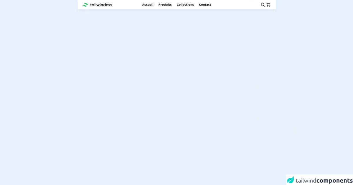
A sticky header desktop UI component is a navigation bar that remains fixed at the top of the screen as the user scrolls down the page. It provides easy access to the website's main navigation and allows users to quickly navigate to different pages on the website.
Why Use Tailwind CSS to Create a Sticky Header Desktop UI Component?
Tailwind CSS provides a set of pre-defined classes that you can use to create a sticky header desktop UI component quickly. It allows you to customize the design of the component easily and provides a responsive design that works on different screen sizes.
The Preview of Sticky Header Desktop UI Component
To create a sticky header desktop UI component with Tailwind CSS, we will use a combination of classes to style the component. We will use the following classes:
fixed: This class will fix the component at the top of the screen.w-full: This class will make the component full width.bg-white: This class will set the background color of the component to white.shadow-lg: This class will add a shadow to the component.
Free download of the Sticky header desktop's source code
The Source Code of Sticky Header Desktop UI Component
To create a sticky header desktop UI component with Tailwind CSS, we will use the following HTML and CSS code:
<header class="fixed w-full bg-white shadow-lg">
  <!-- Navigation Menu Here -->
</header>
/* No CSS Required */
<header class="header sticky top-0 bg-white shadow-md flex items-center justify-between px-8 py-02">
    <!-- logo -->
    <h1 class="w-3/12">
        <a href="">
          <svg viewBox="0 0 248 31" class="h-6 w-auto hover:text-green-500 duration-200"><path d="M25.517 0C18.712 0 14.46 3.382 12.758 10.146c2.552-3.382 5.529-4.65 8.931-3.805 1.941.482 3.329 1.882 4.864 3.432 2.502 2.524 5.398 5.445 11.722 5.445 6.804 0 11.057-3.382 12.758-10.145-2.551 3.382-5.528 4.65-8.93 3.804-1.942-.482-3.33-1.882-4.865-3.431C34.736 2.92 31.841 0 25.517 0zM12.758 15.218C5.954 15.218 1.701 18.6 0 25.364c2.552-3.382 5.529-4.65 8.93-3.805 1.942.482 3.33 1.882 4.865 3.432 2.502 2.524 5.397 5.445 11.722 5.445 6.804 0 11.057-3.381 12.758-10.145-2.552 3.382-5.529 4.65-8.931 3.805-1.941-.483-3.329-1.883-4.864-3.432-2.502-2.524-5.398-5.446-11.722-5.446z" fill="#22C55E"></path><path fill-rule="evenodd" clip-rule="evenodd" d="M76.546 12.825h-4.453v8.567c0 2.285 1.508 2.249 4.453 2.106v3.463c-5.962.714-8.332-.928-8.332-5.569v-8.567H64.91V9.112h3.304V4.318l3.879-1.143v5.937h4.453v3.713zM93.52 9.112h3.878v17.849h-3.878v-2.57c-1.365 1.891-3.484 3.034-6.285 3.034-4.884 0-8.942-4.105-8.942-9.389 0-5.318 4.058-9.388 8.942-9.388 2.801 0 4.92 1.142 6.285 2.999V9.112zm-5.674 14.636c3.232 0 5.674-2.392 5.674-5.712s-2.442-5.711-5.674-5.711-5.674 2.392-5.674 5.711c0 3.32 2.442 5.712 5.674 5.712zm16.016-17.313c-1.364 0-2.477-1.142-2.477-2.463a2.475 2.475 0 012.477-2.463 2.475 2.475 0 012.478 2.463c0 1.32-1.113 2.463-2.478 2.463zm-1.939 20.526V9.112h3.879v17.849h-3.879zm8.368 0V.9h3.878v26.06h-3.878zm29.053-17.849h4.094l-5.638 17.849h-3.807l-3.735-12.03-3.771 12.03h-3.806l-5.639-17.849h4.094l3.484 12.315 3.771-12.315h3.699l3.734 12.315 3.52-12.315zm8.906-2.677c-1.365 0-2.478-1.142-2.478-2.463a2.475 2.475 0 012.478-2.463 2.475 2.475 0 012.478 2.463c0 1.32-1.113 2.463-2.478 2.463zm-1.939 20.526V9.112h3.878v17.849h-3.878zm17.812-18.313c4.022 0 6.895 2.713 6.895 7.354V26.96h-3.878V16.394c0-2.713-1.58-4.14-4.022-4.14-2.55 0-4.561 1.499-4.561 5.14v9.567h-3.879V9.112h3.879v2.285c1.185-1.856 3.124-2.749 5.566-2.749zm25.282-6.675h3.879V26.96h-3.879v-2.57c-1.364 1.892-3.483 3.034-6.284 3.034-4.884 0-8.942-4.105-8.942-9.389 0-5.318 4.058-9.388 8.942-9.388 2.801 0 4.92 1.142 6.284 2.999V1.973zm-5.674 21.775c3.232 0 5.674-2.392 5.674-5.712s-2.442-5.711-5.674-5.711-5.674 2.392-5.674 5.711c0 3.32 2.442 5.712 5.674 5.712zm22.553 3.677c-5.423 0-9.481-4.105-9.481-9.389 0-5.318 4.058-9.388 9.481-9.388 3.519 0 6.572 1.82 8.008 4.605l-3.34 1.928c-.79-1.678-2.549-2.749-4.704-2.749-3.16 0-5.566 2.392-5.566 5.604 0 3.213 2.406 5.605 5.566 5.605 2.155 0 3.914-1.107 4.776-2.749l3.34 1.892c-1.508 2.82-4.561 4.64-8.08 4.64zm14.472-13.387c0 3.249 9.661 1.285 9.661 7.89 0 3.57-3.125 5.497-7.003 5.497-3.591 0-6.177-1.607-7.326-4.177l3.34-1.927c.574 1.606 2.011 2.57 3.986 2.57 1.724 0 3.052-.571 3.052-2 0-3.176-9.66-1.391-9.66-7.781 0-3.356 2.909-5.462 6.572-5.462 2.945 0 5.387 1.357 6.644 3.713l-3.268 1.82c-.647-1.392-1.904-2.035-3.376-2.035-1.401 0-2.622.607-2.622 1.892zm16.556 0c0 3.249 9.66 1.285 9.66 7.89 0 3.57-3.124 5.497-7.003 5.497-3.591 0-6.176-1.607-7.326-4.177l3.34-1.927c.575 1.606 2.011 2.57 3.986 2.57 1.724 0 3.053-.571 3.053-2 0-3.176-9.66-1.391-9.66-7.781 0-3.356 2.908-5.462 6.572-5.462 2.944 0 5.386 1.357 6.643 3.713l-3.268 1.82c-.646-1.392-1.903-2.035-3.375-2.035-1.401 0-2.622.607-2.622 1.892z" fill="currentColor"></path></svg>
        </a>
    </h1>

    <!-- navigation -->
    <nav class="nav font-semibold text-lg">
        <ul class="flex items-center">
            <li class="p-4 border-b-2 border-green-500 border-opacity-0 hover:border-opacity-100 hover:text-green-500 duration-200 cursor-pointer active">
              <a href="">Accueil</a>
            </li>
            <li class="p-4 border-b-2 border-green-500 border-opacity-0 hover:border-opacity-100 hover:text-green-500 duration-200 cursor-pointer">
              <a href="">Produits</a>
            </li>
            <li class="p-4 border-b-2 border-green-500 border-opacity-0 hover:border-opacity-100 hover:text-green-500 duration-200 cursor-pointer">
              <a href="">Collections</a>
            </li>
            <li class="p-4 border-b-2 border-green-500 border-opacity-0 hover:border-opacity-100 hover:text-green-500 duration-200 cursor-pointer">
              <a href="">Contact</a>
            </li>
        </ul>
    </nav>

    <!-- buttons --->
    <div class="w-3/12 flex justify-end">
        <a href="">
            <svg class="h-8 p-1 hover:text-green-500 duration-200" aria-hidden="true" focusable="false" data-prefix="far" data-icon="search" role="img" xmlns="http://www.w3.org/2000/svg" viewBox="0 0 512 512" class="svg-inline--fa fa-search fa-w-16 fa-9x"><path fill="currentColor" d="M508.5 468.9L387.1 347.5c-2.3-2.3-5.3-3.5-8.5-3.5h-13.2c31.5-36.5 50.6-84 50.6-136C416 93.1 322.9 0 208 0S0 93.1 0 208s93.1 208 208 208c52 0 99.5-19.1 136-50.6v13.2c0 3.2 1.3 6.2 3.5 8.5l121.4 121.4c4.7 4.7 12.3 4.7 17 0l22.6-22.6c4.7-4.7 4.7-12.3 0-17zM208 368c-88.4 0-160-71.6-160-160S119.6 48 208 48s160 71.6 160 160-71.6 160-160 160z" class=""></path></svg>
        </a>
        <a href="">
            <svg class="h-8 p-1 hover:text-green-500 duration-200" aria-hidden="true" focusable="false" data-prefix="far" data-icon="shopping-cart" role="img" xmlns="http://www.w3.org/2000/svg" viewBox="0 0 576 512" class="svg-inline--fa fa-shopping-cart fa-w-18 fa-7x"><path fill="currentColor" d="M551.991 64H144.28l-8.726-44.608C133.35 8.128 123.478 0 112 0H12C5.373 0 0 5.373 0 12v24c0 6.627 5.373 12 12 12h80.24l69.594 355.701C150.796 415.201 144 430.802 144 448c0 35.346 28.654 64 64 64s64-28.654 64-64a63.681 63.681 0 0 0-8.583-32h145.167a63.681 63.681 0 0 0-8.583 32c0 35.346 28.654 64 64 64 35.346 0 64-28.654 64-64 0-18.136-7.556-34.496-19.676-46.142l1.035-4.757c3.254-14.96-8.142-29.101-23.452-29.101H203.76l-9.39-48h312.405c11.29 0 21.054-7.869 23.452-18.902l45.216-208C578.695 78.139 567.299 64 551.991 64zM208 472c-13.234 0-24-10.766-24-24s10.766-24 24-24 24 10.766 24 24-10.766 24-24 24zm256 0c-13.234 0-24-10.766-24-24s10.766-24 24-24 24 10.766 24 24-10.766 24-24 24zm23.438-200H184.98l-31.31-160h368.548l-34.78 160z" class=""></path></svg>
        </a>
    </div>
</header>
How to Create a Sticky Header Desktop with Tailwind CSS?
To create a sticky header desktop with Tailwind CSS, follow these steps:
- Create a new HTML file and add the following code:
<!DOCTYPE html>
<html lang="en">
<head>
  <meta charset="UTF-8">
  <title>Sticky Header Desktop</title>
  <link rel="stylesheet" href="https://cdn.jsdelivr.net/npm/[email protected]/dist/tailwind.min.css">
</head>
<body>
  <header class="fixed w-full bg-white shadow-lg">
    <!-- Navigation Menu Here -->
  </header>
</body>
</html>
Add the
fixed,w-full,bg-white, andshadow-lgclasses to theheaderelement to create the sticky header desktop UI component.Add the navigation menu to the
headerelement.Save the file and open it in a web browser to see the sticky header desktop UI component in action.
Conclusion
In this article, we discussed the most effective ways to make a sticky header desktop with Tailwind CSS. We learned that Tailwind CSS provides a set of pre-defined classes that you can use to create custom designs quickly. We also learned that a sticky header desktop UI component is a navigation bar that remains fixed at the top of the screen as the user scrolls down the page. We then provided a preview and source code for creating a sticky header desktop UI component with Tailwind CSS. Finally, we provided step-by-step instructions for creating a sticky header desktop with Tailwind CSS.