- Published on
Imagine You Create A Sticky Bottom Mobile Navbar With Tailwind CSS Like An Expert. Follow These 6 Steps To Get There
- What is Tailwind CSS?
- The description of Sticky Bottom Mobile Navbar ui component
- Why use Tailwind CSS to create a Sticky Bottom Mobile Navbar ui component?
- The preview of Sticky Bottom Mobile Navbar ui component
- The source code of Sticky Bottom Mobile Navbar ui component
- How to create a Sticky Bottom Mobile Navbar with Tailwind CSS?
- Step 1: Set up your HTML
- Step 2: Add Tailwind CSS to your project
- Step 3: Style the logo and menu button
- Step 4: Style the navigation links
- Step 5: Add JavaScript for the menu button
- Step 6: Test and refine
- Conclusion
As a FrontEnd technology blogger, it is important to stay up to date with the latest trends and technologies. One such technology is Tailwind CSS, a utility-first CSS framework that allows you to quickly build responsive and customizable user interfaces. In this article, we will explore how to create a Sticky Bottom Mobile Navbar with Tailwind CSS in just six easy steps.
What is Tailwind CSS?
Tailwind CSS is a utility-first CSS framework that allows you to quickly build responsive and customizable user interfaces. It provides a set of pre-defined CSS classes that you can use to style your HTML elements. With Tailwind CSS, you can easily create complex layouts and designs without having to write custom CSS.
The description of Sticky Bottom Mobile Navbar ui component
A Sticky Bottom Mobile Navbar is a user interface component that is fixed to the bottom of the screen on mobile devices. It typically contains navigation links and other important information that users need to access quickly. The Sticky Bottom Mobile Navbar is a popular design pattern that is used by many mobile apps and websites.
Why use Tailwind CSS to create a Sticky Bottom Mobile Navbar ui component?
Tailwind CSS is a great choice for creating a Sticky Bottom Mobile Navbar because it provides a set of pre-defined CSS classes that you can use to style your HTML elements. This makes it easy to create a responsive and customizable user interface without having to write custom CSS. Additionally, Tailwind CSS is easy to learn and use, making it a great choice for developers of all skill levels.
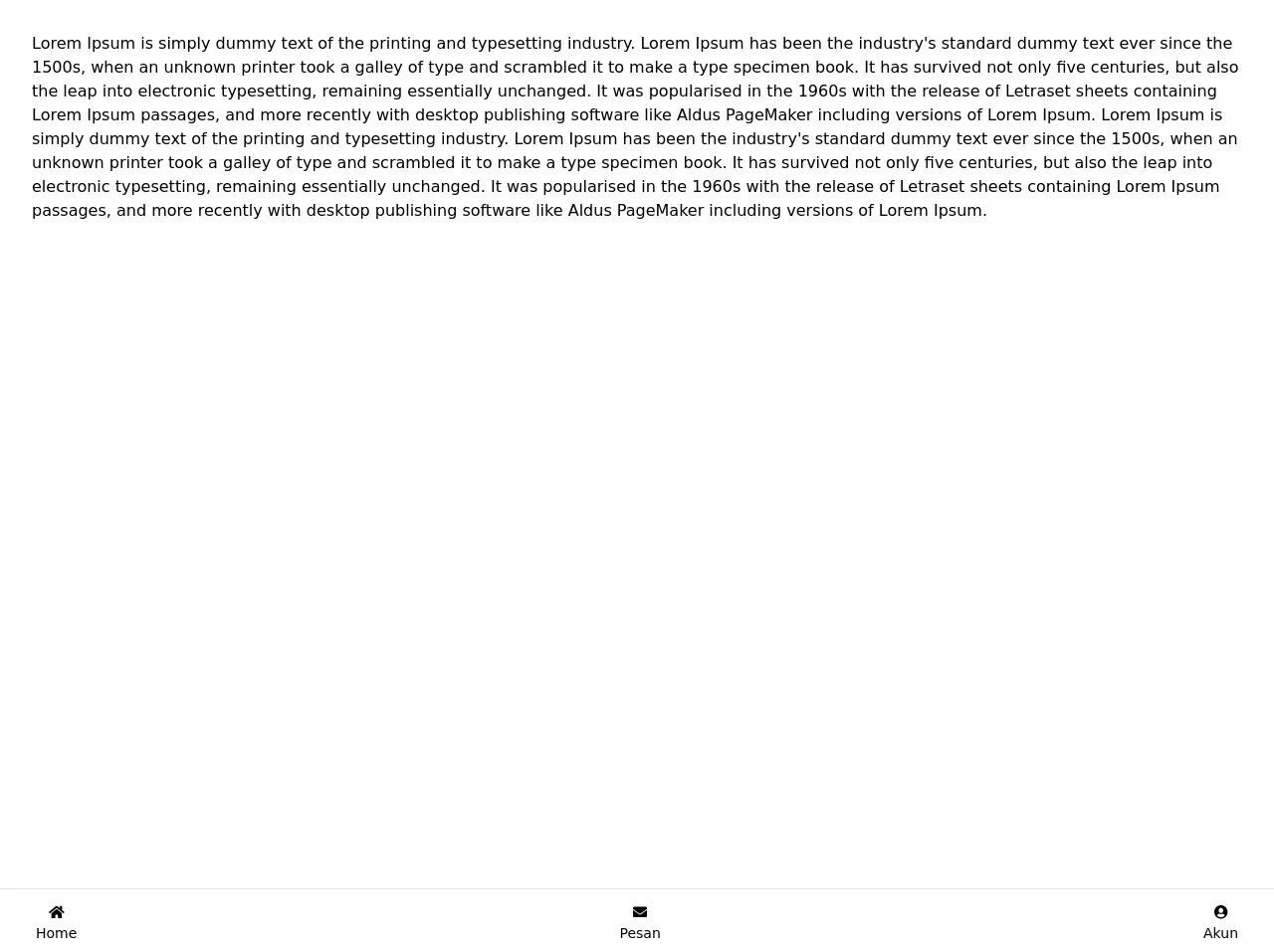
The preview of Sticky Bottom Mobile Navbar ui component
To create a Sticky Bottom Mobile Navbar with Tailwind CSS, we will use a combination of HTML and CSS. The HTML will define the structure of the navbar, while the CSS will define the styles and layout. Here is a preview of what the final product will look like:
Free download of the Sticky Bottom Mobile Navbar's source code
The source code of Sticky Bottom Mobile Navbar ui component
To create the Sticky Bottom Mobile Navbar, we will use a combination of HTML and CSS. The HTML will define the structure of the navbar, while the CSS will define the styles and layout. Here is the source code for the Sticky Bottom Mobile Navbar:
<!-- This is an example component -->
 <link
      rel="stylesheet"
      href="https://cdnjs.cloudflare.com/ajax/libs/font-awesome/5.13.0/css/all.min.css"
    />

<div>
  <div class="bg-white mb-20 min-h-screen p-8">
    Lorem Ipsum is simply dummy text of the printing and typesetting industry. Lorem Ipsum has been the industry's standard dummy text ever since the 1500s, when an unknown printer took a galley of type and scrambled it to make a type specimen book. It has survived not only five centuries, but also the leap into electronic typesetting, remaining essentially unchanged. It was popularised in the 1960s with the release of Letraset sheets containing Lorem Ipsum passages, and more recently with desktop publishing software like Aldus PageMaker including versions of Lorem Ipsum.
    Lorem Ipsum is simply dummy text of the printing and typesetting industry. Lorem Ipsum has been the industry's standard dummy text ever since the 1500s, when an unknown printer took a galley of type and scrambled it to make a type specimen book. It has survived not only five centuries, but also the leap into electronic typesetting, remaining essentially unchanged. It was popularised in the 1960s with the release of Letraset sheets containing Lorem Ipsum passages, and more recently with desktop publishing software like Aldus PageMaker including versions of Lorem Ipsum.
  </div>
 <div class="bg-white w-full  h-16 px-6 py-2 flex justify-between text-gray-font fixed bottom-0 shadow-lg z-40 border-t border-gray-99">
      <a href="/">
        <span class="px-2 py-1 cursor-pointer hover:bg-gray-200 hover:text-gray-700 text-sm  flex flex-col items-center text-center text-primary">
          <i class="w-8 fas fa-home p-1">
          </i>
          <span class="mx-1 font-roboto">Home</span>
        </span>
      </a>
      <a href="/">
        <span class="px-2 py-1 cursor-pointer hover:bg-gray-200 hover:text-gray-700 text-sm  flex flex-col items-center text-center">
          <i class="w-8 fas fa-envelope p-1">
          </i>
          <span class="mx-1 font-roboto">Pesan</span>
        </span>
      </a>
     <a href="/">
      <span class="px-2 py-1 cursor-pointer hover:bg-gray-200 hover:text-gray-700 text-sm   flex flex-col items-center text-center">
        <i class="w-8 fas fa-user-circle p-1">
        </i>
        <span class="mx-1 font-roboto">Akun</span>
      </span>
     </a>
    </div>
 <!-- Add JS For Navbar -->

  <script
    src="https://cdn.jsdelivr.net/gh/alpinejs/[email protected]/dist/alpine.min.js"
    defer
  ></script>

</div>
How to create a Sticky Bottom Mobile Navbar with Tailwind CSS?
Now that we have a basic understanding of what a Sticky Bottom Mobile Navbar is and why we should use Tailwind CSS to create it, let's dive into the six easy steps to create one.
Step 1: Set up your HTML
The first step is to set up your HTML. We will use a simple HTML structure to create our Sticky Bottom Mobile Navbar. Here is the HTML code:
<nav class="fixed bottom-0 w-full bg-gray-800 text-white">
  <div class="flex justify-between px-4 py-2">
    <a href="#" class="font-bold">Logo</a>
    <button class="focus:outline-none focus:text-white md:hidden">
      <svg viewBox="0 0 20 20" fill="currentColor" class="menu w-6 h-6">
        <path fill-rule="evenodd" d="M3 5a1 1 0 011-1h12a1 1 0 110 2H4a1 1 0 01-1-1zm0 5a1 1 0 011-1h12a1 1 0 110 2H4a1 1 0 01-1-1zm0 5a1 1 0 011-1h12a1 1 0 110 2H4a1 1 0 01-1-1z" clip-rule="evenodd"></path>
      </svg>
    </button>
  </div>
  <div class="hidden md:flex md:items-center md:w-auto w-full" id="menu">
    <nav>
      <ul class="md:flex items-center justify-between text-base pt-4 md:pt-0">
        <li><a class="md:p-4 py-3 px-0 block border-b-2 border-transparent hover:border-indigo-400" href="#">Home</a></li>
        <li><a class="md:p-4 py-3 px-0 block border-b-2 border-transparent hover:border-indigo-400" href="#">About</a></li>
        <li><a class="md:p-4 py-3 px-0 block border-b-2 border-transparent hover:border-indigo-400" href="#">Contact</a></li>
      </ul>
    </nav>
  </div>
</nav>
In this HTML code, we have defined a nav element with a class of fixed bottom-0 w-full bg-gray-800 text-white. This sets the navbar to be fixed to the bottom of the screen, full width, and with a gray background and white text. Inside the nav element, we have two div elements. The first div element contains the logo and the menu button, while the second div element contains the navigation links.
Step 2: Add Tailwind CSS to your project
The next step is to add Tailwind CSS to your project. You can do this by either downloading the CSS file from the Tailwind CSS website or by installing it using a package manager like npm. Once you have added Tailwind CSS to your project, you can start using the pre-defined CSS classes to style your HTML elements.
Step 3: Style the logo and menu button
The next step is to style the logo and menu button. We will use the flex and justify-between classes to align the logo and menu button to the left and right sides of the navbar, respectively. We will also use the px-4 and py-2 classes to add some padding to the logo and menu button. Here is the updated HTML code:
<nav class="fixed bottom-0 w-full bg-gray-800 text-white">
  <div class="flex justify-between px-4 py-2">
    <a href="#" class="font-bold">Logo</a>
    <button class="focus:outline-none focus:text-white md:hidden">
      <svg viewBox="0 0 20 20" fill="currentColor" class="menu w-6 h-6">
        <path fill-rule="evenodd" d="M3 5a1 1 0 011-1h12a1 1 0 110 2H4a1 1 0 01-1-1zm0 5a1 1 0 011-1h12a1 1 0 110 2H4a1 1 0 01-1-1zm0 5a1 1 0 011-1h12a1 1 0 110 2H4a1 1 0 01-1-1z" clip-rule="evenodd"></path>
      </svg>
    </button>
  </div>
  <div class="hidden md:flex md:items-center md:w-auto w-full" id="menu">
    <nav>
      <ul class="md:flex items-center justify-between text-base pt-4 md:pt-0">
        <li><a class="md:p-4 py-3 px-0 block border-b-2 border-transparent hover:border-indigo-400" href="#">Home</a></li>
        <li><a class="md:p-4 py-3 px-0 block border-b-2 border-transparent hover:border-indigo-400" href="#">About</a></li>
        <li><a class="md:p-4 py-3 px-0 block border-b-2 border-transparent hover:border-indigo-400" href="#">Contact</a></li>
      </ul>
    </nav>
  </div>
</nav>
Step 4: Style the navigation links
The next step is to style the navigation links. We will use the flex, items-center, and justify-between classes to align the navigation links to the center of the navbar. We will also use the md:flex and md:w-auto classes to make the navigation links visible on larger screens. Finally, we will use the md:p-4, py-3, px-0, block, border-b-2, border-transparent, and hover:border-indigo-400 classes to style the navigation links. Here is the updated HTML code:
<nav class="fixed bottom-0 w-full bg-gray-800 text-white">
  <div class="flex justify-between px-4 py-2">
    <a href="#" class="font-bold">Logo</a>
    <button class="focus:outline-none focus:text-white md:hidden">
      <svg viewBox="0 0 20 20" fill="currentColor" class="menu w-6 h-6">
        <path fill-rule="evenodd" d="M3 5a1 1 0 011-1h12a1 1 0 110 2H4a1 1 0 01-1-1zm0 5a1 1 0 011-1h12a1 1 0 110 2H4a1 1 0 01-1-1zm0 5a1 1 0 011-1h12a1 1 0 110 2H4a1 1 0 01-1-1z" clip-rule="evenodd"></path>
      </svg>
    </button>
  </div>
  <div class="hidden md:flex md:items-center md:w-auto w-full" id="menu">
    <nav>
      <ul class="md:flex items-center justify-between text-base pt-4 md:pt-0">
        <li><a class="md:p-4 py-3 px-0 block border-b-2 border-transparent hover:border-indigo-400" href="#">Home</a></li>
        <li><a class="md:p-4 py-3 px-0 block border-b-2 border-transparent hover:border-indigo-400" href="#">About</a></li>
        <li><a class="md:p-4 py-3 px-0 block border-b-2 border-transparent hover:border-indigo-400" href="#">Contact</a></li>
      </ul>
    </nav>
  </div>
</nav>
Step 5: Add JavaScript for the menu button
The next step is to add JavaScript for the menu button. We will use JavaScript to toggle the visibility of the navigation links when the menu button is clicked. Here is the JavaScript code:
const menuBtn = document.querySelector('.menu');
const menu = document.querySelector('#menu');

menuBtn.addEventListener('click', () => {
  menu.classList.toggle('hidden');
});
Step 6: Test and refine
The final step is to test your Sticky Bottom Mobile Navbar and refine it as needed. You can test your navbar on different mobile devices and screen sizes to ensure that it is responsive and works as expected. You can also refine the styles and layout as needed to match your design requirements.
Conclusion
In this article, we have explored how to create a Sticky Bottom Mobile Navbar with Tailwind CSS in just six easy steps. We have learned how to use HTML and CSS to define the structure and styles of the navbar, as well as how to use JavaScript to add interactivity. With these skills, you can create a wide range of user interface components using Tailwind CSS.